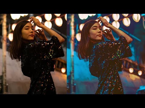
There’s a specific kind of frustration that comes from knowing a photo should look incredible and watching it sit there looking like a beige nothing. The light was right. The composition was there. But something in the RAW file just refuses to pop. I ran into this constantly when I was editing press shots for my band on a zero-dollar budget, squinting at Lightroom at midnight wondering why every image looked like it was shot through a screen door.
That’s why this particular technique caught my attention. In this Jessica Kobeissi tutorial on adding vibrant colors in Lightroom, she walks through a color grading workflow that takes a relatively flat image and pushes it into something with genuine visual energy. It’s not a magic-button preset drop. It’s a layered process, and once you understand the logic behind each move, you’ll start using it intuitively. Watch the full tutorial on YouTube if you want to see her screen in motion, but this breakdown will get you through every step on your own.
One important caveat Jessica makes right upfront: this look is lighting-dependent. If your photo has a lot of natural greenery or was shot in a heavily shaded outdoor environment, the color relationships will fight you. This technique sings on images with controlled or studio-adjacent light, strong skin tones, or bold architectural color. Keep that in mind before you wonder why your forest hike shots aren’t cooperating.
Step 1: Increase Exposure and Pull Down Contrast
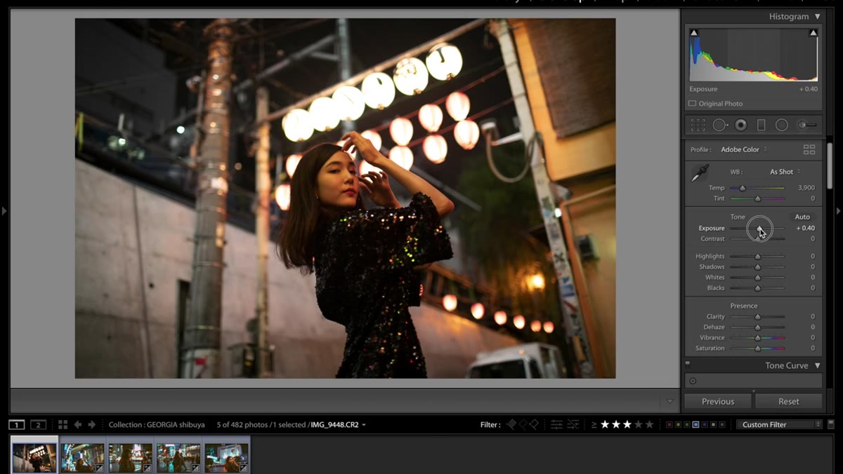 Exposure slider raised, contrast slider lowered in Basic panel
Start in the Basic panel. Push exposure up to around +0.35. This isn’t about blowing out your highlights. It’s about opening the midtones so the colors have room to breathe. Once you’ve done that, pull contrast down. How far depends on your image, but the goal is to flatten things slightly before you re-introduce depth through curves later. Contrast added through the Tone Curve panel gives you far more control than the blunt-instrument contrast slider anyway.
Exposure slider raised, contrast slider lowered in Basic panel
Start in the Basic panel. Push exposure up to around +0.35. This isn’t about blowing out your highlights. It’s about opening the midtones so the colors have room to breathe. Once you’ve done that, pull contrast down. How far depends on your image, but the goal is to flatten things slightly before you re-introduce depth through curves later. Contrast added through the Tone Curve panel gives you far more control than the blunt-instrument contrast slider anyway.
Step 2: Shape the Tonal Range with Highlights, Shadows, and Blacks
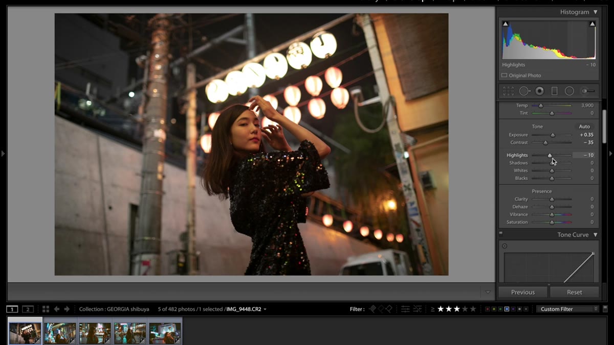 Highlights lowered, shadows raised to maximum in Basic panel
Lower the highlights slightly to keep the bright areas from getting away from you. Then push shadows all the way up. All the way. This crushes the traditional moody shadow look and keeps everything in a brighter, more even tonal range. That might feel wrong if you’re used to dramatic shadow-to-highlight contrast, but trust the process here. Follow that by raising the blacks to around +35. The combination of lifted shadows and pulled-up blacks is what gives this look its airy, almost film-print quality.
Highlights lowered, shadows raised to maximum in Basic panel
Lower the highlights slightly to keep the bright areas from getting away from you. Then push shadows all the way up. All the way. This crushes the traditional moody shadow look and keeps everything in a brighter, more even tonal range. That might feel wrong if you’re used to dramatic shadow-to-highlight contrast, but trust the process here. Follow that by raising the blacks to around +35. The combination of lifted shadows and pulled-up blacks is what gives this look its airy, almost film-print quality.
Step 3: Add Clarity and Dial In Vibrance and Saturation
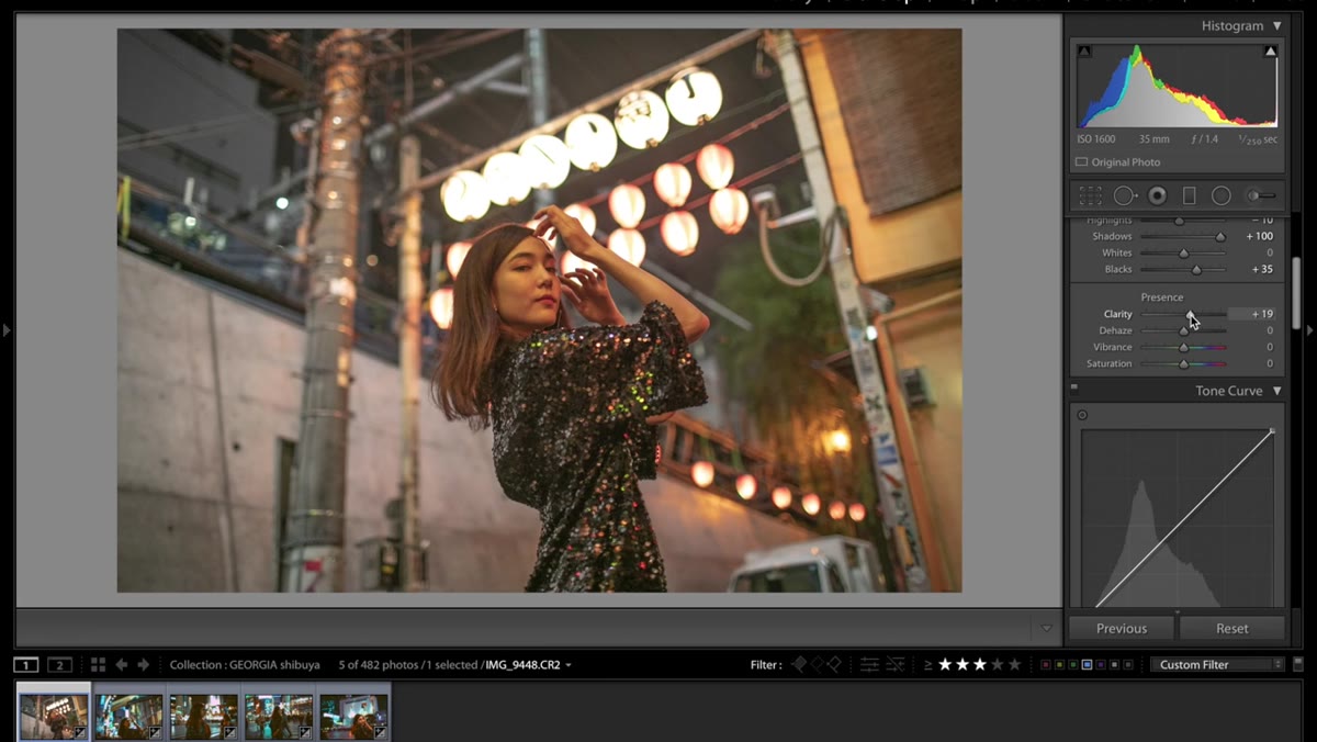 Clarity, vibrance, and saturation sliders adjusted in Basic panel
Bump clarity up to around +19. This adds a subtle midtone contrast that keeps the image from going too soft. It puts just enough edge back into the details without making faces look over-sharpened. For vibrance and saturation, Jessica lands at roughly -9 vibrance and +10 saturation. That combination sounds counterintuitive but it works well. Lower vibrance prevents already-saturated colors from oversaturating, while the saturation boost lifts the flatter tones. Think of it as evening out the playing field rather than just cranking everything louder.
Clarity, vibrance, and saturation sliders adjusted in Basic panel
Bump clarity up to around +19. This adds a subtle midtone contrast that keeps the image from going too soft. It puts just enough edge back into the details without making faces look over-sharpened. For vibrance and saturation, Jessica lands at roughly -9 vibrance and +10 saturation. That combination sounds counterintuitive but it works well. Lower vibrance prevents already-saturated colors from oversaturating, while the saturation boost lifts the flatter tones. Think of it as evening out the playing field rather than just cranking everything louder.
Step 4: Build an S-Curve on the RGB Channel
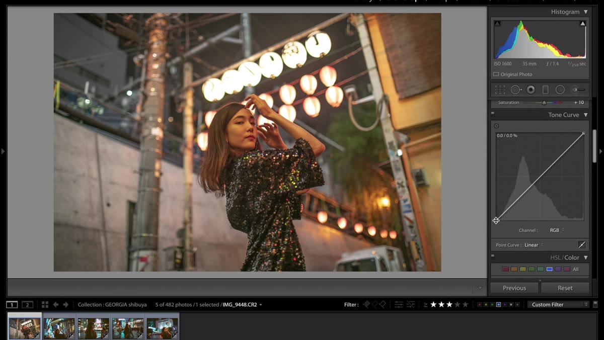 RGB tone curve shaped into soft S-curve
Move into the Tone Curve panel. On the RGB composite channel, create a gentle S-curve. Drag the lower portion of the curve down slightly to deepen the shadows just enough to reintroduce some contrast, and lift the upper portion to brighten the highlights. You’re not trying to make a dramatic S here. The lift you already applied in the Basic panel did a lot of the heavy lifting. This curve is more of a refinement than a dramatic shift.
RGB tone curve shaped into soft S-curve
Move into the Tone Curve panel. On the RGB composite channel, create a gentle S-curve. Drag the lower portion of the curve down slightly to deepen the shadows just enough to reintroduce some contrast, and lift the upper portion to brighten the highlights. You’re not trying to make a dramatic S here. The lift you already applied in the Basic panel did a lot of the heavy lifting. This curve is more of a refinement than a dramatic shift.
Step 5: Work the Red Channel Curve
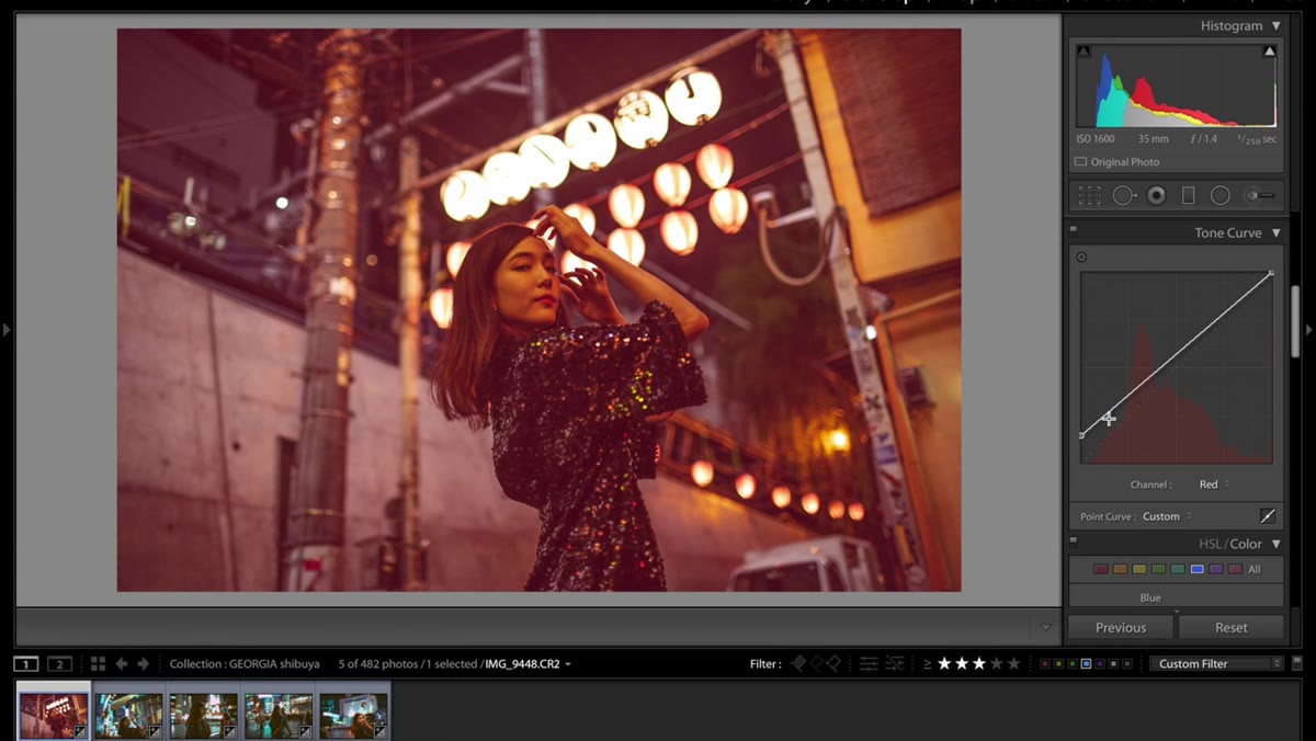 Red channel curve adjusted in Tone Curve panel
Switch from RGB to the Red channel inside the Tone Curve. Lift the bottom of the red curve slightly. This is the move that lets a hint of red bleed into the shadow areas. On skin tones especially, this creates warmth in the darker parts of the image without making midtones go orange. Go slowly here. A little movement on the red curve shadows goes a long way, and it’s easy to overshoot and end up with something that looks like a sunset filter gone wrong.
Red channel curve adjusted in Tone Curve panel
Switch from RGB to the Red channel inside the Tone Curve. Lift the bottom of the red curve slightly. This is the move that lets a hint of red bleed into the shadow areas. On skin tones especially, this creates warmth in the darker parts of the image without making midtones go orange. Go slowly here. A little movement on the red curve shadows goes a long way, and it’s easy to overshoot and end up with something that looks like a sunset filter gone wrong.
Step 6: Adjust the Green Channel
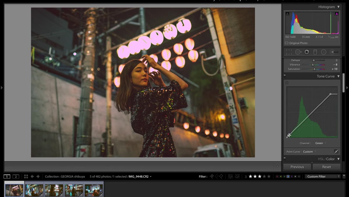 Green channel curve pulled down in Tone Curve panel
Switch to the Green channel and pull it down. This cools the midtones and pushes the overall palette toward a more stylized, slightly magenta-shifted look. Green is often the color that makes images look natural and balanced, so reducing it here is a deliberate move away from neutral and toward something more editorial. Even small adjustments on this channel change the mood significantly. Pull it down until it starts to feel interesting, then back off just a touch.
Green channel curve pulled down in Tone Curve panel
Switch to the Green channel and pull it down. This cools the midtones and pushes the overall palette toward a more stylized, slightly magenta-shifted look. Green is often the color that makes images look natural and balanced, so reducing it here is a deliberate move away from neutral and toward something more editorial. Even small adjustments on this channel change the mood significantly. Pull it down until it starts to feel interesting, then back off just a touch.
Step 7: Shape the Blue Channel Curve
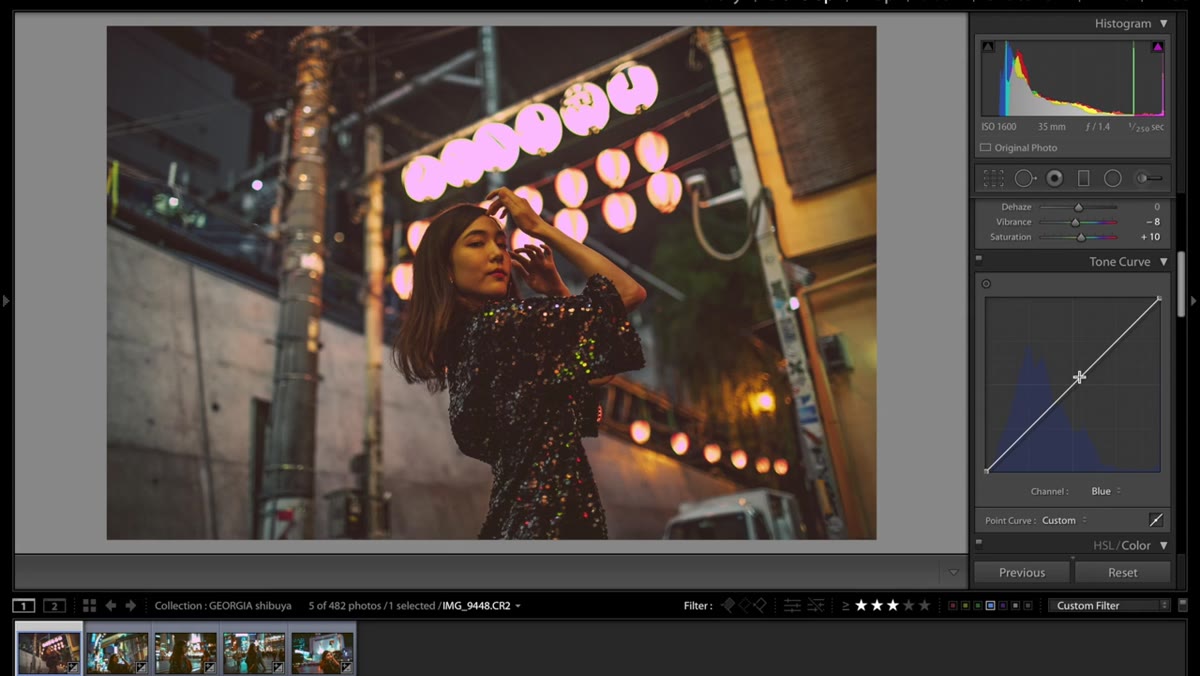 Blue channel curve shaped into dip and lift pattern
The blue channel is where this grade really comes together. Jessica describes the shape as something like a little dipper, and that’s as good a description as any. Create a slight dip in the lower-to-midtone region of the blue curve, then let it lift back up toward the highlights. The dip pulls yellow and warmth into the midtones while the lift keeps the highlights from going too golden. This is the channel worth spending real time on. Minor shifts produce noticeable changes in color temperature and mood throughout the entire image.
Blue channel curve shaped into dip and lift pattern
The blue channel is where this grade really comes together. Jessica describes the shape as something like a little dipper, and that’s as good a description as any. Create a slight dip in the lower-to-midtone region of the blue curve, then let it lift back up toward the highlights. The dip pulls yellow and warmth into the midtones while the lift keeps the highlights from going too golden. This is the channel worth spending real time on. Minor shifts produce noticeable changes in color temperature and mood throughout the entire image.
What I’d Add From My Own Experience
The look Jessica builds here sits in a specific zone that I’d describe as “warm but not Instagram-filter warm.” It works because the changes are distributed across multiple controls rather than done all at once with one big saturation push.
One thing I’d extend from this: once you nail the look on one image, sync it to a similar photo from the same shoot and see what breaks. Almost always it’s the blue channel that needs a slight pull-back or the blacks that need trimming. Build the grade, sync it, then do a second pass on the synced images to tune the outliers. It sounds like extra work but it cuts your total editing time significantly across a full shoot.
Also, if you shoot in mixed lighting or the shadows in your image have a strong color cast from a second light source, the green channel curve is going to be your calibration point. A slight pull up rather than down can neutralize a green cast from overhead fluorescents without touching white balance. I use this more than I expected to when I’m editing anything shot in commercial or event spaces.
The single most transferable lesson from this tutorial is that vibrant color grading isn’t about adding more. It’s about shaping the relationship between the tonal zones so that color can express itself within a tighter, more controlled range. The saturation numbers Jessica uses are modest. The curves are subtle. But together they create images that genuinely stop the scroll.
Watch the full tutorial on YouTube to see the before-and-after in motion and hear Jessica’s own notes on how lighting affects the outcome.
Comments
Leave a Comment