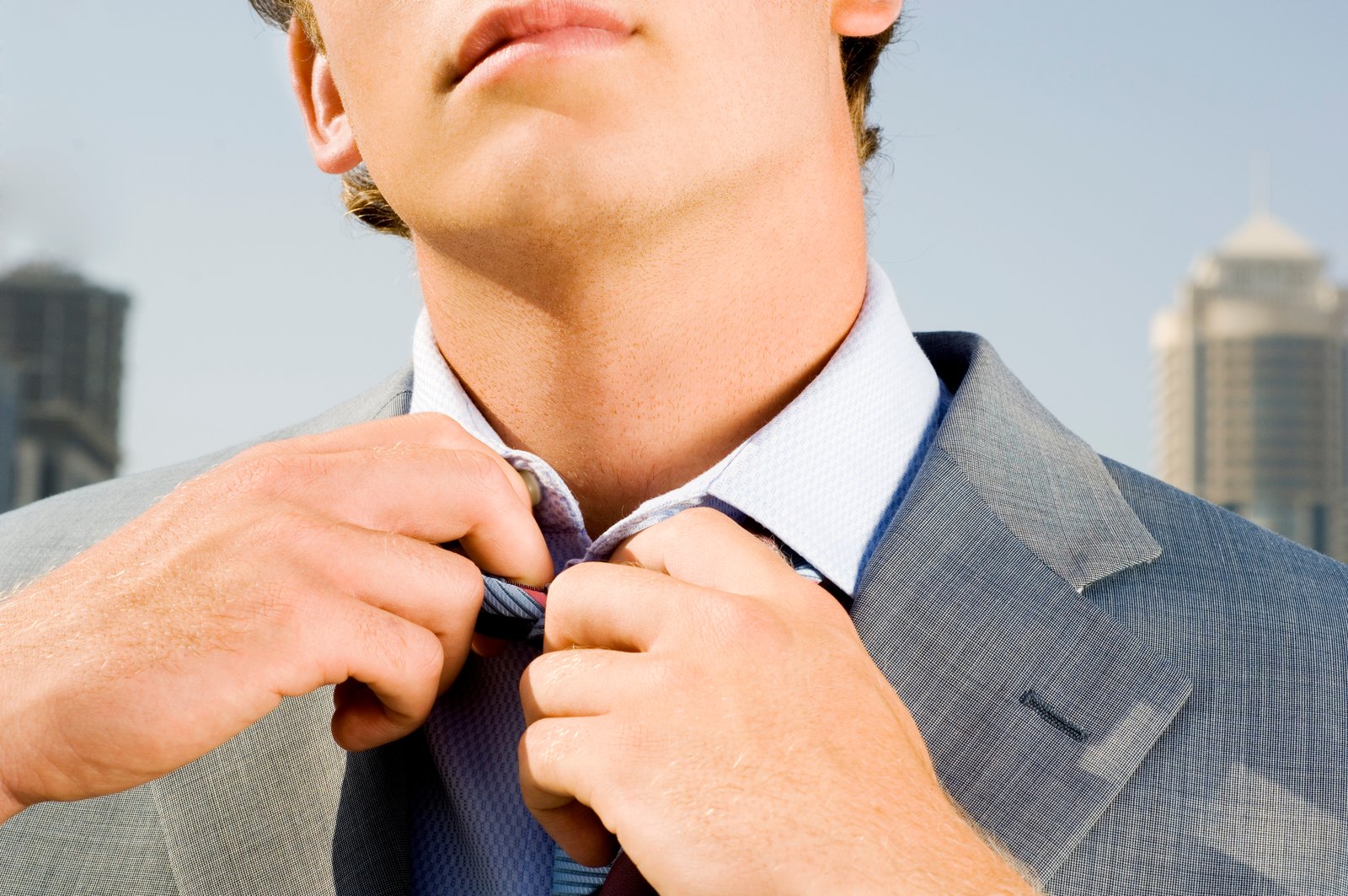
I was staring at a portrait last week, one of those golden-hour shots where the skin tones look almost right but something is pulling the whole image toward orange sherbet. The tone curve was clean. The white balance was dialed. And I kept reaching for the saturation slider like it was going to solve something it was never designed to solve.
The HSL panel fixed it in about forty seconds.
If you’re using HSL only as a final polish step, you’re missing what it’s actually built for. It’s not garnish. For color-specific corrections, it’s the main course.
What HSL Is Actually Doing to Your Pixels
HSL stands for Hue, Saturation, and Luminance. Each of those three tabs in Lightroom contains eight color range sliders: Red, Orange, Yellow, Green, Aqua, Blue, Purple, and Magenta. That’s 24 individual controls, each one operating on a targeted band of color rather than the whole image.
Here’s the part that matters technically. When you drag the Orange Hue slider from 0 to -15, you’re not shifting every orange pixel by a fixed amount. Lightroom applies a weighted adjustment based on how close each pixel’s hue is to the center of the orange range. A pixel sitting right at the core of that orange band gets the full shift. A pixel that’s more red-orange or yellow-orange gets a partial adjustment. The falloff is smooth and the transitions between ranges overlap intentionally, which is why the edits rarely look harsh.
The Luminance tab works the same way but controls brightness per color channel. Drop the Blue Luminance to -20 and your skies deepen without a gradient mask. Lift Yellow Luminance to +15 and foliage picks up a sunlit quality that the Exposure slider can’t isolate.
The Skin Tone Fix That Takes Under a Minute
Back to that orange portrait. The problem was the Orange and Red sliders were fighting each other in a way the global tools couldn’t separate.
Open HSL, go to the Hue tab, and find the Orange slider. For warm-toned skin, a shift between -10 and -20 typically pulls the orange back toward a more natural peach-red. For cooler skin tones, stay closer to -5 to -10. You’re not guessing, you’re steering.
Then go to the Saturation tab. Orange Saturation around -15 to -25 brings down that sunburned look without draining all the warmth. If you’ve got a subject with naturally warm undertones, park it at -15 and leave it. Going past -30 starts flattening the skin into something that reads as gray-adjacent in print.
Finally, check Luminance. Bumping Orange Luminance up to +10 or +15 brightens skin without brightening the whole frame. This is especially useful when your background is a different color family entirely.
The whole correction, assuming your exposure is already close, takes about 45 seconds once you know what you’re touching.
The Landscape Trick Photographers Overlook
I spent a full weekend in 2019 building a preset pack for outdoor and travel photography. Named every preset after a song, because that’s just how I work. The whole pack ended up being free, got about 50,000 downloads, and the number one DM I got afterward was some version of “how did you make the greens look like that.”
The answer was Yellow Luminance and Green Hue working together.
Most landscape photographers reach for the Vibrance slider and call it done. But Vibrance doesn’t know the difference between a field of ryegrass and a cluster of pine trees. HSL does.
For lush, saturated greens: set Green Hue to between -10 and -15 to push it slightly toward a warmer, more yellow-green. Then set Yellow Hue to +5 to keep foliage from going too lime. Bring Green Saturation up to +20 and Yellow Saturation up to +15. Finally, lift Yellow Luminance to +12 and drop Green Luminance to -8. That combination, those specific numbers, creates the kind of layered depth in foliage that single-slider edits flatten out.
For skies, pull Blue Saturation up to +20 to +35 depending on how pale your starting sky is. Then drop Blue Luminance to between -15 and -25. That darkens the blue channel specifically, making clouds pop without any masking work.
When HSL Breaks (And Why You Shouldn’t Panic)
HSL is not magic. It has a real weakness: overlapping colors in the same scene.
If your subject is wearing an orange jacket and standing in front of autumn foliage, the Orange slider is going to touch both. There’s no way around that in HSL alone. The workaround is using Lightroom’s Masking panel to isolate your subject first, apply HSL corrections to the masked layer, then adjust the background separately. That adds two to four minutes to your workflow but keeps the adjustments from bleeding into each other.
Also worth knowing: HSL in Lightroom operates in the RGB color space of your file. If you’re working on a JPEG that was already compressed before you imported it, the color ranges are less clean and you’ll see more banding artifacts when pushing the Saturation sliders past +40. Shoot raw, and this almost never comes up. Shoot JPEG and treat +25 as a soft ceiling on Saturation adjustments.
The Habit That Changes How You Grade Color
The most useful shift I made to my own workflow was moving HSL from the end of my editing sequence to the middle. I run White Balance and Exposure first, then Basic panel tone adjustments, then HSL before I touch anything creative like split toning or the Color Grading panel.
Color Grading adds casts globally or by tonal range. If you do it before HSL, you’re then using HSL to correct a correction, and the math gets messy fast.
Run HSL when your image is technically correct but not yet expressive, and you’ll find it does far more than you expected. Most of the “I don’t know what’s wrong with it” problems in a photo are color-range problems, and that’s exactly the territory HSL was built for.
Comments (1)
Solid advice. Especially the part about taking your time with it.
Leave a Comment