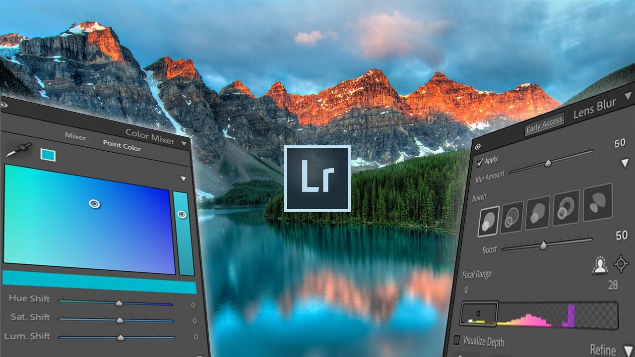
Every few months, Adobe drops an update and I spend the better part of an afternoon figuring out which features are genuinely useful and which ones exist mostly to fill a press release. This one, though, is different. The October Lightroom update landed with three additions that actually change how I work: a simulated lens blur tool, a point color panel, and native HDR editing support. I ran through all of them after watching Watch the full tutorial on YouTube from Mango Street, and I want to walk you through each feature in enough detail that you can follow along without having the video open beside you.
The lens blur feature is the one that made me sit up straight. I’ve written before about faking background blur manually in Lightroom using gradient masks and the dehaze slider in creative ways. It works, but it’s slow, and it never quite looks right on subjects with complex edges like curly hair or anything being held in someone’s hand. Having an AI-generated depth map do the heavy lifting changes that calculation significantly. Let me show you how all three features work.
Step 1: Find the Lens Blur Panel in the Develop Module
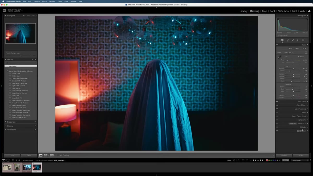 Lens Blur panel visible in Develop module sidebar
Open any photo in your Develop module and look for the new Lens Blur panel. It should appear in your right-side panel stack. When you click to apply it, Adobe Sensei analyzes the image and builds a depth map automatically. You’ll see a Strength slider appear, which controls how heavy the blur effect is. Start low and work up. Cranking it immediately tends to produce edges that look like they belong in a phone portrait mode ad circa 2018, not an actual photograph.
Lens Blur panel visible in Develop module sidebar
Open any photo in your Develop module and look for the new Lens Blur panel. It should appear in your right-side panel stack. When you click to apply it, Adobe Sensei analyzes the image and builds a depth map automatically. You’ll see a Strength slider appear, which controls how heavy the blur effect is. Start low and work up. Cranking it immediately tends to produce edges that look like they belong in a phone portrait mode ad circa 2018, not an actual photograph.
Step 2: Choose Your Bokeh Shape and Set the Focal Range
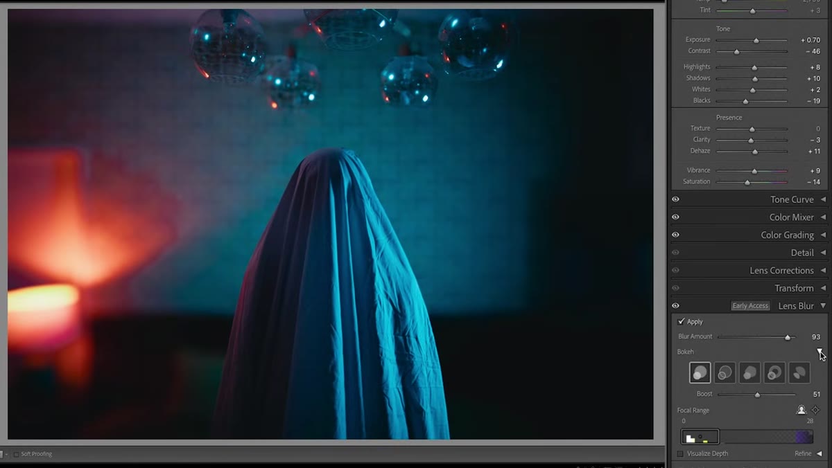 Bokeh shape options panel showing circle, soap bubble, and cat’s eye
Open the Bokeh Options section and you’ll find several shape choices: circle, soap bubble, five blade, ring, and cat’s eye. The soap bubble option is the most stylized and works well for editorial or fashion shots where you want the background to feel intentional. The five blade mimics older vintage lenses and is my personal preference for portraits. There’s also a Boost slider here that increases the brightness of out-of-focus light sources, which is useful for any shot with background highlights or street lights.
Bokeh shape options panel showing circle, soap bubble, and cat’s eye
Open the Bokeh Options section and you’ll find several shape choices: circle, soap bubble, five blade, ring, and cat’s eye. The soap bubble option is the most stylized and works well for editorial or fashion shots where you want the background to feel intentional. The five blade mimics older vintage lenses and is my personal preference for portraits. There’s also a Boost slider here that increases the brightness of out-of-focus light sources, which is useful for any shot with background highlights or street lights.
Below that, the Focus Range section defaults to subject detection. In most clean compositions, the AI correctly identifies your subject and builds blur in front of and behind them. If your scene is more complex, switch to Point or Area focus and click directly on the part of the image you want sharp. You can click “Visualize Depth” to see the actual depth map rendered as a grayscale overlay, which tells you immediately whether the AI understood your scene.
Step 3: Refine the Depth Map with the Brush Tool
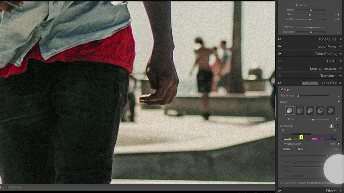 Refine tab open with brush painting over subject’s hand
In the Mango Street tutorial, there’s a shot where the AI failed to recognize a person’s hand as part of the subject, leaving it looking soft when it should be sharp. This is where the Refine tab earns its place. Open it, click the Focus button, and paint over any area that should be sharp but isn’t. You can also paint to blur areas that the AI left in focus by mistake. Adjust the brush size and feathering just like you would with any masking brush in Lightroom. When you’re done, use the Amount slider to blend the correction naturally. The before and after on a properly refined depth map is genuinely impressive.
Refine tab open with brush painting over subject’s hand
In the Mango Street tutorial, there’s a shot where the AI failed to recognize a person’s hand as part of the subject, leaving it looking soft when it should be sharp. This is where the Refine tab earns its place. Open it, click the Focus button, and paint over any area that should be sharp but isn’t. You can also paint to blur areas that the AI left in focus by mistake. Adjust the brush size and feathering just like you would with any masking brush in Lightroom. When you’re done, use the Amount slider to blend the correction naturally. The before and after on a properly refined depth map is genuinely impressive.
Step 4: Use Point Color for Surgical Hue Adjustments
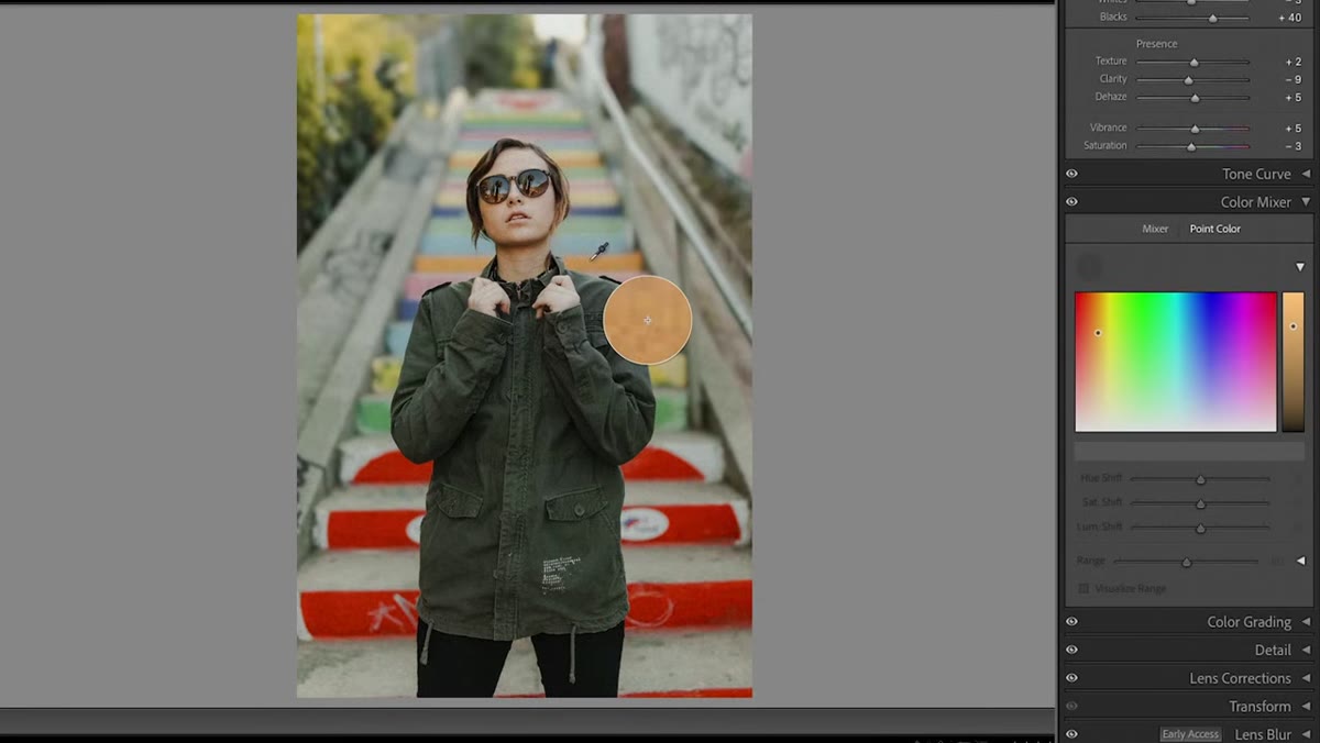 Point Color eyedropper selecting a specific color in the image
The HSL panel has been a Lightroom staple forever, but it paints with a fairly wide brush. The new Point Color tool, found in the same color section now labeled “Color Mixer,” lets you pick a specific hue from your image using an eyedropper. Click the eyedropper, click on the color you want to target, and Lightroom generates HSL controls for that exact hue. It also saves that color as a swatch so you can come back to it without re-sampling.
Point Color eyedropper selecting a specific color in the image
The HSL panel has been a Lightroom staple forever, but it paints with a fairly wide brush. The new Point Color tool, found in the same color section now labeled “Color Mixer,” lets you pick a specific hue from your image using an eyedropper. Click the eyedropper, click on the color you want to target, and Lightroom generates HSL controls for that exact hue. It also saves that color as a swatch so you can come back to it without re-sampling.
Step 5: Narrow the Range to Protect Other Colors
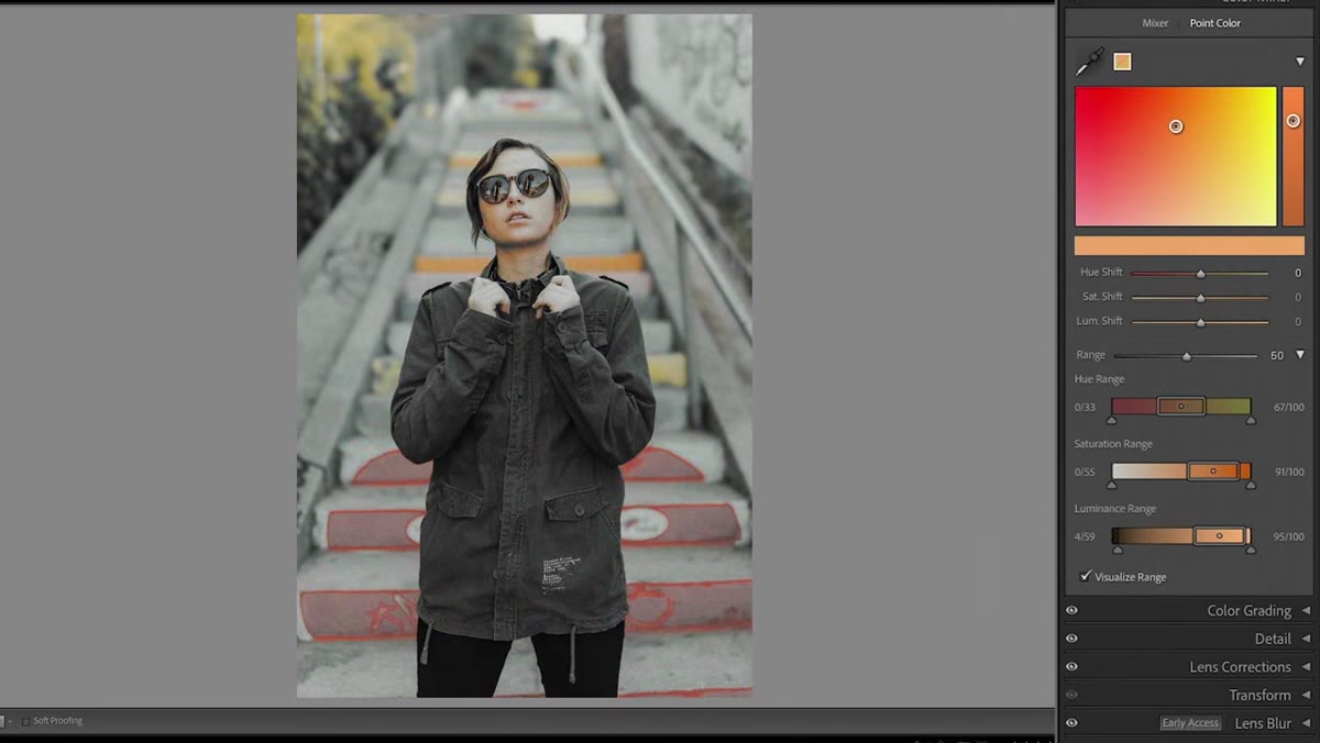 Range settings panel showing hue, saturation, and luminance range sliders
This is where Point Color separates itself from the standard HSL panel. Click into the Range settings for any swatch you’ve created, and you’ll find individual range controls for hue, saturation, and luminance. So if you want to shift the color of a painted wall without touching the warm skin tones sitting in the same orange-red zone, you can tighten the hue range until only the wall falls inside it. Toggle “Visualize Range” to see exactly which pixels are being selected as you adjust. I’ve used this on Nashville street photography where the brick buildings and the subjects’ jackets were occupying almost identical hue ranges. Being able to separate them without switching to Photoshop is a real time-saver.
Range settings panel showing hue, saturation, and luminance range sliders
This is where Point Color separates itself from the standard HSL panel. Click into the Range settings for any swatch you’ve created, and you’ll find individual range controls for hue, saturation, and luminance. So if you want to shift the color of a painted wall without touching the warm skin tones sitting in the same orange-red zone, you can tighten the hue range until only the wall falls inside it. Toggle “Visualize Range” to see exactly which pixels are being selected as you adjust. I’ve used this on Nashville street photography where the brick buildings and the subjects’ jackets were occupying almost identical hue ranges. Being able to separate them without switching to Photoshop is a real time-saver.
Point Color also works with Lightroom’s masking tools, which multiplies its usefulness considerably. Mask a specific object, apply Point Color within that mask, and you can shift individual hues on just that element without affecting anything else in the frame.
Step 6: Enter HDR Editing Mode
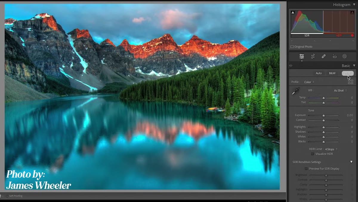 HDR button at top of Basic panel with expanded histogram showing HDR range
At the top of the Basic adjustments panel, there’s now an HDR button. Click it to enter HDR editing mode. The histogram expands to show the additional dynamic range available, with the HDR portion displayed to the right of the standard range. The HDR Limit Selector defaults to four stops of additional range, which is a reasonable starting point. Enable “Visualize HDR” to see a highlight overlay showing which parts of your image fall into the HDR zone, similar to how the clipping warning works.
HDR button at top of Basic panel with expanded histogram showing HDR range
At the top of the Basic adjustments panel, there’s now an HDR button. Click it to enter HDR editing mode. The histogram expands to show the additional dynamic range available, with the HDR portion displayed to the right of the standard range. The HDR Limit Selector defaults to four stops of additional range, which is a reasonable starting point. Enable “Visualize HDR” to see a highlight overlay showing which parts of your image fall into the HDR zone, similar to how the clipping warning works.
If you’re editing for clients or platforms that still display standard dynamic range, turn on “Preview on SDR Display” to see how the image will look on a non-HDR screen. The tone curve also changes shape in HDR mode: the lower-left quadrant represents the SDR range, and everything above and to the right represents the expanded HDR headroom. When exporting, you’ll have two new format options available, AVIF and JPEG XL, both of which support the higher bit depths needed for true HDR output. You can also check an HDR output checkbox directly in the export dialog.
What I’d Add from My Own Experience
The feature I’ll actually reach for most is Point Color with masking, and not for the obvious use case. When I’m grading a batch of street shots and the color temperature shifts between frames because a cloud passed over, Point Color lets me anchor specific hues back to where they should be without re-editing the whole image. Lens Blur is impressive for single-image work, but I wouldn’t lean on it for client delivery yet. The edge refinement on complex subjects still needs a few passes to look natural, and the time you spend refining can approach the time you’d spend doing a manual gradient mask anyway. HDR editing is genuinely exciting, but it’s waiting on the ecosystem. Until most of my clients and their platforms actually display HDR content, it stays in the experimental column.
The real story in this update is that Lightroom’s color toolset is finally catching up to what colorists have had in other software for years. Point Color, in particular, feels like something that should have existed long before now.
The single most important thing to take away here: Point Color with Range control is not just a better HSL slider. It’s a fundamentally different way of targeting color that’s worth rebuilding your color grading habits around.
Watch the full tutorial on YouTube to see Mango Street walk through each feature with live before-and-after examples on real photos.
Comments (2)
Bookmarked. Coming back to this one for sure.
This is fantastic. I've been recommending this approach to my readers too.
Leave a Comment