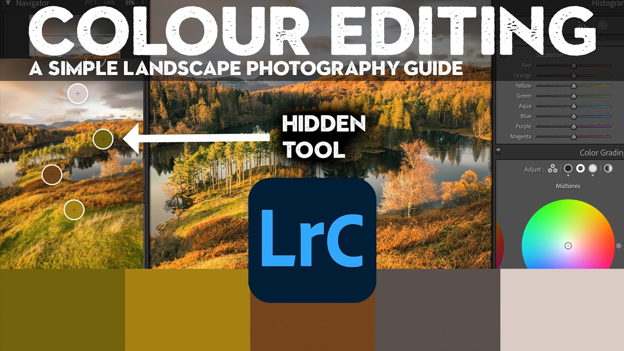
Color questions are the ones that fill my inbox. Not exposure, not sharpening, not even masking. Color. People want to know why their images look muddy, why the greens feel fake, why the sky went from moody to neon the second they touched the saturation slider. I spent years answering those questions one reply at a time before I realized the real problem: most photographers learn color tools in isolation, without ever understanding how each one interacts with the others.
That’s exactly what makes this Nigel Danson tutorial worth your time. Watch the full tutorial on YouTube before or after reading this, because Nigel does something I haven’t seen many educators do: he builds a simple test image in Photoshop with pure red, pure green, pure blue, a mid-gray, and a color wheel, then runs every color tool through it so you can actually see what each one touches. It’s the kind of visual proof that makes abstract concepts click immediately.
What follows is my walkthrough of the method, expanded with notes from my own editing practice. Whether you shoot landscapes, portraits, or anything in between, these fundamentals apply.
Step 1: Understand What You’re Actually Changing Before You Touch a Slider
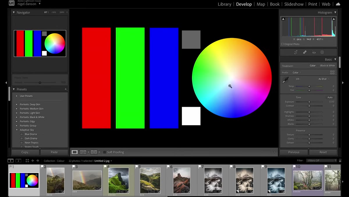
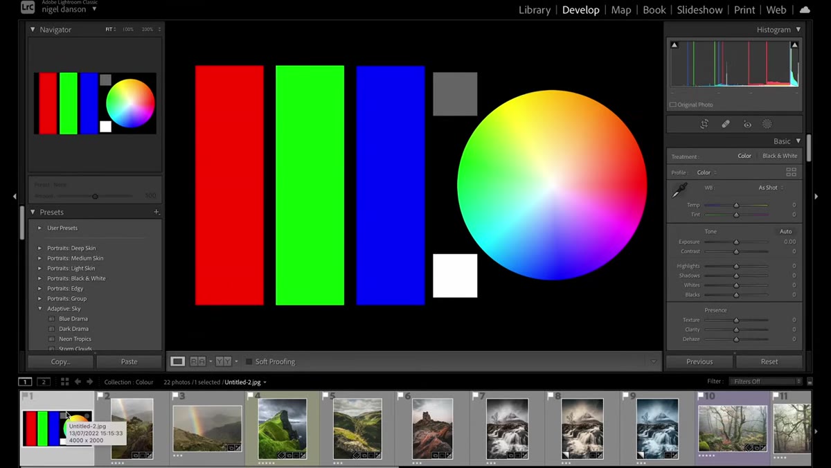 Test image showing pure red, green, blue swatches and color wheel
Before opening a single photo, Nigel starts with a purpose-built reference image: blocks of pure color, a neutral gray, and a full color wheel. This isn’t just a teaching gimmick. It reveals something most Lightroom users never consciously notice: different color tools affect different parts of the tonal range, and some don’t touch neutral tones at all.
Test image showing pure red, green, blue swatches and color wheel
Before opening a single photo, Nigel starts with a purpose-built reference image: blocks of pure color, a neutral gray, and a full color wheel. This isn’t just a teaching gimmick. It reveals something most Lightroom users never consciously notice: different color tools affect different parts of the tonal range, and some don’t touch neutral tones at all.
If you want to replicate this yourself, you can build something similar in Photoshop or even pull up a solid color reference image online. The point is to have a controlled environment so you can see the tool’s behavior without the noise of a real photograph clouding your judgment.
Step 2: Use White Balance to Set the Emotional Temperature of the Image
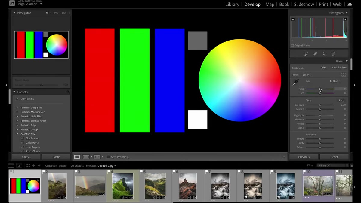 White balance slider cooling the test image, all colors shifting together
White balance is the most-used color tool for a reason. When Nigel drags the temperature slider cooler on his test image, every color in the frame shifts together, the reds, the greens, the blues, everything except the pure white. That’s the key behavior to internalize: white balance is a global shift. It adjusts the overall color cast of the image to simulate how different light sources affect what the camera records.
White balance slider cooling the test image, all colors shifting together
White balance is the most-used color tool for a reason. When Nigel drags the temperature slider cooler on his test image, every color in the frame shifts together, the reds, the greens, the blues, everything except the pure white. That’s the key behavior to internalize: white balance is a global shift. It adjusts the overall color cast of the image to simulate how different light sources affect what the camera records.
The eyedropper tool is your fastest shortcut here. Click on something that should be neutral gray in your image, and Lightroom calculates the correct temperature to make it appear neutral. From that corrected baseline, you can push warm or cool intentionally rather than accidentally. The tint slider works on a green-to-magenta axis and pairs with temperature to dial in skies, skin tones, and artificial light sources.
Step 3: Use HSL to Target Individual Colors Without Touching Anything Else
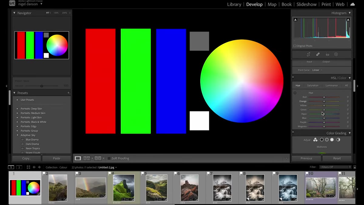
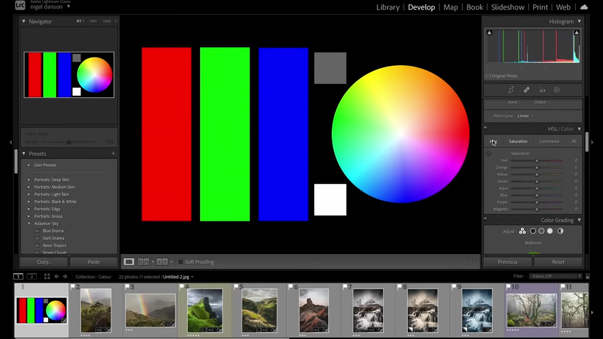 HSL panel open, Hue slider for red being adjusted on test image
This is where the tutorial gets genuinely useful for working photographers. The HSL panel (Hue, Saturation, Luminance) lets you reach into one specific color range and change it without affecting neutral tones or other hues. When Nigel shifts the red hue slider, only the red swatch moves. The gray stays gray. The greens and blues don’t flinch.
HSL panel open, Hue slider for red being adjusted on test image
This is where the tutorial gets genuinely useful for working photographers. The HSL panel (Hue, Saturation, Luminance) lets you reach into one specific color range and change it without affecting neutral tones or other hues. When Nigel shifts the red hue slider, only the red swatch moves. The gray stays gray. The greens and blues don’t flinch.
In practice, this means you can shift a muddy orange-brown into a warmer red-orange, cool down an oversaturated teal sky, or separate two colors that are sitting too close together in the frame. I use the Luminance tab constantly on green foliage. Tennessee summers give you this heavy, dark, slightly olive green that looks nothing like what my eye saw on the trail. Pulling luminance up on the greens lifts them to something closer to reality without nuking the saturation.
Step 4: Treat Saturation as a Relationship Tool, Not a Volume Knob
 Saturation slider boosting blue, color wheel showing shift from edge toward center
Here’s the thing Nigel points out that most beginners miss. When you boost saturation on a color in the HSL panel, the colors in your image start to compete rather than cooperate. On the color wheel visualization, the highly saturated hue pushes outward from the center, becoming more isolated from its neighbors. Colors that were harmonizing start clashing.
Saturation slider boosting blue, color wheel showing shift from edge toward center
Here’s the thing Nigel points out that most beginners miss. When you boost saturation on a color in the HSL panel, the colors in your image start to compete rather than cooperate. On the color wheel visualization, the highly saturated hue pushes outward from the center, becoming more isolated from its neighbors. Colors that were harmonizing start clashing.
This is why landscape images with the saturation slider maxed out feel exhausting to look at. The colors aren’t talking to each other anymore. A more controlled approach is to raise saturation selectively on one or two key colors and actually pull it back slightly on others. I learned this the hard way editing a sunset where I cranked the oranges and the whole image started looking like a fast food logo. Restraint is the move.
Step 5: Use Luminance to Control Brightness Within a Hue
 Luminance panel adjusting brightness of blues independently
The luminance tab inside HSL is one of the most underused tools in the panel. It lets you brighten or darken a specific color range without changing its hue or saturation. Blues too dark? Lift the luminance. Greens too bright and drawing the eye away from your subject? Pull them down.
Luminance panel adjusting brightness of blues independently
The luminance tab inside HSL is one of the most underused tools in the panel. It lets you brighten or darken a specific color range without changing its hue or saturation. Blues too dark? Lift the luminance. Greens too bright and drawing the eye away from your subject? Pull them down.
This is especially powerful when combined with hue adjustments. If you shift a color’s hue and then adjust its luminance, you’re essentially doing targeted color correction that would have taken a selection mask and adjustment layer in Photoshop. In Lightroom, it’s two sliders.
Step 6: Study the Color Wheel Before You Build a Grade
 Color wheel displayed in test image as reference for tonal relationships
Nigel keeps the color wheel visible throughout the tutorial as a reference, and that’s not an accident. Understanding complementary colors, analogous colors, and how hues relate to each other spatially gives you a mental model for why certain grades feel cohesive and others feel chaotic.
Color wheel displayed in test image as reference for tonal relationships
Nigel keeps the color wheel visible throughout the tutorial as a reference, and that’s not an accident. Understanding complementary colors, analogous colors, and how hues relate to each other spatially gives you a mental model for why certain grades feel cohesive and others feel chaotic.
Before I start a serious color grade, I’ll sometimes sketch out the dominant hues in the image and think about where I want them to land. A landscape with warm golden light in the shadows and cool blue-green in the sky is already working with a complementary split. Pushing that further with color grading reinforces the mood. Fighting it usually ends in a muddy middle ground.
What I’d Add From My Own Workflow
The test image method Nigel uses is something I’ve started recommending to anyone who’s building their first preset. I call it “stress testing” a grade. Build your preset, then drop it on that pure color reference image and see what it does to the neutrals. If your favorite cinematic preset is pushing gray toward green or magenta, you’ll see it immediately, and you’ll understand exactly which slider is responsible.
The other thing I’d flag: white balance and color calibration interact in ways that can surprise you. If you’re working with the color calibration panel, changes there can shift your neutral tones in ways that white balance alone won’t fix. Nigel touches on this later in the full video, and it’s worth watching that section specifically if you’ve ever wondered why your preset looks different across camera profiles.
The single most important idea in this tutorial is deceptively simple: every color tool in Lightroom does a different job, and understanding which part of the image each tool affects is the foundation of intentional color grading. Once you stop treating them as interchangeable volume knobs and start treating them as specific instruments, your edits stop fighting each other.
Watch the full tutorial on YouTube to see Nigel walk through real landscape images with these tools in action. The test image section alone is worth ten minutes of your time.
Comments
Leave a Comment