
Every few months I get the same message from readers: “My Lightroom looks different and I don’t know what happened.” Usually it’s a minor UI shuffle. This time, though, Adobe made a move significant enough that I spent a good chunk of my week digging through the changes before I felt comfortable writing about them. The short version is that Lightroom is no longer one app. It’s two. And depending on where you are in your photography journey, that’s either great news or mildly annoying news.
In this First Man Photography tutorial, Adam walks through exactly what Adobe changed, why they changed it, and what it looks like in practice. Watch the full tutorial on YouTube before or after reading this breakdown. I’ve added context from my own workflow throughout, because some of Adam’s observations match things I’ve been thinking about for a while, and a few of them gave me a genuinely different angle on software I use every single day.
The core tension here is one I recognize: Adobe’s previous version of Lightroom hadn’t received a meaningful update since 2015. Performance issues had been piling up, the interface was getting unwieldy, and photographers at every skill level were starting to look elsewhere. Adobe’s answer was to rebuild from two different directions at once. Whether that was the right call depends entirely on who you’re asking.
Step 1: Understand Why Adobe Split Lightroom into Two Apps
 Side-by-side explanation of the two Lightroom versions
Adobe didn’t just rename things or shuffle menus around. They created two distinct products with different goals. The split exists because the old single-app approach was trying to serve too many users at once, from someone editing their first travel snapshots on a phone to a working professional managing thousands of RAW files across multiple shoots.
Side-by-side explanation of the two Lightroom versions
Adobe didn’t just rename things or shuffle menus around. They created two distinct products with different goals. The split exists because the old single-app approach was trying to serve too many users at once, from someone editing their first travel snapshots on a phone to a working professional managing thousands of RAW files across multiple shoots.
Knowing this context matters because it changes how you evaluate both apps. You’re not choosing a “full” version versus a “lite” version. You’re choosing between two tools built for genuinely different workflows. One is designed for depth, the other for accessibility.
Step 2: Get to Know Lightroom CC (The New Cloud-First Version)
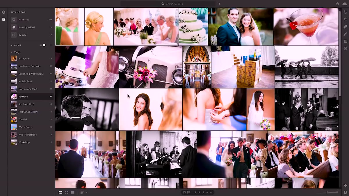 Lightroom CC main window with photos centered on screen
The new Lightroom CC is the stripped-back, cloud-native version. It runs on desktop, iPad, iPhone, Android, and even a web browser, and everything syncs automatically across all of them. Your edits on your phone show up on your laptop. Your collections from Lightroom Mobile carry over. If you’ve ever wanted a seamless mobile-to-desktop editing experience, this is finally a real attempt at building one.
Lightroom CC main window with photos centered on screen
The new Lightroom CC is the stripped-back, cloud-native version. It runs on desktop, iPad, iPhone, Android, and even a web browser, and everything syncs automatically across all of them. Your edits on your phone show up on your laptop. Your collections from Lightroom Mobile carry over. If you’ve ever wanted a seamless mobile-to-desktop editing experience, this is finally a real attempt at building one.
The interface puts your images front and center with albums organized down the left panel. It’s clean in a way that the old Lightroom never quite managed. You can still edit RAW files, which matters, and you still have access to the core sliders: exposure, contrast, highlights, shadows, whites, blacks, HSL, and tone curve. It’s not a toy. It’s just presented without the complexity that used to make new users bounce off Lightroom entirely within the first twenty minutes.
Step 3: Understand What Lightroom Classic CC Actually Is
 Adam explaining Lightroom Classic CC as the familiar version
Lightroom Classic CC is, functionally, the Lightroom most of us have been using for years. Same catalog structure, same panel layout, same folder-based organization. The “Classic” label threw a lot of people off, myself included at first, because it sounds like Adobe is sunsetting it. They’re not. This is the version that received the performance improvements that photographers had been asking for since 2015.
Adam explaining Lightroom Classic CC as the familiar version
Lightroom Classic CC is, functionally, the Lightroom most of us have been using for years. Same catalog structure, same panel layout, same folder-based organization. The “Classic” label threw a lot of people off, myself included at first, because it sounds like Adobe is sunsetting it. They’re not. This is the version that received the performance improvements that photographers had been asking for since 2015.
Classic also picked up luminosity masking in this update, which is a meaningful addition for anyone shooting landscapes or working with high-contrast scenes. Luminosity masks let you make targeted adjustments based on the brightness values in an image, so you can pull detail out of a blown sky without affecting the shadows. It’s the kind of feature that was previously only available through plugins or a manual workaround. Now it’s baked in.
Step 4: Navigate the Lightroom CC Edit Panel
 Edit window open in Lightroom CC with sliders visible on right
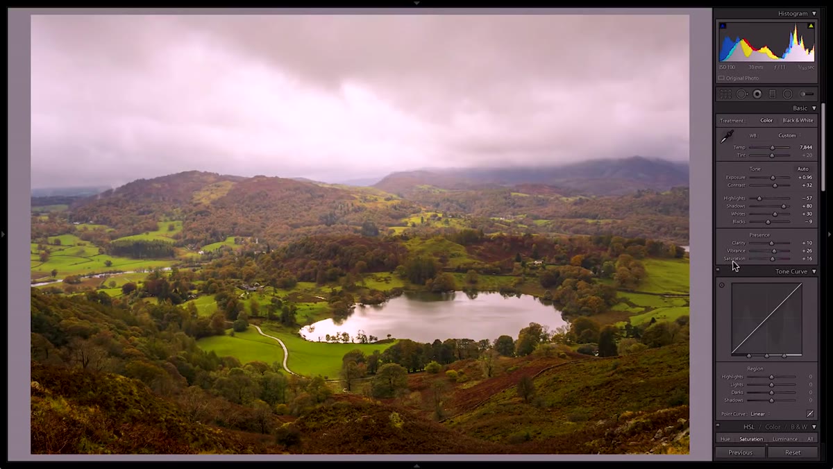
Opening an image in Lightroom CC for editing is straightforward. Select your photo, then click the edit icon on the right side of the screen. This opens your editing panel, which runs down the right side and contains all the standard adjustment tools. The layout feels more like the Lightroom Mobile app than the desktop Classic version, which makes sense given that cloud sync is the whole point.
Edit window open in Lightroom CC with sliders visible on right
Opening an image in Lightroom CC for editing is straightforward. Select your photo, then click the edit icon on the right side of the screen. This opens your editing panel, which runs down the right side and contains all the standard adjustment tools. The layout feels more like the Lightroom Mobile app than the desktop Classic version, which makes sense given that cloud sync is the whole point.
One thing worth noting: the panel is scrollable rather than expandable. In Classic, you expand and collapse individual sections like Detail or Color Grading. In CC, you scroll through them in a single continuous panel. It’s a small difference but it changes how you move through an edit, especially if you have deep muscle memory from years of Classic use.
Step 5: Use the Auto Button as a Starting Point, Not a Finish Line
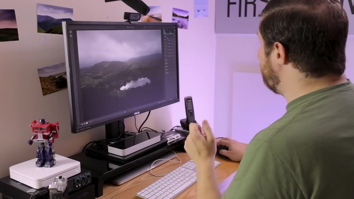 Auto mode applied to an image inside Lightroom CC
Adam makes a point here that I want to reinforce: the Auto function in Lightroom CC has gotten genuinely useful. It’s not the old Auto that used to flatten your image and leave you worse off than when you started. Adobe’s current Auto uses AI-driven analysis to make initial adjustments that are, more often than not, a reasonable starting point.
Auto mode applied to an image inside Lightroom CC
Adam makes a point here that I want to reinforce: the Auto function in Lightroom CC has gotten genuinely useful. It’s not the old Auto that used to flatten your image and leave you worse off than when you started. Adobe’s current Auto uses AI-driven analysis to make initial adjustments that are, more often than not, a reasonable starting point.
The workflow that makes sense is: hit Auto, check what it did, then use that as a baseline you’re reacting to rather than accepting wholesale. Press the forward slash key to toggle between your edited version and the original so you can see exactly what changed. This comparison view is non-destructive, meaning you can flip back and forth without affecting your edits at all. It’s one of those small features that experienced editors use constantly and beginners often don’t know exists.
Step 6: Decide Which Version Belongs in Your Workflow
 Adam at his desk discussing which version fits which photographer
The honest answer is that most serious photographers will end up using both, just not for the same things. Lightroom CC makes sense when you’re shooting on your phone at an event and want to do a quick edit before sharing. It makes sense when you’re traveling and working from a tablet. It makes sense when you’re just getting started and don’t want to spend three hours learning folder structures before you can edit a single photo.
Adam at his desk discussing which version fits which photographer
The honest answer is that most serious photographers will end up using both, just not for the same things. Lightroom CC makes sense when you’re shooting on your phone at an event and want to do a quick edit before sharing. It makes sense when you’re traveling and working from a tablet. It makes sense when you’re just getting started and don’t want to spend three hours learning folder structures before you can edit a single photo.
Lightroom Classic CC makes sense for any situation where you need full control: complex local adjustments, large catalog management, tethered shooting, advanced masking, or anything where the full panel depth actually matters. These aren’t competing apps. They’re different parts of a workflow that used to be crammed into one application whether it fit or not.
One Thing Adam Didn’t Mention (But I Think About Constantly)
The naming is genuinely confusing, and Adam acknowledges this too. Calling the full-featured version “Classic” sends the wrong signal, as though it’s the legacy option that Adobe is keeping around out of obligation. It’s not. If anything, Classic is where the real editing power lives, and “Classic” undersells it.
My suggestion, for what it’s worth: think of Lightroom CC as your mobile-first, cloud-connected editing environment and Lightroom Classic as your studio. You wouldn’t do your final color grade on a phone any more than you’d organize a full shoot on one. Each tool has a home in the process. Once you stop thinking about them as competitors and start thinking about them as a system, the split starts making a lot more sense.
The single most important thing to take from this update is that Adobe is not abandoning the photographers who built their entire workflow around the original Lightroom. Classic is being actively developed, it’s getting new features, and it’s finally getting the performance fixes that should have come years ago. The new CC version is an on-ramp, not a replacement.
Watch the full tutorial on YouTube to see Adam walk through both interfaces in real time. He does a solid job showing exactly what the edit panels look like side by side, and seeing it visually makes the distinction between the two versions much easier to absorb.
Comments (2)
This is exactly what I needed today. Been struggling with this for weeks.
Great breakdown. The step-by-step approach really helps.
Leave a Comment