If you edit photos on your phone with any regularity, you’ve probably opened Lightroom Mobile recently and thought, “Wait, did they move everything?” The answer is yes - and mostly for the better. The old interface had this horizontal strip at the bottom where you’d swipe left and right to hunt for settings, then interact with controls that never quite behaved the way you expected. It was functional, but it felt like a compromise. The new version feels like they finally stopped compromising.
In this Matt Kloskowski tutorial - part of his ongoing Lightroom Mobile series - he walks through the updated interface from left to right, covering every major editing panel. Watch the full tutorial on YouTube before or after reading this, depending on how you learn best. What I want to do here is pull out the specific steps and give you enough detail that you can follow along with your own photos without needing to pause and rewind every thirty seconds.
The core thing to understand before we get into the steps: no new sliders were added. The features are the same. What changed is the layout, and layout matters more than people give it credit for. When controls are easier to reach, you actually use them, and that changes how your edits turn out.
Step 1: Orient Your Screen for More Editing Space
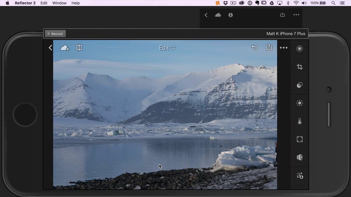 Photo open in Lightroom Mobile in portrait orientation
Most people leave their phone in portrait mode while editing, but rotating to landscape gives you noticeably more screen real estate to see your photo while you work. Matt mentions he does this himself during real editing sessions, even though he keeps portrait mode for the tutorial so the panel labels stay readable on camera.
Photo open in Lightroom Mobile in portrait orientation
Most people leave their phone in portrait mode while editing, but rotating to landscape gives you noticeably more screen real estate to see your photo while you work. Matt mentions he does this himself during real editing sessions, even though he keeps portrait mode for the tutorial so the panel labels stay readable on camera.
Try it with your next edit. Flip the phone sideways, and suddenly the image breathes. You lose a little panel visibility, but you gain a better sense of how your tonal adjustments are actually landing. It’s worth the trade.
Step 2: Crop and Straighten First, Edit Second
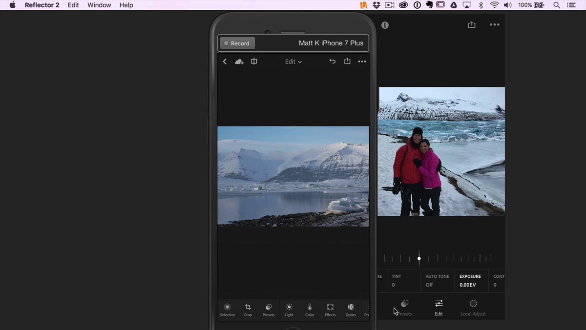 Crop tool panel open showing lock, straighten, rotate, and flip options
The crop tool sits near the far left of the bottom panel. It behaves exactly like the desktop version - you’ve got a lock option to constrain aspect ratio, a straighten tool for fixing horizons, and rotate and flip controls. Tap the X to exit when you’re done.
Crop tool panel open showing lock, straighten, rotate, and flip options
The crop tool sits near the far left of the bottom panel. It behaves exactly like the desktop version - you’ve got a lock option to constrain aspect ratio, a straighten tool for fixing horizons, and rotate and flip controls. Tap the X to exit when you’re done.
Cropping before you start tonal work is a habit worth building. Once you’ve removed the edges you don’t want, the auto adjustments and manual tweaks you make afterward are responding to the actual image you’re keeping - not distracting information in the margins you planned to cut anyway.
Step 3: Apply a Preset as Your Starting Point (Optional but Useful)
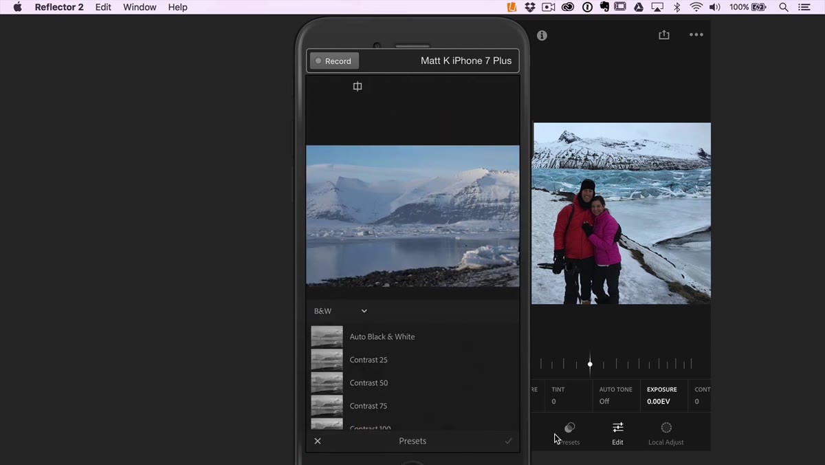 Presets panel open in Lightroom Mobile
The presets panel sits just to the right of the crop tool. Any presets you’ve created or downloaded on mobile will live here. One important limitation to know: your desktop Lightroom preset library does not automatically sync here. Mobile presets are a separate collection.
Presets panel open in Lightroom Mobile
The presets panel sits just to the right of the crop tool. Any presets you’ve created or downloaded on mobile will live here. One important limitation to know: your desktop Lightroom preset library does not automatically sync here. Mobile presets are a separate collection.
If you use this panel as a starting point rather than a final answer, it saves real time. Drop a preset that gets you 70% of the way there, then use the remaining panels to dial it in for the specific light in the shot. I name my presets after songs, which sounds ridiculous until you realize it’s actually faster to remember “that warm golden sound” than “warm-outdoor-v3-final-FINAL.”
Step 4: Work the Light Panel for Tonal Control
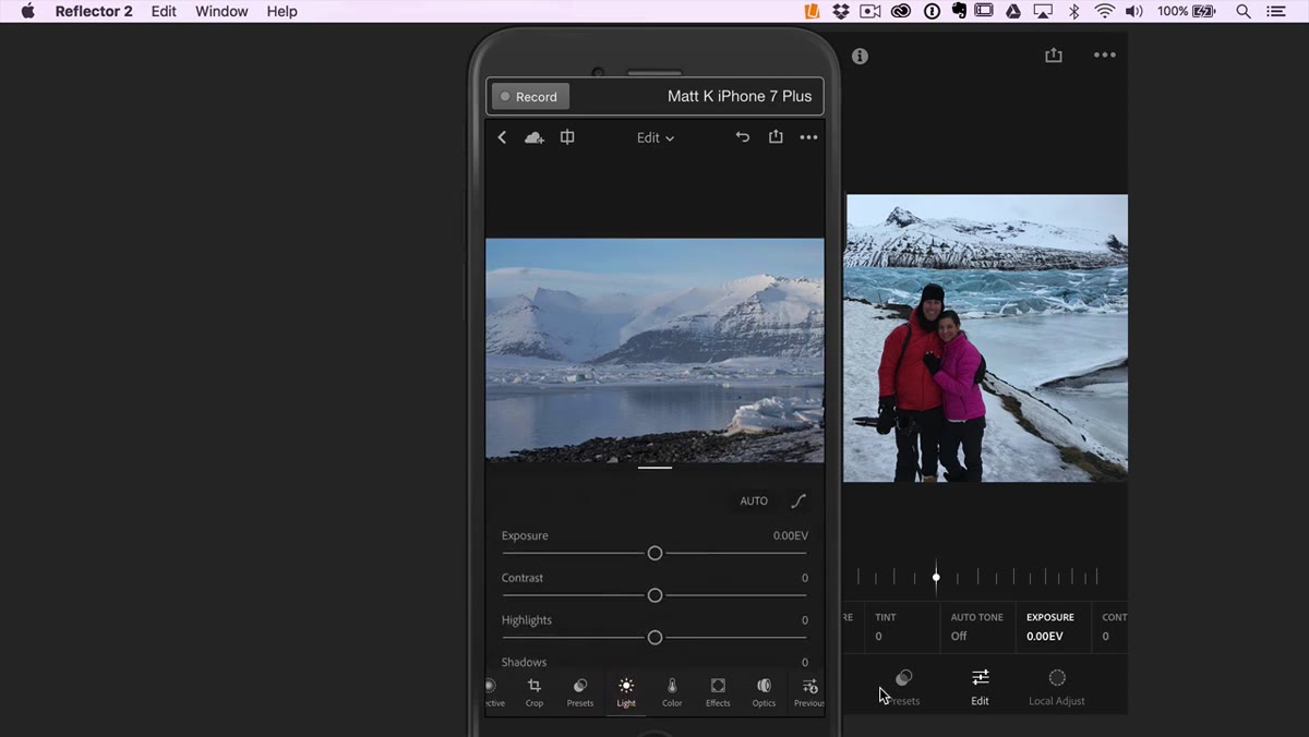 Light panel open with exposure, contrast, highlights, shadows, whites, blacks sliders visible
This is the most important panel in any edit. The Light section now displays as vertical sliders - exposure, contrast, highlights, shadows, whites, and blacks - which is exactly how the desktop version has always worked. You scroll through them rather than hunting through a swipeable strip.
Light panel open with exposure, contrast, highlights, shadows, whites, blacks sliders visible
This is the most important panel in any edit. The Light section now displays as vertical sliders - exposure, contrast, highlights, shadows, whites, and blacks - which is exactly how the desktop version has always worked. You scroll through them rather than hunting through a swipeable strip.
The workflow here is straightforward: set exposure first, then contrast, then use highlights and shadows to recover detail in the bright and dark areas, and finally use whites and blacks to set your endpoints. Tapping a slider label resets it, which is useful when you’ve pushed something too far and want a clean start on that control. The tone curve is also accessible here if you want more precise control over specific tonal ranges.
Step 5: Adjust Color, White Balance, and Saturation
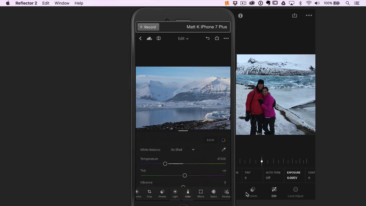 Color panel open showing temperature, tint, vibrance, and saturation sliders
The Color panel handles white balance at the top - temperature and tint - and vibrance and saturation further down. Temperature moves your image warmer or cooler. Tint corrects for green or magenta casts, usually from artificial lighting. Most mobile photographers underuse tint, which is why indoor shots so often look slightly off even after everything else looks right.
Color panel open showing temperature, tint, vibrance, and saturation sliders
The Color panel handles white balance at the top - temperature and tint - and vibrance and saturation further down. Temperature moves your image warmer or cooler. Tint corrects for green or magenta casts, usually from artificial lighting. Most mobile photographers underuse tint, which is why indoor shots so often look slightly off even after everything else looks right.
In the top right corner of this panel, there’s a B&W toggle that converts to black and white and back again. Next to that is a color wheel icon that opens HSL mode - hue, saturation, and luminance controls for individual color ranges. If a specific color in your photo looks wrong, HSL is where you fix it without affecting the whole image.
Step 6: Add Depth and Dimension with Effects
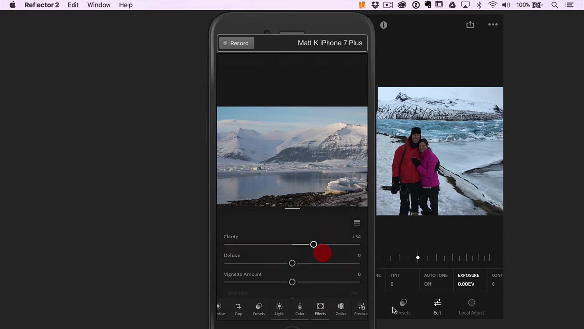 Effects panel open showing clarity, dehaze, and vignette sliders
The Effects panel gives you clarity, dehaze, and vignette controls. Clarity adds midtone contrast and makes textures pop - useful on landscapes and portraits where you want the image to feel more three-dimensional, but easy to overdo. Dehaze cuts through atmospheric haze in outdoor shots, though it can also crush your blacks if you push it hard.
Effects panel open showing clarity, dehaze, and vignette sliders
The Effects panel gives you clarity, dehaze, and vignette controls. Clarity adds midtone contrast and makes textures pop - useful on landscapes and portraits where you want the image to feel more three-dimensional, but easy to overdo. Dehaze cuts through atmospheric haze in outdoor shots, though it can also crush your blacks if you push it hard.
Vignette is where a lot of edits get finished off well or ruined. The panel includes midpoint and feather controls alongside the darkening amount, which gives you enough precision to keep a vignette looking natural. Darken the edges, widen the midpoint, soften the feather - and then step back and check whether the subject actually looks better or just trapped.
Step 7: Apply Lens Correction, Then Use Previous or Reset
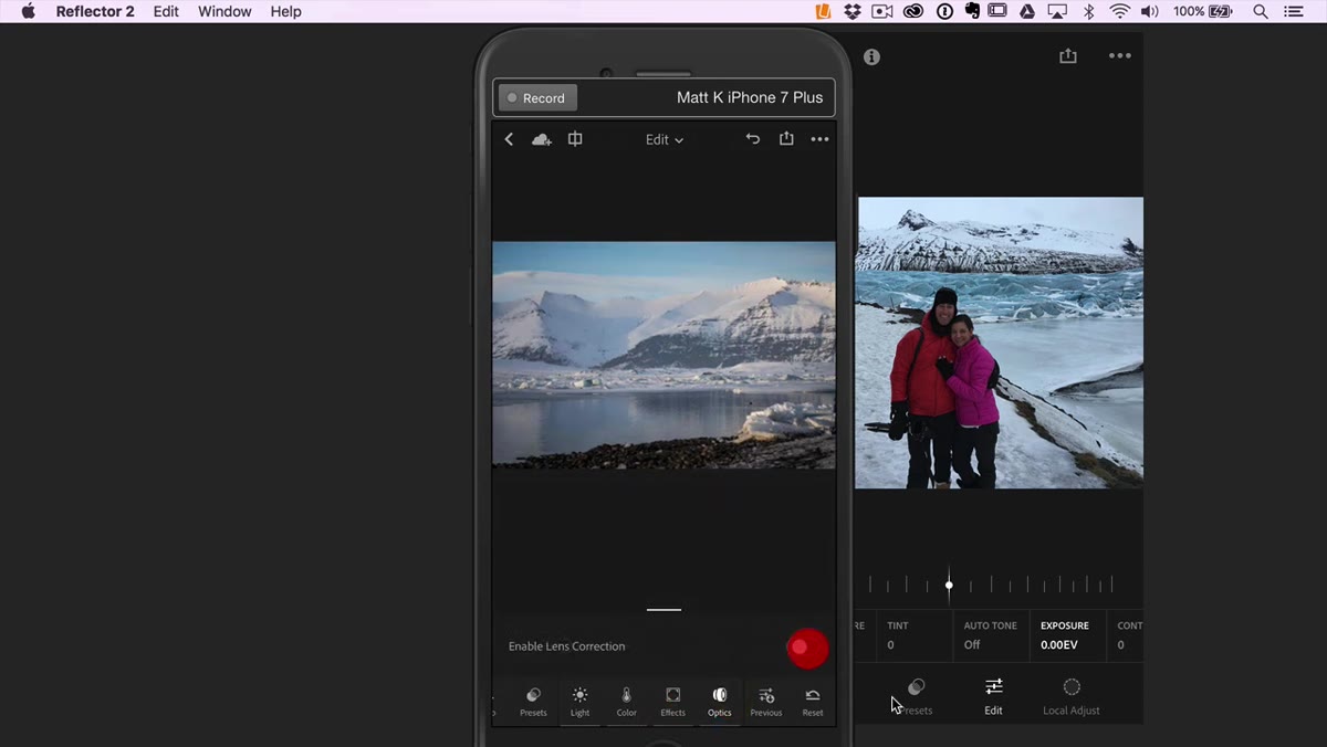 Optics panel open showing lens correction options
Optics handles basic lens correction - distortion and chromatic aberration primarily. For photos shot on a dedicated camera, this can make a visible difference. For phone photos, the improvement is usually subtle because the camera app is already applying correction before you even see the file.
Optics panel open showing lens correction options
Optics handles basic lens correction - distortion and chromatic aberration primarily. For photos shot on a dedicated camera, this can make a visible difference. For phone photos, the improvement is usually subtle because the camera app is already applying correction before you even see the file.
After optics, two more tools close out the panel. “Previous” lets you paste settings from the last photo you edited - either everything, or just the basic tonal adjustments - which is a fast way to create consistency across a series of shots. “Reset” takes the photo back to its original, unedited state. Both are exactly what you’d expect, and both save time when you’re working through a batch.
One Thing the Tutorial Doesn’t Cover: Selective Editing
The panel tour Matt walks through covers global adjustments - changes that affect the whole image. What it doesn’t get into is selective editing, where you paint or mask specific areas and adjust only those. Lightroom Mobile has this functionality, and it’s where a lot of the real professional-level work happens. Dodging a face, burning a sky, sharpening a product without sharpening the background - none of that is possible with global sliders alone.
If you get through this interface tour and want to push further, selective masking is the next skill to build. But you need the global foundation first, and this tutorial gives you exactly that.
The single most important takeaway here is that the new Lightroom Mobile interface finally matches how photographers actually think about editing - working through tonal structure, then color, then finishing touches, in order. Once you stop hunting for controls and start trusting the layout, your edits get faster and more consistent.
Watch the full tutorial on YouTube to see Matt walk through each panel live, with a real photo reacting to each adjustment in real time.
Comments
Leave a Comment