
Photo books have always been one of those Lightroom features I wanted to love but kept abandoning halfway through. The cell-based layout system felt like it was designed by someone who had never actually tried to build a visually interesting spread under deadline pressure. I’d drag a cell, watch it snap somewhere useless, try to nudge it, and eventually just export everything to InDesign and move on with my life.
So when I sat down with this Scott Kelby tutorial on the five new Book module features in Lightroom Classic, I was skeptical but curious. Kelby has a gift for cutting straight to the practical stuff, and this one is no different. What he walks through is a set of updates that genuinely change how freely you can build a page layout inside Lightroom. No more wrestling the grid into submission. No more compromising your design because the software won’t cooperate. These are small changes with a large cumulative effect, and if you use the Book module at all, they’re worth knowing about.
The workflow he demonstrates is simple enough to follow along in real time, which is exactly what I did. Here’s the full breakdown.
Step 1: Resize Any Cell to Any Dimension You Want
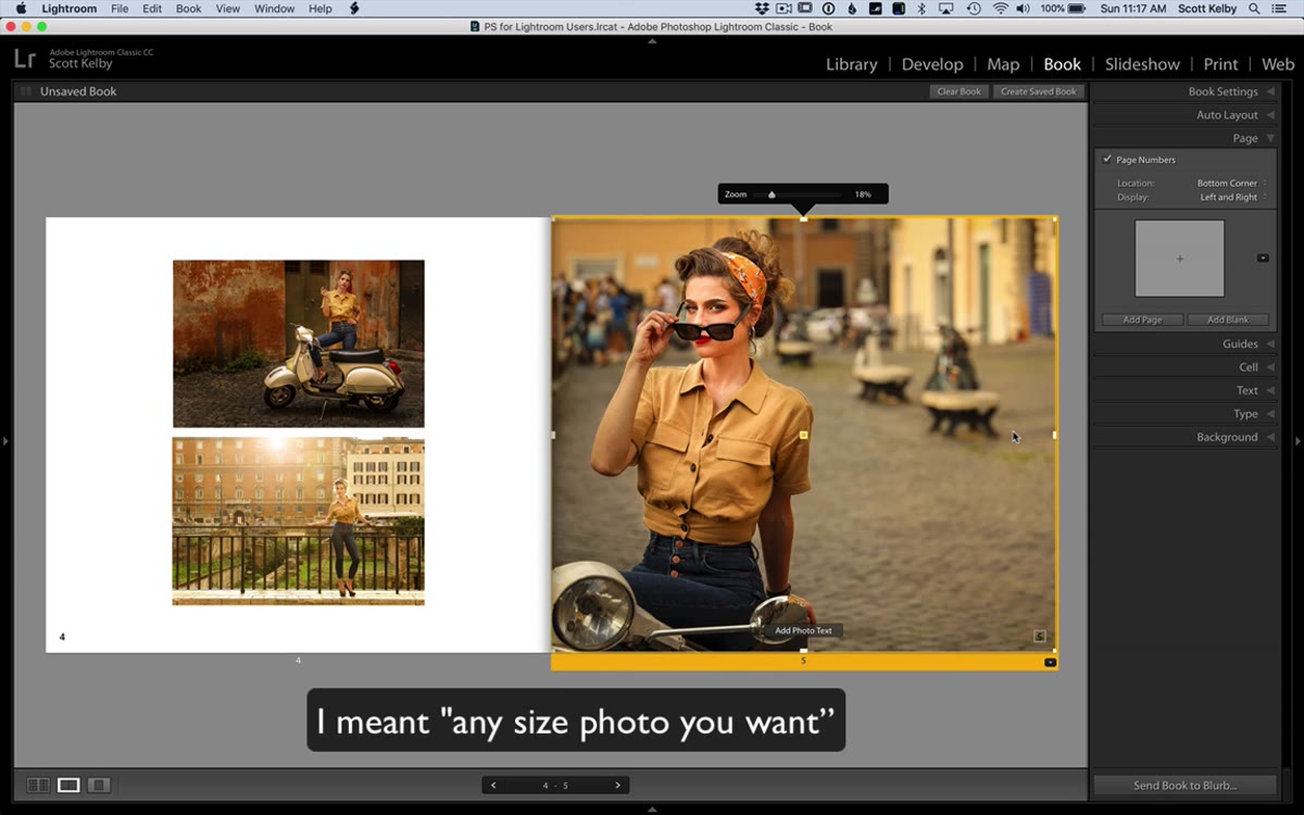 Nine resize handles visible around a selected page cell
When you click on a cell in the Book module, you’ll now see nine control points appear around its edges, including all four corners, the midpoints of each side, and a center handle. Grab any of those edge or corner points and drag. The cell resizes freely, no fixed increments, no fighting with preset dimensions. You can make a tall narrow strip, a wide cinematic rectangle, or a perfect square without touching a single dropdown menu. For anyone who has spent time trying to reverse-engineer Lightroom’s default cell sizes to match a layout they had in their head, this is a significant quality-of-life improvement.
Nine resize handles visible around a selected page cell
When you click on a cell in the Book module, you’ll now see nine control points appear around its edges, including all four corners, the midpoints of each side, and a center handle. Grab any of those edge or corner points and drag. The cell resizes freely, no fixed increments, no fighting with preset dimensions. You can make a tall narrow strip, a wide cinematic rectangle, or a perfect square without touching a single dropdown menu. For anyone who has spent time trying to reverse-engineer Lightroom’s default cell sizes to match a layout they had in their head, this is a significant quality-of-life improvement.
Step 2: Reposition the Cell Anywhere on the Page
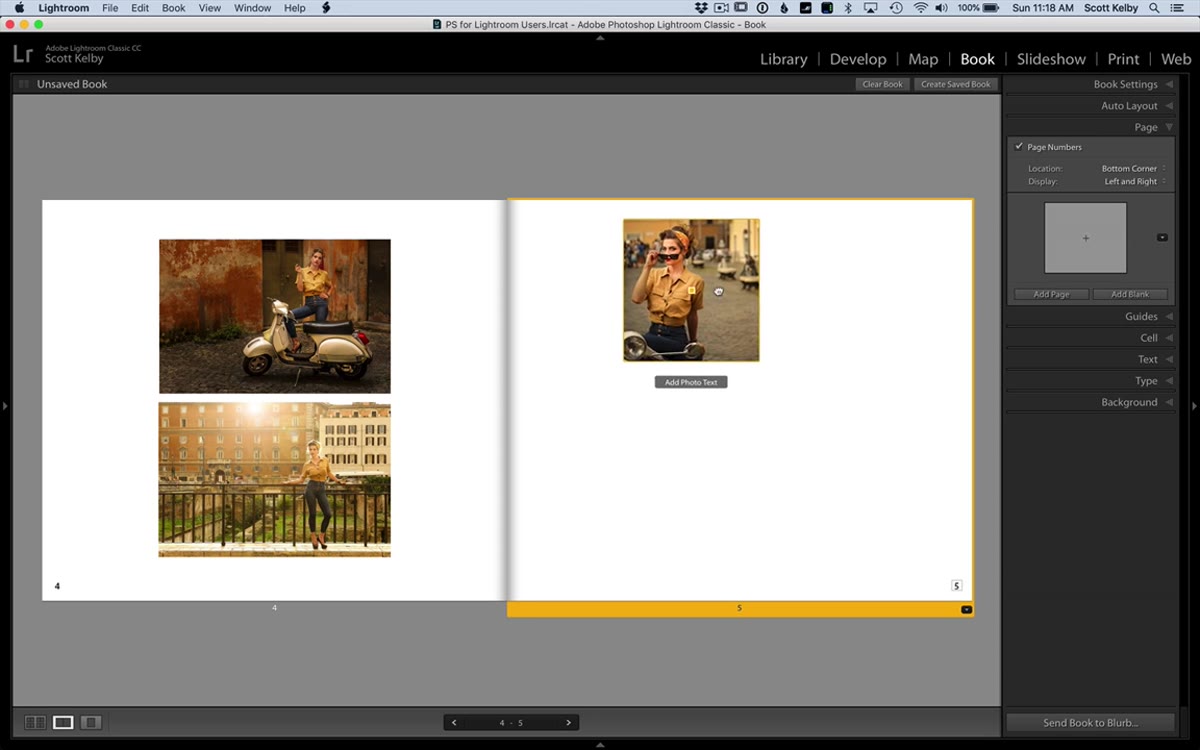 Cell being dragged freely across the page canvas
Once you have the cell sized the way you want it, grab the center handle (the middle of the nine points) and drag. The cell moves freely across the page canvas. It sounds obvious, almost embarrassingly so, but this is a genuine new behavior. The old system locked cells to the grid in ways that made truly freeform layouts nearly impossible without workarounds. Now you can place an image exactly where your eye says it should go, not where the module thinks it belongs.
Cell being dragged freely across the page canvas
Once you have the cell sized the way you want it, grab the center handle (the middle of the nine points) and drag. The cell moves freely across the page canvas. It sounds obvious, almost embarrassingly so, but this is a genuine new behavior. The old system locked cells to the grid in ways that made truly freeform layouts nearly impossible without workarounds. Now you can place an image exactly where your eye says it should go, not where the module thinks it belongs.
Step 3: Add Additional Cells to the Same Page
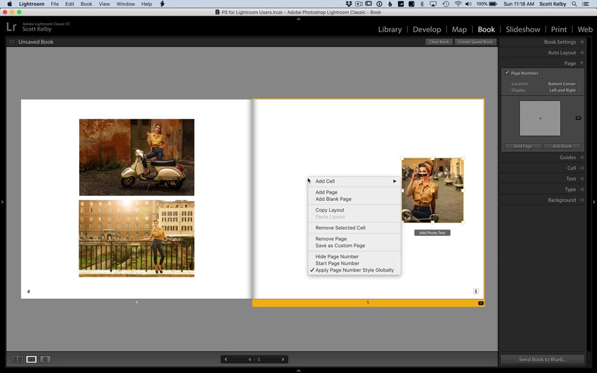 Right-click context menu showing the Add Cell option
Right-click anywhere on the page and you’ll see an option to add a new cell. Select it and a fresh cell appears, independent of any existing ones. You can size and position this new cell the same way you did the first, using the edge handles to resize and the center point to move. This opens up multi-image layouts that actually reflect real design thinking: overlapping images, asymmetrical arrangements, a mix of portrait and landscape crops living on the same spread. Build the layout first, then drop photos in.
Right-click context menu showing the Add Cell option
Right-click anywhere on the page and you’ll see an option to add a new cell. Select it and a fresh cell appears, independent of any existing ones. You can size and position this new cell the same way you did the first, using the edge handles to resize and the center point to move. This opens up multi-image layouts that actually reflect real design thinking: overlapping images, asymmetrical arrangements, a mix of portrait and landscape crops living on the same spread. Build the layout first, then drop photos in.
Step 4: Turn On the Page Grid and Switch Snap to Grid
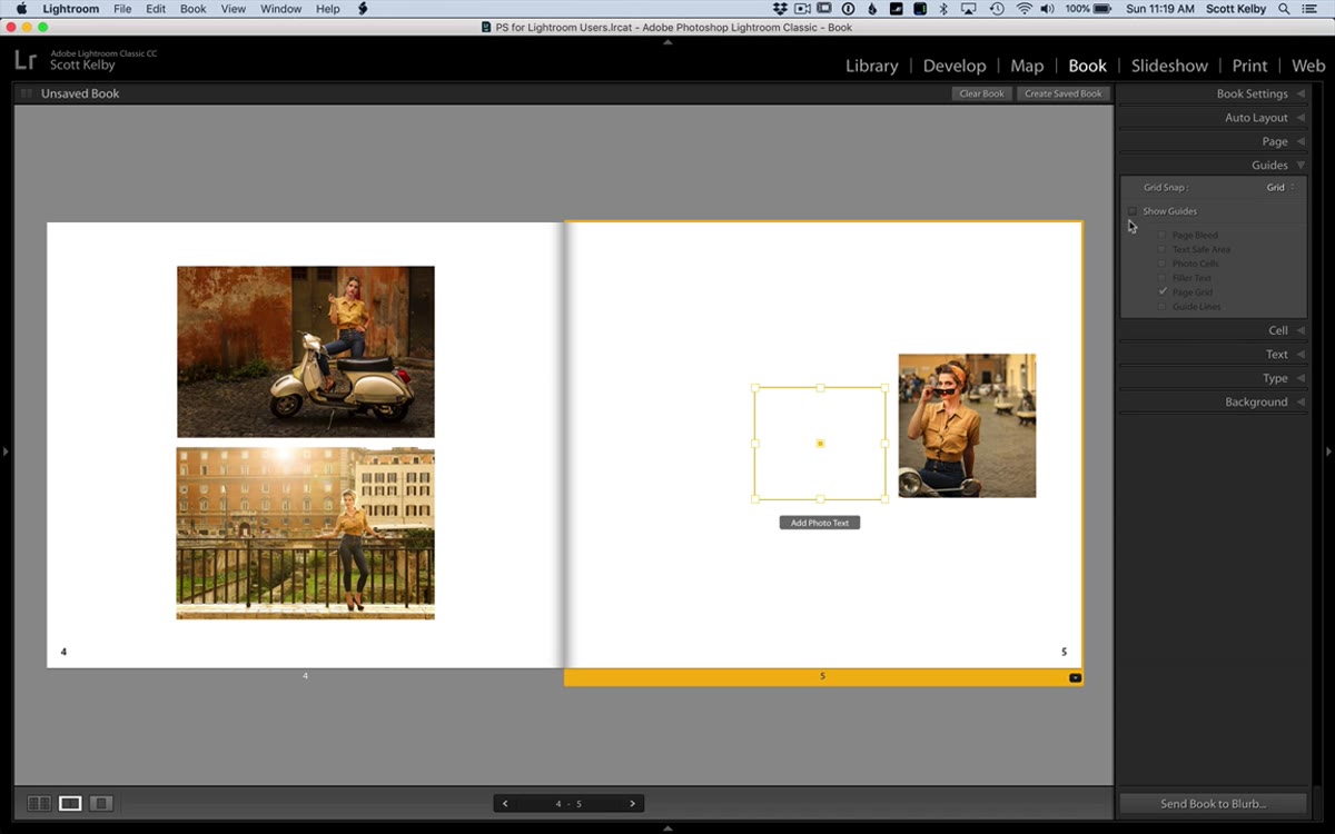 Guides panel open with Page Grid and Grid Snap options visible
Freeform placement is great until you need two cells to share the same top edge, and eyeballing it just isn’t going to cut it. This is where the guides come in. Open the Guides panel on the right side of the Book module and turn on the Page Grid option. A visual grid appears over your canvas, giving you reference lines to work against. Then find the Grid Snap setting, which defaults to “Cells,” and switch it to “Grid.” Now when you drag a cell, it snaps to the grid increments instead of snapping to other cells, which makes precise alignment straightforward. Line up two cells along a shared horizontal axis in a few seconds instead of a few minutes.
Guides panel open with Page Grid and Grid Snap options visible
Freeform placement is great until you need two cells to share the same top edge, and eyeballing it just isn’t going to cut it. This is where the guides come in. Open the Guides panel on the right side of the Book module and turn on the Page Grid option. A visual grid appears over your canvas, giving you reference lines to work against. Then find the Grid Snap setting, which defaults to “Cells,” and switch it to “Grid.” Now when you drag a cell, it snaps to the grid increments instead of snapping to other cells, which makes precise alignment straightforward. Line up two cells along a shared horizontal axis in a few seconds instead of a few minutes.
Step 5: Control Where Page Numbers Appear
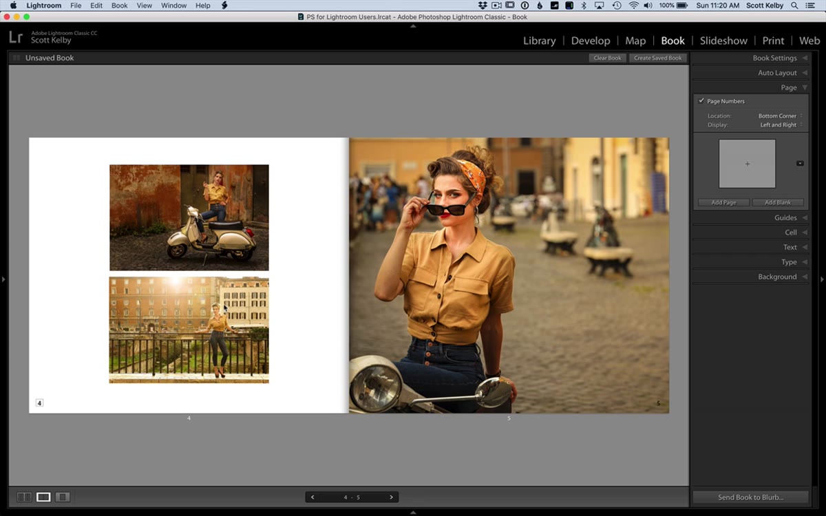 Page spread showing page numbers at the bottom of each page
This last one is small but it solves something that has bothered me for a long time. When you have page numbers turned on in the Book module, they appear at the bottom of every page by default, which means a number can land directly on top of your image. Not ideal. Now, under the Display settings, you can choose to show the page number on the left side only. The logic is simple and solid: if you’re looking at a two-page spread and you can see the number four on the left page, you don’t need the number five printed over the photograph on the right. Your reader can do the math. It’s a minor control, but it keeps the design clean without forcing you to turn page numbers off entirely.
Page spread showing page numbers at the bottom of each page
This last one is small but it solves something that has bothered me for a long time. When you have page numbers turned on in the Book module, they appear at the bottom of every page by default, which means a number can land directly on top of your image. Not ideal. Now, under the Display settings, you can choose to show the page number on the left side only. The logic is simple and solid: if you’re looking at a two-page spread and you can see the number four on the left page, you don’t need the number five printed over the photograph on the right. Your reader can do the math. It’s a minor control, but it keeps the design clean without forcing you to turn page numbers off entirely.
One Thing to Layer On Top of All This
The grid snap feature is useful, but I’d suggest pairing it with Lightroom’s existing cell padding controls if you’re placing text cells alongside image cells. When you add a text caption beneath or beside a photo, the padding defaults can make the type feel cramped or misaligned even when the cell itself is positioned correctly. Go into the Text panel and adjust the padding values manually after you lock in your layout. It adds maybe two minutes to the process and makes the finished book look like something you actually designed rather than something the software designed for you.
I also want to flag that these features work best when you commit to the custom layout approach from the start of a project. If you begin with one of Lightroom’s preset templates and then try to add freeform cells on top, things can get messy. Start with a blank page, build your own structure using these tools, and the whole experience feels cohesive.
The single biggest takeaway from this tutorial is that Lightroom’s Book module has quietly crossed a threshold where it can now handle layouts that previously required a separate application. Free resizing, free placement, snap-to-grid alignment, and smarter page number controls are not flashy features, but together they remove the main friction points that pushed designers out of the module and into other tools.
If you make photo books for clients, for personal projects, or as part of workshop deliverables, it’s worth revisiting the Book module with fresh eyes.
Watch the full tutorial on YouTube to see Scott Kelby walk through each of these features with live examples from his Rome workshop shoot.
Comments
Leave a Comment