Every few years, something shifts in Lightroom that makes me stop mid-edit and actually pay attention. Not a UI refresh, not a slider rename — something that changes how I think about the whole workflow. I’ve been editing photos since my old band needed press shots and couldn’t afford anyone with a real portfolio, so I learned Lightroom out of necessity. That history means I’ve watched a lot of updates come and go without much fuss. This one is different.
In this Matt Kloskowski tutorial, he walks through the latest Lightroom update and does something I appreciate: he separates the feature list from the actual workflow implications. Most update breakdowns just tell you what moved where. Matt explains why it matters, and on creative profiles and LUT support specifically, his take is that we’re looking at the future replacement for traditional presets. After watching it twice and spending a few hours inside the new interface myself, I think he’s right. Watch the full tutorial on YouTube if you want to follow along while you read.
The update touches a handful of areas, but two changes are genuinely significant for anyone doing serious color work. Here’s how to move through them.
Step 1: Find Dehaze in Its New Home
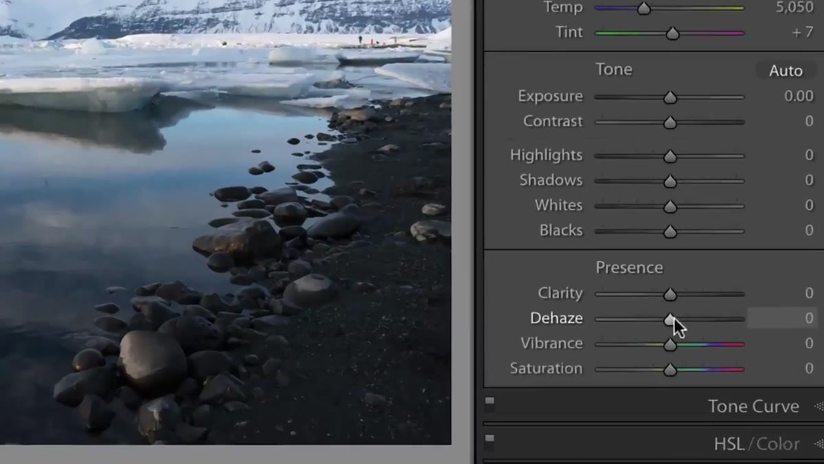 Dehaze slider now visible inside the Basic panel
The first thing to notice when you open the Basic panel is that Dehaze has finally been promoted. It used to live in the Effects panel, which always felt like burying a Swiss Army knife in the junk drawer. If you shoot landscapes, architecture, or anything outdoors with atmospheric haze, you probably visited Effects constantly just for this one slider. Now it sits in Basic where it belongs, alongside Exposure, Contrast, and the rest of the tools you reach for on nearly every image. Pull it right to clear haze, push it left to add a subtle moody atmosphere. The value range is the same, just the address changed.
Dehaze slider now visible inside the Basic panel
The first thing to notice when you open the Basic panel is that Dehaze has finally been promoted. It used to live in the Effects panel, which always felt like burying a Swiss Army knife in the junk drawer. If you shoot landscapes, architecture, or anything outdoors with atmospheric haze, you probably visited Effects constantly just for this one slider. Now it sits in Basic where it belongs, alongside Exposure, Contrast, and the rest of the tools you reach for on nearly every image. Pull it right to clear haze, push it left to add a subtle moody atmosphere. The value range is the same, just the address changed.
Step 2: Hover to Preview Presets Without Clicking
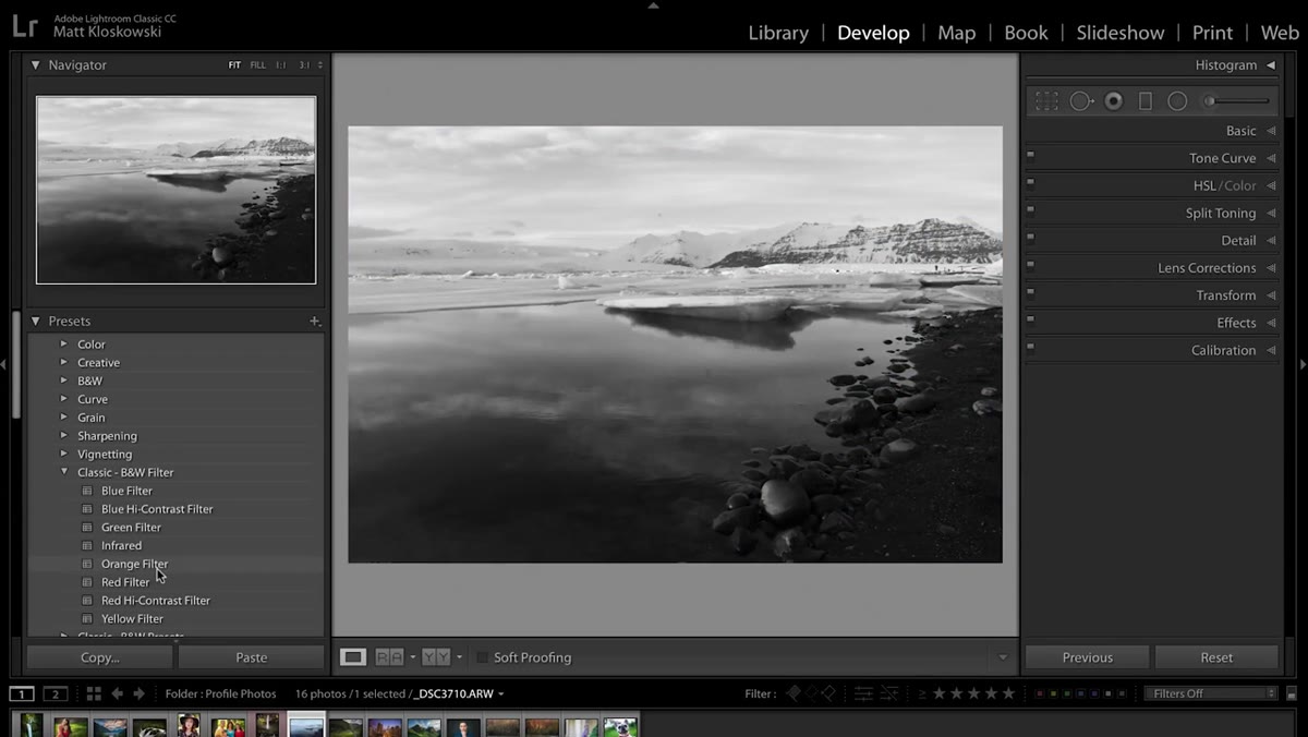 Main photo updating in real time as cursor hovers over preset list
This one sounds minor until you’ve spent an afternoon applying and undoing presets trying to find the right starting point. Previously, Lightroom had a workaround: if you kept the Navigator panel open, hovering over a preset name would show a tiny preview in that small thumbnail. Most people never discovered it. Now the preview happens on the main image itself, in real time, as your cursor moves down the preset list. No clicking, no undoing, no committing to anything. You just drag your mouse and watch the photo respond. For anyone who uses presets as a first step before dialing in specifics, this turns a tedious process into something almost fun.
Main photo updating in real time as cursor hovers over preset list
This one sounds minor until you’ve spent an afternoon applying and undoing presets trying to find the right starting point. Previously, Lightroom had a workaround: if you kept the Navigator panel open, hovering over a preset name would show a tiny preview in that small thumbnail. Most people never discovered it. Now the preview happens on the main image itself, in real time, as your cursor moves down the preset list. No clicking, no undoing, no committing to anything. You just drag your mouse and watch the photo respond. For anyone who uses presets as a first step before dialing in specifics, this turns a tedious process into something almost fun.
Step 3: Open the New Profile Browser
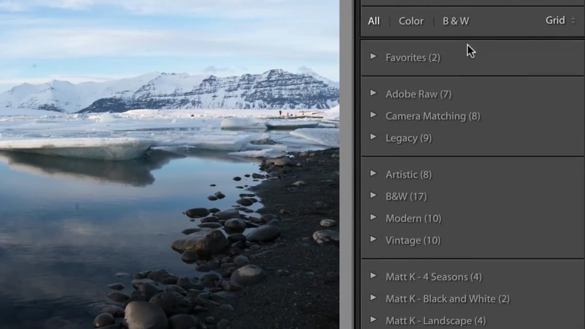 Profile browser panel open showing Adobe and camera-matching profile options
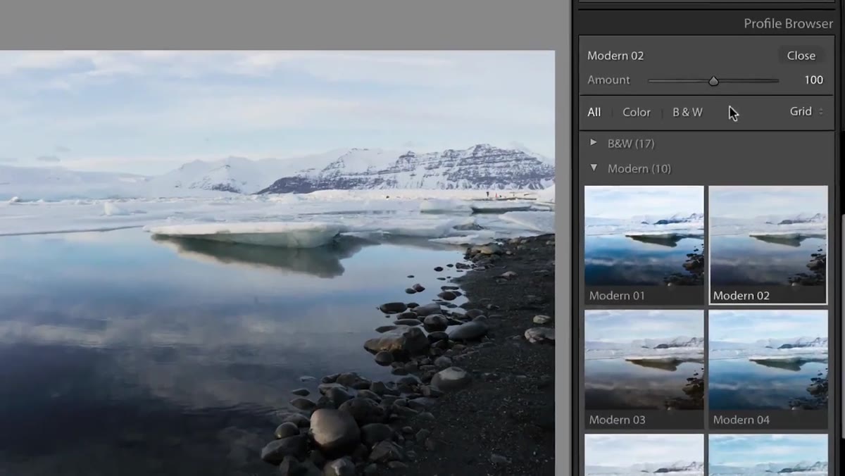
At the very top of the Basic panel, you’ll now see a Profiles section with a Browse button. Click it. What opens is a dedicated profile browser that replaces the old dropdown that used to sit buried in the Calibration panel at the bottom of the develop module. On the surface, all the profiles you knew before are still here: Adobe Color, Adobe Landscape, Adobe Portrait, and the camera-matching profiles that mirror the picture styles set in your camera body. Nothing was taken away. But the new interface makes clear that this is now a first-class feature, not an afterthought.
Profile browser panel open showing Adobe and camera-matching profile options
At the very top of the Basic panel, you’ll now see a Profiles section with a Browse button. Click it. What opens is a dedicated profile browser that replaces the old dropdown that used to sit buried in the Calibration panel at the bottom of the develop module. On the surface, all the profiles you knew before are still here: Adobe Color, Adobe Landscape, Adobe Portrait, and the camera-matching profiles that mirror the picture styles set in your camera body. Nothing was taken away. But the new interface makes clear that this is now a first-class feature, not an afterthought.
Step 4: Understand What Profiles Actually Do
 Side-by-side profile comparison showing raw image with different profiles applied
Profiles operate differently from presets and that distinction matters. A preset adjusts sliders — it sets Exposure to -0.3, Highlights to -40, and so on. A profile works at a deeper level, interpreting the raw data itself before any slider adjustments happen. Think of it like choosing a film stock before you develop the roll. Adobe Standard might render colors conservatively. Adobe Vivid punches up saturation. A camera-matching profile tries to replicate how your Fuji or Sony would have rendered the JPEG. Whatever profile you choose becomes the foundation, and then your sliders sit on top of that foundation. This means two photos with identical slider settings can look completely different depending on which profile is applied underneath.
Side-by-side profile comparison showing raw image with different profiles applied
Profiles operate differently from presets and that distinction matters. A preset adjusts sliders — it sets Exposure to -0.3, Highlights to -40, and so on. A profile works at a deeper level, interpreting the raw data itself before any slider adjustments happen. Think of it like choosing a film stock before you develop the roll. Adobe Standard might render colors conservatively. Adobe Vivid punches up saturation. A camera-matching profile tries to replicate how your Fuji or Sony would have rendered the JPEG. Whatever profile you choose becomes the foundation, and then your sliders sit on top of that foundation. This means two photos with identical slider settings can look completely different depending on which profile is applied underneath.
Step 5: Apply Creative Profiles with the Amount Slider
 Creative profiles section expanded with Amount slider visible below profile grid
The new section inside the profile browser is where things get genuinely exciting: Creative Profiles. These are stylistic looks, similar in spirit to a film simulation or a heavy-handed preset, but with one crucial difference. Every creative profile comes with an Amount slider that controls how strongly the effect is applied. A profile that adds heavy grain and a faded green shadow tone can be dialed back to 20% so it adds just a whisper of character rather than dominating the image. This is something presets have never been able to do cleanly. You could always reduce the effect of a preset by fading it, but that faded every adjustment equally, including exposure corrections you actually wanted. The Amount slider here only scales the creative look, leaving your technical corrections untouched.
Creative profiles section expanded with Amount slider visible below profile grid
The new section inside the profile browser is where things get genuinely exciting: Creative Profiles. These are stylistic looks, similar in spirit to a film simulation or a heavy-handed preset, but with one crucial difference. Every creative profile comes with an Amount slider that controls how strongly the effect is applied. A profile that adds heavy grain and a faded green shadow tone can be dialed back to 20% so it adds just a whisper of character rather than dominating the image. This is something presets have never been able to do cleanly. You could always reduce the effect of a preset by fading it, but that faded every adjustment equally, including exposure corrections you actually wanted. The Amount slider here only scales the creative look, leaving your technical corrections untouched.
Step 6: Explore LUT Support Inside Profiles
 LUT-based profiles listed in browser alongside native Adobe profiles
Color Lookup Tables, LUTs, are a staple of video color grading that photographers have been eyeing from a distance for years. They’re files that remap color values across an image, often used to apply cinematic looks or match footage between cameras. Lightroom now supports LUT-based profiles, meaning you can load a LUT and apply it through the same profile system, complete with the Amount slider. If you have LUTs you already use in Premiere or DaVinci Resolve, you can bring that same look into your still photo workflow without third-party plugins. The integration isn’t buried in an import menu. It shows up directly in the profile browser alongside everything else.
LUT-based profiles listed in browser alongside native Adobe profiles
Color Lookup Tables, LUTs, are a staple of video color grading that photographers have been eyeing from a distance for years. They’re files that remap color values across an image, often used to apply cinematic looks or match footage between cameras. Lightroom now supports LUT-based profiles, meaning you can load a LUT and apply it through the same profile system, complete with the Amount slider. If you have LUTs you already use in Premiere or DaVinci Resolve, you can bring that same look into your still photo workflow without third-party plugins. The integration isn’t buried in an import menu. It shows up directly in the profile browser alongside everything else.
What I’d Add From My Own Workflow
The Amount slider on creative profiles has already replaced about a third of the presets in my library. I used to name presets after songs, and I had separate “heavy” and “lite” versions of the same look taking up twice the space. Now I can build one profile-based look and just drag the slider depending on whether I want that mood to define the image or just complement it. If you’re migrating from a large preset library, I’d suggest spending an afternoon with the profile browser before you assume your presets still need to do the heavy lifting. Some of them probably don’t anymore.
One honest caveat: creative profiles currently work best on raw files. If you’re editing JPEGs, the rendering differences between profiles are much less dramatic because the camera has already baked in its own interpretation of the scene. This is one more reason to shoot raw if you have the option, but it’s worth knowing before you expect dramatic results on an edited JPEG.
The single most important shift here is that profiles are no longer just a technical camera-matching tool. They’re a creative starting point with adjustable intensity, and LUT support means the line between photo editing and video color grading just got a lot thinner. If you want to see every feature Matt demonstrates, including parts of the update I haven’t covered here, go watch the original breakdown: Watch the full tutorial on YouTube.
Comments (2)
I've been looking for exactly this kind of tutorial. Perfect timing.
Solid advice. Especially the part about taking your time with it.
Leave a Comment