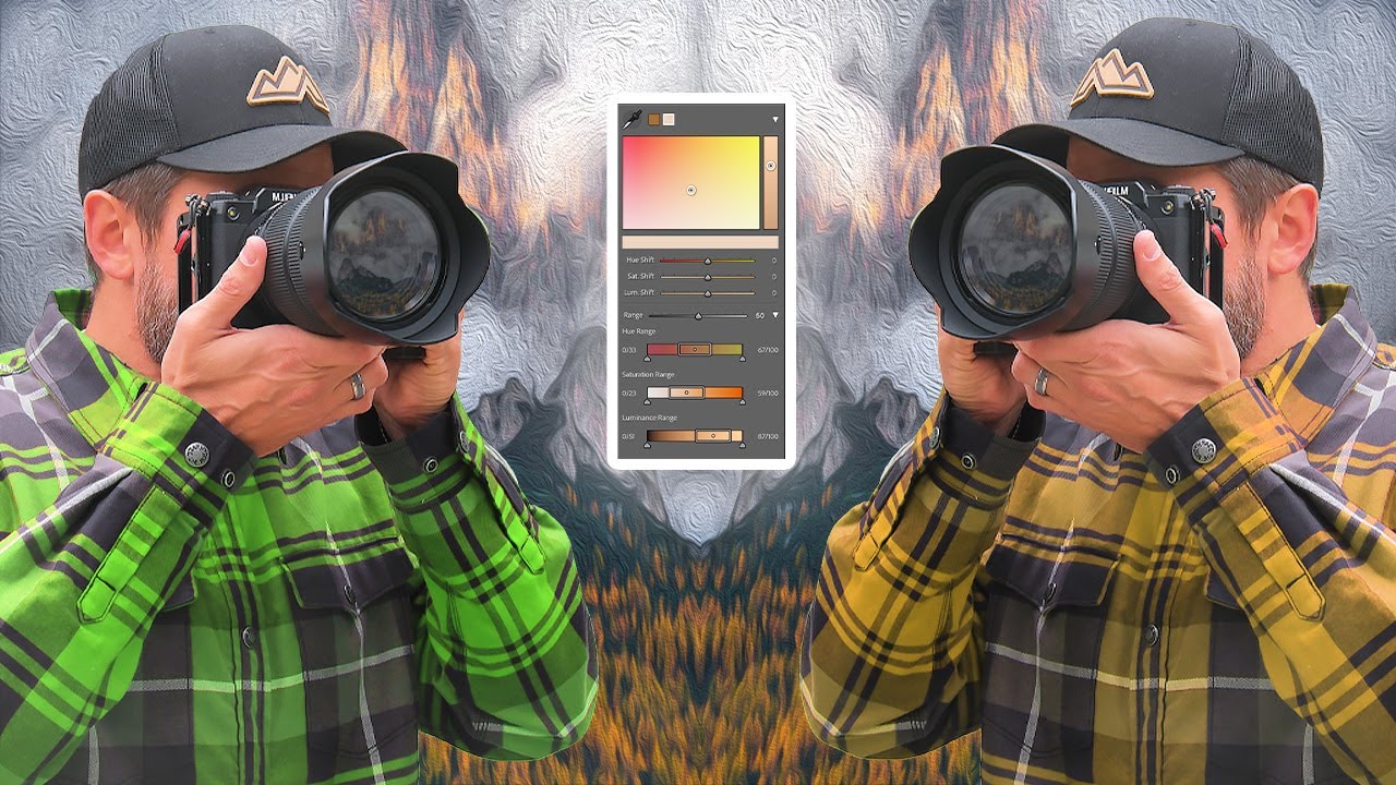
For years, the one thing that sent me running back to Capture One mid-project was targeted color control. The HSL mixer in Lightroom always felt like trying to adjust the volume on one instrument by turning up the whole amplifier. You’d drag a slider, trying to deepen those amber tones in a golden-hour shot, and suddenly your entire sky shifted too. It was blunt. It was frustrating. And honestly, it was the strongest argument in the Lightroom vs. Capture One debate that I never had a good counter for.
That changed with the Point Color tool introduced in Lightroom Classic version 13.0. In a recent tutorial, landscape photographer Mark Denney walks through exactly why the old approach fell short and how Point Color solves it in a way that feels almost overdue. Watch the full tutorial on YouTube before or after this walkthrough. I’ve been using Point Color on nearly every landscape edit since I first saw it demonstrated, and the difference in control is not subtle.
The tutorial uses a Dolomites fall foliage shot as the test case, which is perfect because autumn color editing is exactly the kind of scenario where traditional HSL editing breaks down. You want to push those oranges and yellows without wrecking the greens, and historically Lightroom made that a frustrating game of tug-of-war.
Step 1: Understand Why the HSL Mixer Falls Short
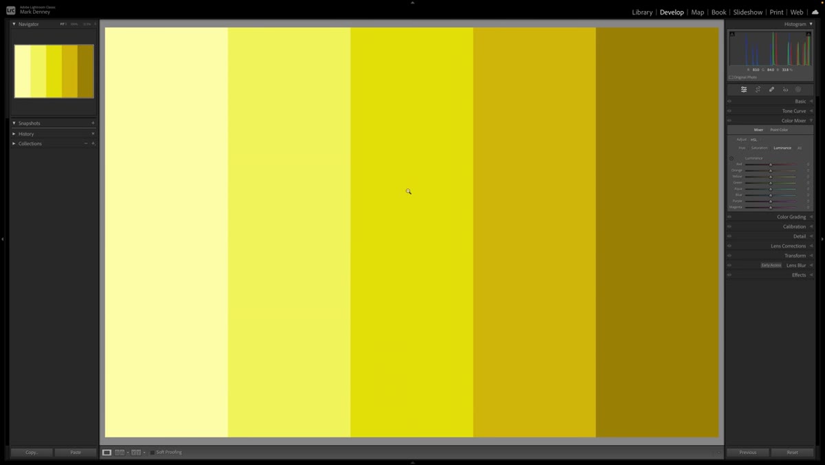 Color mixer sliders showing multiple channels being affected simultaneously
Open any photo with distinct, adjacent colors and head to the Develop module. Pull up the Color Mixer (HSL) panel and grab the targeted adjustment tool. Click on a specific color in your image and drag up or down. Watch what happens: Lightroom flags multiple color channels at once, often yellows and greens together, because it’s reading a range of hues rather than a precise point. Drag the Saturation version of that same picker and the effect bleeds across colors you never intended to touch. This isn’t user error. It’s a fundamental limitation of how the HSL mixer defines color ranges. Broad buckets, not surgical targets.
Color mixer sliders showing multiple channels being affected simultaneously
Open any photo with distinct, adjacent colors and head to the Develop module. Pull up the Color Mixer (HSL) panel and grab the targeted adjustment tool. Click on a specific color in your image and drag up or down. Watch what happens: Lightroom flags multiple color channels at once, often yellows and greens together, because it’s reading a range of hues rather than a precise point. Drag the Saturation version of that same picker and the effect bleeds across colors you never intended to touch. This isn’t user error. It’s a fundamental limitation of how the HSL mixer defines color ranges. Broad buckets, not surgical targets.
Step 2: Locate the Point Color Panel
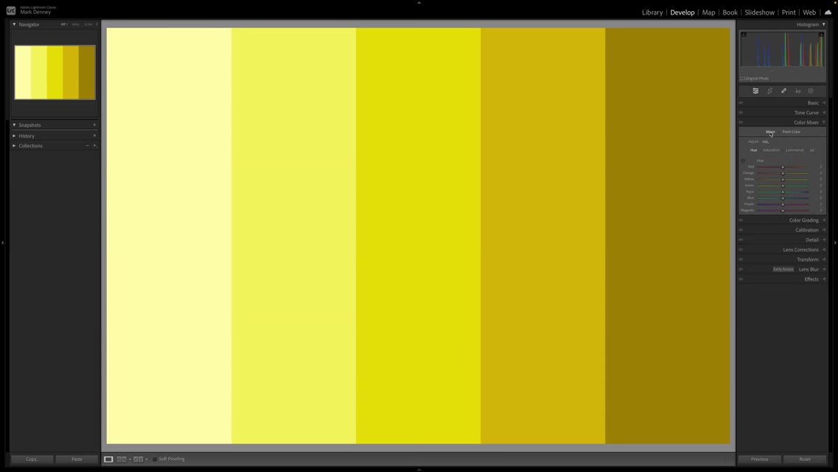 Point Color panel tab visible next to the Color Mixer section
In Lightroom Classic 13.0 or later, look for the Point Color tab sitting directly next to the Color Mixer in the Develop module. If you don’t see it, check that you’re on the most current version before going further. Point Color is not a buried preference or a plugin. It lives right alongside the tools you already use, which makes it easy to fold into an existing workflow without rebuilding your whole process.
Point Color panel tab visible next to the Color Mixer section
In Lightroom Classic 13.0 or later, look for the Point Color tab sitting directly next to the Color Mixer in the Develop module. If you don’t see it, check that you’re on the most current version before going further. Point Color is not a buried preference or a plugin. It lives right alongside the tools you already use, which makes it easy to fold into an existing workflow without rebuilding your whole process.
Step 3: Sample Your Target Color with the Eyedropper
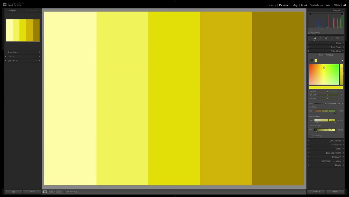 Eyedropper tool dropped on a specific color in the image
Select the eyedropper inside the Point Color panel and click directly on the color you want to isolate. Lightroom reads the exact hue value at that pixel and builds a selection around it. You’ll see a color swatch appear in the panel confirming what was sampled. This is already more precise than the HSL targeted tool, but the real power hasn’t shown up yet. Think of this step as setting a pin on a map. Everything that follows is about deciding how wide the territory around that pin actually is.
Eyedropper tool dropped on a specific color in the image
Select the eyedropper inside the Point Color panel and click directly on the color you want to isolate. Lightroom reads the exact hue value at that pixel and builds a selection around it. You’ll see a color swatch appear in the panel confirming what was sampled. This is already more precise than the HSL targeted tool, but the real power hasn’t shown up yet. Think of this step as setting a pin on a map. Everything that follows is about deciding how wide the territory around that pin actually is.
Step 4: Test the Basic Sliders (And Notice the Same Old Problem)
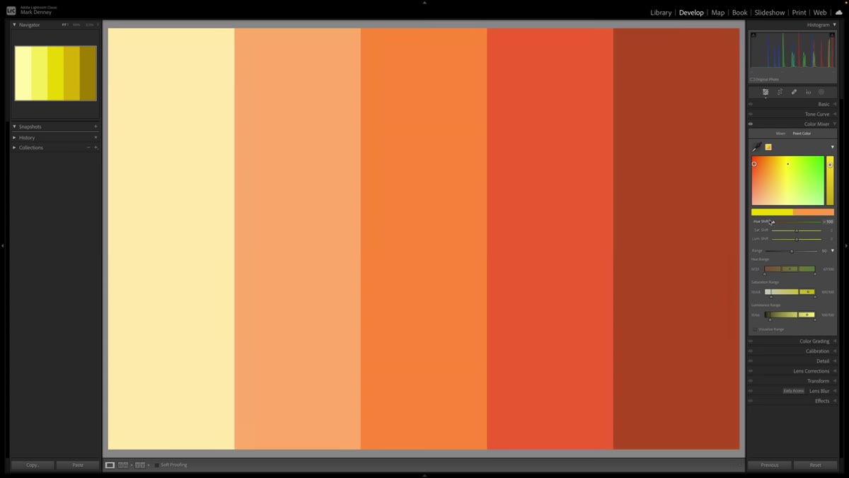 Hue shift slider being dragged while all colors shift on screen
Before diving into the Range controls, try shifting Hue, Saturation, or Luminance with the sampled color active. At default settings, you’ll likely see the same bleed-over problem you got with the HSL mixer. Colors neighboring your target shift alongside it. This is intentional to show in the tutorial, and it’s worth reproducing yourself so you understand what the Range control is actually solving. Don’t skip this step just because it looks like failure. It’s the setup for why the next control is so significant.
Hue shift slider being dragged while all colors shift on screen
Before diving into the Range controls, try shifting Hue, Saturation, or Luminance with the sampled color active. At default settings, you’ll likely see the same bleed-over problem you got with the HSL mixer. Colors neighboring your target shift alongside it. This is intentional to show in the tutorial, and it’s worth reproducing yourself so you understand what the Range control is actually solving. Don’t skip this step just because it looks like failure. It’s the setup for why the next control is so significant.
Step 5: Expand the Range Section and Narrow the Selection
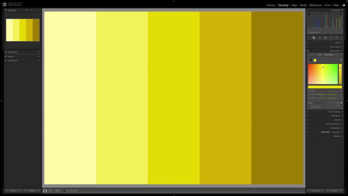 Range section expanded showing color wheel with boundary handles
Look for a small arrow or disclosure triangle at the bottom of the Point Color panel to expand the Range section. What you’ll see is a circular color representation with your sampled point marked at the center. There’s a boundary around it, and that boundary is adjustable. The Range slider controls how wide the selection extends outward from your sampled point. Drag it toward zero and the selection tightens dramatically. The visual feedback here is excellent because you can actually see the selection area shrink in real time on the color wheel.
Range section expanded showing color wheel with boundary handles
Look for a small arrow or disclosure triangle at the bottom of the Point Color panel to expand the Range section. What you’ll see is a circular color representation with your sampled point marked at the center. There’s a boundary around it, and that boundary is adjustable. The Range slider controls how wide the selection extends outward from your sampled point. Drag it toward zero and the selection tightens dramatically. The visual feedback here is excellent because you can actually see the selection area shrink in real time on the color wheel.
Step 6: Drag the Boundary Handles to Refine Exactly Which Colors Are Included
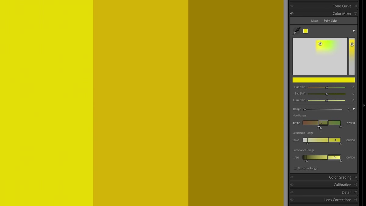 Boundary handles being dragged inward toward the sampled color dot
Beyond the Range slider, you can manually drag the handles on the boundary line in the color wheel view. Pull the left handle toward the center dot, then the right handle, and watch the affected area collapse around your target. As Mark Denney demonstrates with the fall foliage shot, this is where Lightroom starts doing something genuinely impressive. You can isolate a specific amber tone in a leaf and leave the adjacent yellow-green tones completely untouched. The tighter the boundary, the more surgical the result.
Boundary handles being dragged inward toward the sampled color dot
Beyond the Range slider, you can manually drag the handles on the boundary line in the color wheel view. Pull the left handle toward the center dot, then the right handle, and watch the affected area collapse around your target. As Mark Denney demonstrates with the fall foliage shot, this is where Lightroom starts doing something genuinely impressive. You can isolate a specific amber tone in a leaf and leave the adjacent yellow-green tones completely untouched. The tighter the boundary, the more surgical the result.
Step 7: Apply Your Hue, Saturation, or Luminance Adjustment
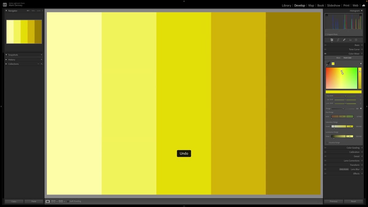 Luminance slider being adjusted on the isolated color selection
Once you’ve dialed in your Range so the selection covers only what you want, go back to the Hue, Saturation, and Luminance sliders and make your actual adjustment. This is where the payoff happens. Moving Saturation on a tightly defined amber tone now affects only that amber tone. Shifting Luminance to brighten a specific highlight color no longer pulls neighboring hues along with it. If the bleed-over effect you saw in Step 4 hasn’t disappeared completely, go back and tighten the Range boundary further before adding more intensity to the adjustment.
Luminance slider being adjusted on the isolated color selection
Once you’ve dialed in your Range so the selection covers only what you want, go back to the Hue, Saturation, and Luminance sliders and make your actual adjustment. This is where the payoff happens. Moving Saturation on a tightly defined amber tone now affects only that amber tone. Shifting Luminance to brighten a specific highlight color no longer pulls neighboring hues along with it. If the bleed-over effect you saw in Step 4 hasn’t disappeared completely, go back and tighten the Range boundary further before adding more intensity to the adjustment.
One Thing I’d Add from My Own Workflow
Point Color pairs surprisingly well with masking. My current approach when editing landscape shots with complex foliage is to create a luminance or color range mask first to isolate a region of the frame, then use Point Color inside that masked area. It adds one more layer of specificity, especially when you have similar hues appearing in different parts of the image at different exposures. The tree line in shade and the same tree line catching direct light might share a hue but need different treatment. Combining a mask with a tight Point Color range lets you handle both without a second exported copy.
If you name your presets the way I do, after songs, this is the kind of tool that earns its own dedicated preset slot. I’ve been saving Point Color settings as starting points for specific shooting conditions, golden hour foliage, overcast coastal greens, and it’s cut my color correction time down noticeably.
The honest takeaway here is that Lightroom finally caught up in an area where it genuinely lagged. Point Color isn’t just a marginal improvement over the HSL mixer. It’s a different approach entirely, and once you’ve used a tight Range selection to nail a single color without disturbing anything around it, going back feels impossible. Watch the full tutorial on YouTube to see Mark Denney walk through the Dolomites image from start to finish. His visual demonstration of the Range handles is worth watching in motion, even after you’ve read through the steps here.
Comments
Leave a Comment