Here’s a gap in Lightroom that surprises a lot of people: the Book module has no built-in 5-photo layout. You can get two images, four images, six images - but five? Nothing. And yet 5-up layouts are genuinely useful, especially for wedding or portrait work where you want a mix of wide establishing shots and tighter vertical images on the same spread. I ran into this problem while putting together a client album and ended up spending way too long hunting through layout presets before accepting that the option simply does not exist.
The workaround is smarter than it sounds. Build the layout yourself in the Print module, which gives you far more control than the Book module’s preset system anyway, then export it as a JPEG and drop it into your book as an image. It becomes a reusable template once you save it. In this KelbyOne tutorial, Scott Kelby walks through exactly how to do this - building a 5-up layout with three horizontal images stacked on the left and two tall verticals on the right. Watch the full tutorial on YouTube
The result looks polished and intentional, not like a workaround at all. Here’s how to build it step by step.
Step 1: Switch to the Print Module and Select Custom Package
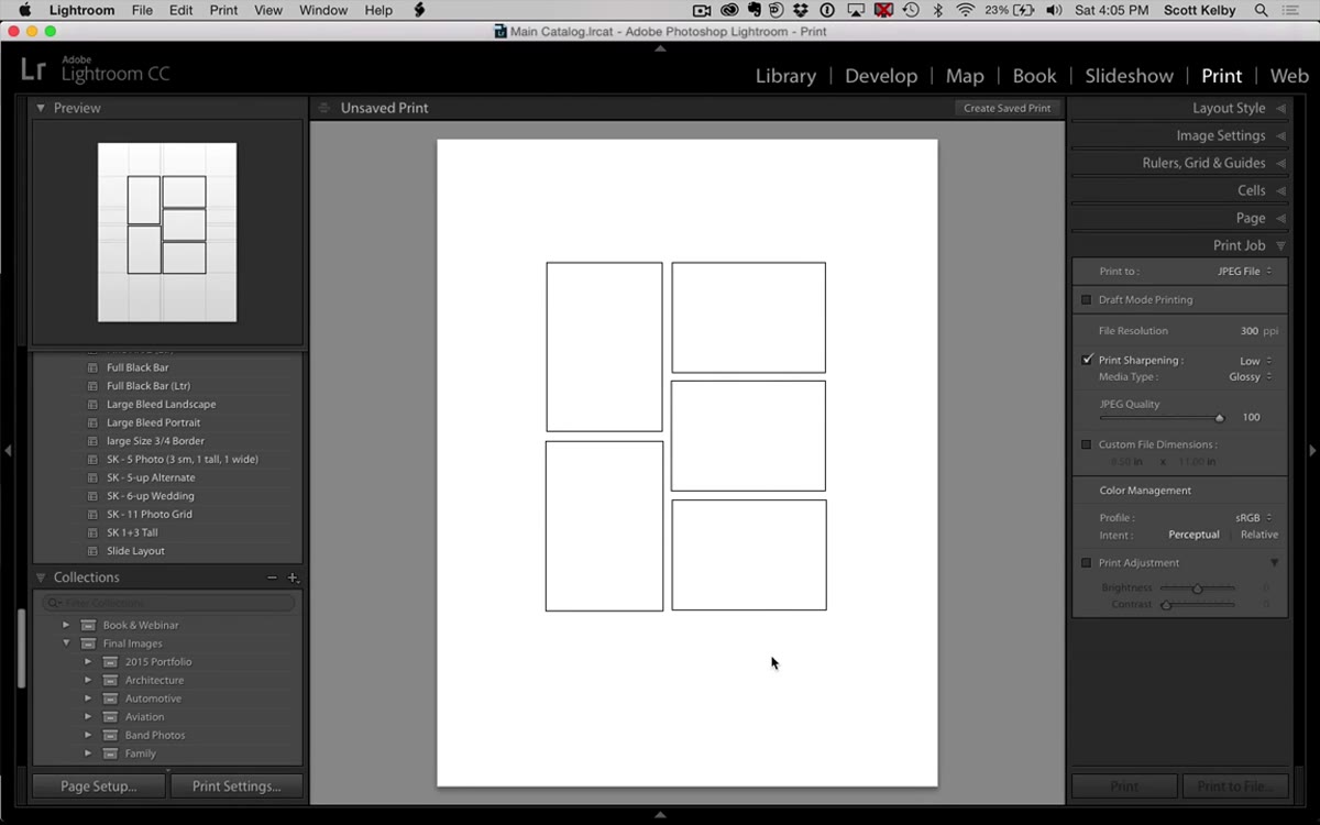 Print module open with blank canvas and layout panel visible
Open the Print module from the top module bar. In the Layout Style panel on the right side, select “Custom Package.” This is the key setting that unlocks freeform cell placement. The other layout styles - Single Image/Contact Sheet and Picture Package - are more rigid and won’t give you the control you need here. Custom Package is where Lightroom lets you treat the canvas like an actual design surface.
Step 2: Add Your First Horizontal Cell and Resize It
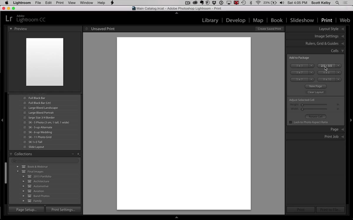 Cells panel open with 2.5x3 cell size highlighted
In the Cells panel (still on the right side), click the 2.5 x 3.5 preset to drop your first cell onto the canvas. It will land large - probably too large for a multi-image layout. Hold Shift and drag a corner handle to scale it down proportionally. Kelby keeps these cells noticeably smaller than full-bleed so there’s breathing room between images. Think of this first cell as setting the size template for the two horizontal images that will follow it. Get it where you like it before you start duplicating.
Step 3: Duplicate the Cell to Create the Three Horizontal Images
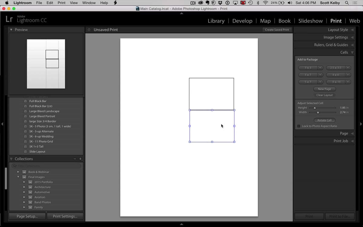 Three horizontal cells arranged vertically on left side of canvas
Hold Option (Mac) or Alt (Windows) and drag the cell to create a copy. Do this twice so you have three horizontal cells total. Arrange them vertically down the left side of the canvas with a consistent gutter between them. If snapping is making this frustrating, go to the Guides panel and find the Grid Snap option - you can toggle it off entirely, which often makes manual placement feel smoother. Kelby mentions that even with snap off, you can feel a subtle grid resistance as you drag, which helps you line things up without being locked into rigid increments. Trust that feel.
Step 4: Add the First Vertical Cell and Adjust Its Proportions
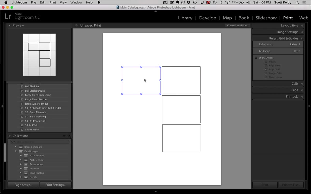 Tall vertical cell added to right side, bottom handle being dragged down
Option/Alt-drag one of the horizontal cells to create your fourth cell. This one becomes the first vertical. Drag the bottom handle downward to make it taller - but stop before it reaches the halfway point of the canvas. You need to leave a gutter between this cell and the vertical below it. Getting greedy with the height here will make the finished layout look crowded. The goal is two vertical images that together roughly match the total height of your three stacked horizontals on the left.
Step 5: Duplicate the Vertical Cell and Align the Bottom Edges
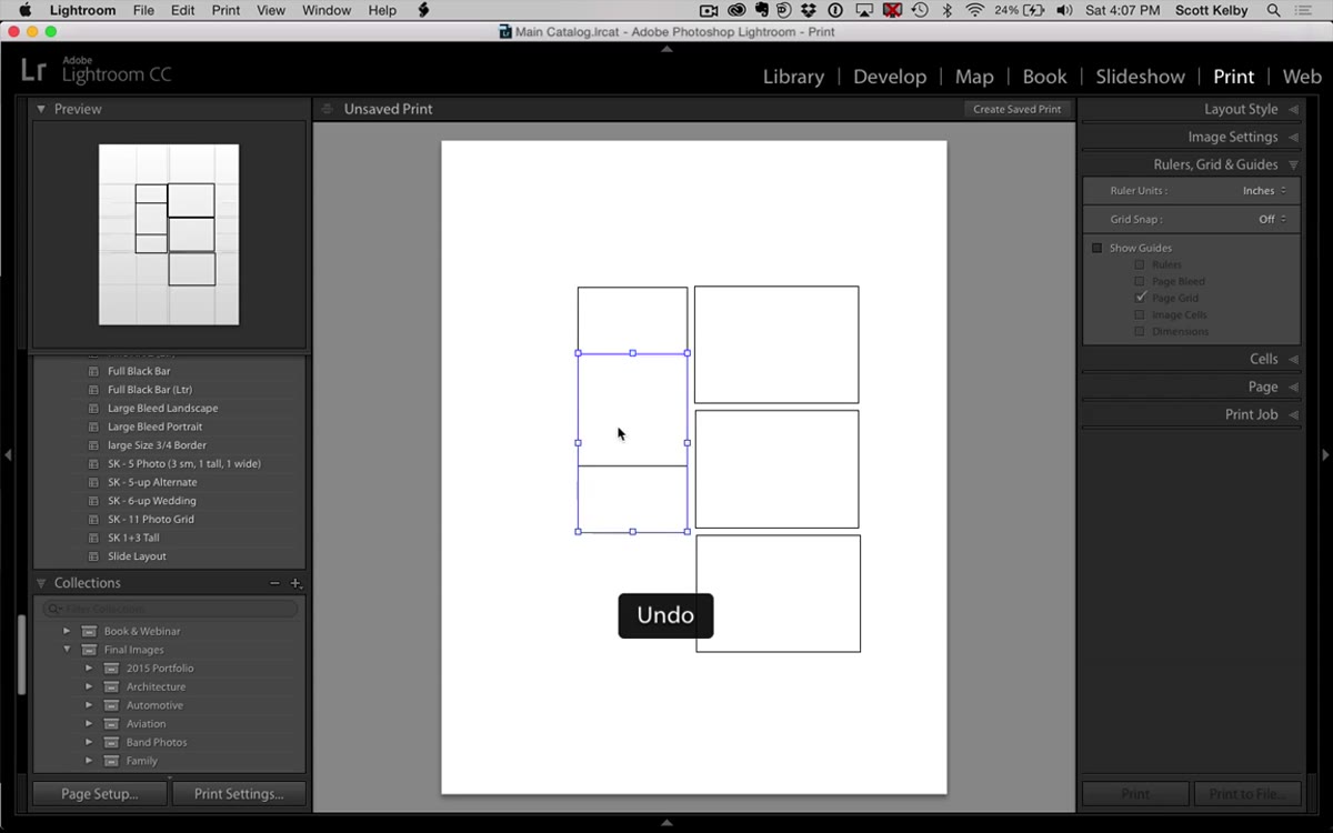 Second vertical cell added, bottom edges being aligned with zoom assist
Option/Alt-drag the vertical cell to create your fifth and final cell. Position it directly below the first vertical with a matching gutter. Now zoom in to check your alignment - Kelby uses his operating system’s native zoom (not Lightroom’s) to get a close look at whether the bottom edges of the two verticals are sitting at the same point. On Mac, you can trigger this with the accessibility zoom shortcut. On Windows, the Magnifier tool does the same job. This step matters more than it seems. Misaligned bottom edges are the first thing a client’s eye catches.
Step 6: Tighten the Gutter Between the Two Column Groups
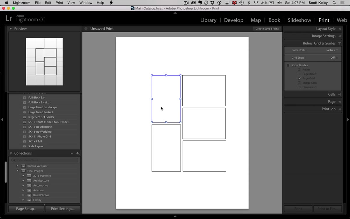 Both columns being nudged closer together to reduce center gap
Once all five cells are placed, look at the horizontal gap between your left column of horizontals and the right column of verticals. If it looks wide, select the right-side cells and nudge them left. This is pure eyeballing - there’s no gutter width field in Custom Package mode. Use the same snap-resistance feel from earlier to find a gap that looks consistent with the gutters you already have between cells. Consistency in spacing is what separates a layout that looks designed from one that looks assembled.
Step 7: Drop In Images and Save the Layout as a Template
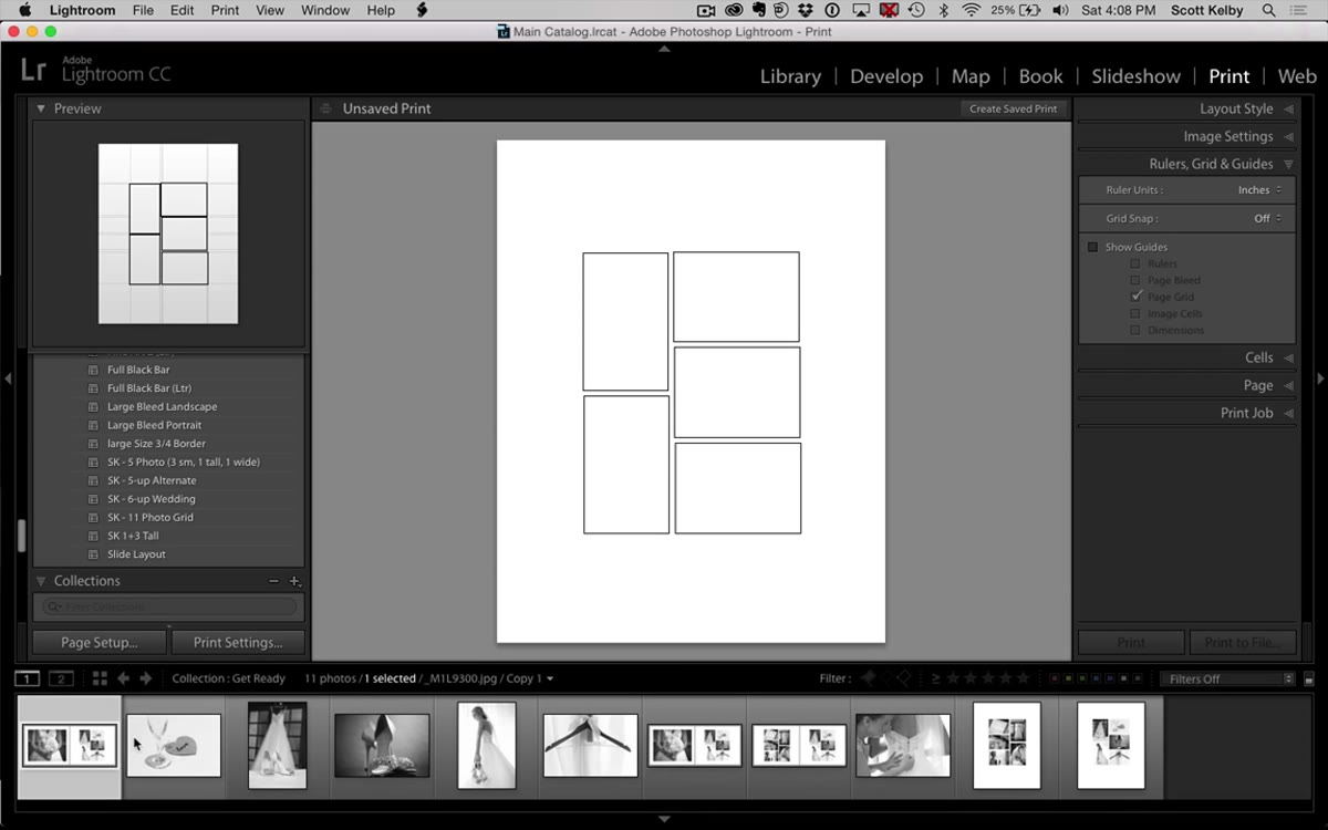 All five cells filled with images and template browser open at top
Drag images from the filmstrip at the bottom into each cell to preview how the layout looks with real photos. Once you’re happy, go to the Template Browser in the left panel and click the plus icon to save this as a named template. Kelby names his “Five Up” - simple and functional. After saving, you can export the whole thing as a JPEG via the Print to File option and bring that JPEG into the Book module as a full-page image. The layout is baked in. Reuse it any time by loading the template and swapping the images.
A Note on Cell Size Consistency Across Albums
One thing I’d add from my own experience: before you save the template, make a quick note of the approximate dimensions of your horizontal cells. If you plan to use this layout across multiple albums - especially if you’re mixing it with other custom layouts you’ve built the same way - slight size differences between templates become obvious when pages sit next to each other in a printed book. I keep a simple text file called “layout specs” where I log rough cell dimensions for each template I save. It takes thirty seconds and saves a lot of reprints.
Also worth flagging: Kelby mentions this template is available to download from Lightroom Killer Tips, so if you want to skip the build and just study the finished structure, that’s a legitimate shortcut. But going through the build at least once teaches you the Custom Package logic in a way that downloading a file simply does not.
The single biggest takeaway here is that the Print module is a far more flexible design tool than most Lightroom users realize. The Book module gets all the attention for album work, but it’s the Print module - with Custom Package mode and free-form cell placement - that actually lets you build layouts that match your creative vision instead of choosing from someone else’s presets.
Watch the full tutorial on YouTube and follow along with Kelby’s walkthrough - seeing the cells snap and resize in real time makes the spacing decisions click much faster than reading about them.
Comments
Leave a Comment