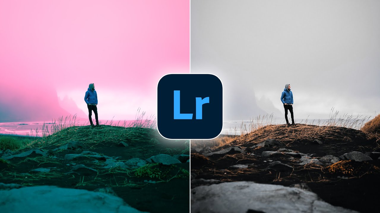
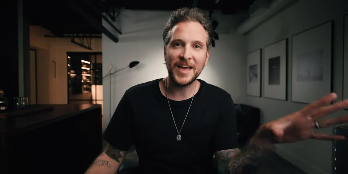
Every few months I sit down with a tutorial from someone whose eye I trust, not to be told what I already know, but to get rattled a little. That’s what happened when I watched Watch the full tutorial on YouTube from Peter McKinnon, where he casually drops two Lightroom techniques that I either glossed over or genuinely never noticed hiding in the software I use every single day. The man is sipping a questionable espresso and somehow still teaching circles around most photography content out there.
The core problem this tutorial addresses is one I run into constantly: maintaining a consistent visual identity across a body of work without every edit feeling copy-pasted. McKinnon’s solution lives in the tone curve panel and the HSL section, two areas most people either avoid entirely or use at surface level. What he shows is that going deeper into both, specifically into the individual RGB channels of the curve, gives you a level of intentional color control that broad sliders simply cannot replicate. After rebuilding my workflow around this approach, I genuinely think it’s the missing step for anyone whose edits look “almost there” but never quite cohesive.
Step 1: Open the Tone Curve and Switch to Individual RGB Channels
 Tone curve panel showing RGB channel selector tabs
The tone curve panel has two modes that most people never toggle between. The default view shows a single luminance curve controlling overall brightness and contrast. But click into the individual channel selector and you get three separate curves: red, green, and blue. Each one controls not just brightness within that channel but the color relationship between that hue and its opposite. Red pushes against cyan. Green pushes against magenta. Blue pushes against yellow. McKinnon points out that a recent Lightroom update made this visual, so the curve line itself turns red, green, or blue depending on which channel you’re editing. If you haven’t updated your Lightroom recently, this is the reason to do it.
Tone curve panel showing RGB channel selector tabs
The tone curve panel has two modes that most people never toggle between. The default view shows a single luminance curve controlling overall brightness and contrast. But click into the individual channel selector and you get three separate curves: red, green, and blue. Each one controls not just brightness within that channel but the color relationship between that hue and its opposite. Red pushes against cyan. Green pushes against magenta. Blue pushes against yellow. McKinnon points out that a recent Lightroom update made this visual, so the curve line itself turns red, green, or blue depending on which channel you’re editing. If you haven’t updated your Lightroom recently, this is the reason to do it.
Step 2: Apply an S-Curve to the Red Channel
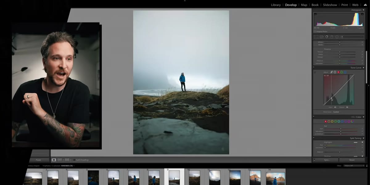 Red channel curve being pulled into S-shape
With the red channel selected, add two anchor points to create a gentle S-curve. Pull the shadows end of the curve slightly downward toward cyan and lift the highlights end upward toward red. The movement doesn’t need to be dramatic. A subtle push in each direction is enough to introduce warmth in the highlights while keeping the shadows from going muddy orange. McKinnon adds a couple of extra anchor points to keep the middle of the curve from swinging too wildly, which is good practice any time you’re working with individual channels. More points give you more control over how gradual the transition feels.
Red channel curve being pulled into S-shape
With the red channel selected, add two anchor points to create a gentle S-curve. Pull the shadows end of the curve slightly downward toward cyan and lift the highlights end upward toward red. The movement doesn’t need to be dramatic. A subtle push in each direction is enough to introduce warmth in the highlights while keeping the shadows from going muddy orange. McKinnon adds a couple of extra anchor points to keep the middle of the curve from swinging too wildly, which is good practice any time you’re working with individual channels. More points give you more control over how gradual the transition feels.
Step 3: Repeat the S-Curve on the Green Channel
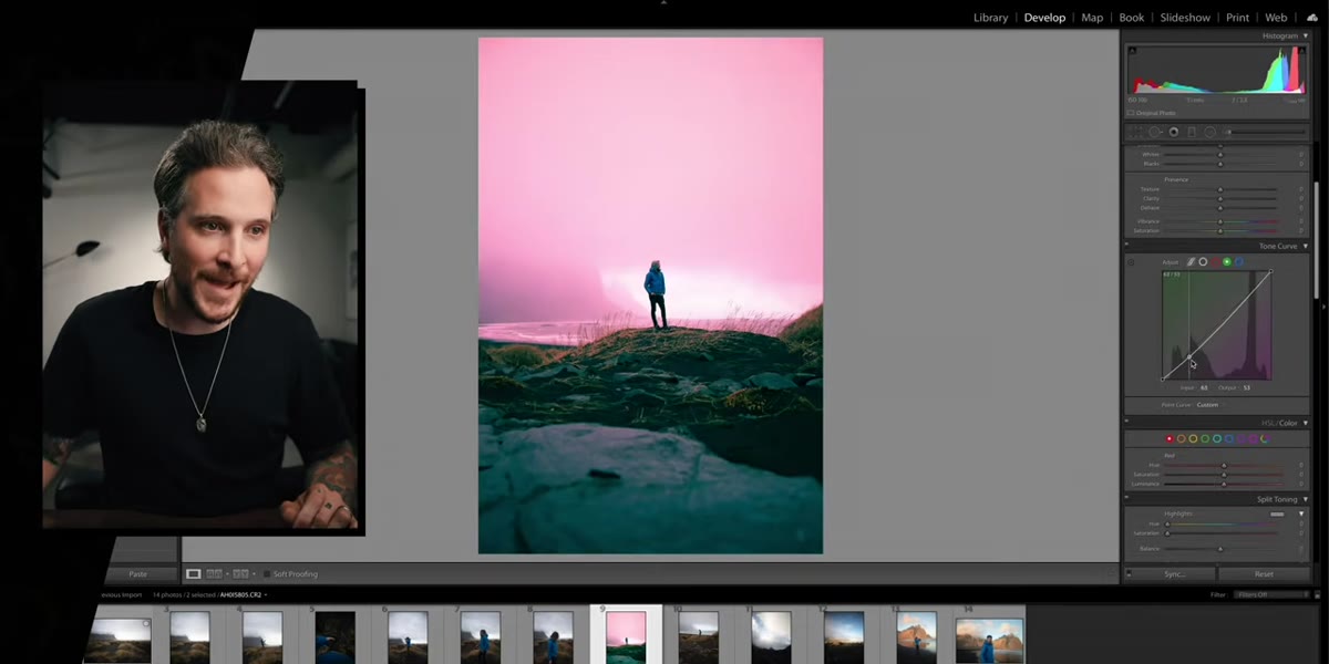 Green channel curve adjusted with visible green shift
Switch to the green channel and apply the same general S-curve logic. Bring the shadows down toward magenta and lift the highlights up toward green. At this point the photo is going to look pretty strange, maybe a little radioactive. That’s normal. McKinnon acknowledges this directly and treats it as part of the process rather than a reason to panic and reset. You’re building a color foundation that will make sense once all three channels are working together. Think of it like mixing paint: individual colors look wrong before they combine into something intentional.
Green channel curve adjusted with visible green shift
Switch to the green channel and apply the same general S-curve logic. Bring the shadows down toward magenta and lift the highlights up toward green. At this point the photo is going to look pretty strange, maybe a little radioactive. That’s normal. McKinnon acknowledges this directly and treats it as part of the process rather than a reason to panic and reset. You’re building a color foundation that will make sense once all three channels are working together. Think of it like mixing paint: individual colors look wrong before they combine into something intentional.
Step 4: Shape the Blue Channel to Finish the Curve Stack
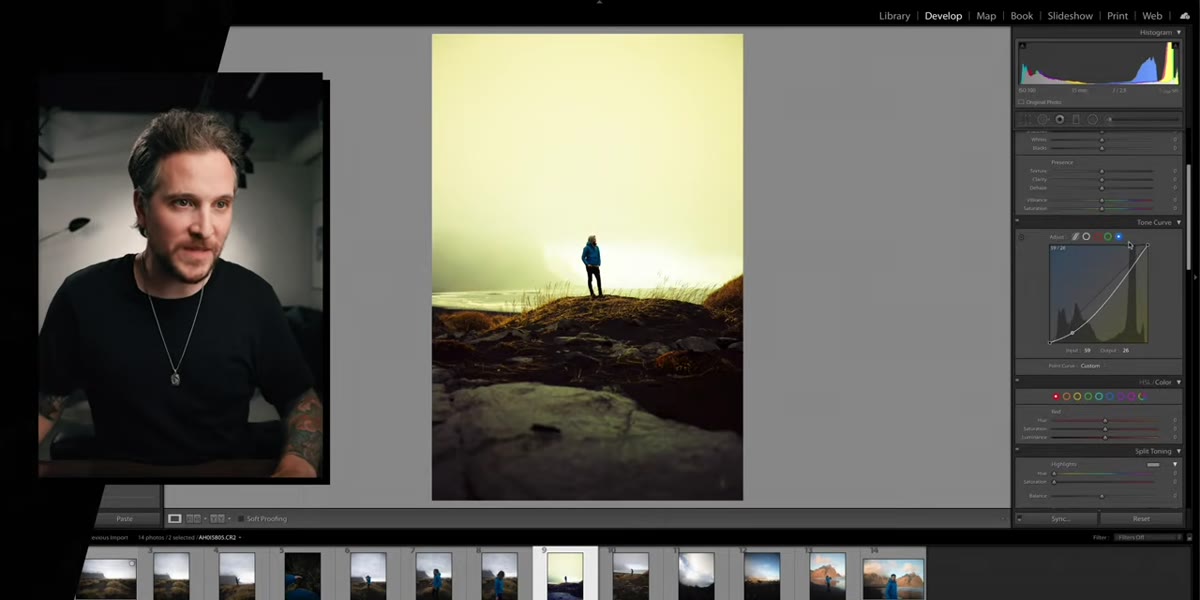 Blue channel curve lifted in highlights toward blue
The blue channel is where the edit starts to resolve. Pull the shadows down toward yellow to add some warmth to the dark tones, then lift the highlights up into blue to cool the bright areas. This is the classic “teal and orange” structure that shows up everywhere in cinema and commercial photography, built from the ground up in the curve rather than applied as a flat preset. Once you’ve done this across all three channels, step back and look at the image as a whole. It should read as cohesive and cinematic rather than colorful in a random way. If it’s too intense, reduce the strength of each curve proportionally rather than fighting yourself by overcorrecting one channel.
Blue channel curve lifted in highlights toward blue
The blue channel is where the edit starts to resolve. Pull the shadows down toward yellow to add some warmth to the dark tones, then lift the highlights up into blue to cool the bright areas. This is the classic “teal and orange” structure that shows up everywhere in cinema and commercial photography, built from the ground up in the curve rather than applied as a flat preset. Once you’ve done this across all three channels, step back and look at the image as a whole. It should read as cohesive and cinematic rather than colorful in a random way. If it’s too intense, reduce the strength of each curve proportionally rather than fighting yourself by overcorrecting one channel.
Step 5: Use the HSL Panel to Target Specific Colors
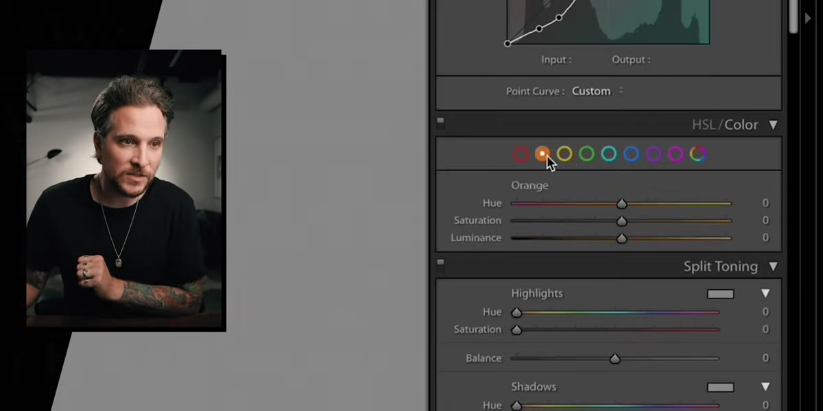 HSL panel open with individual color sliders visible
After the RGB curves establish the overall color grade, the HSL panel gives you a second layer of precision. Hue, Saturation, and Luminance sliders let you reach into specific colors and adjust them independently without touching the rest of the image. McKinnon uses this to refine the results of the curve work. If the green channel adjustment made foliage look unnatural, you can pull the green hue slider to shift it toward a more believable yellow-green without unraveling the broader grade. If the blue in the sky is too saturated after the curve treatment, pull the blue saturation slider back a few points.
HSL panel open with individual color sliders visible
After the RGB curves establish the overall color grade, the HSL panel gives you a second layer of precision. Hue, Saturation, and Luminance sliders let you reach into specific colors and adjust them independently without touching the rest of the image. McKinnon uses this to refine the results of the curve work. If the green channel adjustment made foliage look unnatural, you can pull the green hue slider to shift it toward a more believable yellow-green without unraveling the broader grade. If the blue in the sky is too saturated after the curve treatment, pull the blue saturation slider back a few points.
Step 6: Apply HSL Adjustments to Masked Selections
 Masking interface with isolated region selected in Lightroom
Here’s where McKinnon introduces what he frames as a newer, genuinely exciting capability: the ability to apply HSL color adjustments not to the whole image but to a masked region. In recent versions of Lightroom, you can create a mask using the subject selection, brush, gradient, or range tools, and then apply targeted color changes only within that masked area. This means you can shift the color of a sky without touching the foreground, or warm up a subject’s skin tones without pushing the background orange. The workflow is: create your mask first using the Masking panel, then open the color grading or HSL controls within that mask’s adjustment layer. The interface changed enough in recent updates that it’s worth exploring even if you’ve used Lightroom for years.
Masking interface with isolated region selected in Lightroom
Here’s where McKinnon introduces what he frames as a newer, genuinely exciting capability: the ability to apply HSL color adjustments not to the whole image but to a masked region. In recent versions of Lightroom, you can create a mask using the subject selection, brush, gradient, or range tools, and then apply targeted color changes only within that masked area. This means you can shift the color of a sky without touching the foreground, or warm up a subject’s skin tones without pushing the background orange. The workflow is: create your mask first using the Masking panel, then open the color grading or HSL controls within that mask’s adjustment layer. The interface changed enough in recent updates that it’s worth exploring even if you’ve used Lightroom for years.
What I’d Add From My Own Workflow
One thing McKinnon doesn’t dive into here, probably because it deserves its own video, is the relationship between the RGB curve work and the color mixer in the HSL panel when you’re working across a whole shoot rather than a single image. My approach is to build the RGB curves first on one hero image, then save that curve state as part of a preset. I name my presets after songs, which is a habit I picked up years ago when I was editing band press shots in a hurry and the names helped me remember the mood I was going for. The point is, once you’ve dialed in the three-channel S-curve for a specific shooting condition, that work translates across the whole session. Paste it onto 40 images, then use HSL on each individual shot for any fine-tuning that’s unique to that frame. It cuts editing time significantly and keeps the set looking unified.
The real takeaway from McKinnon’s tutorial is that the features that create professional-level color grades have been sitting inside Lightroom the whole time. The RGB channel curves and masked HSL adjustments are not hidden. They’re just underexplained, and most people never go looking for them because the broad sliders are right there and get the job 80% done. That last 20% is what separates an edit that reads as intentional from one that just reads as edited. Watch the full tutorial on YouTube and pay special attention to the end, where McKinnon teases a feature that’s already in your software and might genuinely surprise you.
Comments
Leave a Comment