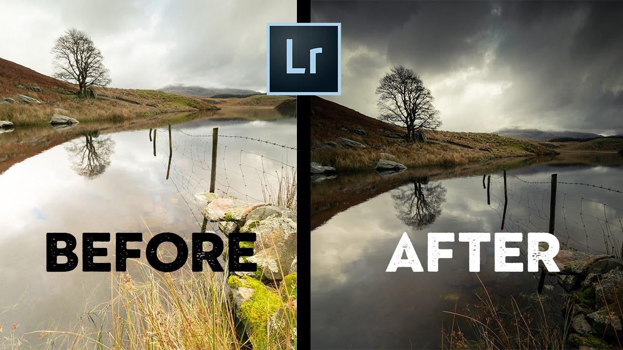
There’s a version of Lightroom editing where you open a raw file, spend 45 minutes pushing sliders around, and end up with something that looks worse than when you started. I lived in that version for longer than I’d like to admit. What changed things for me was watching editors who had a clear sequence - people who knew what they were fixing and why before they touched a single control. Nigel Danson is one of those editors.
In this Nigel Danson tutorial, he works through a set of viewer-submitted raw files and shows how a handful of targeted adjustments can transform a good photo into a great one. The images are varied, but the first example, a moody woodland shot, is where his workflow really clicks. It’s simple in the best way - no exotic plugins, no buried menus, just a logical order of operations that gives the image shape, depth, and atmosphere.
What I find genuinely useful here isn’t any single technique. It’s watching how Nigel thinks about priority. He’s not trying to fix everything. He’s deciding what the image needs most, and stopping when he gets there. That’s the skill. Here’s how he does it.
Step 1: Add a Radial Filter Vignette to Direct the Eye
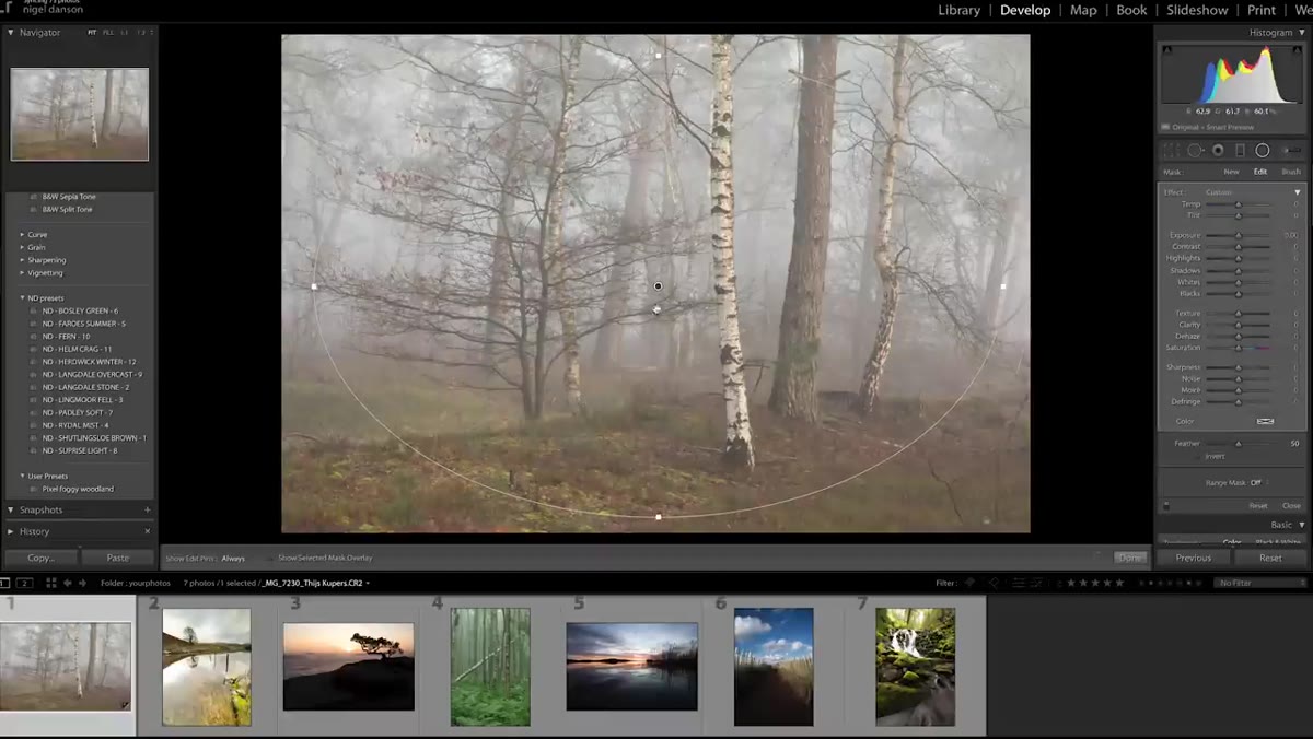 Radial filter applied, darkening the outer edges of woodland shot
Before touching exposure or color, Nigel reaches for the Radial Filter to darken the edges of the frame. This isn’t the standard vignette slider in the Lens Corrections panel - it’s a manual radial gradient, which gives you more control over shape and placement. Draw a large oval over the center of your image, then pull the exposure down on the outside of that oval. For a woodland scene like this one, the effect pulls your attention toward the light between the trees, adding mystery without feeling heavy-handed. He notes this technique works especially well when there’s a bright area visible in the distance - the vignette frames it like a natural tunnel.
Radial filter applied, darkening the outer edges of woodland shot
Before touching exposure or color, Nigel reaches for the Radial Filter to darken the edges of the frame. This isn’t the standard vignette slider in the Lens Corrections panel - it’s a manual radial gradient, which gives you more control over shape and placement. Draw a large oval over the center of your image, then pull the exposure down on the outside of that oval. For a woodland scene like this one, the effect pulls your attention toward the light between the trees, adding mystery without feeling heavy-handed. He notes this technique works especially well when there’s a bright area visible in the distance - the vignette frames it like a natural tunnel.
Step 2: Use the Healing Brush to Remove Distracting Elements
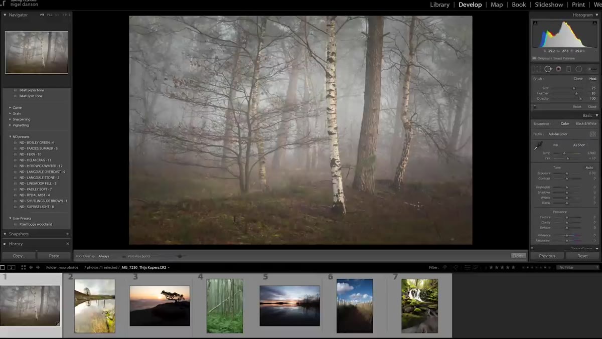 Healing brush removing distracting branch in lower frame
With the composition anchored by the vignette, Nigel spots a branch in the lower portion of the frame that’s pulling attention away from the scene. He removes it quickly with the Healing Brush - not perfectly, but well enough for the purpose of the demonstration. The lesson here is about editing with intention: if something in the frame competes with your main subject without adding to the story, get rid of it. In practice, you’ll want to spend more time here than Nigel does in the video, especially if the distracting element overlaps a complex texture like bark or foliage. The Content-Aware option in Lightroom’s Healing tool handles most situations, but manual Source selection gives you cleaner results on detailed backgrounds.
Healing brush removing distracting branch in lower frame
With the composition anchored by the vignette, Nigel spots a branch in the lower portion of the frame that’s pulling attention away from the scene. He removes it quickly with the Healing Brush - not perfectly, but well enough for the purpose of the demonstration. The lesson here is about editing with intention: if something in the frame competes with your main subject without adding to the story, get rid of it. In practice, you’ll want to spend more time here than Nigel does in the video, especially if the distracting element overlaps a complex texture like bark or foliage. The Content-Aware option in Lightroom’s Healing tool handles most situations, but manual Source selection gives you cleaner results on detailed backgrounds.
Step 3: Shape Contrast With an S-Curve and Lift the Blacks
 S-curve applied in Tone Curve panel, blacks lifted slightly
Rather than using the Contrast slider (which is blunt and often creates muddiness), Nigel goes to the Tone Curve and draws a gentle S-shape - pulling the upper midtones up and the lower midtones down. This gives the image more punch while keeping the tonal transitions smooth. The move that caught my attention here is what he does to the black point: instead of letting the darkest tones go fully to zero, he lifts the bottom-left anchor point of the curve slightly upward. This “fades” the blacks a little, giving the image a more cinematic, atmospheric quality rather than a harsh HDR look. It’s subtle, but it separates images that feel alive from images that just feel processed.
S-curve applied in Tone Curve panel, blacks lifted slightly
Rather than using the Contrast slider (which is blunt and often creates muddiness), Nigel goes to the Tone Curve and draws a gentle S-shape - pulling the upper midtones up and the lower midtones down. This gives the image more punch while keeping the tonal transitions smooth. The move that caught my attention here is what he does to the black point: instead of letting the darkest tones go fully to zero, he lifts the bottom-left anchor point of the curve slightly upward. This “fades” the blacks a little, giving the image a more cinematic, atmospheric quality rather than a harsh HDR look. It’s subtle, but it separates images that feel alive from images that just feel processed.
Step 4: Adjust Individual Color Hues for Mood
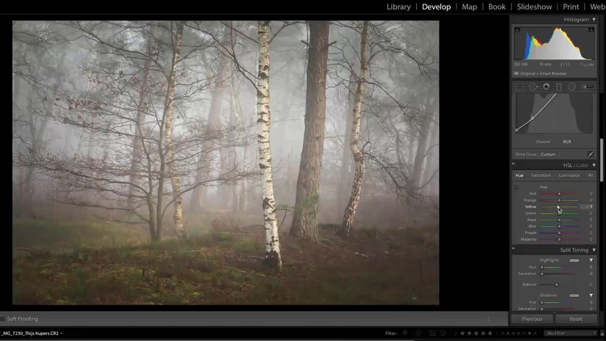 HSL panel open, orange and green hue sliders being adjusted
This is where the image starts feeling intentional rather than just corrected. Nigel opens the HSL panel and nudges the hue sliders for the earthy tones - oranges and yellows - to push them toward a warmer, richer quality. He also shifts the greens slightly to separate them from the other foliage tones. The key is restraint. We’re talking about shifts of maybe 10-15 points, not dramatic swings. The goal isn’t to replace the colors the scene had - it’s to refine them toward what you felt when you were standing there. If your woodland shot has that damp, golden-hour warmth, these small hue shifts are what let you communicate that to someone who wasn’t there.
HSL panel open, orange and green hue sliders being adjusted
This is where the image starts feeling intentional rather than just corrected. Nigel opens the HSL panel and nudges the hue sliders for the earthy tones - oranges and yellows - to push them toward a warmer, richer quality. He also shifts the greens slightly to separate them from the other foliage tones. The key is restraint. We’re talking about shifts of maybe 10-15 points, not dramatic swings. The goal isn’t to replace the colors the scene had - it’s to refine them toward what you felt when you were standing there. If your woodland shot has that damp, golden-hour warmth, these small hue shifts are what let you communicate that to someone who wasn’t there.
Step 5: Split Tone the Highlights and Shadows
 Split Toning panel, warm highlights and cool blue shadows applied
Nigel uses the Split Toning panel (called Color Grading in newer versions of Lightroom) to add a warm-green tint to the highlights and a cool blue to the shadows. The highlight warmth echoes the natural light filtering through the trees, while the blue shadows add depth and a slight otherworldly quality to the darker areas of the frame. The balance between these two decisions is what gives the final image its coherent mood - they complement rather than fight each other. A practical starting point: keep your highlight saturation low (around 15-20) so the tint reads as natural light, not a filter. Shadow saturation can sit a little higher, around 20-30, since our eyes are less sensitive to color shifts in dark areas.
Split Toning panel, warm highlights and cool blue shadows applied
Nigel uses the Split Toning panel (called Color Grading in newer versions of Lightroom) to add a warm-green tint to the highlights and a cool blue to the shadows. The highlight warmth echoes the natural light filtering through the trees, while the blue shadows add depth and a slight otherworldly quality to the darker areas of the frame. The balance between these two decisions is what gives the final image its coherent mood - they complement rather than fight each other. A practical starting point: keep your highlight saturation low (around 15-20) so the tint reads as natural light, not a filter. Shadow saturation can sit a little higher, around 20-30, since our eyes are less sensitive to color shifts in dark areas.
Step 6: Crop and Refine White Balance Last
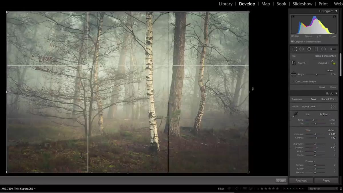 Crop tool active, slight trim applied to edges of frame
After all the tonal and color work is done, Nigel makes a small crop - trimming a little from each edge to tighten the composition. Then he revisits white balance, pulling it slightly cooler to match the mood he’s built with the split toning. Doing white balance last might feel counterintuitive, but it makes sense: once you’ve established the emotional tone of the image through curves and color grading, you can use white balance as a final tuning knob rather than a foundation decision. A few points cooler here reinforced the atmospheric quality of the whole edit without undoing anything he’d already built.
Crop tool active, slight trim applied to edges of frame
After all the tonal and color work is done, Nigel makes a small crop - trimming a little from each edge to tighten the composition. Then he revisits white balance, pulling it slightly cooler to match the mood he’s built with the split toning. Doing white balance last might feel counterintuitive, but it makes sense: once you’ve established the emotional tone of the image through curves and color grading, you can use white balance as a final tuning knob rather than a foundation decision. A few points cooler here reinforced the atmospheric quality of the whole edit without undoing anything he’d already built.
My Addition: Save Tonal Decisions as a Starting Preset
One thing I’d add to Nigel’s workflow: once you’ve landed on an S-curve shape and a blacks lift value that works for a particular type of scene, save it as a preset immediately. I keep a small library of curve-only presets I’ve built from edits exactly like this one. They’re not meant to finish an image - they’re meant to give me a starting contrast structure I can refine from. For woodland and forest shots specifically, a lifted-black S-curve is almost always where I want to begin. It takes maybe 30 seconds to save and it saves you from rebuilding the same curve from memory every single time.
The biggest thing Nigel’s workflow reinforces is that editing order matters as much as the individual adjustments. Vignette first to establish focus, structure second with the curve, color last to set mood. When you follow that sequence, each decision builds on the last instead of fighting it. Everything feels earned.
Watch the full tutorial on YouTube to see Nigel work through the rest of the images - the lake scene that follows is worth watching for how he handles bright skies and reflections.
Comments
Leave a Comment