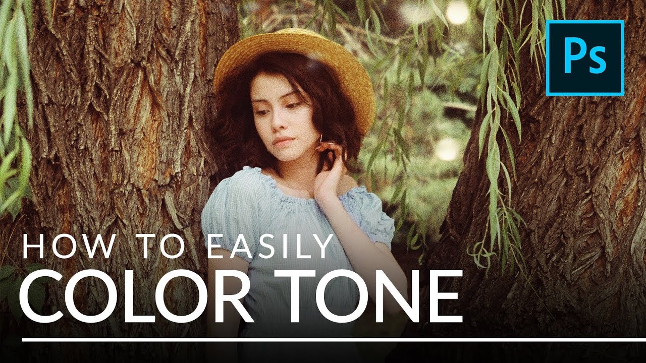
Most of my color work happens in Lightroom. That’s my home turf. But every so often a technique shows up in Photoshop that’s so clean, so flexible, that I have to stop and pay attention. This is one of those techniques. In this Aaron Nace (PHLEARN) tutorial, the concept is deceptively simple: drop a solid color fill layer on your image, change the blend mode, and suddenly you’re color grading like you’ve been doing it for years. No complicated curves gymnastics. No HSL panel hunting. Just a color, a mode, and a slider.
What caught me was the second half of the technique, where Aaron uses the “Blend If” sliders to push a color into only the shadows or only the highlights. That’s the part that made me sit up. Split toning is something I do constantly in Lightroom, but doing it this way in Photoshop gives you a level of visual control that the Lightroom split tone panel doesn’t quite match. The interaction between the color and the image feels more organic, and it’s easier to dial back if you overshoot.
Watch the full tutorial on YouTube
Here’s the full walkthrough so you can follow along without pausing every 30 seconds.
Step 1: Add a Solid Color Fill Layer
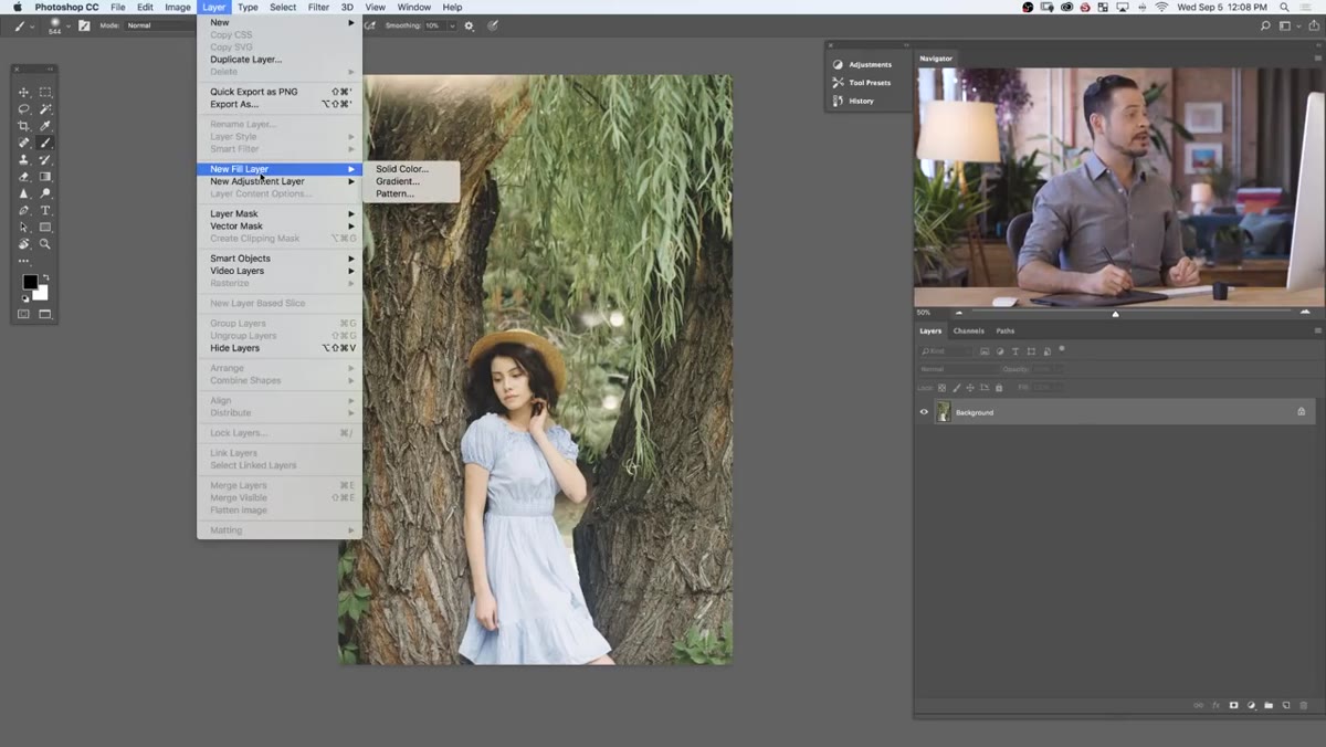 Layer menu open, New Fill Layer selected
Go to Layer, then New Fill Layer, then Solid Color. This opens a color picker right away. Pick any color for now because you’re going to change it later and the whole point of this method is how easy that is to do. Aaron picks a mid-range color just to demonstrate the effect. Click OK and Photoshop drops a fill layer that covers your entire image in a flat color.
Layer menu open, New Fill Layer selected
Go to Layer, then New Fill Layer, then Solid Color. This opens a color picker right away. Pick any color for now because you’re going to change it later and the whole point of this method is how easy that is to do. Aaron picks a mid-range color just to demonstrate the effect. Click OK and Photoshop drops a fill layer that covers your entire image in a flat color.
It looks terrible at this stage. That’s expected. The fill layer on its own is just a color block. The next step is where the actual magic starts.
Step 2: Change the Blend Mode to Soft Light
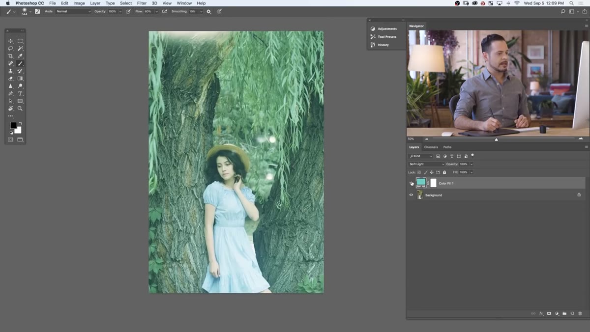 Blend mode dropdown showing Soft Light selected
With your fill layer selected, find the blend mode dropdown at the top of the Layers panel. It defaults to Normal. Change it to Soft Light. This mode blends the color into your image in a way that respects the existing luminosity values, so bright areas stay bright and dark areas stay dark, but everything picks up a tint from your chosen color.
Blend mode dropdown showing Soft Light selected
With your fill layer selected, find the blend mode dropdown at the top of the Layers panel. It defaults to Normal. Change it to Soft Light. This mode blends the color into your image in a way that respects the existing luminosity values, so bright areas stay bright and dark areas stay dark, but everything picks up a tint from your chosen color.
Soft Light is the sweet spot here. It’s strong enough to be visible but subtle enough that it doesn’t flatten your image. Other modes like Overlay or Color can work too, but Soft Light tends to be the most forgiving starting point.
Step 3: Adjust the Color by Double-Clicking the Layer Thumbnail
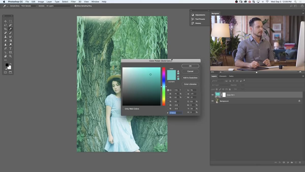 Color picker open with layer thumbnail highlighted
Here’s the part that makes fill layers worth using over other methods. Double-click the small color swatch thumbnail on the fill layer in the Layers panel. The color picker reopens and any change you make updates the image in real time. Drag toward green and your image goes green. Drag toward blue and the whole thing shifts cool. No need to delete the layer and start over.
Color picker open with layer thumbnail highlighted
Here’s the part that makes fill layers worth using over other methods. Double-click the small color swatch thumbnail on the fill layer in the Layers panel. The color picker reopens and any change you make updates the image in real time. Drag toward green and your image goes green. Drag toward blue and the whole thing shifts cool. No need to delete the layer and start over.
This live preview makes it genuinely fast to audition color directions. Aaron cycles through a few options here just to show the range, and it’s a good reminder to experiment before committing. I usually land somewhere in the muted amber or teal territory because those read well in the genres I shoot, but the slider is yours to explore.
Step 4: Use Blend If to Restrict the Color to Shadows Only
 Layer Style dialog open showing Blend If sliders
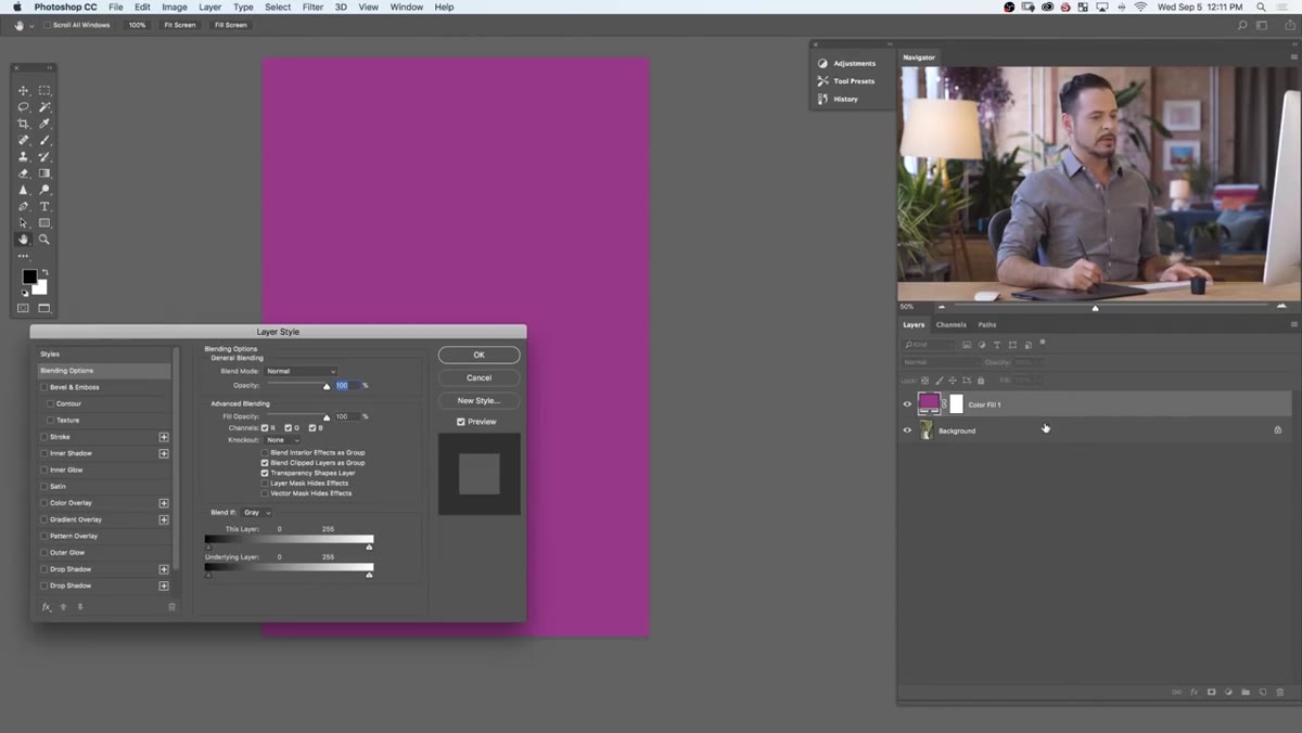
This is where the technique goes from useful to genuinely powerful. Double-click on the gray area of the layer row (not the thumbnail, not the name) to open the Layer Style dialog. Scroll to the bottom and you’ll see a section called “Blend If” with two gradient sliders labeled “This Layer” and “Underlying Layer.”
Layer Style dialog open showing Blend If sliders
This is where the technique goes from useful to genuinely powerful. Double-click on the gray area of the layer row (not the thumbnail, not the name) to open the Layer Style dialog. Scroll to the bottom and you’ll see a section called “Blend If” with two gradient sliders labeled “This Layer” and “Underlying Layer.”
You want the bottom slider, “Underlying Layer.” Hold Alt (Option on Mac) and click the right-side white triangle, then drag it left. Holding Alt splits the slider in two, which creates a gradual transition instead of a hard cutoff. Dragging it left tells Photoshop to hide this layer wherever the underlying image is bright, leaving the color visible only in the darker shadow regions. The further left you pull, the more selective it becomes. Hit OK when the shadows look toned but the highlights still look clean.
Step 5: Add a Second Fill Layer for the Highlights
 Second fill layer added above the first in the Layers panel
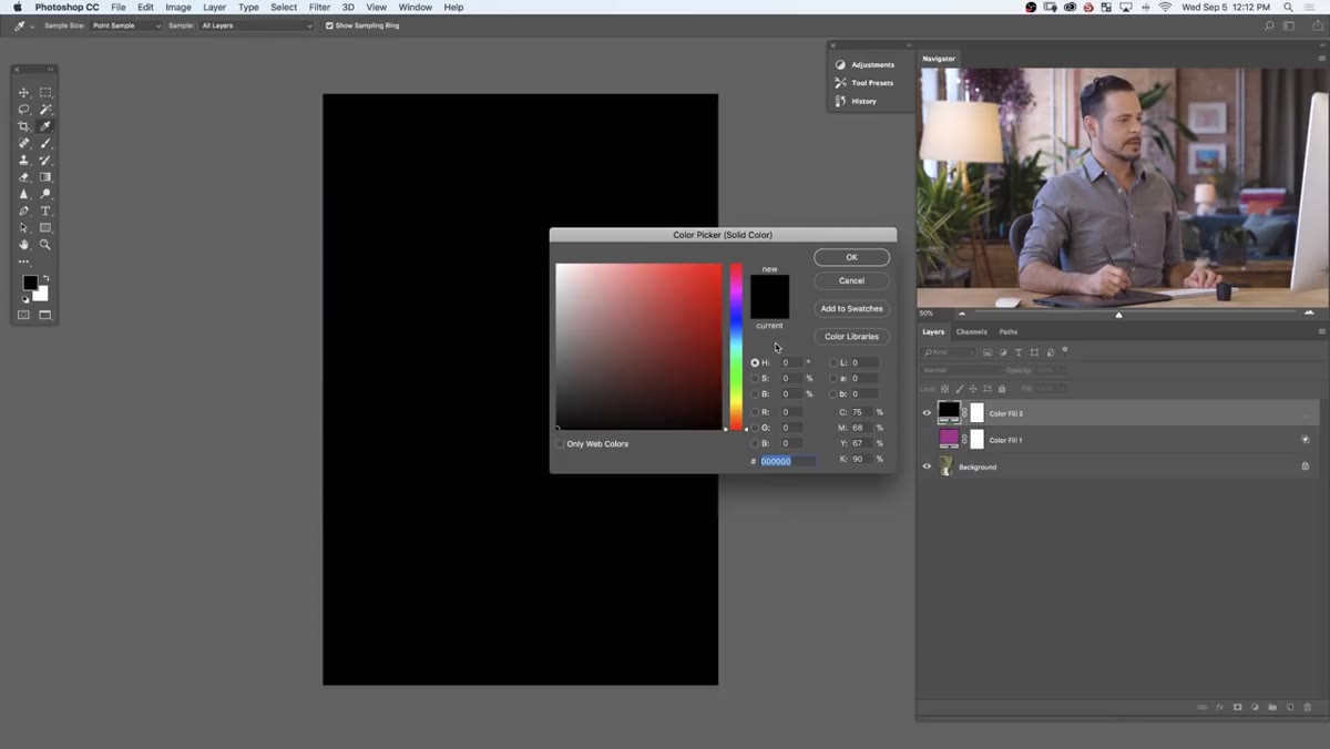
Create another solid color fill layer using the same Layer menu path. Set it to Soft Light again. This layer is going to handle your highlights, so pick a color that complements your shadow tone. Aaron uses a warm red in the shadows and a green in the highlights to match the forest setting in his sample image. That contrast between warm shadows and cool-green highlights is a classic cinematic look.
Second fill layer added above the first in the Layers panel
Create another solid color fill layer using the same Layer menu path. Set it to Soft Light again. This layer is going to handle your highlights, so pick a color that complements your shadow tone. Aaron uses a warm red in the shadows and a green in the highlights to match the forest setting in his sample image. That contrast between warm shadows and cool-green highlights is a classic cinematic look.
One important note Aaron flags: if there are people in your frame, mask out skin tones on the highlight layer. Green-tinted skin reads as wrong to a viewer’s eye even when the rest of the image looks great. A quick mask on the subject keeps the effect looking intentional rather than experimental.
Step 6: Use Blend If to Restrict the Second Layer to Highlights
 Blend If slider being dragged left to right on highlight layer
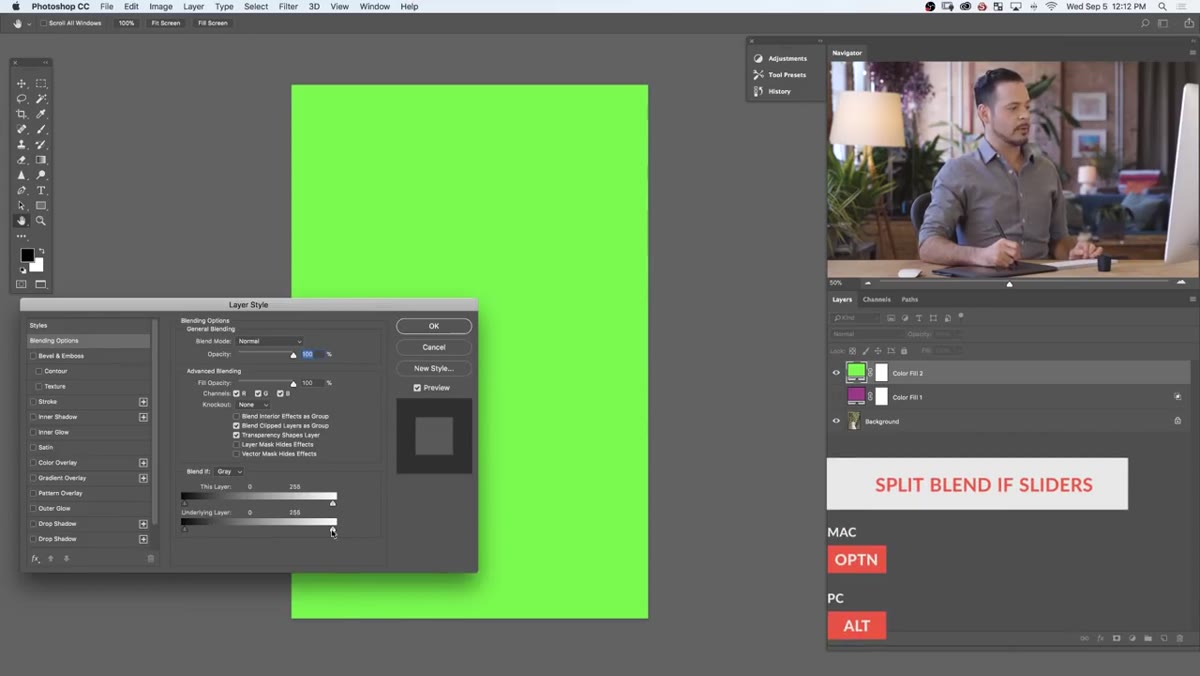
Open the Layer Style dialog for your new fill layer the same way as before. This time, hold Alt and click the left-side black triangle on the Underlying Layer slider, then drag it right. This hides the layer in the shadows and lets it appear only where the image is bright.
Blend If slider being dragged left to right on highlight layer
Open the Layer Style dialog for your new fill layer the same way as before. This time, hold Alt and click the left-side black triangle on the Underlying Layer slider, then drag it right. This hides the layer in the shadows and lets it appear only where the image is bright.
The two layers work together now: one color lives in the shadows, a different color lives in the highlights, and the midtones blend between them naturally because of the split sliders. That’s a full split tone, built from two fill layers and a couple of Blend If adjustments.
What I’d Add From My Own Workflow
The technique Aaron demonstrates is clean as-is, but I like to drop the fill layer’s overall Opacity down to somewhere between 40 and 70 percent before I touch the Blend If sliders. Starting at full opacity makes the effect feel heavy while you’re calibrating, and it’s easy to overshoot. Pulling the opacity back first gives you a more accurate sense of how the final result will actually read. Once the Blend If sliders are set, you can nudge opacity back up if you want more intensity.
I also keep a running PSD with about eight of these fill layers pre-built and labeled by color family, like a Photoshop version of my Lightroom preset packs. Turning them on and off during review is faster than rebuilding from scratch, and it’s a good way to stress-test a color direction across multiple images before committing.
The biggest takeaway here is that color toning doesn’t have to be complicated to be effective. A single fill layer on Soft Light can shift the entire mood of a photograph in about 20 seconds. Two fill layers with Blend If gives you a split tone that would take considerably longer to replicate by hand in curves. This is one of those rare techniques that’s actually faster than the alternative.
Watch the full tutorial on YouTube to see Aaron walk through the complete process with his sample image. His visual examples make the Blend If slider behavior especially clear, and it’s worth watching that section at least twice.
Comments (1)
Bookmarked. Coming back to this one for sure.
Leave a Comment