Every RAW file I open starts the same way: flat, a little lifeless, waiting. For years my first instinct was to hit the Auto button and let Lightroom’s AI take a swing at exposure before I started making real decisions. It works fine. But “fine” is not exactly the bar I’m trying to clear.
Scott Kelby recently dropped a short tip over on KelbyOne that made me rethink that reflex entirely. The subject is Adaptive Color, a profile option that’s been sitting in Lightroom’s Profile Browser for a while now, quietly being overlooked because most people assume it’s just a fancier version of Adobe Color. It isn’t. Watch the full tutorial on YouTube and then come back here, because I want to walk through exactly what makes this approach better and when I’ve started reaching for it first.
The short version: Adaptive Color does what Auto does in spirit, but it stays out of your sliders. That one difference changes the whole editing experience.
Step 1: Start With a RAW File and Open the Profile Browser
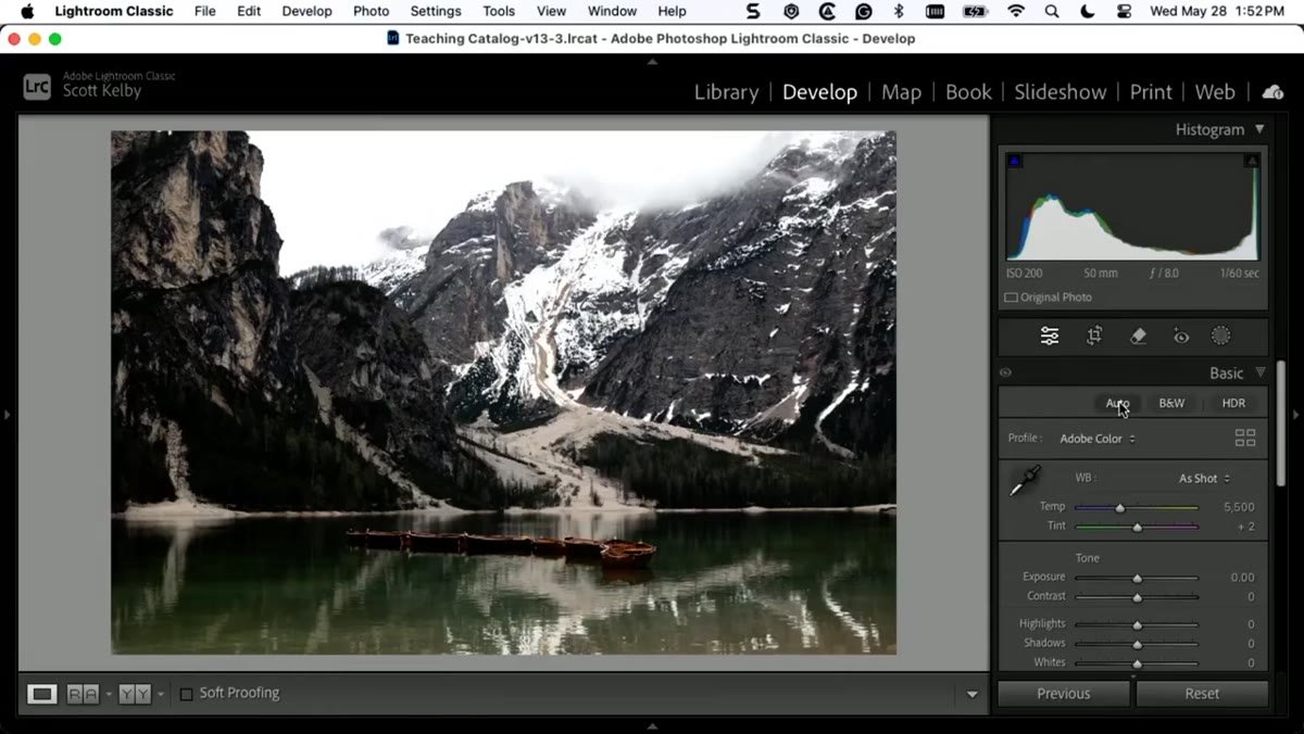 RAW photo open in Lightroom’s Develop module
Make sure you’re working with a RAW file, not a JPEG. This matters because the profile system in Lightroom is designed to interpret raw sensor data, and the difference Adaptive Color makes is most visible when there’s actual dynamic range to work with. Open your image in the Develop module and look at the top of the Basic panel. You’ll see the word “Profile” with a name next to it, usually Adobe Color by default, and a small icon that opens the Profile Browser.
RAW photo open in Lightroom’s Develop module
Make sure you’re working with a RAW file, not a JPEG. This matters because the profile system in Lightroom is designed to interpret raw sensor data, and the difference Adaptive Color makes is most visible when there’s actual dynamic range to work with. Open your image in the Develop module and look at the top of the Basic panel. You’ll see the word “Profile” with a name next to it, usually Adobe Color by default, and a small icon that opens the Profile Browser.
Step 2: Locate Adaptive Color in the Profile Browser Popup
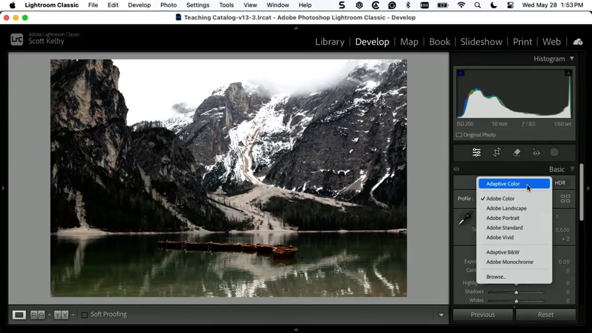 Profile Browser popup showing Adaptive Color option
Click that Profile Browser icon to open the popup menu. You’re looking for Adaptive Color, not Adobe Color. They sit close to each other alphabetically and visually, so it’s easy to scroll past. Adaptive Color will be listed in the Adobe Raw section alongside profiles like Adobe Landscape and Adobe Portrait. Once you spot it, hover over it first before clicking so you can see a live preview on your image without committing.
Profile Browser popup showing Adaptive Color option
Click that Profile Browser icon to open the popup menu. You’re looking for Adaptive Color, not Adobe Color. They sit close to each other alphabetically and visually, so it’s easy to scroll past. Adaptive Color will be listed in the Adobe Raw section alongside profiles like Adobe Landscape and Adobe Portrait. Once you spot it, hover over it first before clicking so you can see a live preview on your image without committing.
Step 3: Apply Adaptive Color and Compare It to Your Auto Result
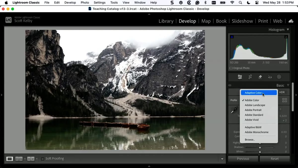 Image showing result after Adaptive Color profile applied
Click Adaptive Color to apply it. Now toggle back to Adobe Color (your previous profile) a few times using the before/after view. Kelby’s honest about this: sometimes Adaptive Color looks noticeably better, sometimes Auto still wins. The comparison is the point. What Adaptive Color is doing under the hood is analyzing the specific content of your image with AI and applying tonal and color adjustments at the profile level rather than the slider level. Think of it less like a preset and more like a smarter camera profile.
Image showing result after Adaptive Color profile applied
Click Adaptive Color to apply it. Now toggle back to Adobe Color (your previous profile) a few times using the before/after view. Kelby’s honest about this: sometimes Adaptive Color looks noticeably better, sometimes Auto still wins. The comparison is the point. What Adaptive Color is doing under the hood is analyzing the specific content of your image with AI and applying tonal and color adjustments at the profile level rather than the slider level. Think of it less like a preset and more like a smarter camera profile.
Step 4: Check Your Sliders and Notice What Didn’t Move
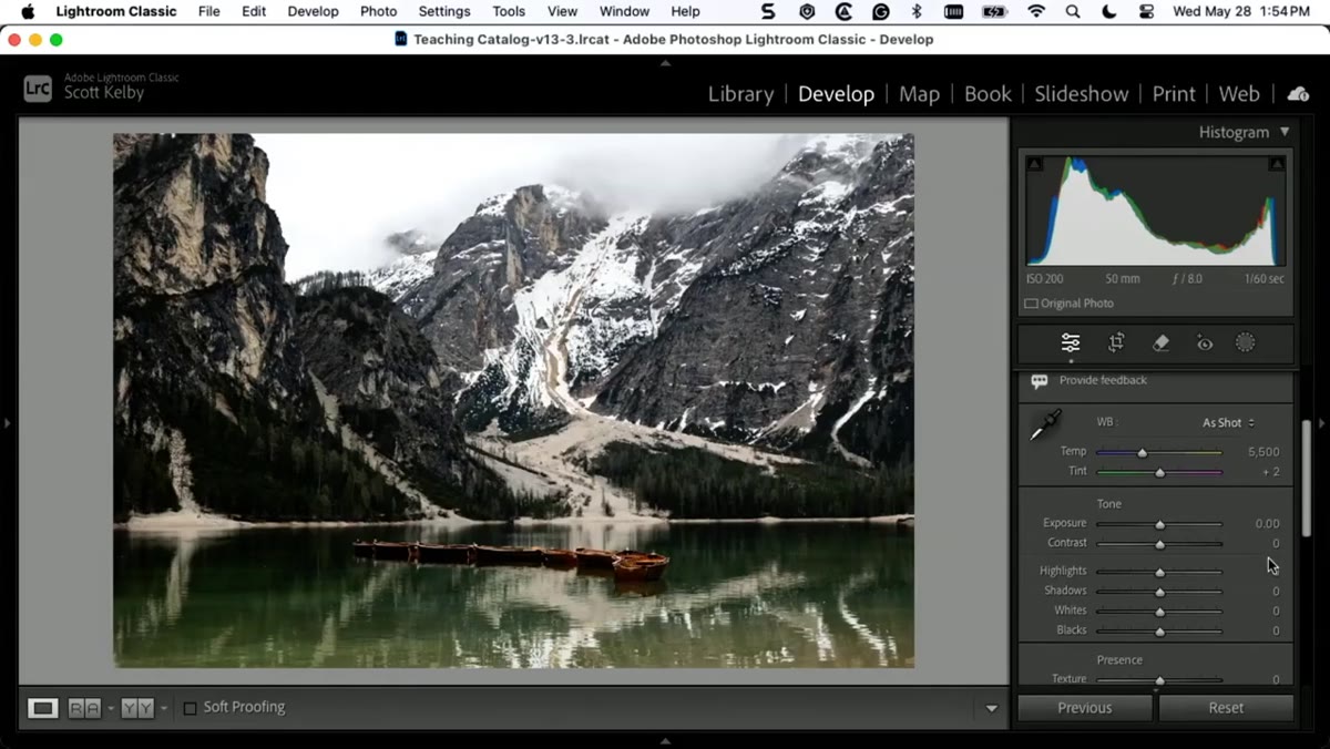 Basic panel sliders all remaining at zero after Adaptive Color applied
Here’s the part that actually changed how I work. After applying Adaptive Color, scroll down to your Basic panel and look at your sliders. Exposure, Contrast, Highlights, Shadows, Whites, Blacks: all still sitting at zero. Nothing moved. When you click the Auto button instead, Lightroom pushes those sliders to wherever its algorithm thinks they should land, which means you might already be at 80% of your Shadows slider’s range before you’ve even started editing. Adaptive Color gives you the visual head start without burning your slider headroom. You’ve got the full range of every control still available.
Basic panel sliders all remaining at zero after Adaptive Color applied
Here’s the part that actually changed how I work. After applying Adaptive Color, scroll down to your Basic panel and look at your sliders. Exposure, Contrast, Highlights, Shadows, Whites, Blacks: all still sitting at zero. Nothing moved. When you click the Auto button instead, Lightroom pushes those sliders to wherever its algorithm thinks they should land, which means you might already be at 80% of your Shadows slider’s range before you’ve even started editing. Adaptive Color gives you the visual head start without burning your slider headroom. You’ve got the full range of every control still available.
Step 5: Use the Amount Slider to Dial In Exactly How Much You Want
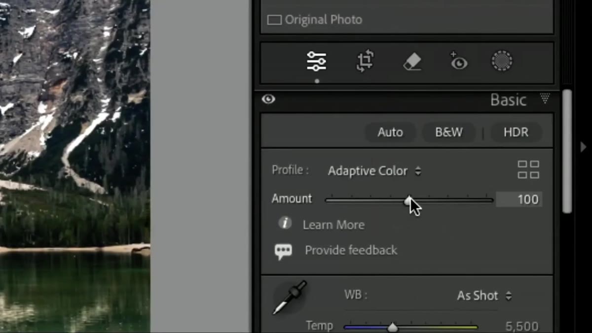 Amount slider beneath the profile controls being adjusted
This is the feature Kelby flags as the one people most often miss. Directly below the Profile name in the Basic panel, there’s an Amount slider specific to the applied profile. With Adobe Color sitting at its default, this slider doesn’t do much interesting. But with Adaptive Color applied, dragging that Amount slider left or right lets you blend between no profile influence and full profile influence. You can land at 40% and get a subtle push, or go to 130% and push the effect harder than the default. It’s a strength dial for the entire AI analysis, and nothing else in the Auto workflow gives you that kind of granular control.
Amount slider beneath the profile controls being adjusted
This is the feature Kelby flags as the one people most often miss. Directly below the Profile name in the Basic panel, there’s an Amount slider specific to the applied profile. With Adobe Color sitting at its default, this slider doesn’t do much interesting. But with Adaptive Color applied, dragging that Amount slider left or right lets you blend between no profile influence and full profile influence. You can land at 40% and get a subtle push, or go to 130% and push the effect harder than the default. It’s a strength dial for the entire AI analysis, and nothing else in the Auto workflow gives you that kind of granular control.
Step 6: Try Adaptive Black and White for Monochrome Conversions
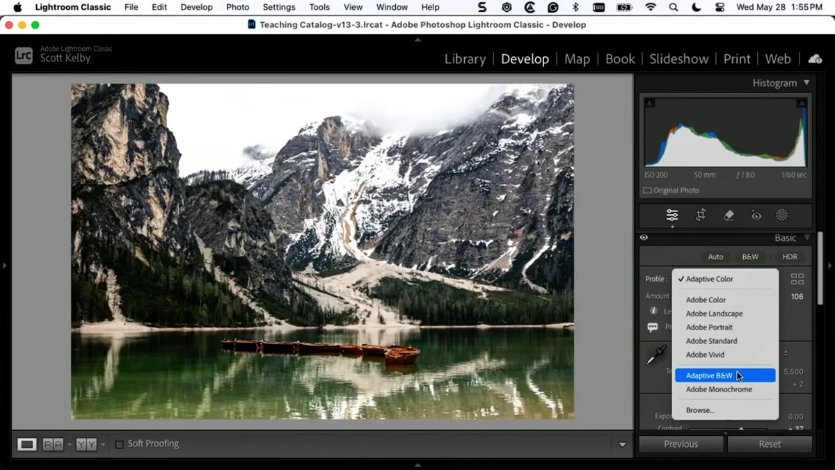 Adaptive Black and White profile selected in the Profile Browser
Kelby briefly mentions that there’s also an Adaptive Black and White option in the same section of the Profile Browser. The same logic applies: instead of just clicking the Black and White mix button and getting a flat conversion, Adaptive Black and White analyzes your specific image and makes a more intelligent starting conversion. The sliders in the HSL/B&W panel stay available for your own adjustments. If you do any monochrome work at all, this is worth adding to your standard starting routine.
Adaptive Black and White profile selected in the Profile Browser
Kelby briefly mentions that there’s also an Adaptive Black and White option in the same section of the Profile Browser. The same logic applies: instead of just clicking the Black and White mix button and getting a flat conversion, Adaptive Black and White analyzes your specific image and makes a more intelligent starting conversion. The sliders in the HSL/B&W panel stay available for your own adjustments. If you do any monochrome work at all, this is worth adding to your standard starting routine.
What I’d Add From My Own Experience
I’ve started pairing Adaptive Color with a quick check of the Histogram before I touch anything else. Because the sliders haven’t moved, the Histogram reflects the profile’s influence cleanly, and I can see exactly how much latitude I still have in the highlights and shadows before I commit to any direction. With Auto, the Histogram already reflects slider decisions that weren’t mine, which makes it harder to reason about what’s actually recoverable.
One other thing worth noting: Adaptive Color plays noticeably better with masking workflows. Since your sliders are untouched, when you apply a luminance or subject mask and then start pulling the Exposure slider for that masked area, you’re working from a true zero baseline. The math is cleaner and the adjustments feel more predictable. I’ve named a few of my go-to starting configurations after this approach, and the preset I’ve been calling “Side A” (yes, like the first side of a record) starts with Adaptive Color at around 85 and works outward from there.
The single most important shift in thinking here is this: the Auto button gives you an answer, and Adaptive Color gives you a better starting question. One locks in decisions for you, the other sets a foundation and then gets out of the way. For any image where you’re planning a real edit, that distinction matters more than it sounds.
Watch the full tutorial on YouTube and spend five minutes testing Adaptive Color against your usual Auto workflow. I’d be surprised if you go back.
Comments
Leave a Comment