Wildlife photography editing is a different beast from portrait or landscape work, and I mean that literally. The subject moves, the light is usually not cooperating, and you’ve got about half a second to get the shot before the osprey or the elk or whatever you’re chasing decides it’s done posing. That pressure carries over into the editing room, where photographers often rush the crop, overdo the sharpening, and wonder why the final image doesn’t feel as alive as the moment did in the field.
I’ve been going deep on wildlife editing workflows lately, and Watch the full tutorial on YouTube from Matt Kloskowski stopped me mid-edit because he names five specific problems I’ve seen constantly in community galleries and edit critique threads. These aren’t vague principles either. He works through real images and shows the before and after in Lightroom, which makes the lessons land in a way that abstract rules usually don’t. Here’s a breakdown of what he covers, with enough detail that you can apply it immediately without pausing and rewinding every thirty seconds.
Step 1: Recognize That Editing Wildlife Is a Creative Decision, Not a Formula
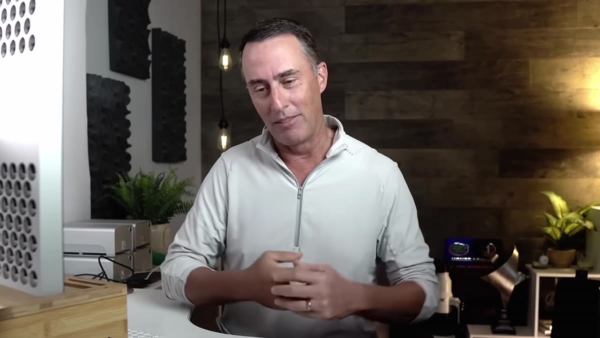 caption: Matt discussing the subjective nature of wildlife editing settings
Before touching a single slider, Kloskowski makes a point worth writing on a sticky note and putting on your monitor. Every camera is different, every shot has different problems, and chasing specific numbers is a trap. He suggests finding a small group of photographers you trust, whether that’s a club, a Discord server, or just a few friends, and regularly sharing edits to calibrate your taste against other people’s reactions.
This matters because wildlife editing has very few universal “correct” answers. What reads as a punchy, well-exposed bird shot to one person looks blown-out and flat to someone else. Building that feedback loop early saves you from developing blind spots in your own editing style.
Step 2: Stop Leaving Too Much Dead Space in Your Crop
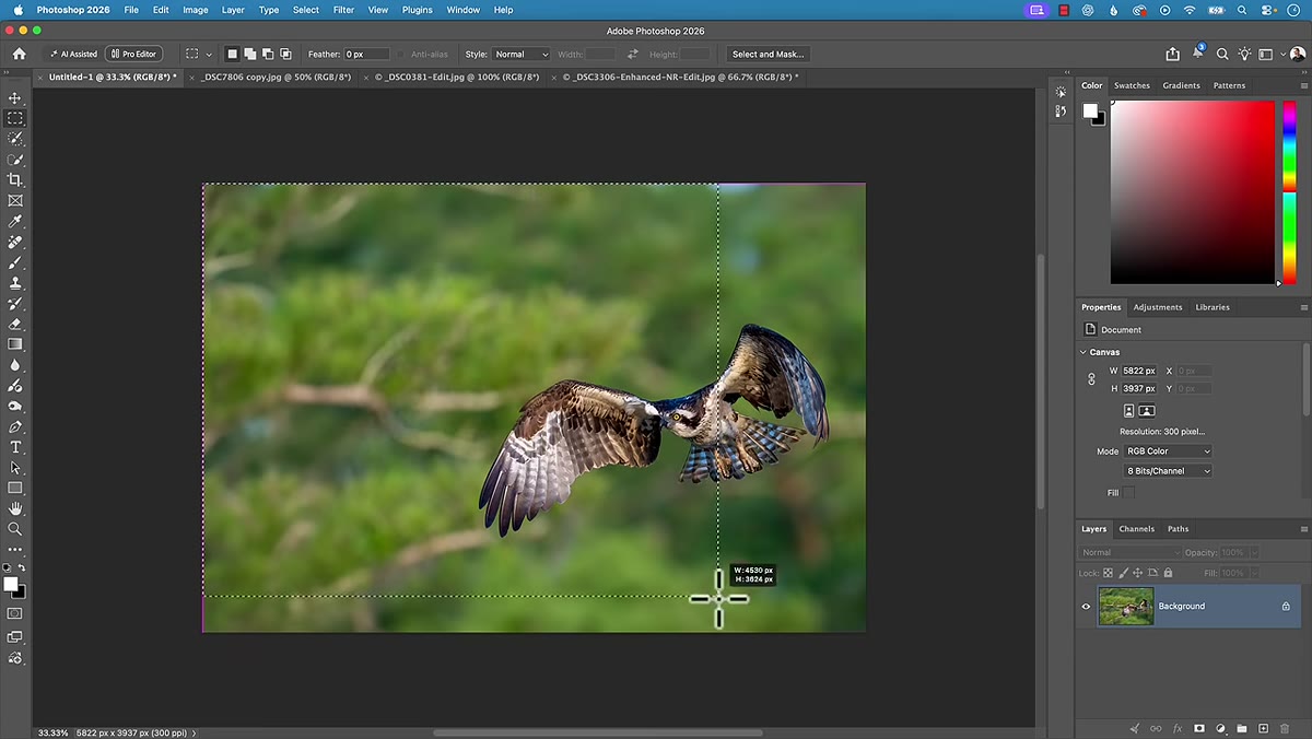 caption: Crop overlay showing nearly half the frame as empty space
The most common framing mistake Kloskowski flags is one that starts with good intentions. Photographers learn early that you should leave space in front of a moving subject, so an animal walking left gets more room on the left side of the frame. That’s correct. The problem is when people take it too far and leave nearly half the frame as empty air.
He pulls up an osprey image in Lightroom and uses the crop tool to show that roughly half the photo is void. The fix is not to squeeze the subject into the center, but to bring that leading space down to something more like a third of the frame. The subject should feel like it has room to breathe, not like it’s drowning in negative space.
Step 3: Adjust the Crop So the Visual Weight Falls Closer to the Subject
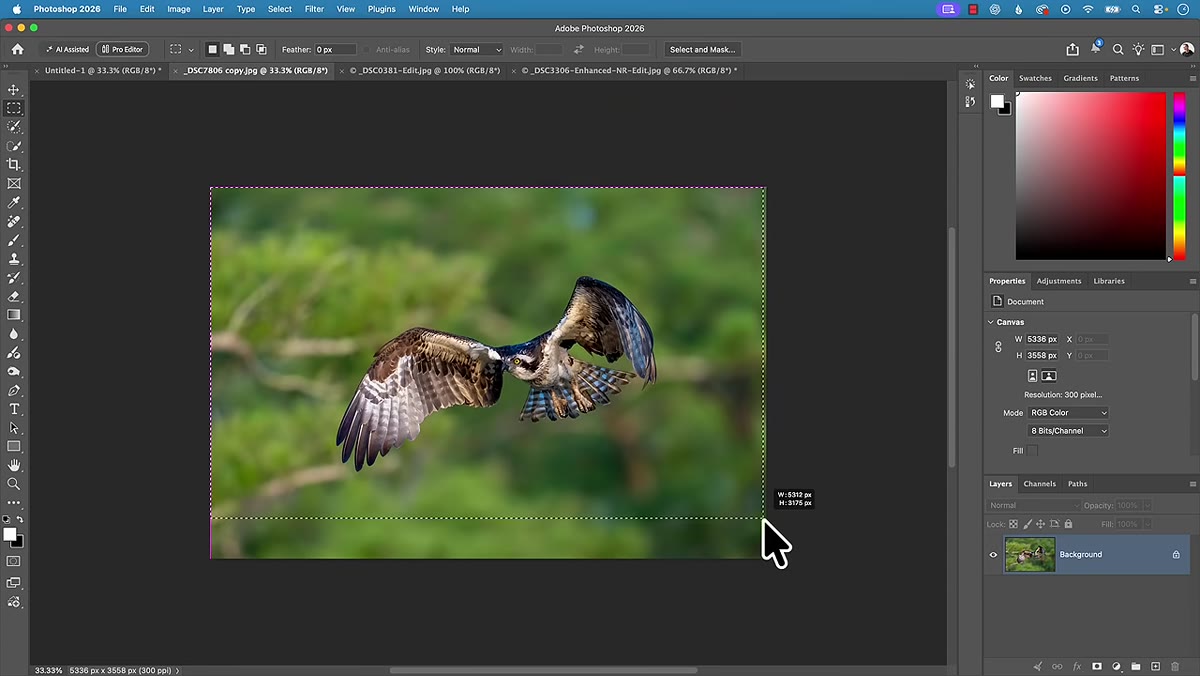 caption: Repositioned crop bringing osprey’s beak toward frame center
After showing the problem, Kloskowski demonstrates the corrected crop on the osprey shot. He moves the frame so the bird’s beak and eye sit closer to the natural focal point of the image. Even though it still looks like there’s roughly equal space on either side at a glance, there’s actually meaningfully more room in front of the bird than behind it.
In Lightroom, use the crop overlay (press R to open it) and drag the frame edges manually rather than relying on preset ratios. Hold Shift while dragging if you want to constrain proportions. The goal is for the leading space to feel intentional, not accidental.
Step 4: Catch the Opposite Problem - Crops That Feel Claustrophobic
 caption: Tight crop with animal pressed uncomfortably against frame edge
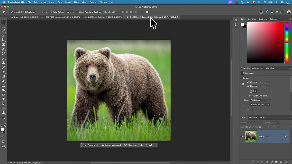
After spending time on the too-much-space problem, Kloskowski flips it. He shows examples where the subject is cropped so tightly that it feels physically uncomfortable to look at, like the animal is about to bump its nose on the edge of the photo. There’s no technical measurement for this. It’s a visual and emotional reaction, and training yourself to notice it is the whole skill.
His corrected version pulls back just enough to let the subject exist in the frame without that tension. A little breathing room on all sides, slightly more in front than behind, is the target. If you’re printing to a specific size, you’ll need to work within a fixed aspect ratio, but within those constraints the same principle applies: the edges of the frame should not feel like a wall the animal is about to run into.
Step 5: Treat Vertical Formats as a Real Option, Not a Last Resort
 caption: Matt suggesting a 4x5 vertical reframe for a flying bird shot
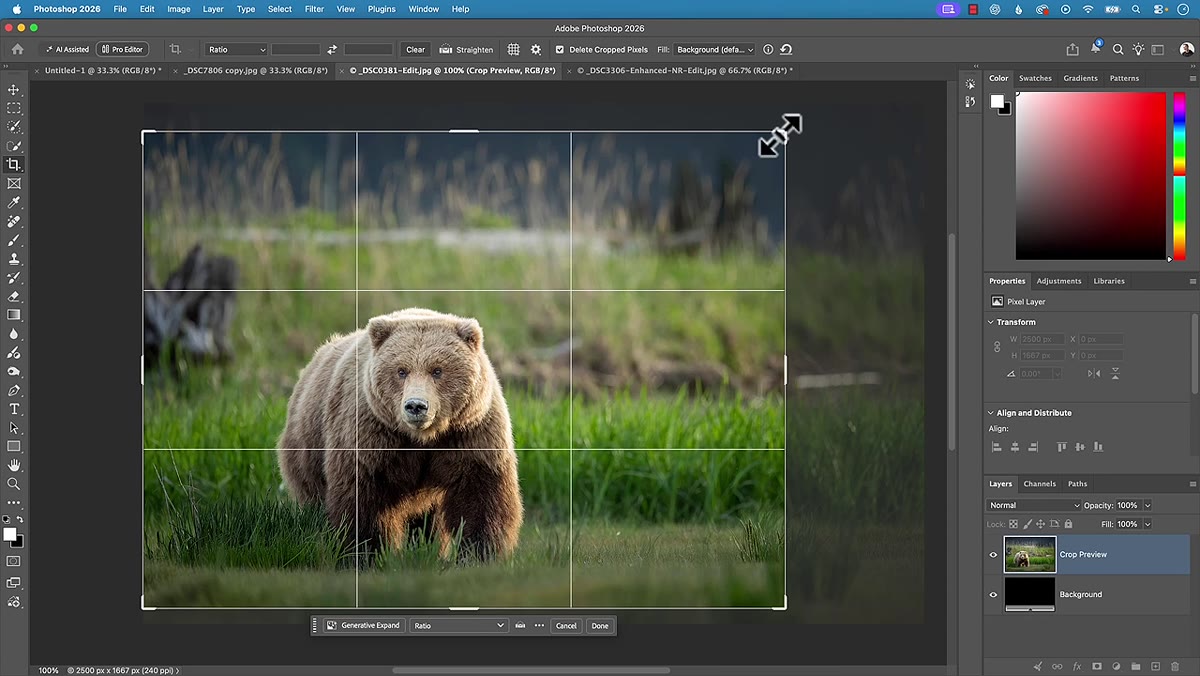
One of the more practical suggestions Kloskowski drops, almost as an aside, is that a vertical or near-square crop often solves framing problems that feel unsolvable in a horizontal format. He mentions a 4x5 or 5x4 ratio specifically for a shot of a bird in flight where the horizontal frame was creating too much dead space on one side.
Photographers, especially those used to shooting in landscape orientation, often mentally lock themselves into horizontal crops. But if the subject is tall, or if the leading space problem is happening on a horizontal axis, rotating your crop orientation can immediately fix the balance. In Lightroom’s crop tool, click the aspect ratio lock and manually type in a vertical ratio, or just grab the corner handles and reshape the frame freely.
My Take: The Creative Discomfort Test
Here’s something I’ve started doing that I didn’t see covered in the tutorial but pairs directly with what Kloskowski teaches. After I finalize a crop, I flip the image horizontally using the Transform panel in Lightroom, just temporarily. Because my brain has been staring at the original orientation, mirroring it makes the composition feel new again, and framing problems that I had stopped seeing suddenly become obvious. If the flipped version looks fine but the original feels off, that’s a signal worth investigating before you export.
The other thing I’ll add is that Kloskowski’s point about creative subjectivity is not an excuse to skip getting feedback. The best thing I ever did for my editing eye was post unfinished edits in a small, honest group and ask specifically what felt wrong. Not “what do you think,” but “what’s bothering you.” The specificity of the question gets you specific answers.
The single most useful thing to take from this tutorial is deceptively simple: the amount of space you leave around your subject communicates intention, and right now your crops are probably either too tight or too loose. Getting that balance right does more for a wildlife image than any amount of slider work in the HSL panel.
Watch the full tutorial on YouTube to see all five mistakes demonstrated on real images, and check out Matt Kloskowski’s full Lightroom for Wildlife Photographers course at mattk.com if you want to go deeper on the complete workflow.
Comments (1)
I keep coming back to this article. It's that useful.
Leave a Comment