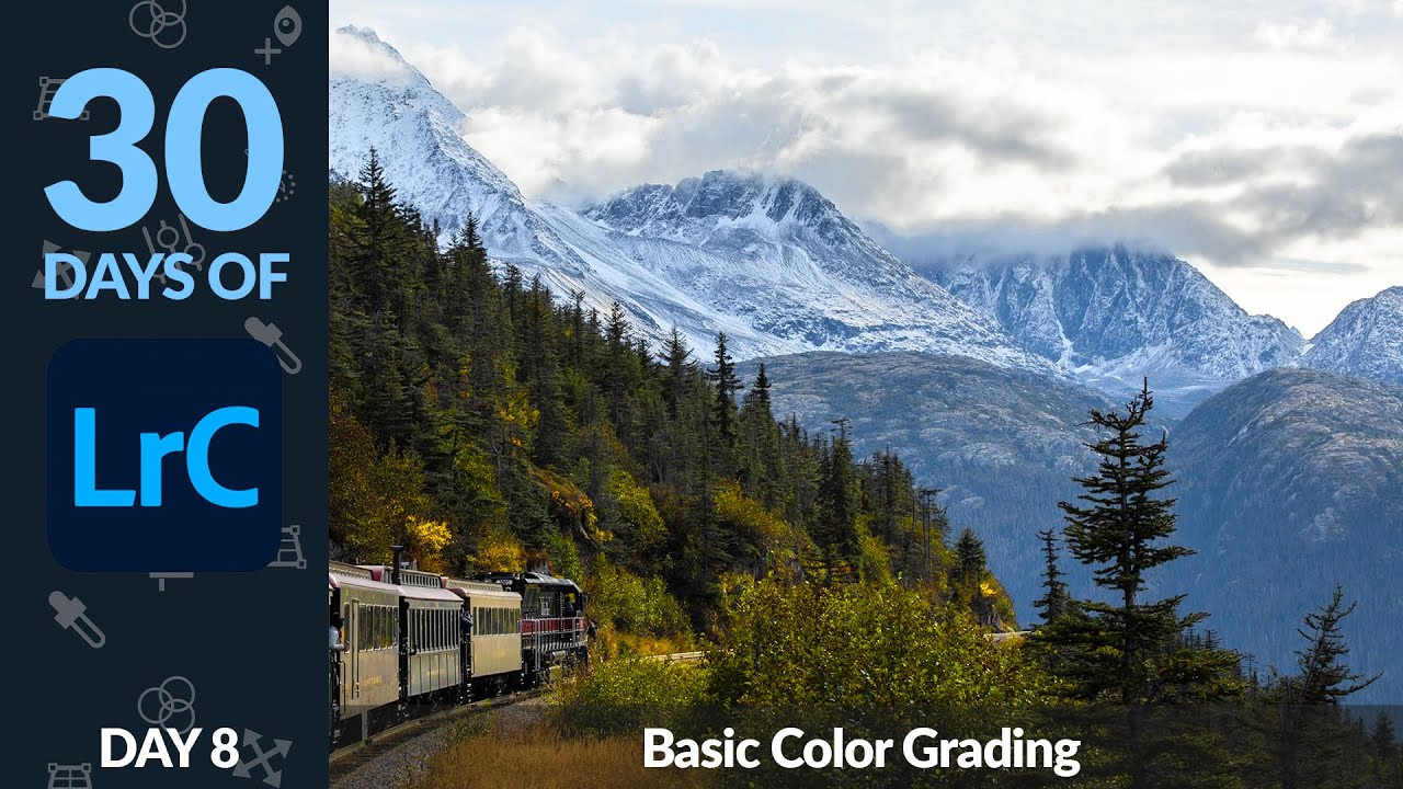
Every time I hand off an edited landscape or portrait to a client, I think about how badly my early work would have embarrassed me. Back when I was cutting my teeth on Lightroom, editing my band’s press shots in a Nashville apartment at midnight, I treated color like a single dial. Warm it up, crank the vibrance, call it done. The results looked like a sunset filter threw up on a perfectly decent photo.
The truth is that great color grading isn’t about pushing one slider to the right. It’s about treating each color in your image as its own adjustable element, with its own hue, saturation, and luminance. That’s exactly what Aaron Nace breaks down in this Day 8 installment of his 30 Days of Lightroom series over on PHLEARN. Watch the full tutorial on YouTube – it’s one of the cleaner explanations of the Color Mixer I’ve come across, and I want to walk through it step by step so you can follow along in your own edits.
The sample image Aaron uses is a nature shot with distinct yellows in the trees, greens throughout, and blue sky above. It’s a perfect test case because those three color families often fight each other when you try to edit them as a group. Here’s how he handles it.
Step 1: Start With Auto – Then Understand What It Actually Did
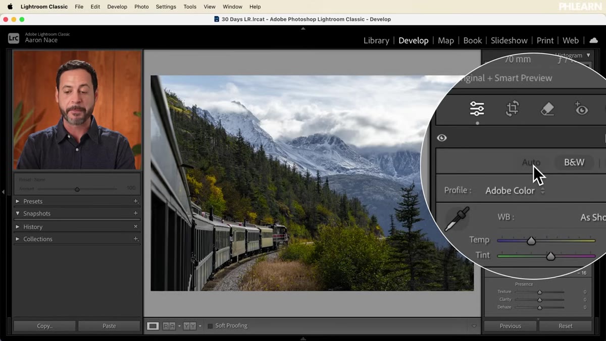 Auto button clicked, histogram shifting with tonal adjustments
Before touching any color tools, Aaron clicks the Auto button in the Basic panel. This isn’t a lazy move. It’s strategic. Auto makes a solid first pass at exposure, highlights, and shadows, pulling more detail out of the image before you start messing with color. Think of it as leveling the playing field.
Auto button clicked, histogram shifting with tonal adjustments
Before touching any color tools, Aaron clicks the Auto button in the Basic panel. This isn’t a lazy move. It’s strategic. Auto makes a solid first pass at exposure, highlights, and shadows, pulling more detail out of the image before you start messing with color. Think of it as leveling the playing field.
What’s worth noting here is that Auto also moves the Vibrance slider, sometimes significantly. That matters because vibrance adjustments affect the whole image at once. Before you go any further, scroll to the bottom of the Basic panel and take note of where your Vibrance and Saturation sliders landed after the Auto adjustment. You’ll be resetting these to zero in the next step.
Step 2: Zero Out Vibrance and Saturation
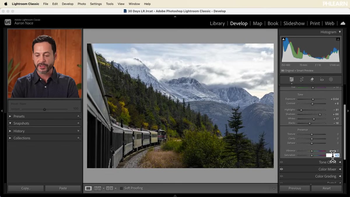 Vibrance and Saturation sliders being dragged back to zero
This is the move most beginners skip, and it costs them. Once you’ve seen what Auto did to your tonal range, pull Vibrance and Saturation back to zero in the Basic panel. You’re not throwing away color. You’re getting out of the way so you can add color back intentionally, one range at a time.
Vibrance and Saturation sliders being dragged back to zero
This is the move most beginners skip, and it costs them. Once you’ve seen what Auto did to your tonal range, pull Vibrance and Saturation back to zero in the Basic panel. You’re not throwing away color. You’re getting out of the way so you can add color back intentionally, one range at a time.
Global saturation is a blunt instrument. It boosts every color equally, which sounds fair until you realize your sky is now a cartoon and your greens have gone radioactive. Zeroing these out and rebuilding color through the Color Mixer gives you precision that global sliders simply can’t match.
Step 3: Set Your White Balance With Intention
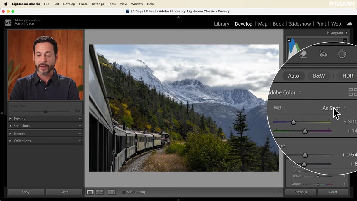 White Balance dropdown open showing preset options
With your saturation cleared, move up to the White Balance section at the top of the Basic panel. Lightroom gives you preset options like Daylight, Cloudy, and Shade – each applying a different color temperature to your image. Aaron keeps his set to As Shot here, which is a reasonable starting point if your camera’s auto white balance was reasonably accurate in the field.
White Balance dropdown open showing preset options
With your saturation cleared, move up to the White Balance section at the top of the Basic panel. Lightroom gives you preset options like Daylight, Cloudy, and Shade – each applying a different color temperature to your image. Aaron keeps his set to As Shot here, which is a reasonable starting point if your camera’s auto white balance was reasonably accurate in the field.
The two manual sliders below the preset menu are your real tools. The Temperature slider shifts your image between blue and yellow – cooler or warmer. The Tint slider handles the green-to-magenta axis. A subtle push toward warmth can make a golden-hour landscape feel more alive, while pulling slightly cool works well for overcast urban scenes. Dial these in based on the emotional tone you’re after, not just what “looks correct.”
Step 4: Open the Color Mixer and Reset It
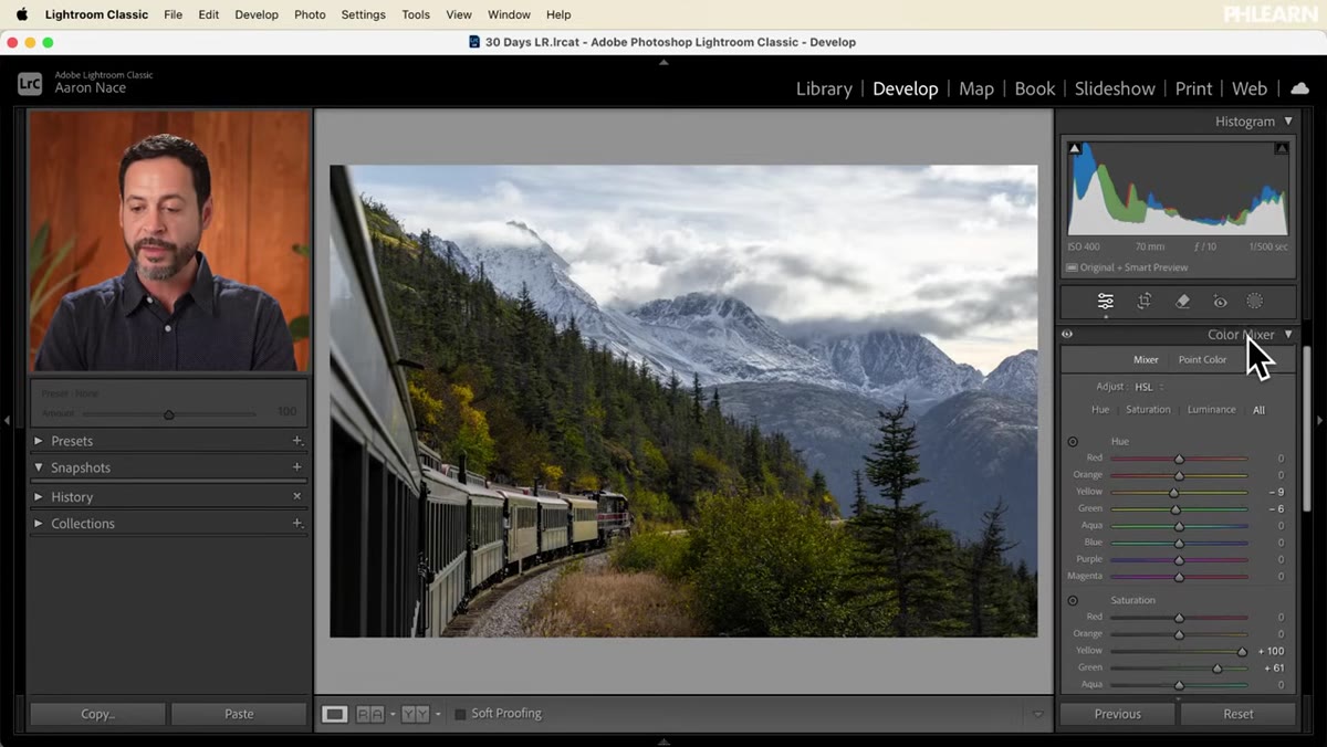 Color Mixer panel open, Mixer tab selected
Now the real work starts. Scroll down in the right panel until you find the Color Mixer. This is where individual color ranges live. You’ll see tabs for Mixer and Point Color – start with Mixer.
Color Mixer panel open, Mixer tab selected
Now the real work starts. Scroll down in the right panel until you find the Color Mixer. This is where individual color ranges live. You’ll see tabs for Mixer and Point Color – start with Mixer.
Before adjusting anything, hold Alt (Option on Mac) and click the panel header to reset the Color Mixer. Aaron does this because clicking Auto earlier may have already moved some of the individual color sliders, specifically saturation values for yellows and greens. If you skip this reset, you’re editing on top of changes you didn’t consciously make, which makes it hard to know what’s actually working.
Step 5: Choose “All” and Learn the Three Axes
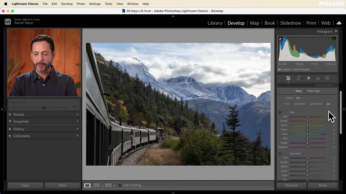 Color Mixer set to All, showing Hue, Saturation, and Luminance rows
Inside the Mixer, you can view Hue, Saturation, or Luminance independently, or switch to All to see all three rows at once. Aaron recommends All, and so do I. Seeing everything simultaneously helps you understand the relationship between the three properties as you edit.
Color Mixer set to All, showing Hue, Saturation, and Luminance rows
Inside the Mixer, you can view Hue, Saturation, or Luminance independently, or switch to All to see all three rows at once. Aaron recommends All, and so do I. Seeing everything simultaneously helps you understand the relationship between the three properties as you edit.
Here’s a quick breakdown of what each does. Hue shifts the actual color – for greens, sliding left might push them toward yellow, sliding right toward teal. Saturation controls color intensity – how much of that hue you see. Luminance controls brightness – how light or dark that color range appears, independent of its hue or saturation. Most editors focus on saturation and ignore luminance. That’s a mistake. Luminance is often what separates a professional-looking grade from one that feels slightly off.
Step 6: Use the On-Image Drag Tool, Not Just the Sliders
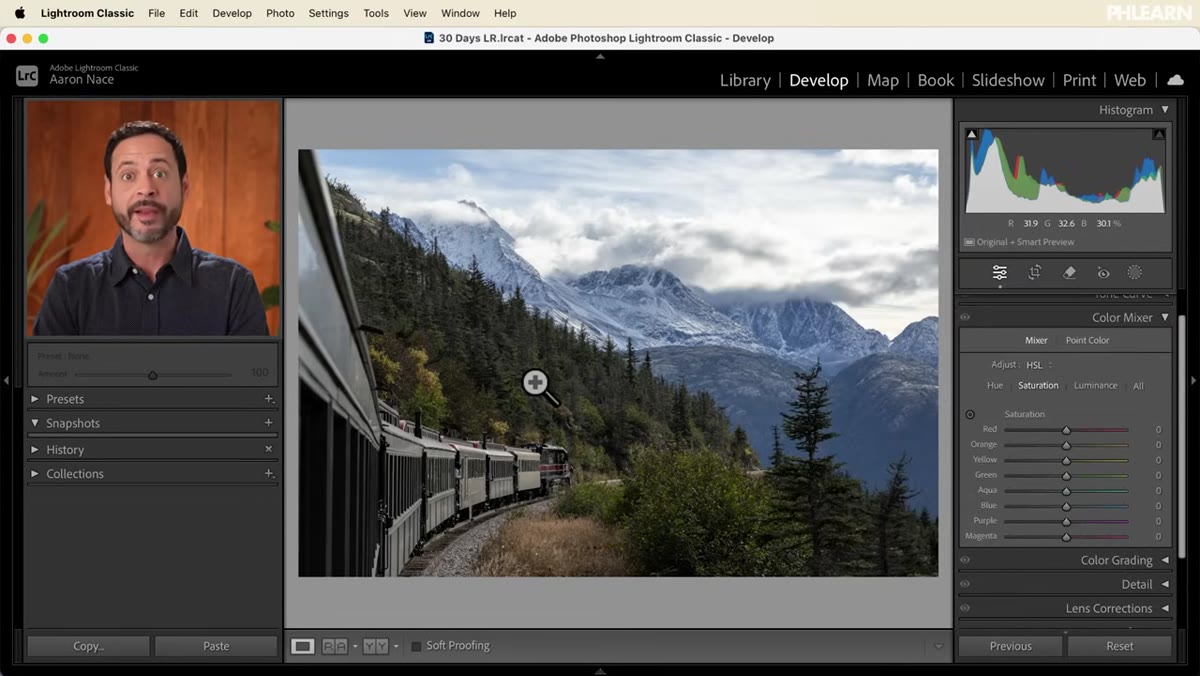 On-image adjustment tool active, cursor dragging over green trees
This is the part of Aaron’s tutorial I immediately started using in my own workflow. In the top-left corner of the Color Mixer panel, there’s a small circular icon that activates the on-image adjustment tool. Click it, then click and drag directly on your photo.
On-image adjustment tool active, cursor dragging over green trees
This is the part of Aaron’s tutorial I immediately started using in my own workflow. In the top-left corner of the Color Mixer panel, there’s a small circular icon that activates the on-image adjustment tool. Click it, then click and drag directly on your photo.
When you drag up or down on a specific area – say, the yellow trees – Lightroom detects which color ranges are under your cursor and adjusts the corresponding sliders automatically. It’s much faster than guessing which slider controls the exact shade of teal in your sky or the specific green in a subject’s jacket. You’re letting the software identify the color range, and then you’re controlling the direction and intensity of the change. It feels intuitive in a way that staring at eight sliders never quite does.
What I’d Add From My Own Experience
The Color Mixer is powerful, but it can create banding artifacts if you push individual luminance sliders too hard – especially in skies. I’ve learned to keep luminance adjustments under about 30 points in either direction unless I’m deliberately going for a stylized look. If your blues start looking patchy or your greens start separating visually from each other, ease back and check your adjustments at 1:1 zoom before exporting.
I’d also suggest naming your edited states as snapshots when you land on a color grade you like. I name mine after songs – a rich autumn landscape might become “November Rain,” a clean bright portrait might become “Here Comes the Sun.” It’s ridiculous, but I always know exactly which snapshot to come back to.
The single most important idea from this tutorial is that color grading in Lightroom works best when you stop thinking about your photo as one image and start thinking about it as a collection of color families, each with its own personality and adjustable properties. Global sliders get you in the neighborhood. The Color Mixer gets you to the right door.
Watch the full tutorial on YouTube to see Aaron walk through the Point Color panel as well, which takes individual color targeting even further than the Mixer.
Comments (1)
Love how you break down complex stuff into manageable steps.
Leave a Comment