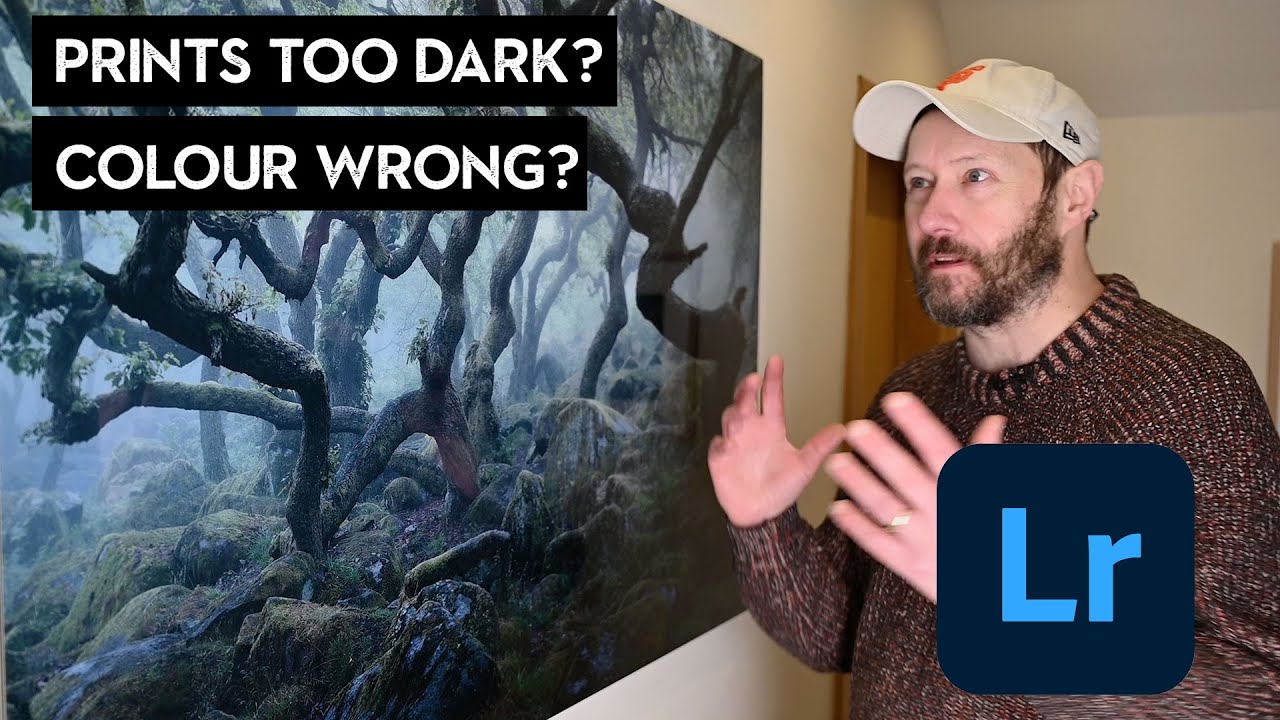
Printing your own work should feel like a reward. You spent hours getting the edit right, the colors are dialed in, the tones sit exactly where you want them. Then the print comes back and it looks like it was processed in a different decade. I used to think this was just the cost of printing, something you accepted like buffering on a slow internet connection. Turns out, it’s almost entirely a workflow problem, and it’s fixable.
Watch the full tutorial on YouTube
In this Nigel Danson tutorial on preparing Lightroom images for print, the whole thing clicked for me in a way that years of trial-and-error never managed. Danson frames it the way good teachers do: here’s what’s actually happening under the hood, and here’s what you do about it. Whether you’re sending files to a professional lab or printing at home, the same logic applies. Here’s how the workflow breaks down.
Step 1: Understand What Lightroom Is Actually Doing With Color
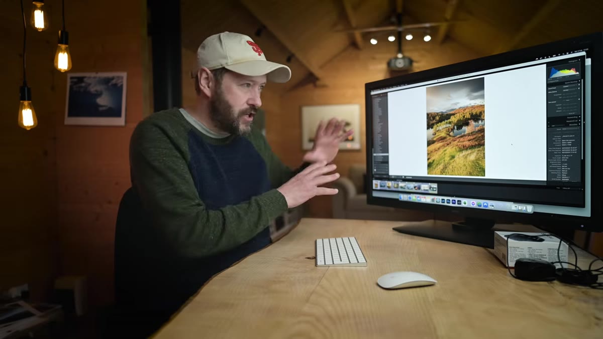 Diagram showing ProPhoto RGB vs Adobe RGB vs sRGB color spaces
Lightroom works in ProPhoto RGB, full stop. You cannot change it, you cannot opt out of it, and honestly you wouldn’t want to. ProPhoto RGB is a massive color space that holds onto all the information your camera captured. The problem is that your monitor can only display a fraction of that, roughly in the Adobe RGB range, sometimes a little less. So what you’re seeing on screen is already a compromise. When you send a file to a printer or a lab, you’re introducing a third interpreter, the paper and printer combination, which has its own color profile. Every step in that chain is a translation, and mistranslations are where your colors fall apart.
Diagram showing ProPhoto RGB vs Adobe RGB vs sRGB color spaces
Lightroom works in ProPhoto RGB, full stop. You cannot change it, you cannot opt out of it, and honestly you wouldn’t want to. ProPhoto RGB is a massive color space that holds onto all the information your camera captured. The problem is that your monitor can only display a fraction of that, roughly in the Adobe RGB range, sometimes a little less. So what you’re seeing on screen is already a compromise. When you send a file to a printer or a lab, you’re introducing a third interpreter, the paper and printer combination, which has its own color profile. Every step in that chain is a translation, and mistranslations are where your colors fall apart.
The key thing to understand before you touch any export settings is this: you’re not color grading a final file, you’re handing off instructions that another device has to interpret. Getting those instructions right is the whole game.
Step 2: Recognize Which Colors Are Most at Risk
 Visual comparison of color space differences with greens highlighted
Danson points out something that matches what I’ve seen in my own work: greens are the first casualty when color spaces shift. If you’ve ever printed a landscape and the foliage came back looking flat, muddy, or slightly wrong in a way you couldn’t quite name, that’s almost certainly a color space translation problem. The difference between ProPhoto RGB and sRGB can be dramatic in the green channel, and most online printing services default to sRGB.
Visual comparison of color space differences with greens highlighted
Danson points out something that matches what I’ve seen in my own work: greens are the first casualty when color spaces shift. If you’ve ever printed a landscape and the foliage came back looking flat, muddy, or slightly wrong in a way you couldn’t quite name, that’s almost certainly a color space translation problem. The difference between ProPhoto RGB and sRGB can be dramatic in the green channel, and most online printing services default to sRGB.
This is worth keeping in mind as you look at your image before exporting. If there are saturated greens, teal shadows, or any highly chromatic colors that your edit depends on, those are the areas where a wrong export setting will hurt you most. Flag them mentally so you can check the proof before committing to a full print run.
Step 3: Know Your Output Destination Before You Export Anything
 Nigel discussing different print locations around his house
This sounds obvious, but it changes everything. Printing at home on your own inkjet printer is a completely different workflow from sending files to a professional lab like White Wall or a local print shop. Home printers let you use soft proofing inside Lightroom with the printer’s specific ICC profile. Labs give you their own export specs, usually a specific color space, a resolution requirement, and sometimes a file size cap.
Nigel discussing different print locations around his house
This sounds obvious, but it changes everything. Printing at home on your own inkjet printer is a completely different workflow from sending files to a professional lab like White Wall or a local print shop. Home printers let you use soft proofing inside Lightroom with the printer’s specific ICC profile. Labs give you their own export specs, usually a specific color space, a resolution requirement, and sometimes a file size cap.
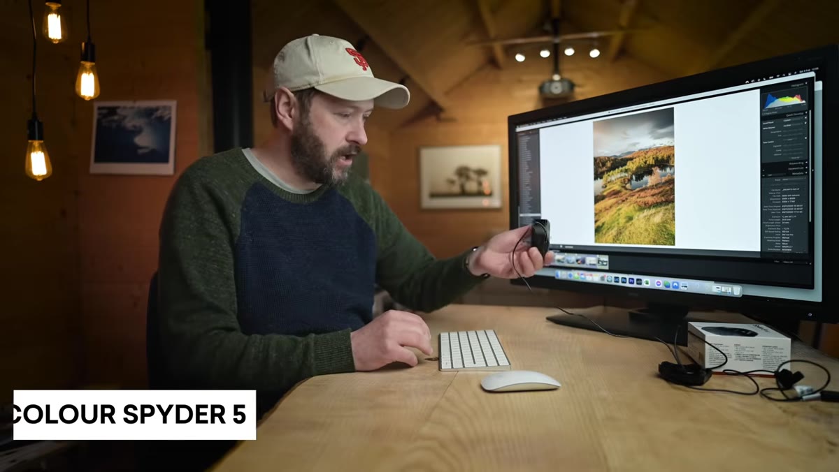
Before you open the export dialog, know the answer to two questions: who is printing this, and what are their specs? If you’re printing at home, download the ICC profile for your exact paper and printer combination from the manufacturer’s website. If you’re using a lab, check their FAQ or submission guidelines. Most good labs publish exactly what they want. Working backward from the output is the move.
Step 4: Use Soft Proofing to See What the Printer Will See
 Lightroom Develop module with soft proofing panel active
Soft proofing is Lightroom’s way of simulating how your image will look when processed through a specific ICC profile. You activate it in the Develop module by pressing S, and then you load the ICC profile for your printer or paper. Lightroom will show you a simulated version of what the output will look like, including any colors that fall outside the printable range, which show up as gamut warnings.
Lightroom Develop module with soft proofing panel active
Soft proofing is Lightroom’s way of simulating how your image will look when processed through a specific ICC profile. You activate it in the Develop module by pressing S, and then you load the ICC profile for your printer or paper. Lightroom will show you a simulated version of what the output will look like, including any colors that fall outside the printable range, which show up as gamut warnings.
When you see those warnings, you have two options: make a copy of the image specifically adjusted for that profile, or accept that some detail will be lost in translation. I almost always make a print-specific copy. It takes ten minutes and the difference between a proofed and an unproofed print is the difference between a photo you hang on the wall and one you stuff in a drawer. Danson mentions doing exactly this, keeping his prints on walls rather than in storage, and the soft proofing step is what makes that possible without disappointment.
Step 5: Configure the Export Dialog for Print
 Lightroom export dialog open with file settings visible
When you’re ready to export, go to File, Export, and work through the settings in order. For a professional lab, the typical setup is TIFF or high-quality JPEG depending on what the lab requests, Adobe RGB as the color space unless they specifically ask for sRGB, and a resolution of 300 PPI. Do not resize unless the lab asks you to, and do not sharpen for screen, choose sharpen for matte or glossy paper depending on your media.
Lightroom export dialog open with file settings visible
When you’re ready to export, go to File, Export, and work through the settings in order. For a professional lab, the typical setup is TIFF or high-quality JPEG depending on what the lab requests, Adobe RGB as the color space unless they specifically ask for sRGB, and a resolution of 300 PPI. Do not resize unless the lab asks you to, and do not sharpen for screen, choose sharpen for matte or glossy paper depending on your media.
For home printing, the workflow is slightly different because you’re handling the color management yourself in the print driver rather than in Lightroom. In that case, export without color management adjustments and let the printer driver handle the ICC profile conversion. The main thing you want to avoid is double-converting, applying an ICC profile in Lightroom and then letting the printer driver apply it again. That’s a fast route to a color disaster.
Step 6: Match Your Sharpening to Your Print Size
 Export dialog sharpening options for print output
Lightroom’s output sharpening for print is more useful than most people give it credit for. The amount of sharpening you need scales with print size and paper type. A small print on glossy paper needs less sharpening than a large print on matte or fine art paper, which absorbs ink and can soften detail. Set the sharpening to match what you’re actually printing on, and if you’re unsure, start with Standard and run a small test print before committing to a large format.
Export dialog sharpening options for print output
Lightroom’s output sharpening for print is more useful than most people give it credit for. The amount of sharpening you need scales with print size and paper type. A small print on glossy paper needs less sharpening than a large print on matte or fine art paper, which absorbs ink and can soften detail. Set the sharpening to match what you’re actually printing on, and if you’re unsure, start with Standard and run a small test print before committing to a large format.
One Thing Danson Doesn’t Say (But His Workflow Implies)
Build a print preset for every paper and printer combination you use regularly. I have a handful of export presets named after albums, because that’s how my brain works, and each one has the right color space, resolution, and sharpening already configured for a specific output. The first time you set up an export for a new paper or a new lab takes thought. Every time after that should take about four seconds.
The single most important thing this tutorial reinforced for me is that printing problems are almost never Lightroom problems. They’re translation problems between color spaces, and the fix is understanding which color space your output device expects and giving it exactly that. Get that right and your prints stop being a disappointment and start being the reason you have blank wall space in the first place.
Watch the full tutorial on YouTube
Comments
Leave a Comment