Every preset pack I’ve ever built started the same way: me fiddling with HSL sliders in Lightroom, convincing myself I could get exactly the tone I wanted if I just pushed the Aqua Luminance a little further. Sometimes it worked. Usually it didn’t. The controls in Lightroom are powerful, but they’re also a ceiling, and for years I bumped my head against that ceiling without realizing there was a door in it.
Profiles changed that. When Adobe added them to Lightroom and Camera Raw in early 2018, it opened up a completely different way of thinking about color grading, one that borrows from the world of video production and gives photographers access to tools that slider-based presets simply cannot replicate. I kept hearing about the technique but couldn’t find a clear walkthrough until I watched this tutorial from Matt Kloskowski. Watch the full tutorial on YouTube. What follows is my breakdown of his process, with enough detail that you can work through it without pausing the video every thirty seconds.
Fair warning: this is not a beginner topic. If you’re not sure what a Lightroom profile is or how it differs from a preset, get that foundation first. But if you’ve been editing long enough to feel frustrated by what Lightroom’s sliders can’t do, this is exactly where to go next.
Step 1: Understand Why LUTs Beat Sliders for Profile Creation
 Matt explaining why LUTs offer more control than sliders
Before touching any software, it helps to understand the logic here. You can technically create a Lightroom profile using nothing but Lightroom’s own sliders and then export it. But that approach defeats the purpose. The whole reason to build a custom profile is to get access to color adjustments that Lightroom and Camera Raw don’t natively offer, things like precise color mapping, blend mode-level control over luminance versus color, and the kind of deep hue manipulation that the HSL panel can only approximate.
Matt explaining why LUTs offer more control than sliders
Before touching any software, it helps to understand the logic here. You can technically create a Lightroom profile using nothing but Lightroom’s own sliders and then export it. But that approach defeats the purpose. The whole reason to build a custom profile is to get access to color adjustments that Lightroom and Camera Raw don’t natively offer, things like precise color mapping, blend mode-level control over luminance versus color, and the kind of deep hue manipulation that the HSL panel can only approximate.
LUTs, or Look-Up Tables, originated in video production as a way to map one set of color values to another. Think of a LUT as a translation key: every color that goes in gets assigned a specific color that comes out. That translation can be as simple or as complex as you want, and it gives you finer control over tone and color relationships than dragging a slider ever could.
Step 2: Open Photoshop and Add a Color Lookup Adjustment Layer
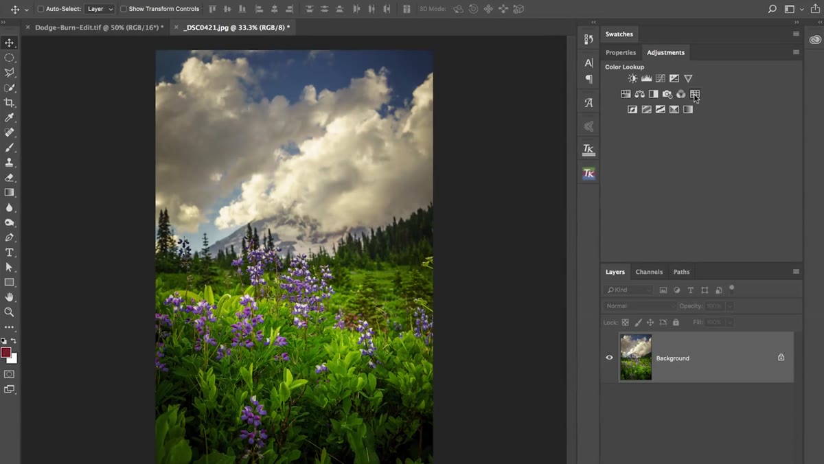 Photoshop adjustments panel with Color Lookup selected
Open Photoshop and load any photo you want to use as a reference image while you work. From the Adjustments panel, add a Color Lookup Table adjustment layer. Photoshop ships with a solid collection of built-in LUTs, and these are worth exploring before you start building your own. Kloskowski singles out “Crisp Warm” as a personal go-to, and it’s a good one to start with because the effect is noticeable without being heavy-handed.
Photoshop adjustments panel with Color Lookup selected
Open Photoshop and load any photo you want to use as a reference image while you work. From the Adjustments panel, add a Color Lookup Table adjustment layer. Photoshop ships with a solid collection of built-in LUTs, and these are worth exploring before you start building your own. Kloskowski singles out “Crisp Warm” as a personal go-to, and it’s a good one to start with because the effect is noticeable without being heavy-handed.
At this stage you’re not just applying a look, you’re studying one. Pay attention to what the LUT does to highlights versus shadows, and how it shifts skin tones or sky colors. This is the same mechanism you’ll use when you build something from scratch.
Step 3: Modify the Blend Mode to Isolate Color from Luminance
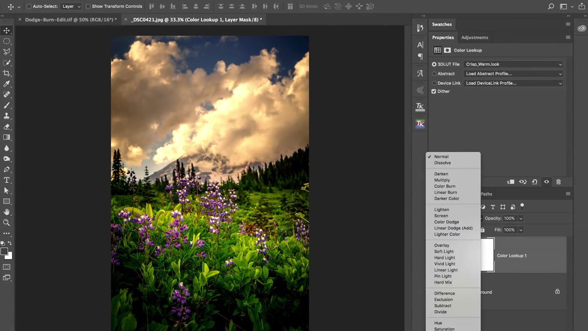 Blend mode dropdown set to Color on the adjustment layer
Here’s where things get genuinely interesting, and where profiles start doing things presets never could. Once you’ve applied a Color Lookup adjustment layer, change its blend mode from Normal to Color in the Layers panel dropdown. This tells Photoshop to apply only the color shift from the LUT, not any luminance or contrast changes it would otherwise introduce.
Blend mode dropdown set to Color on the adjustment layer
Here’s where things get genuinely interesting, and where profiles start doing things presets never could. Once you’ve applied a Color Lookup adjustment layer, change its blend mode from Normal to Color in the Layers panel dropdown. This tells Photoshop to apply only the color shift from the LUT, not any luminance or contrast changes it would otherwise introduce.
The practical effect is a cleaner, more targeted grade. You’re shifting hues and saturation without accidentally crushing your blacks or lifting your highlights. When you later export this as a LUT and bring it into Lightroom as a profile, that blend mode behavior travels with it. You’re essentially giving Lightroom a capability it doesn’t have natively. That’s the whole game.
Step 4: Export the LUT File from Photoshop
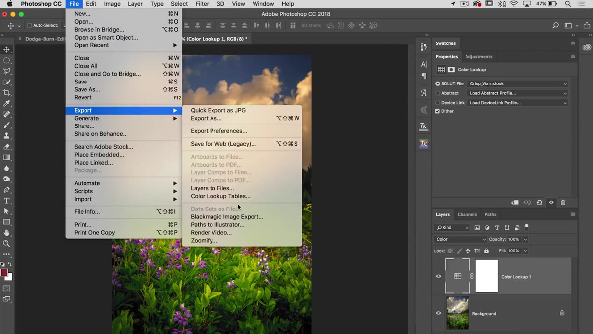 File menu open with Export option highlighted
Once your adjustment layer is set up the way you want it, go to File, then Export, and look for the option to export as a Color Lookup Table. Photoshop will give you a dialog with format options. The format you want is .cube, which is the standard LUT format that Lightroom and Camera Raw can read. Name the file something you’ll recognize, and save it somewhere logical.
File menu open with Export option highlighted
Once your adjustment layer is set up the way you want it, go to File, then Export, and look for the option to export as a Color Lookup Table. Photoshop will give you a dialog with format options. The format you want is .cube, which is the standard LUT format that Lightroom and Camera Raw can read. Name the file something you’ll recognize, and save it somewhere logical.
Keep your LUT files organized from day one. I keep mine sorted by project and named after the edit style rather than the date, which saves me from staring at a folder full of “LUT_final_v3_REAL_FINAL.cube” files later on. A little discipline here pays off the moment you start accumulating a library.
Step 5: Package the LUT as a Lightroom or Camera Raw Profile
 Overview of LUT-to-profile conversion process explained
A .cube file on its own isn’t a Lightroom profile. To get it there, you need to package it using the Adobe DNG Profile Editor, a free utility from Adobe that’s been around for a while but doesn’t get nearly enough attention. Inside the Profile Editor, you can import your .cube file, assign it a name and category, and then export it as a .dcp file, which is the actual profile format that Lightroom and Camera Raw recognize.
Overview of LUT-to-profile conversion process explained
A .cube file on its own isn’t a Lightroom profile. To get it there, you need to package it using the Adobe DNG Profile Editor, a free utility from Adobe that’s been around for a while but doesn’t get nearly enough attention. Inside the Profile Editor, you can import your .cube file, assign it a name and category, and then export it as a .dcp file, which is the actual profile format that Lightroom and Camera Raw recognize.
Once the .dcp is exported, drop it into the correct Lightroom profiles folder on your system. On Mac, that’s typically inside your Library folder under Application Support, Adobe, Camera Raw, and then CameraProfiles. On Windows the path runs through AppData. After you restart Lightroom, your profile will appear in the Profile Browser at the top of the Develop module’s Basic panel, ready to use just like any built-in camera profile.
A Note from My Own Workflow: Start with Subtlety
This is the part Kloskowski doesn’t say explicitly but that I’ve learned the hard way over years of building preset and profile packs. The first time you export a custom LUT and load it into Lightroom, it’s going to look too strong. Almost always. The blend mode change helps, but LUTs have a way of being more aggressive at full opacity than they appeared in Photoshop.
Build in restraint from the start. Design your LUT so that 100% opacity in Lightroom is the look you’d call “tasteful.” That gives the photographer room to dial it back using the profile Amount slider without the grade falling apart. The profiles I’ve seen get the most traction from other photographers are almost always the ones that feel like they’re doing less. They’re not. They’re just doing it quietly.
One more thing: profile effects are non-destructive and sit underneath all your slider adjustments. That means a photographer can apply your profile and still have full freedom to push their own corrections on top. Design for collaboration, not control.
The single biggest thing this technique unlocks is blend mode support inside Lightroom. That alone makes the effort worth it. If you’ve ever wished you could apply a color grade that ignores luminance, or map colors in ways the HSL panel can’t quite reach, building a LUT-based profile is how you get there.
Watch the full tutorial on YouTube to see Matt walk through the complete process, including additional methods for generating LUT source material that I didn’t cover here. His explanation of the technical side is clear without being condescending, which is rarer than it should be.
Comments (1)
This should be required reading for anyone starting out.
Leave a Comment