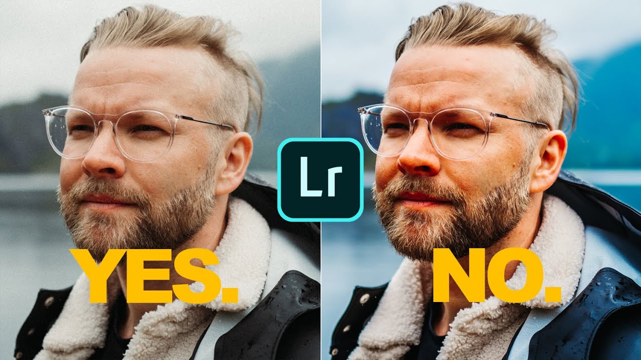
There’s a version of me from about six years ago who would have wrecked these photos. I know this because I still have the hard drives. Too much contrast, greens cranked to neon, a heavy-handed preset slapped on top like a bumper sticker. I thought volume equaled quality. I was wrong, and it took years of editing other people’s work before I figured out why my own stuff looked so processed.
That’s why Peter McKinnon’s recent tutorial landed differently than most. In this Peter McKinnon Lightroom tutorial, he walks through editing photos shot on the Leica Q2, and the most striking thing about the session is how little he actually does. The edits are surgical. Every slider move has a reason. And the whole thing quietly exposes a habit a lot of us have: editing to feel busy rather than editing to serve the image.
What follows is a step-by-step breakdown of his workflow so you can follow along in your own catalog, even if you never touch a Leica in your life. The principles apply to anything.
Step 1: Evaluate What the Camera Already Gave You
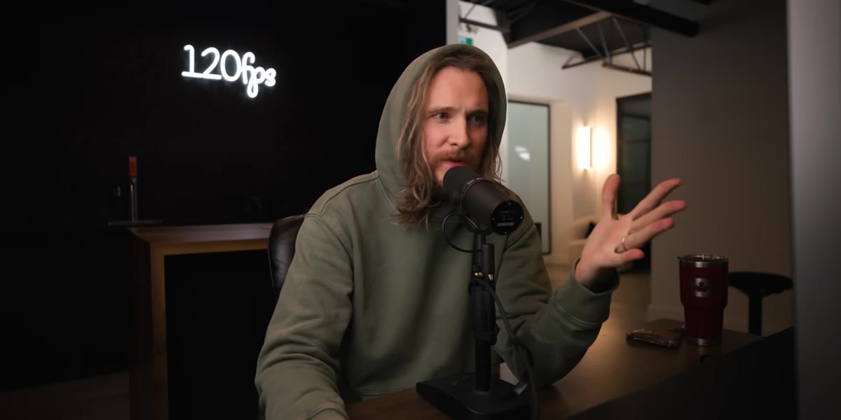 Peter reviewing unedited Leica Q2 photo in Lightroom
Before touching a single slider, McKinnon makes a point that deserves to be heard twice: good cameras produce good files, and good files don’t need to be rebuilt from scratch. He notes that images from the Q2 come out sharp, clean, and with a natural rendering that heavy editing can actually degrade.
Peter reviewing unedited Leica Q2 photo in Lightroom
Before touching a single slider, McKinnon makes a point that deserves to be heard twice: good cameras produce good files, and good files don’t need to be rebuilt from scratch. He notes that images from the Q2 come out sharp, clean, and with a natural rendering that heavy editing can actually degrade.
The practical takeaway here is to spend thirty seconds just looking at your raw file before you reach for anything. Ask what’s already working. Ask what specifically bothers you, not what you could theoretically improve. This question alone will save you from adding fake contrast to a photo that already has beautiful natural contrast.
Step 2: Crop With Intention Before You Color Grade
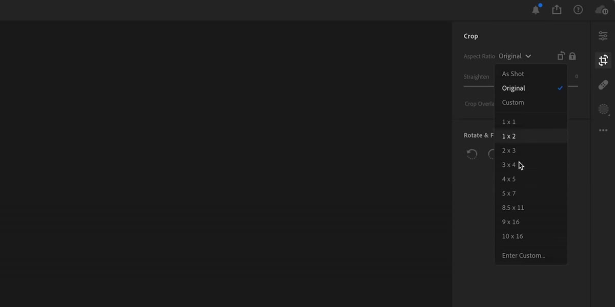 Cropping tool open with 4x5 ratio selected in Lightroom
McKinnon starts with the crop, not the color, which is the right instinct and one that a lot of tutorials skip over. He’s working with a photo taken from an elevated angle, shot through a window framed entirely by greenery, and his creative goal was always to center that window and fill the frame with green. He selects a 4x5 ratio, centers the window, and then crops in tighter from there to eliminate distracting wall edges at the top, left, and bottom.
Cropping tool open with 4x5 ratio selected in Lightroom
McKinnon starts with the crop, not the color, which is the right instinct and one that a lot of tutorials skip over. He’s working with a photo taken from an elevated angle, shot through a window framed entirely by greenery, and his creative goal was always to center that window and fill the frame with green. He selects a 4x5 ratio, centers the window, and then crops in tighter from there to eliminate distracting wall edges at the top, left, and bottom.
The lesson is compositional clarity before tonal work. If your crop is going to change the mood of the image, make that call first. Color grading an image you’re about to crop significantly is wasted effort, and worse, it can make you fall in love with a version of the photo you’re then reluctant to reframe.
Step 3: Open the HSL Panel and Fix Your Greens
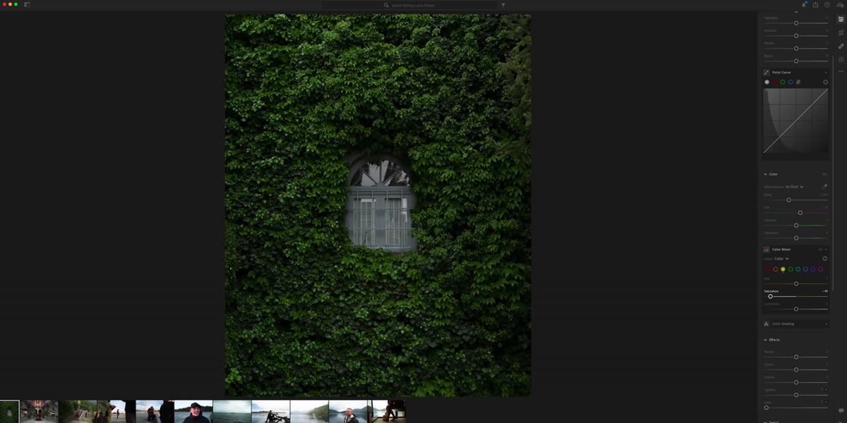 HSL panel open with green and yellow hue sliders visible
This is the move that makes the biggest difference in the photo, and it’s two slider adjustments. McKinnon opens the HSL panel (Hue, Saturation, Luminance) and targets the green channel first. The problem he’s solving is specific: greens shot in natural light often read as too yellow in camera. They look slightly jaundiced rather than lush.
HSL panel open with green and yellow hue sliders visible
This is the move that makes the biggest difference in the photo, and it’s two slider adjustments. McKinnon opens the HSL panel (Hue, Saturation, Luminance) and targets the green channel first. The problem he’s solving is specific: greens shot in natural light often read as too yellow in camera. They look slightly jaundiced rather than lush.
His fix is to shift the green hue slightly toward yellow on the hue slider, then pull the saturation of that channel back a touch to let it breathe. The result is a more muted, film-adjacent green that feels intentional rather than oversaturated. If you’re working with outdoor photos, portraits in nature, or anything with significant foliage, this two-step HSL adjustment is worth building into your base preset. The difference between a processed-looking green and a cinematic one often lives entirely in this panel.
Step 4: Add a Subtle Vignette to Anchor the Frame
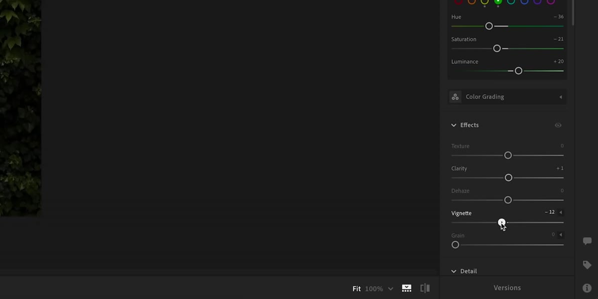 Vignette slider being adjusted in Effects panel
After the HSL work, McKinnon dials in a light vignette. This isn’t the dramatic tunnel-vision vignette from 2009 photography forums. It’s subtle enough that most viewers won’t consciously notice it, but it pulls the eye toward the center of the frame and makes the crop feel deliberate rather than accidental.
Vignette slider being adjusted in Effects panel
After the HSL work, McKinnon dials in a light vignette. This isn’t the dramatic tunnel-vision vignette from 2009 photography forums. It’s subtle enough that most viewers won’t consciously notice it, but it pulls the eye toward the center of the frame and makes the crop feel deliberate rather than accidental.
In Lightroom, the vignette lives under Effects, then Post-Crop Vignetting. Keep the amount low, somewhere in the -10 to -20 range depending on your image, and use the Feather slider to keep the falloff gradual. McKinnon uses this tool specifically because the green-filled crop could easily feel like a random section of a larger photo. The vignette signals that this framing was chosen.
Step 5: Shape Contrast With a Gentle S-Curve
 Tone Curve panel open showing a slight S-curve applied
The final tonal adjustment is a tone curve with almost no drama to it. McKinnon pulls the highlights up slightly and the shadows down slightly to create the faintest S-shape. This adds a small amount of perceived saturation and contrast without touching the saturation or contrast sliders directly, which tend to be blunter tools.
Tone Curve panel open showing a slight S-curve applied
The final tonal adjustment is a tone curve with almost no drama to it. McKinnon pulls the highlights up slightly and the shadows down slightly to create the faintest S-shape. This adds a small amount of perceived saturation and contrast without touching the saturation or contrast sliders directly, which tend to be blunter tools.
The tone curve gives you surgical control over where contrast lives in the tonal range. A soft S-curve affects the midtones the most, which is usually exactly where skin tones and natural textures sit. If you’ve never used the curve and have only used the Contrast slider, this is the week to make the switch. You’ll wonder how you edited without it.
Step 6: Use Presets as a Comparison Reference, Not a Crutch
 Preset panel open with golden hour preset previewing on hover
McKinnon briefly hovers over one of his presets, specifically a golden hour lift from a spring collection, and the hover preview shows something worth noting: it lands almost exactly where his manual edits landed. Desaturated greens, pulled-back yellows, gentle contrast. He uses this not to apply the preset, but to validate that his manual intuition was calibrated correctly.
Preset panel open with golden hour preset previewing on hover
McKinnon briefly hovers over one of his presets, specifically a golden hour lift from a spring collection, and the hover preview shows something worth noting: it lands almost exactly where his manual edits landed. Desaturated greens, pulled-back yellows, gentle contrast. He uses this not to apply the preset, but to validate that his manual intuition was calibrated correctly.
This is a smart way to use presets that most people don’t think about. Instead of applying first and tweaking second, try building your edit manually and then checking it against a preset you trust. If they’re close, you’re developing a consistent eye. If they’re wildly different, you’ll know which direction you want to go.
What I’d Add From My Own Workflow
One thing McKinnon doesn’t go into here, which I’d layer on top of this workflow, is the Calibration panel at the very bottom of the Develop module. When I’m working with greens that still feel off after HSL adjustments, shifting the Green Primary Hue slider in Calibration can give a different quality of color shift than HSL alone. It affects the raw interpretation of the file rather than a post-processing tint, so it tends to feel more organic. Try moving it just two or three points in either direction before committing to your HSL values. Sometimes the calibration fix replaces the HSL fix entirely, which means fewer adjustments and a cleaner edit.
The single most important idea in this tutorial isn’t a slider or a panel. It’s the editorial restraint behind every move McKinnon makes. Each adjustment solves one specific visual problem, and then he stops. No extra texture added, no clarity cranked, no tone thrown in because why not. That discipline is what separates photos that look like photographs from photos that look like they’ve been edited.
Watch the full tutorial on YouTube to see each adjustment in real time alongside the before and after comparisons.
Comments (5)
This is the kind of content that keeps me coming back.
Tried this technique this morning. Game changer for real.
Excellent tutorial. I'd add that from a lighting standpoint, this technique is incredibly versatile.
I keep coming back to this article. It's that useful.
Great breakdown. The step-by-step approach really helps.
Leave a Comment