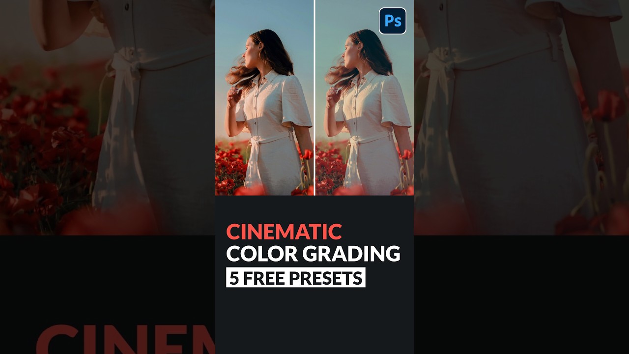
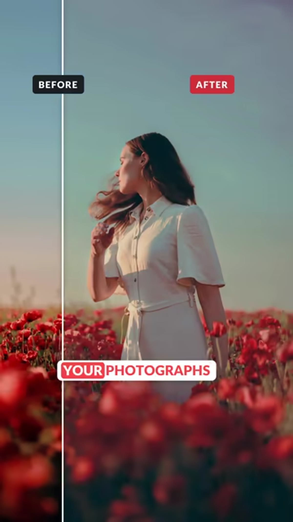
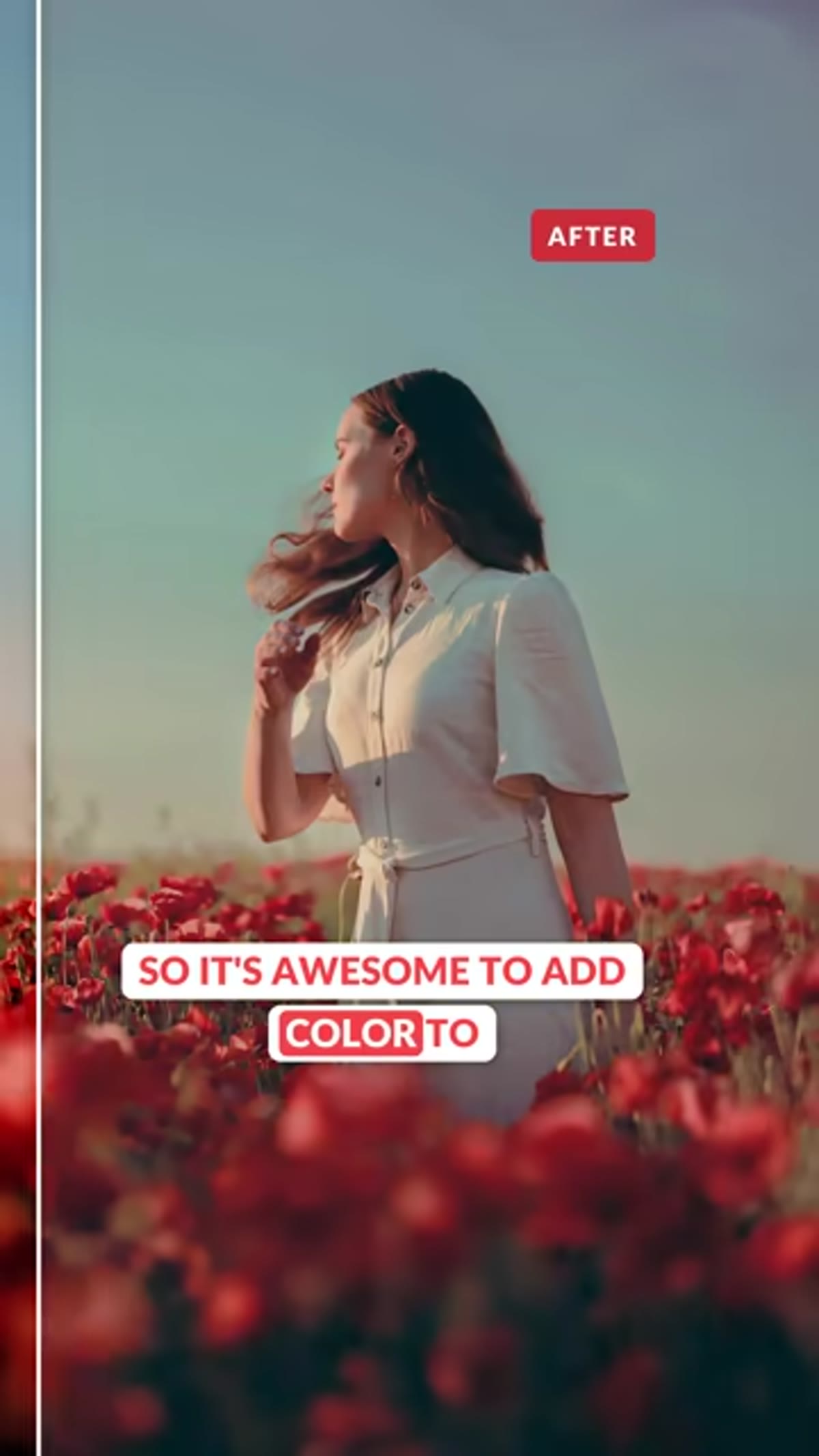
There’s a specific kind of frustration that comes from spending an hour on a color grade, finally getting that moody teal-and-orange look just right, and then noticing the subject’s face looks like they’ve got a mild case of hypothermia. I’ve been there more times than I want to admit. The shadows are perfect. The highlights are perfect. And somehow the person in the photo looks like they need a blanket and a hot drink.
The problem, almost every single time, is unprotected midtones. Skin tones live in the midtone range of a photograph, which means any color you’re pushing into shadows and highlights can creep into that zone and throw off the whole look. It’s one of those things nobody tells you when you’re first learning to color grade, and it makes an enormous difference once you understand it.
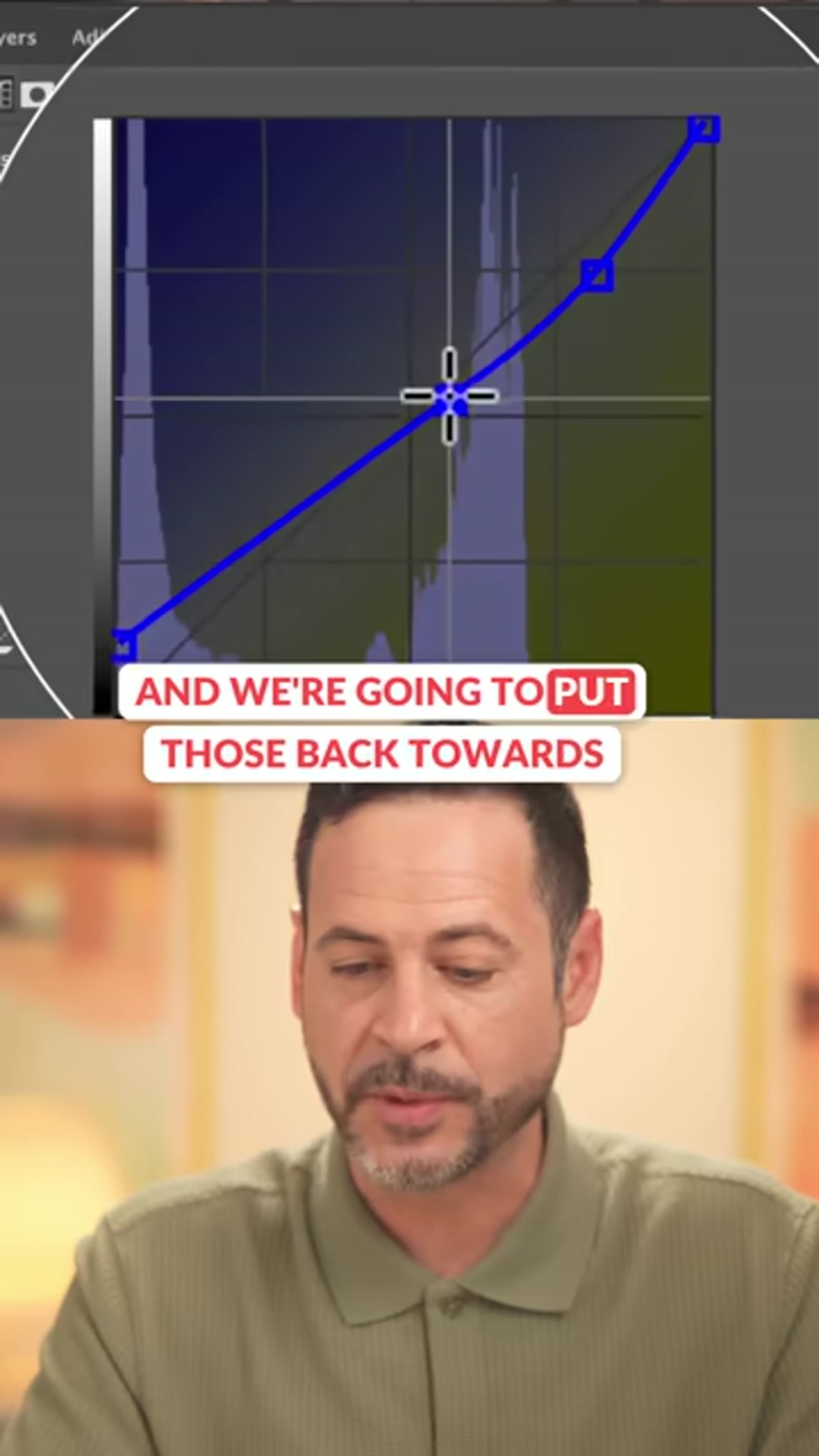
In this Aaron Nace (PHLEARN) tutorial, he breaks down the fix in about thirty seconds flat. Watch the full tutorial on YouTube – but I’ve expanded the technique below so you can follow along without pausing and rewinding.
Step 1: Open Your Image and Access the Color Grading Tool
 Color grading panel open with image showing visible skin tones
Start with an image that includes skin tones – portraits work best here, but this applies to any shot with people in it. In Photoshop, you’ll want to be working with a Color Balance or Color Grading adjustment layer. If you’re using Camera Raw or the Camera Raw Filter (Filter > Camera Raw Filter), look for the Color Grading section, which gives you dedicated wheels for shadows, midtones, and highlights.
The key thing before you touch anything is to actually look at where your subject’s skin falls tonally. For most people photographed in normal lighting, skin sits squarely in the midtone range – not the deep shadows, not the blown highlights. That’s the zone you’re about to protect.
Step 2: Add Your Color Grade to Shadows and Highlights First
 Shadow and highlight color wheels being adjusted in Color Grading panel
Go ahead and push your shadow and highlight colors wherever you want them. This is the fun part. Maybe you’re pulling the shadows toward teal and the highlights toward warm orange. Maybe you’re doing something more subtle, like a slight green push in the shadows for a cinematic feel. Do that work first, before you think about midtones.
This step matters because it gives you a clear before-and-after reference. Once your creative grade is in place, you’ll be able to see exactly how much it’s affecting skin tones – and then you’ll understand why the next step is so useful.
Step 3: Check What the Midtone Slider Is Doing
 Midtone wheel showing color shift away from center
Here’s where most people unknowingly cause the problem. When you adjust shadows and highlights in a color grading tool, the midtone wheel often shifts as a byproduct, or it stays at a neutral position that isn’t actually protecting anything. Either way, any color in the midtone wheel is directly hitting your skin tones.
Look at your midtone wheel or midtone sliders. If there’s any color cast dialed in – even a small one – it’s affecting the faces in your image. Sometimes this is intentional. Most of the time, especially if you’re doing dramatic shadow and highlight grading, it’s working against you.
Step 4: Pull the Midtone Sliders Back to Center
 Midtone slider being dragged back toward the center point
This is the core technique from Aaron’s tutorial. Take the midtone color wheel or sliders and bring them back toward the center – toward neutral. In Photoshop’s Color Grading panel, that means making sure the midtone point is sitting at zero, not drifting toward any particular hue.
What this does is create a kind of buffer zone. Your shadows can be as teal as you want. Your highlights can glow warm. But the midtones – where the skin lives – stay clean and natural. The color grade suddenly looks intentional rather than accidental, because the faces in the frame look like faces again instead of mood lighting casualties.
Step 5: Compare Before and After on the Skin Tones Specifically
 Final graded image showing clean skin tones against colored shadows and highlights
Toggle your adjustment layer on and off and look specifically at the skin, not the overall image. This is a habit worth building. It’s easy to evaluate a color grade by looking at the whole frame and thinking it looks cool. It’s harder – and more important – to isolate what’s happening to your subject’s face.
With the midtones centered, you should see that the skin retains its natural hue and luminosity while the rest of the image carries your grade. That contrast between the clean midtones and the stylized shadows and highlights is actually what makes a color grade look professional. It signals that the colorist knew what they were doing and made deliberate choices.
How I Apply This in Lightroom (and Why It Transfers Directly)
Lightroom’s Color Grading panel works on exactly the same principle – three wheels for shadows, midtones, and highlights, with a luminance slider for each. Everything Aaron demonstrates in Photoshop maps over without any translation required.
My workflow is to build the shadow and highlight look first, then explicitly zero out the midtone wheel before I do anything else. I treat it like setting a foundation. From there, if I want to add a tiny bit of warmth to midtones intentionally, I can – but I’m doing it on purpose, with a light hand, not letting it happen by accident.
One thing I’d add from my own experience: if you’re working with mixed lighting situations, like a subject near a window with cool natural light and warm practical lights in the background, your skin tones might already be fighting an uphill battle. Neutralizing the midtone wheel helps here too, but you may also want to do targeted hue adjustments (HSL panel in Lightroom, Hue/Saturation in Photoshop) to bring the orange or red channel back to a natural value. The midtone technique is the first line of defense. Targeted corrections are the cleanup crew.
Protecting skin tones during a color grade isn’t about limiting your creativity – it’s about making sure your creative choices actually land. A beautiful shadow grade means nothing if the subject’s face is reading wrong. Centering the midtone slider is the kind of small, specific adjustment that separates a grade that looks finished from one that looks like a filter was slapped on and called done.
Watch the full tutorial on YouTube to see Aaron walk through the complete color grading process, and check out the full-length version at phlearn.com where you can also download the sample images and five free presets.
Comments (1)
My workflow just got 10x faster. Not even kidding.
Leave a Comment