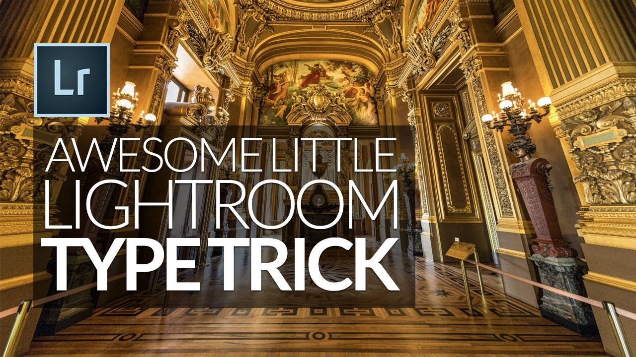
If you’ve ever tried to build a proper print layout in Lightroom and wanted to add more than a single line of text, you’ve probably hit the same wall I did. The identity plate field looks simple enough until you try to hit Return and Lightroom treats it like you just clicked OK. That’s it. Done. No line breaks, no centering, no tracking. Just a flat string of text sitting on your print like a name tag at a conference.
I kept working around it by exporting to Photoshop and adding type there, which works but adds a whole extra step every single time. Then I came across Watch the full tutorial on YouTube from Scott Kelby, and it solved the problem in a way that felt almost too obvious once I saw it. The technique is deceptively simple, and it actually layers two or three smaller tricks on top of each other, which is why it’s worth breaking down fully.
Step 1: Enable the Identity Plate in the Print Module
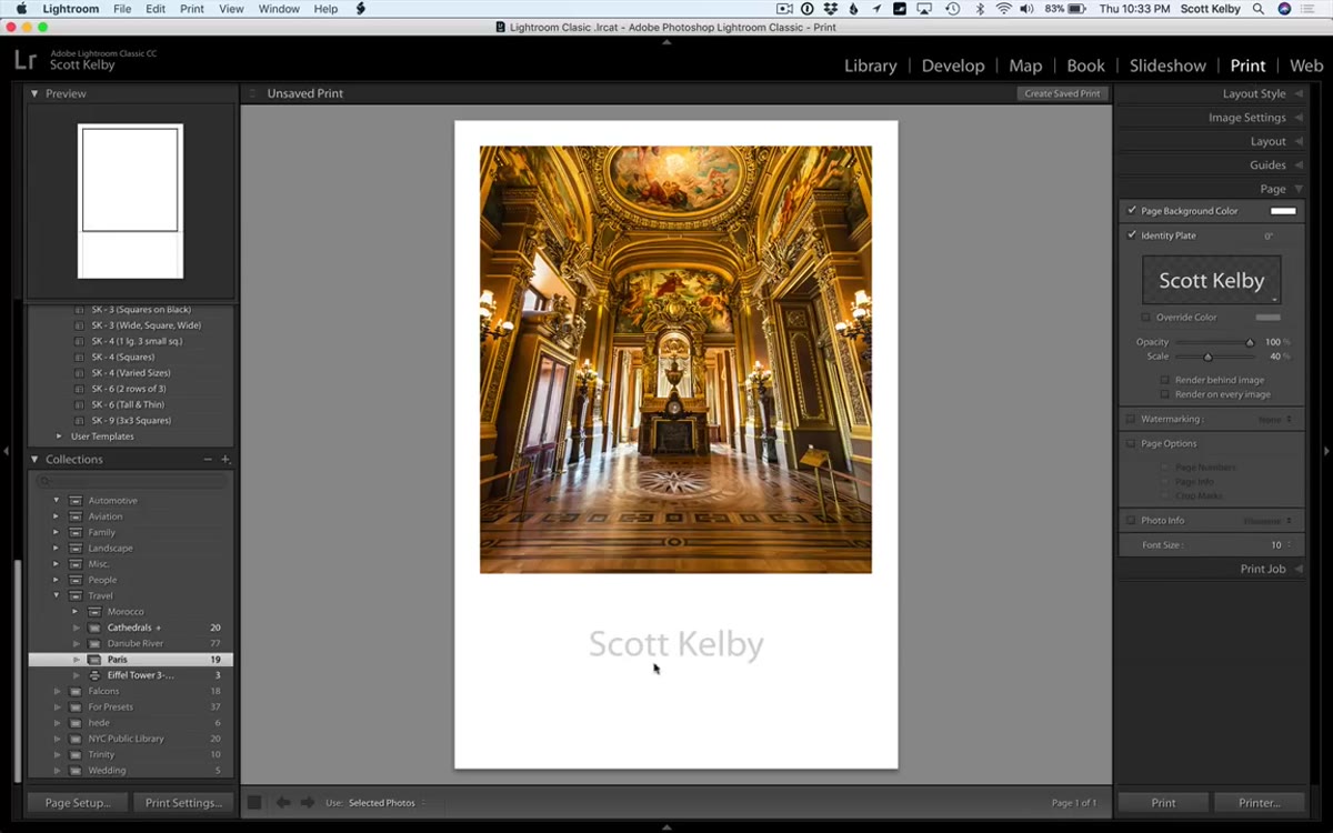 Identity plate checkbox in Lightroom Print module panel
Open the Print module and look for the Identity Plate option in the right-hand panel. Check the box to enable it. By default, it pulls in whatever name you registered with the software, so you’ll likely see your own name appear on the canvas. This is your text layer for the entire print layout. It’s the only native text tool Lightroom’s Print module gives you, which is exactly why knowing how to push its limits matters.
Identity plate checkbox in Lightroom Print module panel
Open the Print module and look for the Identity Plate option in the right-hand panel. Check the box to enable it. By default, it pulls in whatever name you registered with the software, so you’ll likely see your own name appear on the canvas. This is your text layer for the entire print layout. It’s the only native text tool Lightroom’s Print module gives you, which is exactly why knowing how to push its limits matters.
Step 2: Open the Identity Plate Editor — and Understand Why It Fights You
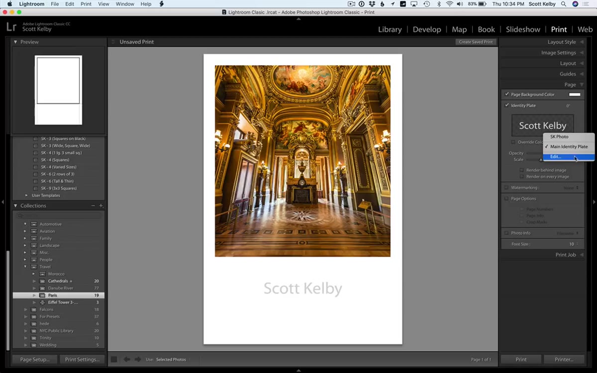 Identity plate editor dialog box open in Lightroom
Click “Edit” in the Identity Plate panel to open the editor. This is where you type your text. The problem shows up immediately when you try to create a multi-line layout. Pressing Return confirms the dialog instead of creating a new line. Pressing Shift+Return does the same thing. You’re essentially locked into a single line unless you know the workaround.
Identity plate editor dialog box open in Lightroom
Click “Edit” in the Identity Plate panel to open the editor. This is where you type your text. The problem shows up immediately when you try to create a multi-line layout. Pressing Return confirms the dialog instead of creating a new line. Pressing Shift+Return does the same thing. You’re essentially locked into a single line unless you know the workaround.
There is a keyboard shortcut that technically allows line breaks: hold Option on Mac or Alt on Windows before pressing Return. It works, but the editor gives you no visual feedback while you type additional lines, so you’re composing text completely blind. You can get something onto the canvas this way, but it’s easy to introduce typos, and you have zero control over alignment or spacing. Kelby demonstrates this in the video and the result is exactly as messy as it sounds.
Step 3: Format Your Text in an External App First
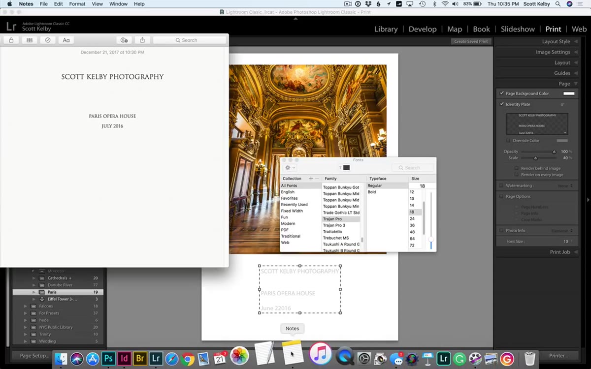 Apple Notes app open with centered, multi-line text
Here’s where the actual trick lives. Instead of fighting the identity plate editor, write and format your text somewhere else entirely. Kelby uses Apple Notes, but any text editor works. TextEdit on Mac, Notepad on Windows, even a Google Doc. The key is that you can do things in these apps that the identity plate editor won’t let you do natively: hit Return freely to create multiple lines, center your text, choose your alignment, and get a visual sense of how it’ll read as a block.
Apple Notes app open with centered, multi-line text
Here’s where the actual trick lives. Instead of fighting the identity plate editor, write and format your text somewhere else entirely. Kelby uses Apple Notes, but any text editor works. TextEdit on Mac, Notepad on Windows, even a Google Doc. The key is that you can do things in these apps that the identity plate editor won’t let you do natively: hit Return freely to create multiple lines, center your text, choose your alignment, and get a visual sense of how it’ll read as a block.
Take a moment here to think about what you actually want the layout to communicate. For a print sale or gallery piece, you might want the title centered over your name with a couple of lines of breathing room between them. Set that up in your text editor exactly as you want it to appear.
Step 4: Copy and Paste Into the Identity Plate Editor
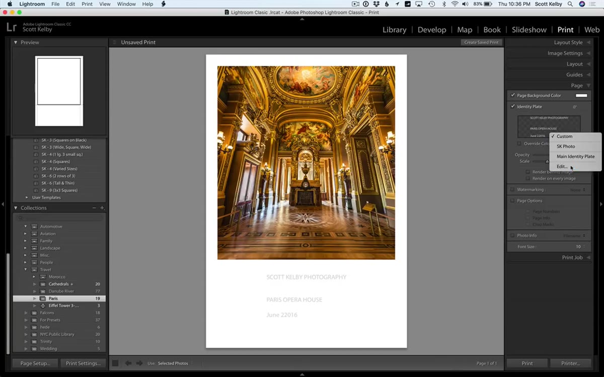 Pasting formatted text into Lightroom identity plate editor
Select all of your formatted text in the external app and copy it. Back in Lightroom, open the identity plate editor again and paste. This is the part that genuinely surprised me the first time: Lightroom preserves the line breaks, the font, and the centering. It carries over more formatting information than you’d expect from a field that can’t even handle a basic Return key press. The text appears on the canvas as a properly structured, multi-line block.
Pasting formatted text into Lightroom identity plate editor
Select all of your formatted text in the external app and copy it. Back in Lightroom, open the identity plate editor again and paste. This is the part that genuinely surprised me the first time: Lightroom preserves the line breaks, the font, and the centering. It carries over more formatting information than you’d expect from a field that can’t even handle a basic Return key press. The text appears on the canvas as a properly structured, multi-line block.
This alone solves probably 80% of print text use cases. If you’re on a deadline or just need something clean and readable, stop here. It works.
Step 5: Use InDesign for Full Typographic Control
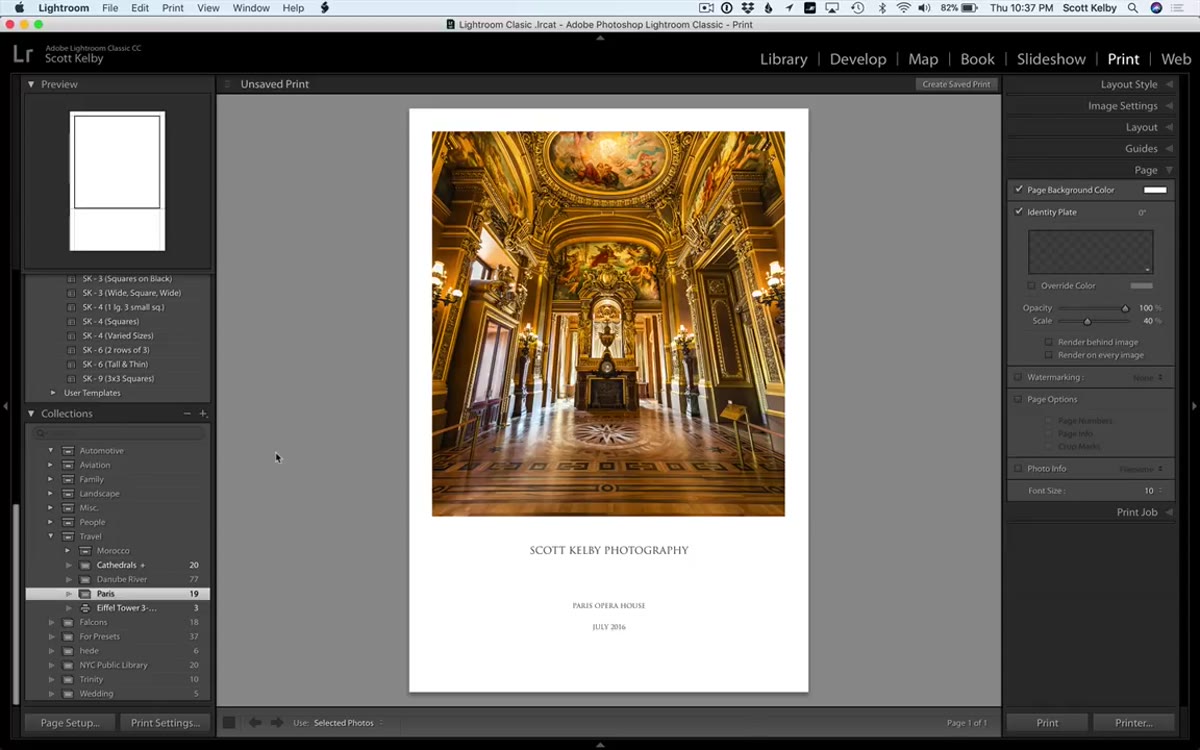 InDesign document with tracked type ready to copy
If you have Adobe InDesign as part of a Creative Cloud subscription, you can go further. InDesign gives you proper typographic controls: letter spacing (tracking), leading, kerning, multiple font weights in the same text block. Set up your text there exactly as you want it, including any character spacing you want between letters. Something you absolutely cannot do inside Lightroom’s editor is adjust the tracking between individual letters, but InDesign handles it natively.
InDesign document with tracked type ready to copy
If you have Adobe InDesign as part of a Creative Cloud subscription, you can go further. InDesign gives you proper typographic controls: letter spacing (tracking), leading, kerning, multiple font weights in the same text block. Set up your text there exactly as you want it, including any character spacing you want between letters. Something you absolutely cannot do inside Lightroom’s editor is adjust the tracking between individual letters, but InDesign handles it natively.
Copy your text from InDesign and paste it into the identity plate editor using the same method as Step 4. Lightroom will honor your tracking and font choices when they come from InDesign, which means you can achieve the kind of refined typographic look you’d normally only get by finishing the layout in Photoshop. This is genuinely useful for fine art prints or any situation where the text treatment is part of the design.
Step 6: Resize Individual Lines After Pasting
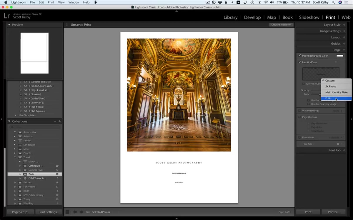 Selecting a single line of text in the identity plate editor
Once your text is inside the identity plate editor, you can still make adjustments. Click and drag to select a specific line of text, then change the font size for just that selection. This lets you create visual hierarchy directly inside Lightroom, for example, making your name or studio title larger than the caption text below it, without going back to your external app to redo everything. It’s a small but useful edit that saves a round trip.
Selecting a single line of text in the identity plate editor
Once your text is inside the identity plate editor, you can still make adjustments. Click and drag to select a specific line of text, then change the font size for just that selection. This lets you create visual hierarchy directly inside Lightroom, for example, making your name or studio title larger than the caption text below it, without going back to your external app to redo everything. It’s a small but useful edit that saves a round trip.
What I’d Add From My Own Workflow
The copy-paste method changed how I build my print templates. I keep a Notes document for each ongoing project with pre-formatted text blocks ready to go: series titles, edition numbers, location credits. When I’m building a new print layout, I’m not typing anything fresh. I’m pulling from that document, adjusting what I need, and pasting it in. It turns a fiddly process into something closer to a system.
One thing worth knowing: if you switch computers or share a Lightroom catalog, the identity plate text travels with the catalog but the font references can break if the other machine doesn’t have the same fonts installed. If you’re on a Creative Cloud plan, syncing fonts through Adobe Fonts largely eliminates this issue, but it’s worth checking before you send anything to print on an unfamiliar machine.
The single most important idea from this tutorial is that Lightroom doesn’t have to be the place where you do your text formatting. It just has to be the place where it lands. Leaning on better tools for the creative work and letting Lightroom handle the output is exactly the kind of workflow thinking that makes the whole process faster and less frustrating.
Watch the full tutorial on YouTube to see Scott Kelby walk through each step live, including the InDesign paste in action.
Comments (3)
Applied this to my portfolio shots and the improvement is noticeable.
This is exactly what I needed today. Been struggling with this for weeks.
Well explained. I think my audience would really benefit from this — mind if I link to it?
Leave a Comment