There’s a specific kind of photo edit that haunts me. It’s the one where I’ve been staring at a screen too long, nudging sliders a little further each time, and what started as a raw file with real potential has slowly become something that looks like it was processed inside a microwave. I’ve been editing long enough to know that the problem isn’t usually a single bad decision. It’s death by a thousand tiny overcorrections, each one feeling justified in the moment.
That’s exactly what Matt Kloskowski tackles in a tutorial that I think every Lightroom user needs to watch at least once a year. Watch the full tutorial on YouTube. The core question Matt asks is deceptively simple: how do you actually know when you’ve gone too far? Not in a vague, “develop your taste” way. In a practical, here’s-what-to-look-for way. The answer involves a handful of specific behaviors in Lightroom that serve as early warning signs, and once you know what they look like, you can’t unsee them.
What I appreciate about Matt’s approach is that he doesn’t frame over-editing as a beginner mistake. He frames it as a universal trap. That tracks. I’ve seen portfolio-level photographers post images with halos along tree lines and just… not notice. The eye adapts to what it’s been staring at. The techniques below are largely about building in checkpoints so you can catch yourself before the damage is done.
Step 1: Turn On Highlight Clipping Warnings Before You Touch Anything
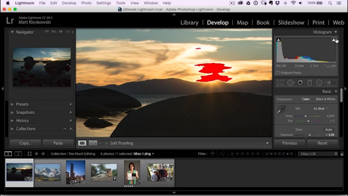 Highlight clipping warning activated in histogram panel
Before you make a single exposure adjustment, click the small triangle in the upper right corner of the histogram panel in Lightroom’s Develop module. This activates the highlight clipping warning, which paints clipped areas in red so you can actually see where your brightest tones are losing detail. It’s one of those features that’s been in Lightroom forever but a surprising number of people never use.
Highlight clipping warning activated in histogram panel
Before you make a single exposure adjustment, click the small triangle in the upper right corner of the histogram panel in Lightroom’s Develop module. This activates the highlight clipping warning, which paints clipped areas in red so you can actually see where your brightest tones are losing detail. It’s one of those features that’s been in Lightroom forever but a surprising number of people never use.
The reason to do this first rather than after the fact is context. When you can see exactly where clipping exists before you start dragging, you’re making decisions. When you discover it after, you’re doing damage control.
Step 2: Don’t Chase Every Clipped Highlight to Zero
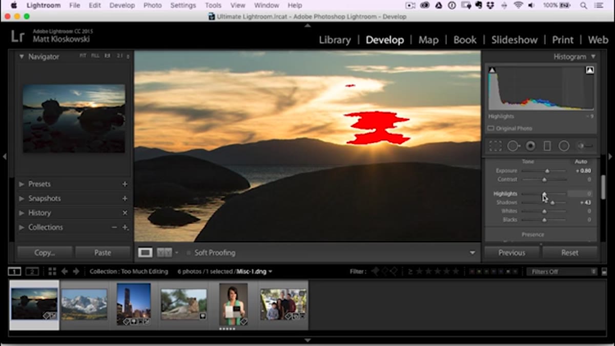 Highlights slider dragged down, sky appearing flat and dark
Here’s where Matt makes a point that changed how I think about sky editing. When shooting into the sun or toward bright clouds, the instinct is to drag the Highlights slider all the way down until every red clipping warning disappears. The problem is that this often creates something worse than a blown highlight. It creates a flat, gray, lifeless sky with a strange dark void where the sun used to glow.
Highlights slider dragged down, sky appearing flat and dark
Here’s where Matt makes a point that changed how I think about sky editing. When shooting into the sun or toward bright clouds, the instinct is to drag the Highlights slider all the way down until every red clipping warning disappears. The problem is that this often creates something worse than a blown highlight. It creates a flat, gray, lifeless sky with a strange dark void where the sun used to glow.
Some highlight clipping near a direct light source is not only acceptable, it’s often correct. The sun is brighter than your sensor. Pretending otherwise by crushing the highlights produces an unnatural result. Matt’s guidance is to accept a degree of clipping near the light source itself and use more targeted tools if you want to manage the surrounding sky.
Step 3: Use a Graduated Filter for Sky Control Instead of Global Sliders
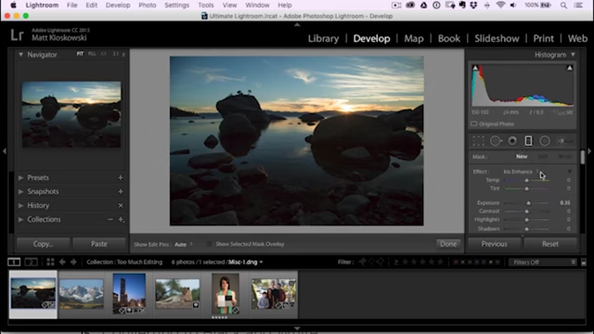 Graduated filter applied from top of frame downward
If the sky genuinely needs to come down in exposure, reach for the Graduated Filter (now called the Linear Gradient in newer versions of Lightroom) rather than the global Highlights or Exposure sliders. Draw the gradient from the top of the frame downward, then pull the Exposure value down just enough to bring structure back into the clouds without making the whole image feel underexposed.
Graduated filter applied from top of frame downward
If the sky genuinely needs to come down in exposure, reach for the Graduated Filter (now called the Linear Gradient in newer versions of Lightroom) rather than the global Highlights or Exposure sliders. Draw the gradient from the top of the frame downward, then pull the Exposure value down just enough to bring structure back into the clouds without making the whole image feel underexposed.
The key word is “just enough.” Matt’s demonstration shows a subtle pull, not a dramatic one. If you’re dropping exposure by more than a stop with a graduated filter on an already-exposed-correctly image, you’re probably overcompensating for something that could have been handled at capture.
Step 4: Erase the Gradient From the Sun Itself to Preserve the Glow
 Brush erase tool removing gradient effect around sun area
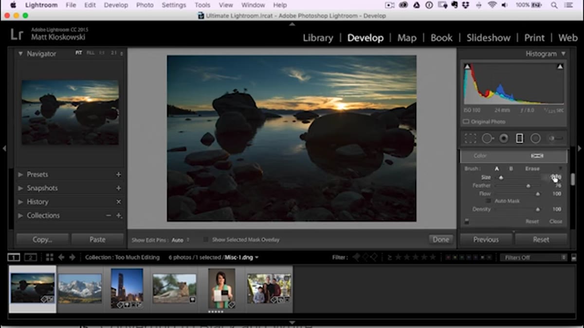
This is the technique inside the technique, and it’s one I’ve started using regularly. After applying the graduated filter to the sky, switch to the Brush option within the filter, scroll down to select Erase, and paint away the darkening effect directly around the sun. Use a large, feathered brush and work with light clicks rather than long strokes.
Brush erase tool removing gradient effect around sun area
This is the technique inside the technique, and it’s one I’ve started using regularly. After applying the graduated filter to the sky, switch to the Brush option within the filter, scroll down to select Erase, and paint away the darkening effect directly around the sun. Use a large, feathered brush and work with light clicks rather than long strokes.
What this does is preserve the natural luminous glow that radiates from the sun while still controlling the rest of the sky. The difference between a darkened sky with a preserved glow versus a uniformly flattened sky is the difference between “dramatic” and “processed.” One looks like atmosphere. The other looks like Lightroom.
Step 5: Watch the Halos When You Push Highlights and Shadows in Opposite Directions
 Halo artifacts visible along edges at high highlight and shadow values
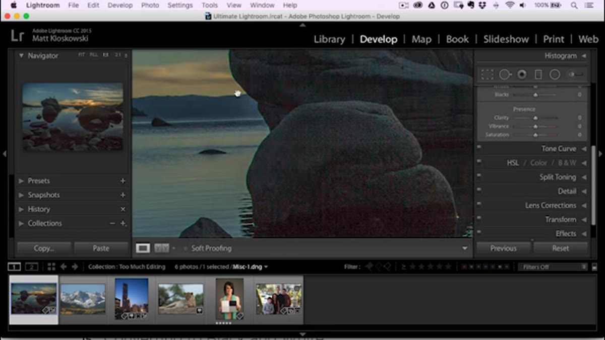
One of the most common over-editing signatures I see in submitted edits on forums and social media is the halo. It appears as a bright or dark fringe along high-contrast edges, like where a dark treeline meets a bright sky. It’s caused by pushing the Highlights and Shadows sliders hard in opposite directions simultaneously, which is a move that feels intuitive because it seems like it should “open up” the image.
Halo artifacts visible along edges at high highlight and shadow values
One of the most common over-editing signatures I see in submitted edits on forums and social media is the halo. It appears as a bright or dark fringe along high-contrast edges, like where a dark treeline meets a bright sky. It’s caused by pushing the Highlights and Shadows sliders hard in opposite directions simultaneously, which is a move that feels intuitive because it seems like it should “open up” the image.
Matt zooms in to show exactly where halos develop, specifically along edges in areas where the tonal shift is sharpest. The fix isn’t just pulling back one slider. It’s reconsidering the approach entirely. If you need shadow detail, try lifting the Blacks slider slightly instead. If you need to manage highlights, use local adjustments. Reaching for both global Highlights down and Shadows up at extreme values is almost always going to leave artifacts.
One Thing I’d Add From My Own Workflow
The five-minute reset is the habit that’s saved more of my edits than any single technique. After I think I’m done with an image, I close Lightroom, make a cup of coffee, and come back before exporting. Sounds small. The difference in what you see is not small. The eye recalibrates when you step away, and what looked punchy five minutes ago often looks overcooked when you return.
I’d also suggest using the backslash key in Lightroom’s Develop module to toggle between your edited version and the original. Do it fast, several times in a row. If the edit looks jarring rather than improved, that’s information. The before doesn’t need to look identical to the after, but it should feel like the same world.
The single most important thing Matt’s tutorial communicates is that restraint is a skill. It’s not timidity and it’s not lack of vision. It’s knowing that the slider can go to 100 and choosing 30 anyway because 30 is the right answer for this image. That judgment gets built by understanding what goes wrong at the extremes, which is exactly what this tutorial walks you through.
Watch the full tutorial on YouTube and follow along with your own raw files. The concepts land differently when you’re watching your own sky flatten in real time.
Comments
Leave a Comment