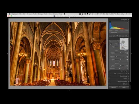
I’ve edited a lot of bad interior shots. Not bad in an interesting way. Bad in the “this looks like a screenshot from a 2009 real estate listing” way. Flat, blown-out windows, one side of the room looking like a cave while the other side looks like someone left the flash on. It’s a specific kind of image pain, and for a long time my solution was to either reach for HDR or just accept that the shot was a loss. Neither of those felt great.
That’s why when I watched this KelbyOne tutorial from Scott Kelby, something clicked. Watch the full tutorial on YouTube — it’s a start-to-finish walkthrough on a church interior that, in its original state, is genuinely rough. Flat, dark on one side, blown highlights on the other. The kind of image most people would write off. Kelby doesn’t write it off. He works through it methodically in Lightroom alone, no plugins, no HDR stacking, and the result is a photograph that looks like it was lit by someone who knew what they were doing.
What I want to do here is pull apart exactly how he does it so you can follow the logic, not just copy the sliders.
Step 1: Don’t Trust the Auto Button Blindly
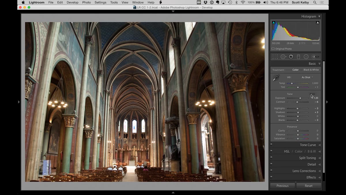 Auto button applied, image overexposed with blown windows
Kelby’s first move is to hit Lightroom’s Auto button, which is a useful gut-check but almost never a finished result. The Auto button tends to push exposure up more than it should, and in an interior shot with windows, that means instant highlight blowout. The windows go white. All that detail disappears.
Auto button applied, image overexposed with blown windows
Kelby’s first move is to hit Lightroom’s Auto button, which is a useful gut-check but almost never a finished result. The Auto button tends to push exposure up more than it should, and in an interior shot with windows, that means instant highlight blowout. The windows go white. All that detail disappears.
The value of clicking Auto first isn’t to accept the result. It’s to see where the image wants to go and which problems get amplified. In this case, it makes the flatness more visible and it torches the highlights. Now you know exactly what you’re fighting.
Step 2: Recover the Highlights Before Anything Else
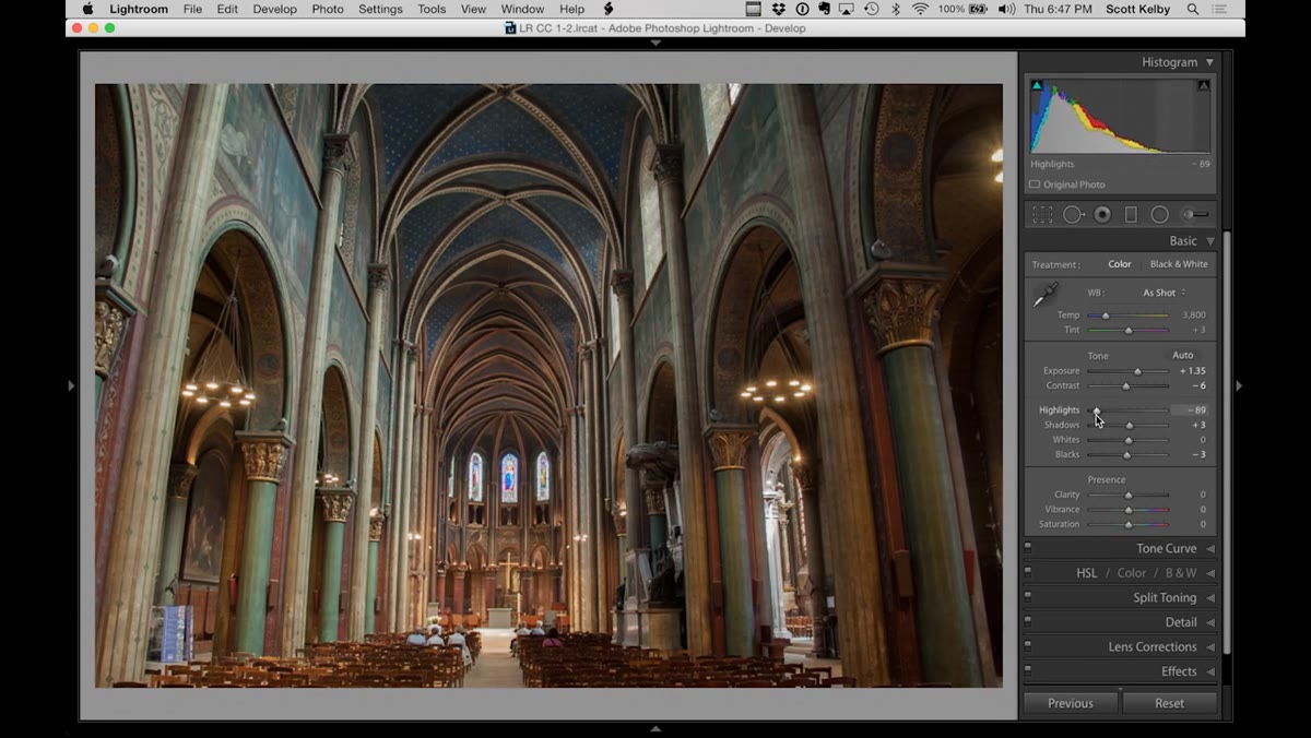 Highlights slider pulled left, window detail returning
Once the highlights are blown, that’s the most urgent problem on screen. Kelby drags the Highlights slider left, hard, landing somewhere around -89. That number might sound extreme but with blown interior windows it’s usually where you need to be. The goal isn’t to make the windows look dramatic. The goal is to bring back actual information in those bright zones so the image reads as a real space.
Highlights slider pulled left, window detail returning
Once the highlights are blown, that’s the most urgent problem on screen. Kelby drags the Highlights slider left, hard, landing somewhere around -89. That number might sound extreme but with blown interior windows it’s usually where you need to be. The goal isn’t to make the windows look dramatic. The goal is to bring back actual information in those bright zones so the image reads as a real space.
If you find yourself pulling highlights down this far and the rest of the image starts going muddy or flat, that’s normal. You’re not done yet. Highlights is a triage move, not a finishing move.
Step 3: Add Contrast to Kill the Flatness
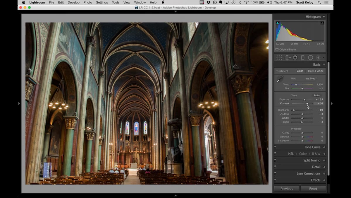 Contrast slider increased, image gaining depth and dimension
Flat images have a particular look. The tones all cluster toward the middle of the histogram and nothing has any real weight. Kelby’s fix here is straightforward: grab the Contrast slider and push it up. He doesn’t finesse it. He cranks it and watches what happens.
Contrast slider increased, image gaining depth and dimension
Flat images have a particular look. The tones all cluster toward the middle of the histogram and nothing has any real weight. Kelby’s fix here is straightforward: grab the Contrast slider and push it up. He doesn’t finesse it. He cranks it and watches what happens.
The effect is immediate and significant. The image separates. Shadows get a little deeper, midtones pop, the whole thing starts to feel like a photograph taken in a real space rather than a scanned document. If you’ve been avoiding the Contrast slider because it feels blunt, this is a good reminder that blunt is sometimes exactly right.
Step 4: Open the Shadows to Reveal Interior Detail
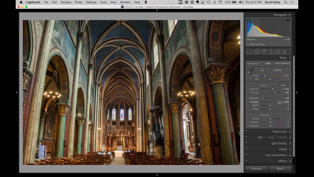 Shadows slider pulled right, dark areas of church becoming visible
With contrast added, the shadow areas can get pretty dense. Kelby lifts the Shadows slider to bring back detail in the darker parts of the church interior. This is the standard recovery move, and it works well, but it also sets up the problem he’s about to solve. Lifting shadows globally helps the dark corners but it doesn’t fix the fundamental issue: the two sides of the room are lit completely differently.
Shadows slider pulled right, dark areas of church becoming visible
With contrast added, the shadow areas can get pretty dense. Kelby lifts the Shadows slider to bring back detail in the darker parts of the church interior. This is the standard recovery move, and it works well, but it also sets up the problem he’s about to solve. Lifting shadows globally helps the dark corners but it doesn’t fix the fundamental issue: the two sides of the room are lit completely differently.
One side has the chandeliers and is genuinely bright. The other side is dim. Global shadow recovery helps a little but it can’t rebalance uneven light across a whole scene. That takes a different tool.
Step 5: Use the Adjustment Brush to Rebalance the Room’s Light
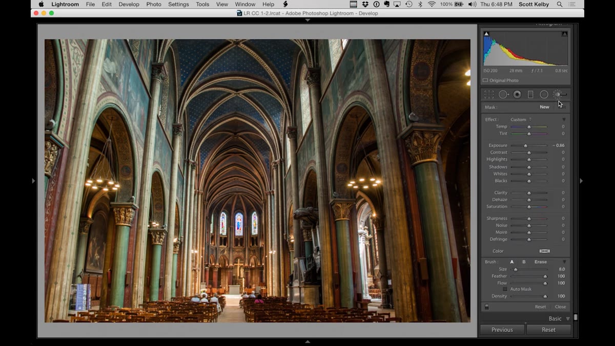 Adjustment brush selected, painting exposure onto dark side of church
This is the step that separates a competent edit from a great one. Kelby opens the Adjustment Brush, double-clicks the word “Effect” to zero out all the sliders, and then manually repaints the light in the room. The left side is too dark. The right side is too bright. So he sets a negative exposure value and brushes across the overlit side to bring it down.
Adjustment brush selected, painting exposure onto dark side of church
This is the step that separates a competent edit from a great one. Kelby opens the Adjustment Brush, double-clicks the word “Effect” to zero out all the sliders, and then manually repaints the light in the room. The left side is too dark. The right side is too bright. So he sets a negative exposure value and brushes across the overlit side to bring it down.
He’s honest that he picks a rough number first and adjusts after. That’s the right way to work with the Adjustment Brush. Paint the area, then go back to the pin and dial in the actual amount. He ends up pulling back a bit from his initial value because it went too dark. He also adds a touch of contrast specifically to that painted area because lifting or lowering exposure in one zone can make it look a little flat relative to the rest of the image. The goal is for both sides of the room to feel like they exist under the same light.
What I’d Add From My Own Experience
The rebalancing step Kelby demonstrates works beautifully for spaces with obvious left-right lighting problems, but I’d extend the same logic vertically. In a lot of church and cathedral shots, the ceiling is dramatically darker than the floor level where the ambient light pools. A second Adjustment Brush pass on the upper portion of the image, with a slight exposure lift and some added clarity, can make a ceiling feel like it’s part of the same building rather than a separate dark zone floating above the interesting stuff.
I’d also suggest toggling the mask overlay on (press O while the brush is active) to make sure your painted areas don’t have hard edges. Nothing kills a rebalanced interior like a visible brush stroke line cutting across the middle of a wall.
The biggest thing I took from this tutorial is that uneven light isn’t a reason to throw out an interior shot. It’s an editing problem with a specific solution: stop trying to fix it globally and start painting the light back in manually. The global sliders handle the overall tone. The Adjustment Brush handles the physics of the room.
If you want to see Kelby work through the full edit in real time, including the white balance adjustments and the final polish that didn’t make it into this breakdown, watch the full tutorial on YouTube. It’s one of those edits that looks complicated in the finished image and turns out to be a series of logical decisions made in the right order.
Comments (5)
Been doing this wrong for years apparently. Thanks for the wake-up call.
Been doing this wrong for years apparently. Thanks for the wake-up call.
Bookmarked. Coming back to this one for sure.
Applied this to my portfolio shots and the improvement is noticeable.
Really solid breakdown. This pairs perfectly with the photography work I've been writing about.
Leave a Comment