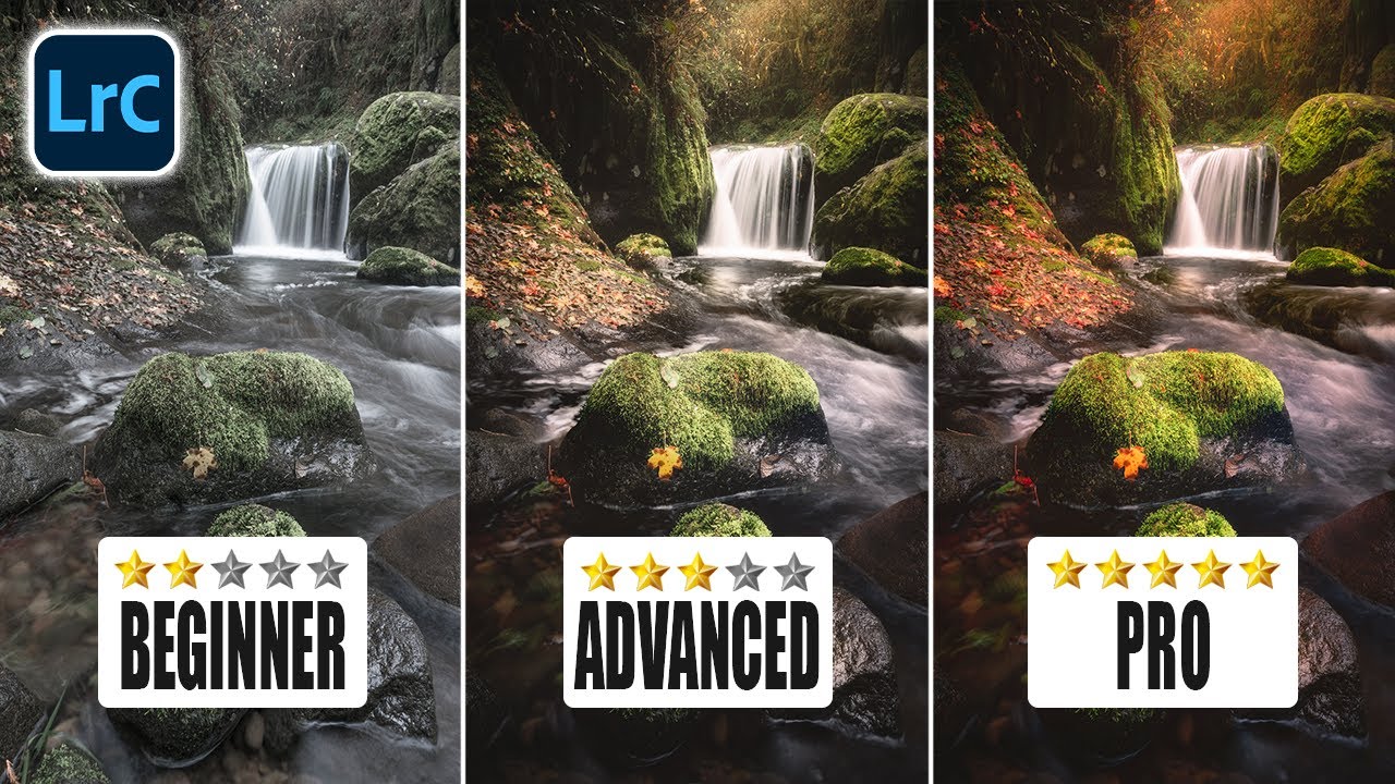
There’s a panel in Lightroom that I ignored for an embarrassingly long time. Not because I didn’t know it existed, but because every time I opened it, nothing about it made intuitive sense. The sliders didn’t behave the way I expected. The results felt accidental. So I’d close it and go back to the HSL panel where everything felt safe and logical. I suspect most editors do the same thing, because the Camera Calibration panel has the energy of a mysterious neighbor you’ve never actually talked to.
That changed when I worked through Watch the full tutorial on YouTube from Mark Denney, who has a gift for explaining the genuinely confusing parts of Lightroom without making you feel like you should have known already. His walkthrough of the Calibration panel cracked something open for me. The tool still behaves strangely, but now I understand why it behaves strangely, and that changes everything about how useful it is.
The short version: the Calibration panel isn’t doing what you think it’s doing. And once you see it clearly, you’ll probably start using it on almost every landscape edit.
Step 1: Find the Calibration Panel (It May Be Hidden)
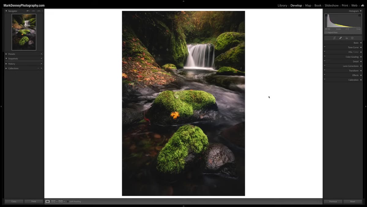 Lightroom develop panel with Calibration section closed
Before anything else, make sure the Calibration panel is actually visible in your Develop module. Lightroom lets you customize which panels appear, and plenty of users have accidentally hidden this one or never turned it on. Right-click anywhere on the panel headers in the right-side column and select “Customize Develop Panel.” From there, make sure Calibration is checked. You can also drag the panels to reorder them. While you’re in there, it’s worth turning on Solo Mode if you usually have ten panels open at once and feel like you’re scrolling through a CVS receipt. Solo Mode auto-closes whatever panel you were in when you open a new one.
Lightroom develop panel with Calibration section closed
Before anything else, make sure the Calibration panel is actually visible in your Develop module. Lightroom lets you customize which panels appear, and plenty of users have accidentally hidden this one or never turned it on. Right-click anywhere on the panel headers in the right-side column and select “Customize Develop Panel.” From there, make sure Calibration is checked. You can also drag the panels to reorder them. While you’re in there, it’s worth turning on Solo Mode if you usually have ten panels open at once and feel like you’re scrolling through a CVS receipt. Solo Mode auto-closes whatever panel you were in when you open a new one.
That said, for this particular workflow, Denney recommends turning Solo Mode off temporarily. You’ll want both the Calibration panel and the HSL/Color panel visible at the same time for comparison purposes, which Solo Mode would prevent.
Step 2: Open the Calibration Panel and Find the Blue Primary
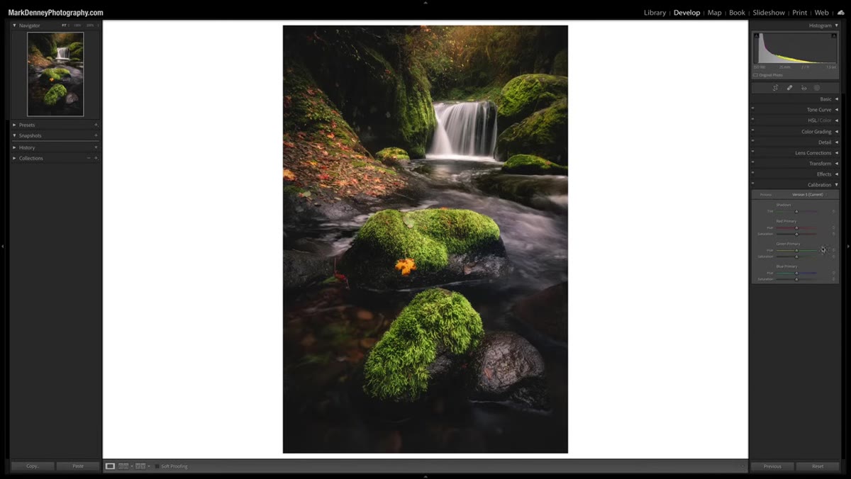 Calibration section expanded showing Red, Green, Blue primary sliders
With the Calibration panel open, you’ll see three primary color channels: Red, Green, and Blue. Each one has a Hue slider and a Saturation slider. Head straight to the Blue Primary section at the bottom. This is where Denney focuses his demonstration, and it’s the best place to start because the results are the most visually dramatic and the most instructive.
Calibration section expanded showing Red, Green, Blue primary sliders
With the Calibration panel open, you’ll see three primary color channels: Red, Green, and Blue. Each one has a Hue slider and a Saturation slider. Head straight to the Blue Primary section at the bottom. This is where Denney focuses his demonstration, and it’s the best place to start because the results are the most visually dramatic and the most instructive.
Don’t touch the Hue slider yet. Just locate the Saturation slider under Blue Primary and get ready to drag it.
Step 3: Drag the Blue Saturation Slider to Extremes
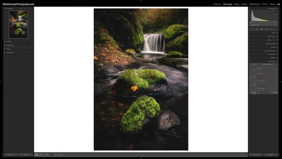 Blue Primary Saturation slider being dragged to negative 100
Take the Blue Primary Saturation slider and drag it all the way to -100, then all the way to +100. Do this slowly, or rock it back and forth. Watch what happens to the image, but here’s the key instruction: don’t watch the sky. Watch everything else. The areas most visibly affected by this slider are often the warm-toned regions, things like golden grass, earthy shadows, sunlit rock faces, the rim light on a mountain ridge. Denney points this out explicitly, and once you see it you cannot unsee it.
Blue Primary Saturation slider being dragged to negative 100
Take the Blue Primary Saturation slider and drag it all the way to -100, then all the way to +100. Do this slowly, or rock it back and forth. Watch what happens to the image, but here’s the key instruction: don’t watch the sky. Watch everything else. The areas most visibly affected by this slider are often the warm-toned regions, things like golden grass, earthy shadows, sunlit rock faces, the rim light on a mountain ridge. Denney points this out explicitly, and once you see it you cannot unsee it.
The slider is labeled “Blue Saturation” but it is influencing color zones that contain almost no visible blue. That’s the thing that breaks everyone’s brain the first time.
Step 4: Understand Why It Works This Way
 Color swatch grid showing Red, Green, Blue primary relationships
Here’s the conceptual piece Denney walks through, and it’s worth slowing down for. The Calibration panel doesn’t work like the HSL panel. The HSL panel targets specific hues as they appear visually in your image. The Calibration panel works at the raw data level, adjusting how the primary color channels relate to each other before the rest of Lightroom’s processing even happens.
Color swatch grid showing Red, Green, Blue primary relationships
Here’s the conceptual piece Denney walks through, and it’s worth slowing down for. The Calibration panel doesn’t work like the HSL panel. The HSL panel targets specific hues as they appear visually in your image. The Calibration panel works at the raw data level, adjusting how the primary color channels relate to each other before the rest of Lightroom’s processing even happens.
When you increase Blue Primary Saturation, you’re not just adding blue to blue things. You’re shifting the balance of the entire color matrix. Because warm colors like orange and red are partly defined by their relationship to blue in the color model, pushing or pulling the blue channel affects those warm tones in real and noticeable ways. It’s a global color relationship tool, not a targeted hue tool. Think of it less like painting and more like adjusting the temperature of a light source in a room.
Step 5: Compare the Calibration and HSL Panels Side by Side
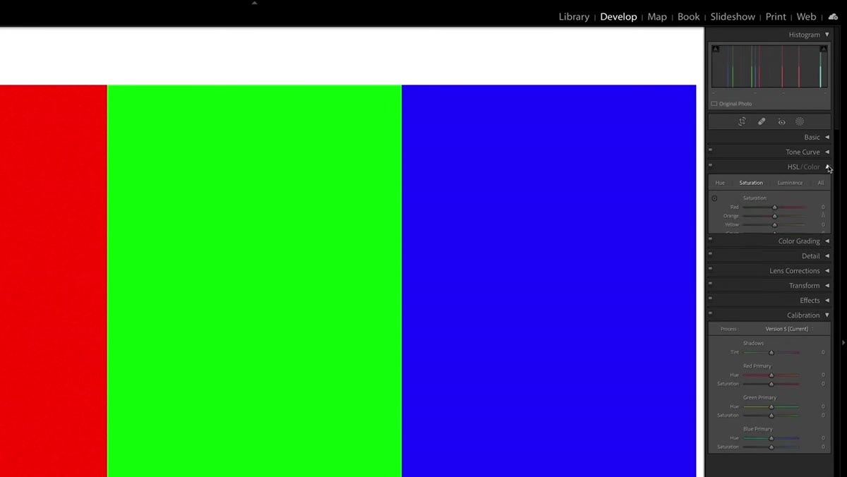 HSL Saturation panel and Calibration panel both visible on screen
This is where having both panels open pays off. Pull up your HSL panel and go to the Saturation tab. Find the Red or Orange channel and drag it back and forth the same way you did with the Blue Primary. Notice how the HSL slider targets only the pixels that are visually that color. Now go back to Calibration and do the same with Blue Primary. The area of effect is fundamentally different. HSL is a scalpel. Calibration is something closer to a lens shift.
HSL Saturation panel and Calibration panel both visible on screen
This is where having both panels open pays off. Pull up your HSL panel and go to the Saturation tab. Find the Red or Orange channel and drag it back and forth the same way you did with the Blue Primary. Notice how the HSL slider targets only the pixels that are visually that color. Now go back to Calibration and do the same with Blue Primary. The area of effect is fundamentally different. HSL is a scalpel. Calibration is something closer to a lens shift.
This comparison isn’t just academic. It tells you which tool to reach for depending on what problem you’re solving. If you want to desaturate just the orange tones in a sunset, use HSL. If you want to shift the character of the warmth across the whole image, Calibration is the move.
Step 6: Dial in a Real Edit Using Blue Primary Saturation
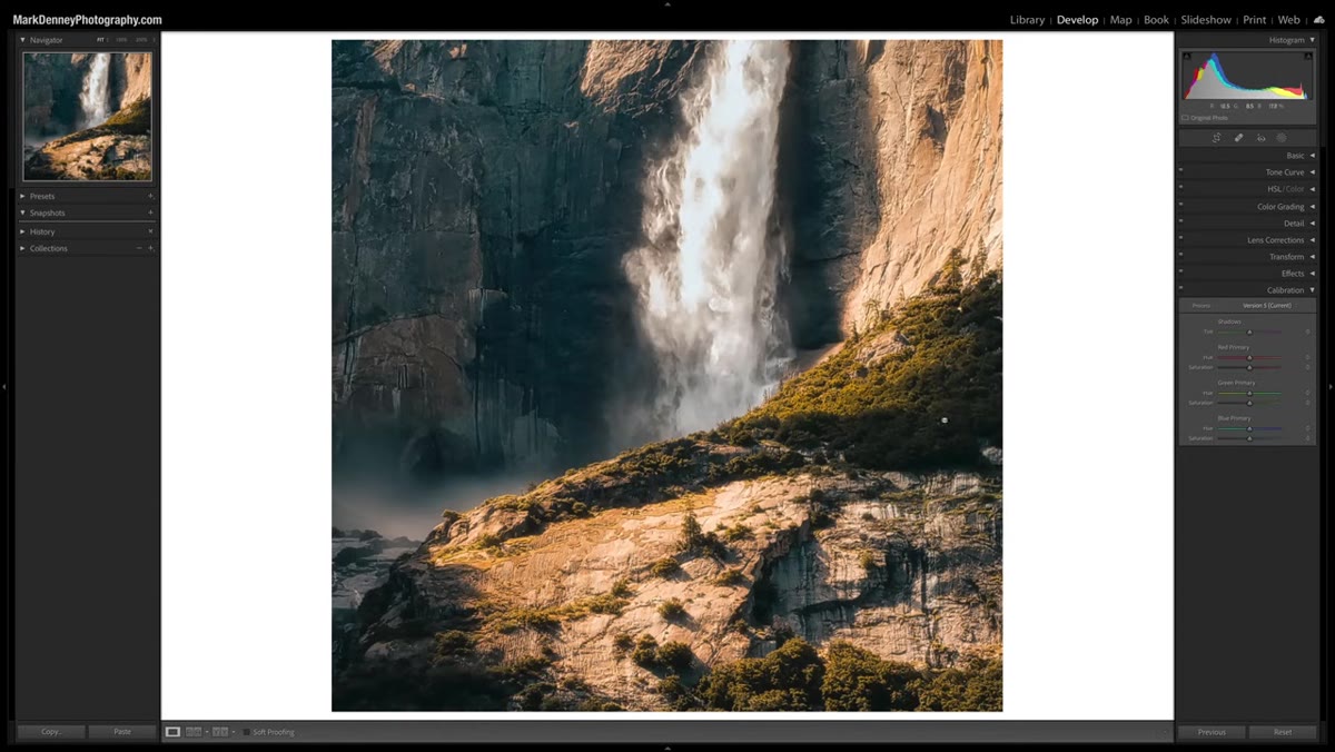 Landscape photo showing color shift with Blue Primary at positive value
Now that you understand what’s happening, use it deliberately. Start with Blue Primary Saturation between +10 and +30 on a landscape image that has warm tones, golden hour shots work especially well. Watch how the richness of the earth tones deepens without the edit looking like you just cranked the Vibrance slider. There’s a dimensional quality to the color enhancement, almost like the image is gaining weight in a good way. Denney describes it as a kind of color-aware dodge and burn, and that framing is accurate. The highlights in warm areas get a little brighter and more saturated simultaneously.
Landscape photo showing color shift with Blue Primary at positive value
Now that you understand what’s happening, use it deliberately. Start with Blue Primary Saturation between +10 and +30 on a landscape image that has warm tones, golden hour shots work especially well. Watch how the richness of the earth tones deepens without the edit looking like you just cranked the Vibrance slider. There’s a dimensional quality to the color enhancement, almost like the image is gaining weight in a good way. Denney describes it as a kind of color-aware dodge and burn, and that framing is accurate. The highlights in warm areas get a little brighter and more saturated simultaneously.
Experiment with negative values too. Pulling Blue Primary Saturation toward -20 or -30 can add a subtle cool, desaturated quality to earthy tones that works well for moody, overcast edits.
My Take After Using This for a While
I’ve been working the Calibration panel into my base preset for landscape edits for about a year now, and I keep landing on a Blue Primary Saturation value somewhere between +15 and +25 as a starting point. Combined with a slight Red Primary Hue shift, it’s become the first move I make before I touch anything else. The reason it works so well as a foundation is that it shapes the color relationships globally, so everything I do afterward in HSL or Color Grading is working with a warmer, richer base rather than trying to compensate for a flat one.
One thing Denney doesn’t specifically call out, but which I’ve noticed: this slider behaves differently depending on your camera profile. If you’re using Adobe Standard versus Camera Matching profiles, the Blue Primary channel will have a different starting range of influence. Worth testing on your specific camera body before you bake a value into a preset.
The single most important thing to take from this is that the Calibration panel and the HSL panel are not doing the same job with different labels. They operate at different levels of the image pipeline, and treating them as interchangeable is why most people get muddy results when they try to push Calibration without understanding it. Mark Denney’s demonstration of the Blue Primary slider is the clearest explanation I’ve seen of why these tools behave the way they do, and the side-by-side comparison is the moment everything clicks.
Watch the full tutorial on YouTube to see the before-and-after on Denney’s actual landscape images. Watching those sliders move in real time is worth it.
Comments
Leave a Comment