There’s a specific frustration I’ve run into more times than I can count: you nail the exposure on a shot, everything looks clean and balanced, and then you try to push the color in a creative direction using the Temperature slider. Suddenly your highlights are clipping, your tones are shifting, and what was a clean edit is now a mess you have to chase back down. I always assumed this was just the cost of doing business with white balance. Turns out, I was missing a smarter tool that was sitting right there the whole time.
Watch the full tutorial on YouTube
In this Matt Kloskowski tutorial, he walks through a comparison between using Lightroom’s Temperature and Tint sliders versus a lesser-known color overlay method buried inside the Graduated Filter tool. The difference in how these two approaches handle your tonal data is genuinely worth understanding, especially if you do any kind of creative color work where protecting your highlights actually matters.
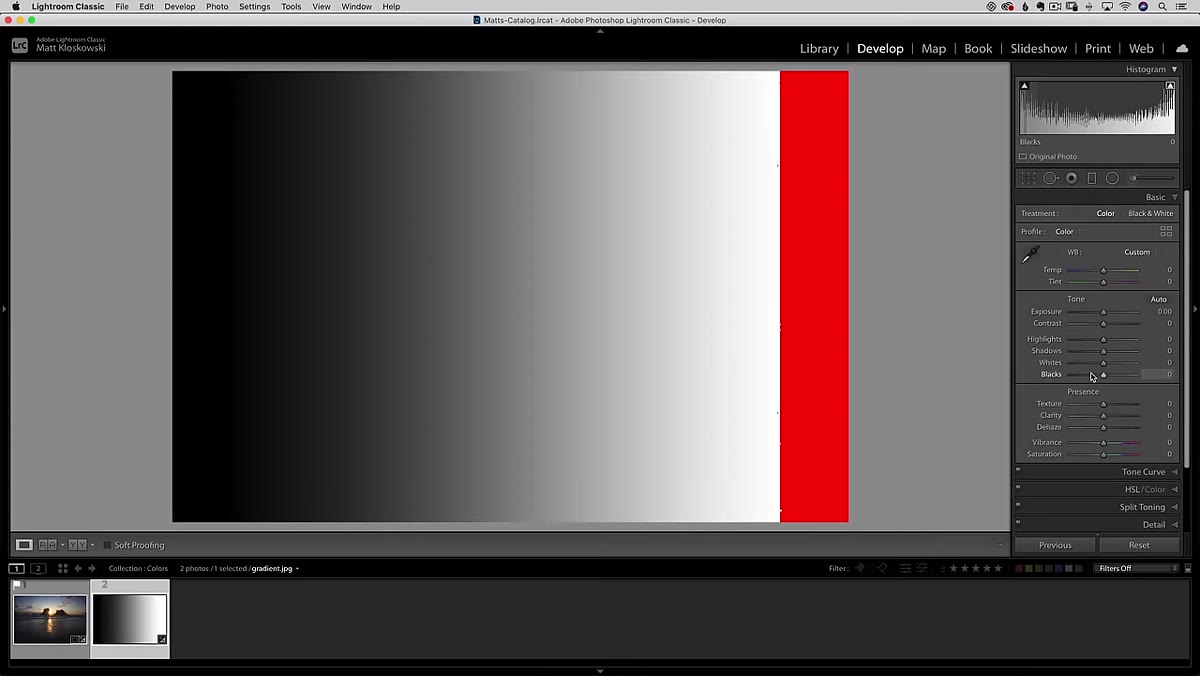
Step 1: Enable the Highlight Clipping Warning
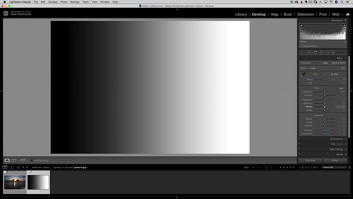 Histogram panel open with highlight clipping triangle highlighted
Before you touch any color controls, open your Histogram panel in the top-right corner of Lightroom Classic and click the small triangle in the upper-right corner of the histogram. This activates the highlight clipping warning, which will flash any blown-out areas red directly on your image. It’s a visual alarm system, and for this comparison, it’s the whole ballgame. You need to see what’s actually happening to your tones as you adjust color.
Histogram panel open with highlight clipping triangle highlighted
Before you touch any color controls, open your Histogram panel in the top-right corner of Lightroom Classic and click the small triangle in the upper-right corner of the histogram. This activates the highlight clipping warning, which will flash any blown-out areas red directly on your image. It’s a visual alarm system, and for this comparison, it’s the whole ballgame. You need to see what’s actually happening to your tones as you adjust color.
This step isn’t just setup, it’s the entire argument. Once you can see the clipping warning in real time, the difference between the two color methods becomes obvious fast.
Step 2: Test the Temperature and Tint Sliders
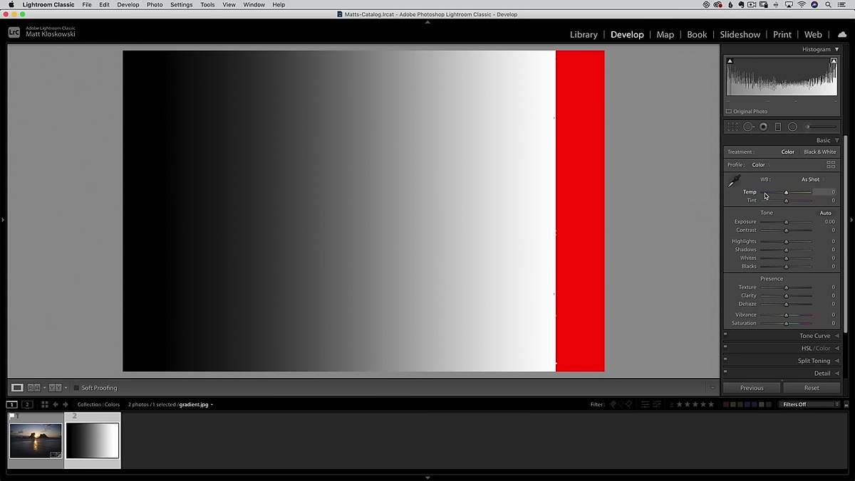 Temperature slider being dragged with histogram shifting visibly
With the clipping warning active, head up to the White Balance section in the Basic panel and start dragging the Temperature slider left and right. Watch the histogram as you move it. You’ll see the tonal distribution shift meaningfully, even with small adjustments. Push it warm and the highlights start to creep. Pull it cool and the histogram redistributes. The Tint slider is a little gentler, but you’ll still see movement.
Temperature slider being dragged with histogram shifting visibly
With the clipping warning active, head up to the White Balance section in the Basic panel and start dragging the Temperature slider left and right. Watch the histogram as you move it. You’ll see the tonal distribution shift meaningfully, even with small adjustments. Push it warm and the highlights start to creep. Pull it cool and the histogram redistributes. The Tint slider is a little gentler, but you’ll still see movement.
The point here isn’t that white balance adjustments are wrong. They’re the right tool for correcting a color cast or matching a scene’s natural light. The problem shows up when you want to use color creatively, like adding warmth for mood or pushing a cooler, cinematic feel, because those adjustments are dragging your exposure data along for the ride whether you want them to or not.
Step 3: Reset Temperature and Tint to Zero
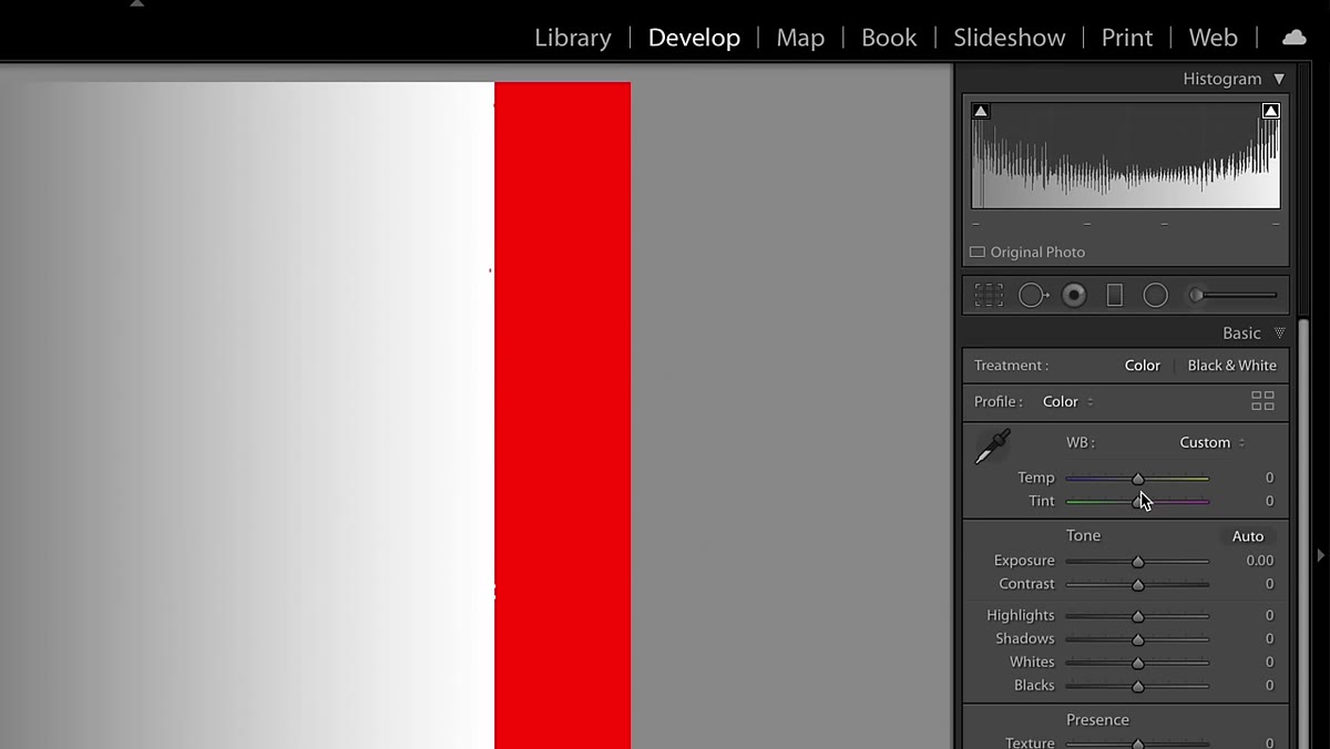 Temperature and Tint sliders returned to zero
Double-click both the Temperature and Tint sliders to reset them to their defaults before moving on. You want a clean baseline so the comparison is honest. If you’ve been experimenting, also check that your exposure and tone controls are where they were before. Starting from a neutral state here makes the next step much easier to evaluate.
Temperature and Tint sliders returned to zero
Double-click both the Temperature and Tint sliders to reset them to their defaults before moving on. You want a clean baseline so the comparison is honest. If you’ve been experimenting, also check that your exposure and tone controls are where they were before. Starting from a neutral state here makes the next step much easier to evaluate.
Think of this as clearing the whiteboard. You’re not undoing good work, you’re setting up a side-by-side you can actually learn from.
Step 4: Open the Graduated Filter and Scroll to the Color Option
 Graduated Filter panel open with Color swatch visible at bottom
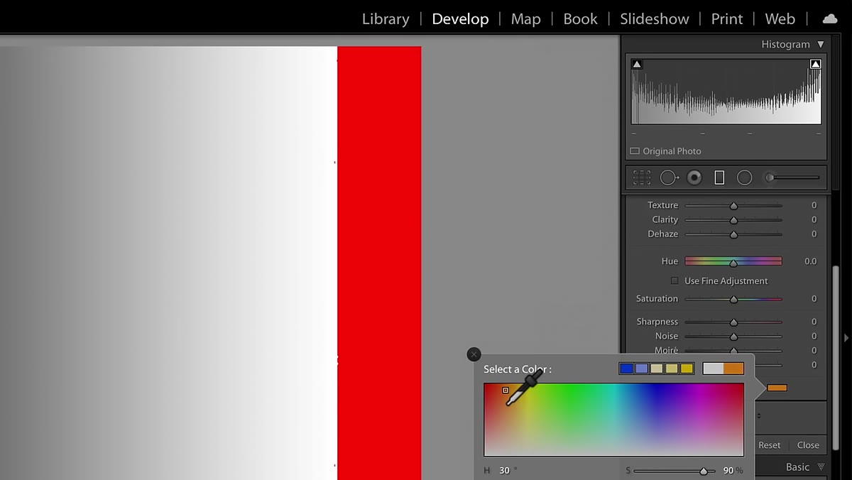
Click on the Graduated Filter tool in the toolbar beneath the Histogram panel. It looks like a rectangle with a gradient. Once the panel opens, scroll all the way down past all the familiar sliders, past Sharpness, Noise, and Moire, until you reach the Color option at the very bottom. There’s a small color swatch next to it. This is the tool Matt refers to as semi-hidden, and semi-hidden is accurate. It’s not labeled in a way that screams “color grade me,” which is probably why most people scroll past it.
Graduated Filter panel open with Color swatch visible at bottom
Click on the Graduated Filter tool in the toolbar beneath the Histogram panel. It looks like a rectangle with a gradient. Once the panel opens, scroll all the way down past all the familiar sliders, past Sharpness, Noise, and Moire, until you reach the Color option at the very bottom. There’s a small color swatch next to it. This is the tool Matt refers to as semi-hidden, and semi-hidden is accurate. It’s not labeled in a way that screams “color grade me,” which is probably why most people scroll past it.
Click the color swatch and the standard color picker will open. This is where you’ll choose the hue you want to apply.
Step 5: Pick Your Color and Apply It to the Whole Image
 Color picker open with a warm hue selected inside Graduated Filter
Inside the color picker, choose a hue that fits the direction you want to push your image. For a warmer, golden-hour feel, pull toward orange or yellow. For a cooler, more subdued look, move toward blue. You can also adjust the saturation of the color inside the picker to control how intensely it applies.
Color picker open with a warm hue selected inside Graduated Filter
Inside the color picker, choose a hue that fits the direction you want to push your image. For a warmer, golden-hour feel, pull toward orange or yellow. For a cooler, more subdued look, move toward blue. You can also adjust the saturation of the color inside the picker to control how intensely it applies.
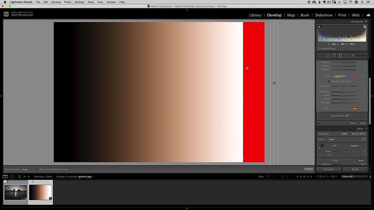
Here’s the key move: once you’ve picked your color, drag the Graduated Filter handles outside the boundaries of your photo entirely. When the gradient extends beyond the frame on all sides, it effectively covers the entire image with a flat, even color overlay. What starts as a gradient tool becomes a whole-image color wash. It’s a workaround, but it’s a clean one.
Step 6: Watch the Histogram and Clipping Warning
 Histogram showing minimal change with Color overlay applied
Now look at your histogram and your clipping warning. Compare this to what happened when you moved the Temperature slider. The difference is the entire point of the tutorial. The Color overlay inside the Graduated Filter applies tint to your image without meaningfully shifting the underlying tonal data. Your highlights stay where they were. The clipping warning barely reacts. You can push the saturation of the color and still not blow out your sky.
Histogram showing minimal change with Color overlay applied
Now look at your histogram and your clipping warning. Compare this to what happened when you moved the Temperature slider. The difference is the entire point of the tutorial. The Color overlay inside the Graduated Filter applies tint to your image without meaningfully shifting the underlying tonal data. Your highlights stay where they were. The clipping warning barely reacts. You can push the saturation of the color and still not blow out your sky.
Toggle the filter off and on a few times using the switch at the top of the panel. You’ll see the color shift clearly in the image, but the histogram barely flinches. That stability is what makes this approach so useful for creative color work.
One Extra Thing Worth Knowing
I’ve started using this method as a first pass on any image where I want a stylized look before I do any tone work. Locking in a color direction early, without disturbing the exposure, means I can still lift shadows and pull down highlights freely afterward. The color stays consistent even as the tones move around it.
The one limitation to know about: this method doesn’t give you channel-specific control the way HSL does. You can’t tell it to only shift the blues in the sky. It’s a global overlay. So for surgical color correction, Temperature, Tint, and HSL are still the right tools. But for setting a mood across a whole image? This approach is faster and safer than reaching for white balance every time.
The single most useful idea here is that color and tone don’t have to move together. White balance sliders are powerful, but they move everything at once. The Color overlay inside the Graduated Filter lets you push a creative color direction while keeping your tonal structure exactly where you left it. That’s a meaningful distinction once you start doing more intentional color grading.
Watch the full tutorial on YouTube to see Matt walk through the full before-and-after comparison with the clipping warning in real time. Seeing it live in the histogram makes the concept click faster than any description can.
Comments
Leave a Comment