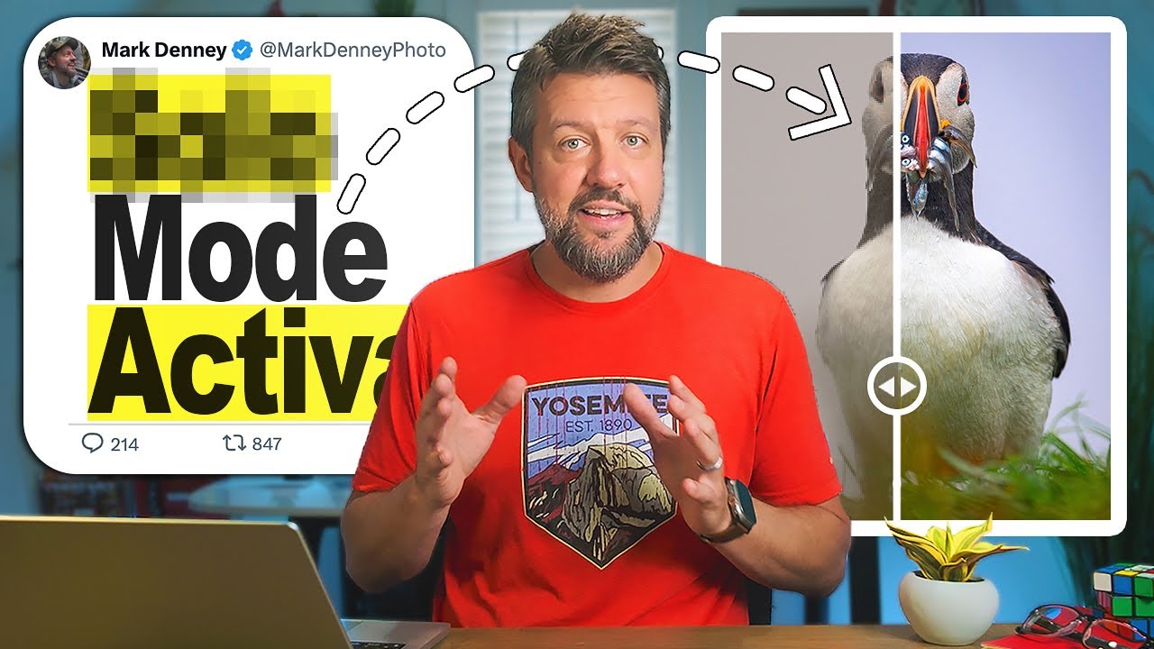
Every editor has a turning point. Mine came embarrassingly late. I was two years into editing photos for a local music scene in Nashville, spending 45 minutes per image tweaking sliders I didn’t fully understand, when a photographer friend leaned over my shoulder and said, “Why are you doing it that way?” Turns out I had been fighting Lightroom’s architecture instead of working with it.
That experience is exactly why I keep coming back to tutorials from creators who clearly live inside this software. In this Mark Denney tutorial on 9 Lightroom hacks pros know that beginners don’t, Denney moves through techniques that aren’t hidden exactly, but are obscure enough that most intermediate editors have never touched them. The kind of things that make you close your laptop and stare at the ceiling for a minute.
Two techniques in particular stopped me mid-watch. One solves a problem I didn’t even know had a name, and the other changes how you think about reviewing your own work. Here’s a proper walkthrough of both.
Step 1: Understand Why Lightroom’s Tone Sliders Have a Blind Spot
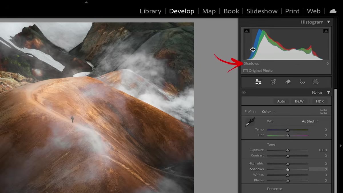 Histogram with labeled tonal zones in the Basic panel
Before you touch anything, it helps to understand the actual problem. Open any raw file in the Develop module and look at the histogram. The left edge represents your blacks, the zone just inside that is shadows, the right edge is whites, and just inside that sits highlights. Lightroom gives you a dedicated slider for every one of those zones.
Histogram with labeled tonal zones in the Basic panel
Before you touch anything, it helps to understand the actual problem. Open any raw file in the Develop module and look at the histogram. The left edge represents your blacks, the zone just inside that is shadows, the right edge is whites, and just inside that sits highlights. Lightroom gives you a dedicated slider for every one of those zones.
The big middle section of the histogram, the one that actually contains most of the tonal information in a properly exposed photograph, is called midtones. And Lightroom does not give you a midtone slider in the Basic panel. The Exposure slider sits there labeled like it covers that territory, but move it and you’ll see the entire histogram shift, not just the middle. For nuanced editing, that’s a real limitation, and most beginners never realize there’s a workaround sitting two panels away.
Step 2: Close the Basic Panel and Navigate to Color Grading
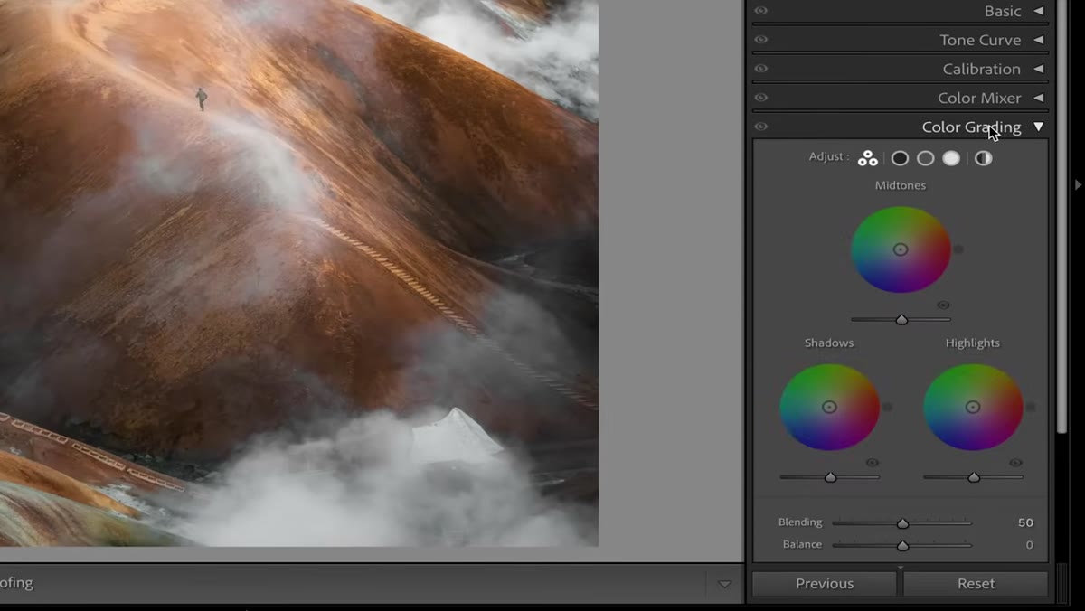 Color Grading section open showing three color wheels
Collapse your Basic panel and scroll down to the Color Grading section. You’ll see three color wheels arranged on screen. The top wheel controls midtones, the bottom left handles shadows, and the bottom right manages highlights. Most people open this section once, decide it looks complicated, and never come back.
Color Grading section open showing three color wheels
Collapse your Basic panel and scroll down to the Color Grading section. You’ll see three color wheels arranged on screen. The top wheel controls midtones, the bottom left handles shadows, and the bottom right manages highlights. Most people open this section once, decide it looks complicated, and never come back.
That’s a mistake. The color wheels themselves are worth learning, but right now you’re not here for color. You’re here for a slider sitting directly beneath the midtone wheel labeled Luminance.
Step 3: Use the Midtone Luminance Slider as Your Missing Midtone Control
 Luminance slider beneath midtone wheel being adjusted
Click the midtone color wheel to select it, then look for the Luminance slider underneath. Luminance is just brightness with a fancier name. Drag the slider left and right while watching your histogram. Notice what happens: only the center mass of the histogram moves. The highlight peaks and shadow depths stay pinned. You are surgically adjusting your midtones without touching anything else.
Luminance slider beneath midtone wheel being adjusted
Click the midtone color wheel to select it, then look for the Luminance slider underneath. Luminance is just brightness with a fancier name. Drag the slider left and right while watching your histogram. Notice what happens: only the center mass of the histogram moves. The highlight peaks and shadow depths stay pinned. You are surgically adjusting your midtones without touching anything else.
This is genuinely one of the more powerful things you can do in Lightroom that requires zero masking, zero local adjustments, and zero frustration. Denney mentions using this on almost every image he edits, and after about ten minutes of testing it, I understood why. It brings up a flat RAW file in a way that feels natural because midtones are where the eye actually reads a photo.
Step 4: Compare It Against the Exposure and Highlights Sliders to See the Difference
 Histogram shift while moving Exposure slider in Basic panel
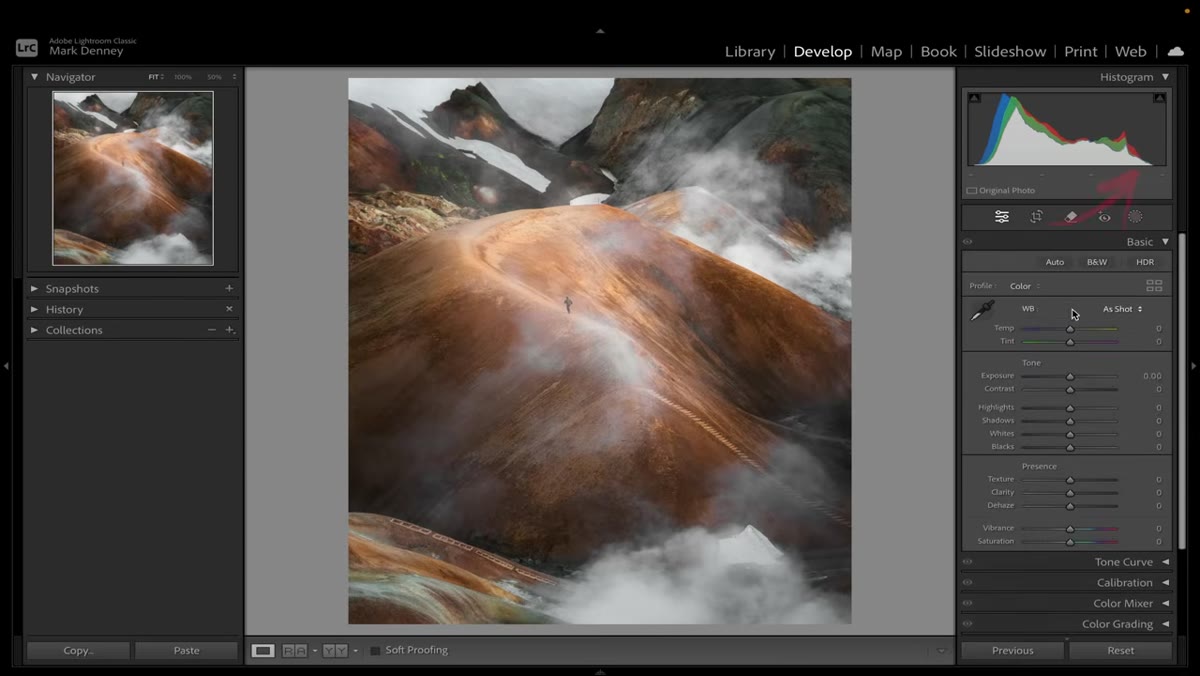
This step is optional but I’d call it essential for actually internalizing the technique. Go back to the Basic panel and drag the Exposure slider while watching the histogram. The whole mountain moves right. Then try Highlights. Still broad, still affecting tonal ranges you didn’t intend to touch.
Histogram shift while moving Exposure slider in Basic panel
This step is optional but I’d call it essential for actually internalizing the technique. Go back to the Basic panel and drag the Exposure slider while watching the histogram. The whole mountain moves right. Then try Highlights. Still broad, still affecting tonal ranges you didn’t intend to touch.
Now come back to the Color Grading midtone Luminance slider and do the same thing. The difference is immediately visible. If you’ve ever pushed Exposure up to brighten a scene and wondered why your sky looked blown out even though you pulled Highlights back down, this is the explanation. You were editing the midtones with a tool that wasn’t designed to isolate them. Now you have one that is.
Step 5: Use the Y Key to Open the Before and After Comparison View
 Split screen before and after view triggered by Y key
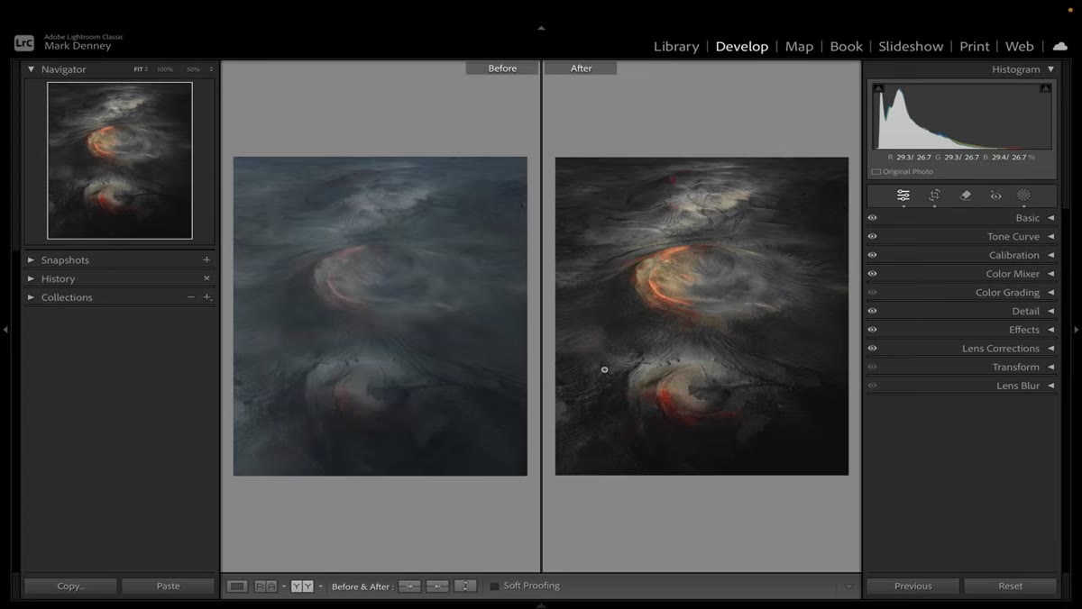
The backslash key gives you a quick before/after toggle that most editors know. But Denney points out that pressing the Y key opens a more detailed comparison mode, a side-by-side split where the left panel shows the unedited raw file and the right shows your current edit.
Split screen before and after view triggered by Y key
The backslash key gives you a quick before/after toggle that most editors know. But Denney points out that pressing the Y key opens a more detailed comparison mode, a side-by-side split where the left panel shows the unedited raw file and the right shows your current edit.
This is more useful than it sounds for a specific reason. When you’re staring at the same image for 20 minutes, your eyes adapt and you stop seeing it accurately. The split view resets your perception fast. You’re not toggling a memory, you’re literally looking at both versions simultaneously. For any edit that involves luminance adjustments where the difference can feel subtle, this comparison is the honest gut-check you need before you export.
A Note on Where This Fits in My Actual Workflow
I’ve been naming my presets after songs for years. There’s a preset I made at 2am called “Horses” after the Patti Smith record, and it uses almost exactly this technique: Color Grading midtones Luminance pulled up slightly, Exposure left untouched. The images it produces look bright without looking processed. That quality is hard to describe until you start understanding why midtones are the thing an eye actually reads as “light.”
One caveat worth mentioning: the Luminance slider in Color Grading can interact with any color tinting you’ve added to the same wheel. If you’re using Color Grading for actual color work, adjusting the Luminance on the same wheel you’ve tinted will shift both simultaneously. My workaround is to use Color Grading strictly for luminance during the tonal edit stage, then come back for color work separately. Keeps things clean and gives you more predictable results across different images in the same session.
The biggest thing I took from this Denney tutorial is a reframe rather than a trick: Lightroom is not missing a midtone slider. It moved it. The fact that it lives inside Color Grading means most editors scroll past it entirely, which is exactly why the editors who know about it have a consistent edge on anyone who doesn’t.
Watch the full breakdown and all nine techniques here: Watch the full tutorial on YouTube
Comments (2)
Great breakdown. The step-by-step approach really helps.
This should be required reading for anyone starting out.
Leave a Comment