
There’s a shot I’ve taken probably a hundred times at Radnor Lake. Wide angle, polarizing filter, golden hour. The composition is solid every time. The sky ruins it about half the time. Not because of clouds or blown highlights, but because of that banded, uneven blue you get when you shoot wide with a polarizer. One side of the sky goes deep navy. The other fades to something closer to periwinkle. The human eye adjusts for it in real life. In a photo, it just looks like a mistake.
I’ve patched this problem for years using gradient masks and aggressive HSL work. It works, but it’s fiddly and it never feels like a clean solution. When I saw the October 2025 Lightroom Classic update drop at Adobe Max, one feature jumped out immediately: the Variance slider inside the Color Mixer. Watch the full tutorial on YouTube where Matt Kloskowski walks through this and the rest of the update. What follows is my breakdown of the Variance feature specifically, with the workflow tips that actually matter.
Step 1: Update to Lightroom Classic Version 15
 Adobe Creative Cloud updater showing Lightroom Classic version 15
Before anything else, make sure you’re running the right version. This update brings Lightroom Classic to version 15. Don’t confuse it with Lightroom (the cloud version), which is on version 9. Open Adobe Creative Cloud, find Lightroom Classic in your apps list, and update. The installer replaces the old version automatically.
Adobe Creative Cloud updater showing Lightroom Classic version 15
Before anything else, make sure you’re running the right version. This update brings Lightroom Classic to version 15. Don’t confuse it with Lightroom (the cloud version), which is on version 9. Open Adobe Creative Cloud, find Lightroom Classic in your apps list, and update. The installer replaces the old version automatically.
One housekeeping note worth knowing: your catalog will need to upgrade when you launch the new version. This happens every year. If your catalog filename has turned into something like “Lightroom Catalog-v13-2-final-FINAL,” now is a good time to clean it up. After the upgrade completes, go to File and choose Rename Catalog. Give it something simple. Future you will appreciate it.
Step 2: Locate the Variance Slider in the Color Mixer
 Color Mixer panel showing new Variance adjustment below Hue, Saturation, Luminance
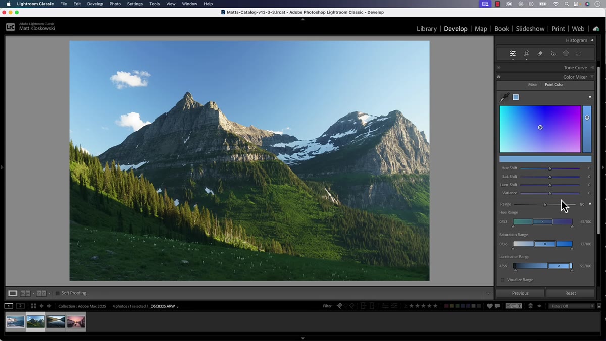
Open a photo with a problematic sky or uneven color range. Head to the Develop module and find the Color Mixer panel. Use the eyedropper tool to sample the color you want to work with, like the blue in a sky. You’ll see the familiar Hue, Saturation, and Luminance sliders appear for that color range. Directly below those, there’s now a Variance slider. That’s the new addition.
Color Mixer panel showing new Variance adjustment below Hue, Saturation, Luminance
Open a photo with a problematic sky or uneven color range. Head to the Develop module and find the Color Mixer panel. Use the eyedropper tool to sample the color you want to work with, like the blue in a sky. You’ll see the familiar Hue, Saturation, and Luminance sliders appear for that color range. Directly below those, there’s now a Variance slider. That’s the new addition.
Variance has been available in Camera Raw for a little while, but this is its first appearance inside Lightroom Classic. The concept is straightforward: it controls how much variation is allowed within that color range. Drag left and the colors within that range become more uniform. Drag right and the differences between them become more pronounced.
Step 3: Understand Why Applying It Globally Is Usually the Wrong Move
 Full photo showing Variance applied globally, affecting colors beyond the sky
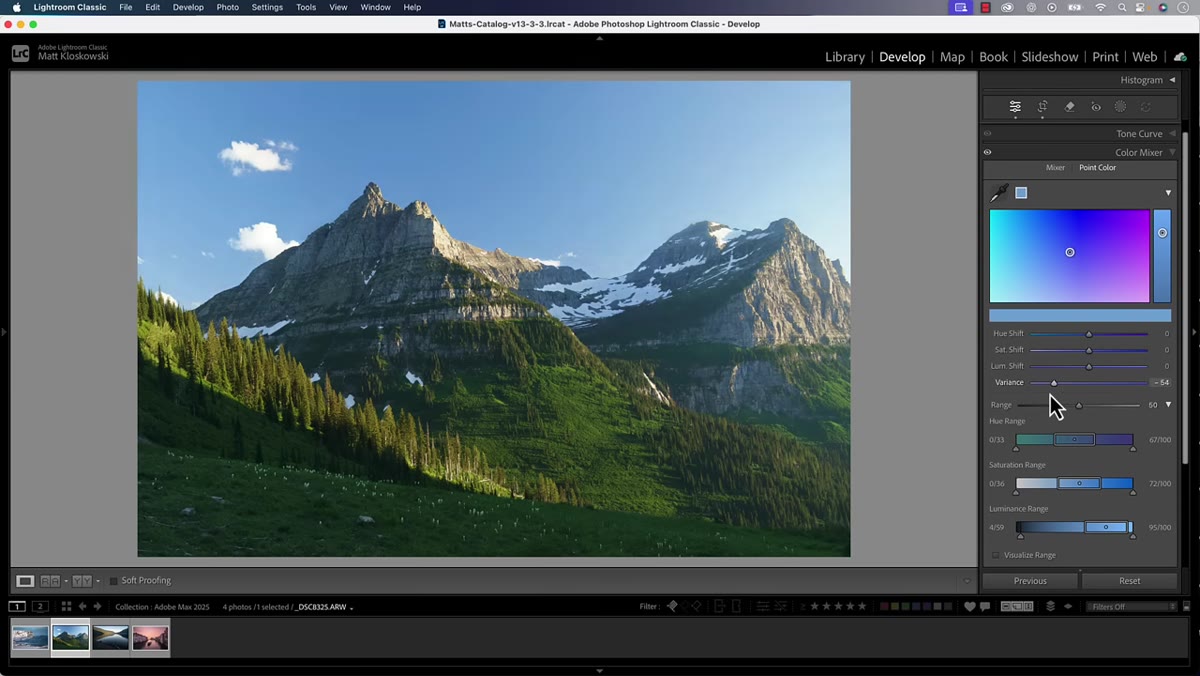
Here’s where a lot of people will make the obvious mistake, and it’s worth being explicit about it. If you apply the Variance slider directly from the Color Mixer panel without a mask, it affects every instance of that color in the entire photo. Reduce the variance on blues to smooth out your sky, and you’ll also flatten the blues in water, clothing, shadows, and anything else sharing that color range.
Full photo showing Variance applied globally, affecting colors beyond the sky
Here’s where a lot of people will make the obvious mistake, and it’s worth being explicit about it. If you apply the Variance slider directly from the Color Mixer panel without a mask, it affects every instance of that color in the entire photo. Reduce the variance on blues to smooth out your sky, and you’ll also flatten the blues in water, clothing, shadows, and anything else sharing that color range.
For landscapes especially, global Variance adjustments can create that plastic, over-processed look fast. The fix is to not use it globally. Which brings us to the step that actually makes this tool useful.
Step 4: Apply Variance Inside a Sky Mask
 Masking panel open with AI sky mask selected and Point Color panel visible
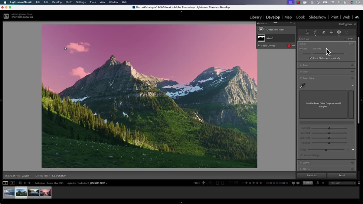
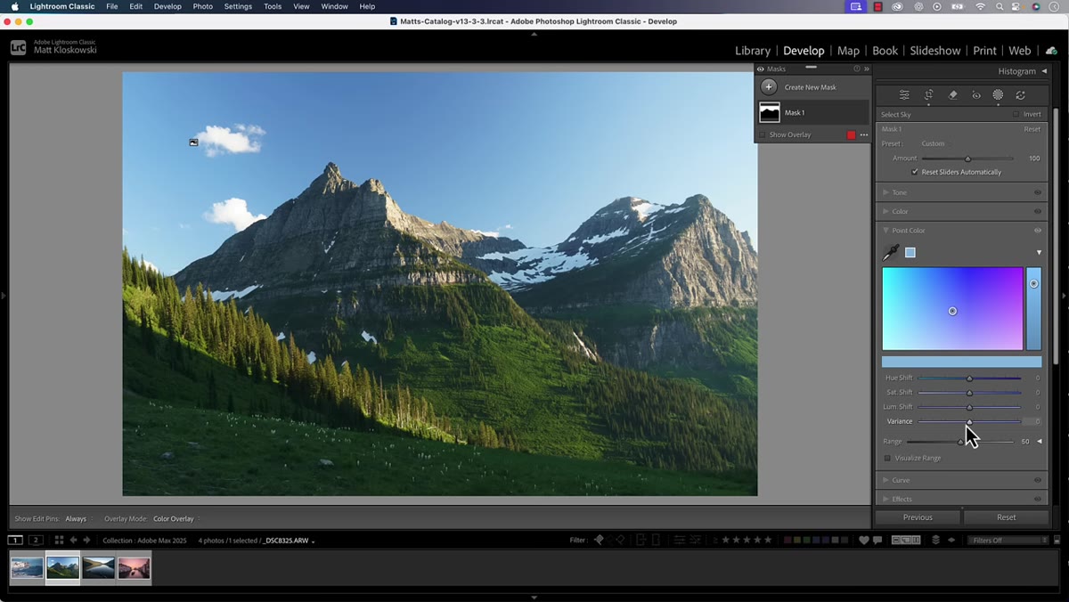
Go to the Masking panel and use the Select Sky option. Lightroom’s AI sky selection is genuinely good at this point, and for most shots it’ll grab the sky cleanly without much fuss. Once you’ve created the sky mask, look at the panel options available inside that mask. You’ll find a Point Color panel there, which is the masked version of what you’d normally do in the Color Mixer.
Masking panel open with AI sky mask selected and Point Color panel visible
Go to the Masking panel and use the Select Sky option. Lightroom’s AI sky selection is genuinely good at this point, and for most shots it’ll grab the sky cleanly without much fuss. Once you’ve created the sky mask, look at the panel options available inside that mask. You’ll find a Point Color panel there, which is the masked version of what you’d normally do in the Color Mixer.
Use the eyedropper inside the masked Point Color panel to sample your sky blue. Now when you pull the Variance slider to the left, it only affects the blue variation inside the sky mask. Nothing below the horizon line gets touched. Drag left to unify those uneven tones. For my wide-angle polarizer shots, pulling it to around minus 40 or minus 50 typically smooths the banding without making the sky look fake.
Step 5: Use a Second Separate Mask for Other Sky Adjustments
 Two separate sky masks shown in masking panel for different adjustments
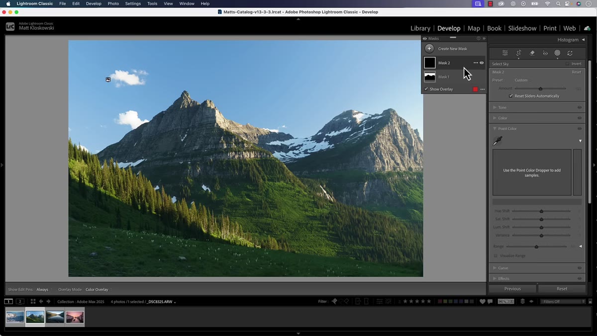
This is the workflow tip Matt attributes to Adobe’s own engineers, and it’s the one that surprised me most. The instinct is to do everything to the sky inside one mask. Reduce variance, boost brightness, add saturation, all in one place. The engineers recommend against it.
Two separate sky masks shown in masking panel for different adjustments
This is the workflow tip Matt attributes to Adobe’s own engineers, and it’s the one that surprised me most. The instinct is to do everything to the sky inside one mask. Reduce variance, boost brightness, add saturation, all in one place. The engineers recommend against it.
If you want to make additional adjustments to the sky beyond variance smoothing, create a second sky mask and do those adjustments there. Keep the Variance work isolated in its own mask. The reason is that the Variance slider interacts with the other color adjustments in ways that can compound unexpectedly. Separating them gives you cleaner, more predictable results and makes it much easier to go back and tweak either adjustment independently without everything shifting on you.
Step 6: Try Variance on Skin Tones in Portraits
 Portrait photo with skin tone selected in Point Color panel inside a mask
The sky use case is the obvious one for landscape photographers, but Matt mentions portrait photographers finding it just as useful. Sample a skin tone color with the eyedropper inside a masked Point Color panel, and reducing variance can smooth out the subtle shifts in complexion that come from uneven lighting or mixed color temperatures on set.
Portrait photo with skin tone selected in Point Color panel inside a mask
The sky use case is the obvious one for landscape photographers, but Matt mentions portrait photographers finding it just as useful. Sample a skin tone color with the eyedropper inside a masked Point Color panel, and reducing variance can smooth out the subtle shifts in complexion that come from uneven lighting or mixed color temperatures on set.
I tested this on a few headshots I’ve edited recently. Creating a subject mask first, then reducing skin tone variance by about 20 to 30 points, gave me a cleaner base to work from without the heavy-handed look of aggressive HSL moves. It’s not a replacement for frequency separation or dedicated retouching work, but as a first pass it’s fast and surprisingly effective.
My Take: This Changes How I’ll Handle Fall Foliage
Fall color editing has always been a balancing act for me. The reds, oranges, and yellows in a canopy shot are never uniform, and that’s usually the point. But sometimes there’s one section of leaves that just looks off because of the light angle, and targeted HSL work on a color that’s this complex tends to blow up other parts of the image.
Here’s what I’ll be experimenting with through fall: using the Variance slider dragged to the right, not the left, on masked sections of foliage to actually increase the differentiation between similar tones. Matt mentions this in passing and I think it’s the more interesting creative direction. More variance in autumn colors could help individual trees read distinctly instead of blending into one undifferentiated orange mass. I’ll report back on how it goes.
The single most important thing to take from this update is the masking-first mindset. The Variance slider is powerful, but it only makes sense when it’s contained. Build the mask, work inside it, and if you need multiple adjustments on the same area, build multiple masks. That’s clean, reversible, and exactly how Lightroom is meant to be used.
Watch the full tutorial on YouTube to see Matt’s complete walkthrough of everything else in the October 2025 update.
Comments (6)
Printing this out and pinning it next to my monitor. That good.
Solid advice. Especially the part about taking your time with it.
This saved me so much time on my last edit. Wish I'd found this sooner.
Great article! I actually covered something related on my site — the photography angle is really complementary to this.
This saved me so much time on my last edit. Wish I'd found this sooner.
I tried this on a client project yesterday and the results were way better than expected.
Leave a Comment