I’ve been editing photos in Lightroom long enough to think I’d found all the tricks. And then something comes along and completely rearranges my mental model of how a tool works. That happened recently when I watched a tutorial by Matt Kloskowski showing a vibrance adjustment hidden inside Lightroom’s local adjustment tools. Not a workaround. Not a hack. A legitimately different rendering behavior that’s been sitting there quietly the whole time.
The practical problem this solves is one I’ve run into on almost every landscape job I’ve edited in the past year. You want to punch up the color in one section of a frame, maybe the sky or a patch of wildflowers, without torching the warm skin tones in the foreground. The global saturation slider doesn’t care about your skin tones. It treats everything equally and aggressively. Vibrance is smarter, but until I watched this Matt Kloskowski tutorial on YouTube, I didn’t realize you could apply that vibrance-style behavior locally.
Here’s the full walkthrough so you can try it yourself.
Step 1: Set Up Virtual Copies for Comparison
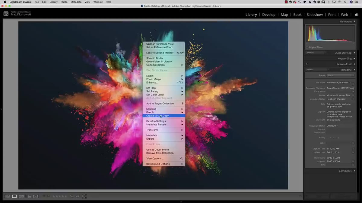 Creating multiple virtual copies of a photo in Lightroom
Before touching any sliders, right-click your image in the Library module and select “Create Virtual Copy.” Do this three times so you end up with four total versions of the same photo. This isn’t busywork. Comparing these side by side is the only way to really see what’s happening with the color rendering. If you skip this step, you’ll be taking the result on faith instead of seeing the actual difference with your own eyes.
Creating multiple virtual copies of a photo in Lightroom
Before touching any sliders, right-click your image in the Library module and select “Create Virtual Copy.” Do this three times so you end up with four total versions of the same photo. This isn’t busywork. Comparing these side by side is the only way to really see what’s happening with the color rendering. If you skip this step, you’ll be taking the result on faith instead of seeing the actual difference with your own eyes.
Pick an image with a good range of colors for this test, especially one with oranges, reds, and yellows. Portraits work great. Flowers, fall foliage, anything with warm tones that would go nuclear under heavy saturation. The more vivid the source image, the more obvious the effect will be.
Step 2: Apply Global Vibrance at 100 to the First Copy
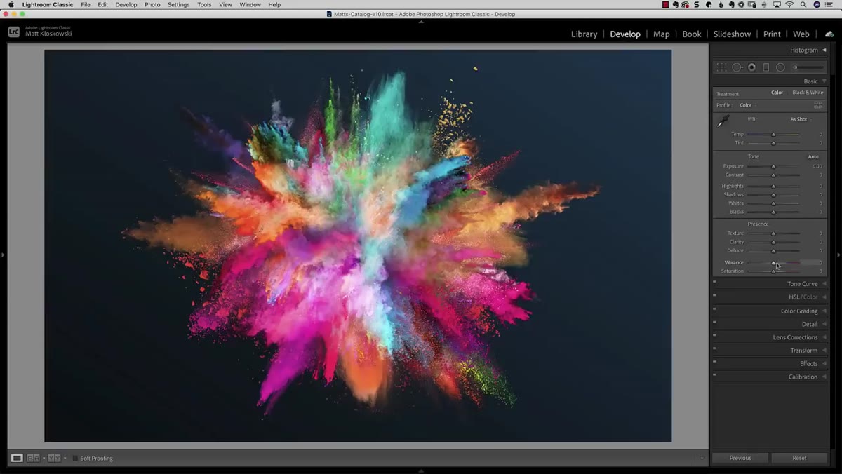 Vibrance slider cranked to 100 in the Develop module
Take your first virtual copy into the Develop module and drag the Vibrance slider all the way to 100. Yes, 100 is an absurd real-world value, but this is a controlled test and the exaggeration makes the differences visible. Notice how the oranges and warm skin tones stay relatively contained even at this extreme. The blues and greens get saturated, but the reds and yellows pump the brakes a little. That’s the defining characteristic of vibrance.
Vibrance slider cranked to 100 in the Develop module
Take your first virtual copy into the Develop module and drag the Vibrance slider all the way to 100. Yes, 100 is an absurd real-world value, but this is a controlled test and the exaggeration makes the differences visible. Notice how the oranges and warm skin tones stay relatively contained even at this extreme. The blues and greens get saturated, but the reds and yellows pump the brakes a little. That’s the defining characteristic of vibrance.
This is the benchmark version. Every comparison you make for the rest of this test will come back to what vibrance looks like at full intensity.
Step 3: Apply Global Saturation at 100 to the Second Copy
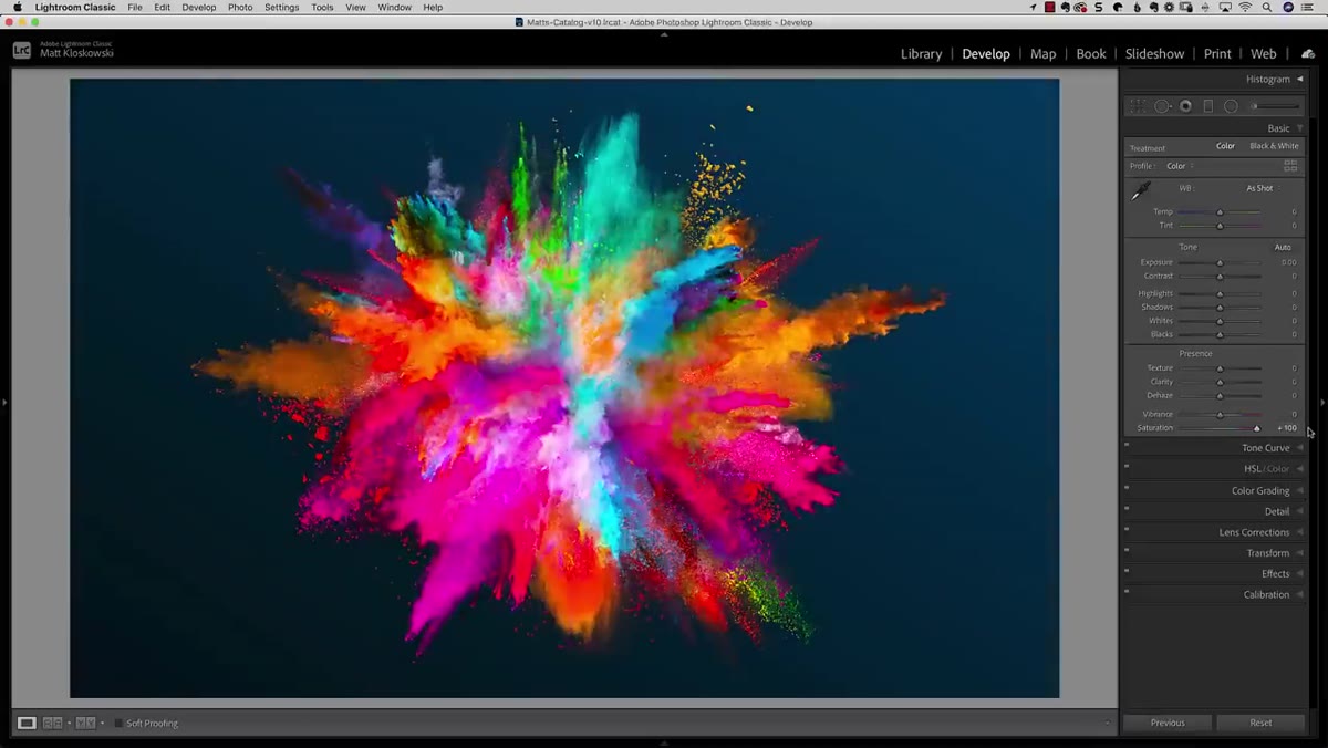 Saturation slider at 100 showing radioactive skin tones
On your second virtual copy, zero out everything and push the Saturation slider to 100. The difference from the vibrance version is immediate and pretty alarming. Skin tones go radioactive. Oranges and reds blow out into something closer to a neon sign than a photograph. Saturation treats every color channel with the same heavy hand, which is precisely why it’s a less forgiving tool when you’re trying to selectively intensify color without wrecking warm tones.
Saturation slider at 100 showing radioactive skin tones
On your second virtual copy, zero out everything and push the Saturation slider to 100. The difference from the vibrance version is immediate and pretty alarming. Skin tones go radioactive. Oranges and reds blow out into something closer to a neon sign than a photograph. Saturation treats every color channel with the same heavy hand, which is precisely why it’s a less forgiving tool when you’re trying to selectively intensify color without wrecking warm tones.
This is the comparison anchor. When you see what 100 saturation looks like globally, you’ll appreciate why the local adjustment panel’s behavior is so interesting.
Step 4: Apply a Graduated Filter With Saturation at 100 to the Third Copy
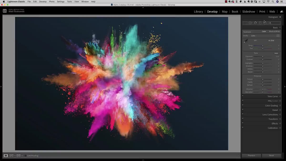 Graduated filter dragged off-canvas edge covering the whole photo
Here’s where it gets interesting. On your third copy, open the Graduated Filter tool. Double-click the word “Effect” at the top of the panel to zero everything out. Now drag the gradient from just outside the edge of the frame inward so the transition line is off-canvas. The practical effect is that the gradient now covers the entire image uniformly, with no actual gradient falloff visible in the frame.
Graduated filter dragged off-canvas edge covering the whole photo
Here’s where it gets interesting. On your third copy, open the Graduated Filter tool. Double-click the word “Effect” at the top of the panel to zero everything out. Now drag the gradient from just outside the edge of the frame inward so the transition line is off-canvas. The practical effect is that the gradient now covers the entire image uniformly, with no actual gradient falloff visible in the frame.
Crank the Saturation slider inside the graduated filter panel to 100. On the surface, this looks like it should produce the same result as Step 3. Same slider, same value, just applied locally instead of globally. But it doesn’t.
Step 5: Compare All Three Versions Side by Side
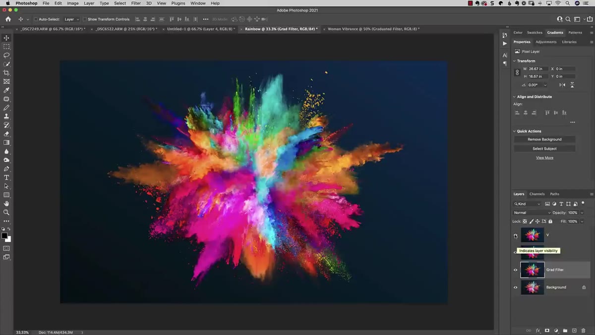 Three versions stacked in Photoshop showing color differences
Matt takes these three versions into Photoshop as stacked layers to compare them directly, and the result is genuinely surprising. The graduated filter version and the global saturation version at 100 look completely different. The global saturation version punishes those warm tones. The graduated filter version, despite technically being set to 100 saturation, produces something much closer to the global vibrance result from Step 2.
Three versions stacked in Photoshop showing color differences
Matt takes these three versions into Photoshop as stacked layers to compare them directly, and the result is genuinely surprising. The graduated filter version and the global saturation version at 100 look completely different. The global saturation version punishes those warm tones. The graduated filter version, despite technically being set to 100 saturation, produces something much closer to the global vibrance result from Step 2.
That’s the hidden behavior. The saturation slider inside Lightroom’s local adjustment tools, including the Graduated Filter, the Radial Filter, and the Adjustment Brush, doesn’t actually render like global saturation. It renders more like vibrance. It protects skin tones and warm hues from going completely off the rails. The label says “Saturation” but the math underneath behaves like “Vibrance.”
Step 6: Confirm It on a Portrait
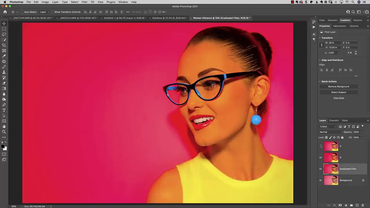 Portrait comparison showing skin tone protection in graduated filter
The landscape test makes the concept visible, but a portrait really locks in why this matters practically. Apply the same test to a photo with a human face. Global saturation at 100 makes skin tones look like a sunburn emergency. The global vibrance version is still aggressive but noticeably more forgiving. And the graduated filter at 100 saturation? Almost identical to vibrance, with the same warm-tone protection doing its quiet work.
Portrait comparison showing skin tone protection in graduated filter
The landscape test makes the concept visible, but a portrait really locks in why this matters practically. Apply the same test to a photo with a human face. Global saturation at 100 makes skin tones look like a sunburn emergency. The global vibrance version is still aggressive but noticeably more forgiving. And the graduated filter at 100 saturation? Almost identical to vibrance, with the same warm-tone protection doing its quiet work.
This confirms it’s not a fluke of one image. The local adjustment panel in Lightroom genuinely applies a vibrance-style algorithm even though the slider is labeled saturation.
How I Use This in Real Edits
Knowing this changes how I approach color work on location shots, especially golden hour photos where I want to deepen the sky blues without turning my subject’s face orange. Instead of reaching for the global vibrance slider and accepting that it will touch everything, I’ll drop an Adjustment Brush or a Radial Filter on just the area I want to intensify and push the saturation inside that local adjustment. The result is targeted, vibrance-style color enhancement that stays clean where it matters.
I’ve also started leaning on this when I’m editing environmental portraits, where the background needs a color lift but the person in the frame needs to stay looking human. The local adjustment’s built-in warm-tone protection gives me a lot more control than I’d get from any combination of global sliders.
One thing worth noting: this behavior is most obvious at high values. At subtle, realistic edit levels like 20 to 30, the difference between global saturation and local saturation is smaller. But once you know it’s there, you’ll notice it, and you’ll use it intentionally.
The single most useful thing this tutorial teaches isn’t just a trick. It’s a reminder that the label on a slider isn’t always the full story of what that slider does. The saturation control inside Lightroom’s local adjustments is doing something different from what it says on the tin, and that difference is exactly what makes painting vibrance onto part of a photo finally possible.
Watch the full tutorial on YouTube to see Matt walk through the Photoshop comparison himself. Seeing the layers toggle on and off in real time really drives home how significant the difference is.
Comments (1)
Just subscribed. If the rest of your content is this good, I'm in.
Leave a Comment