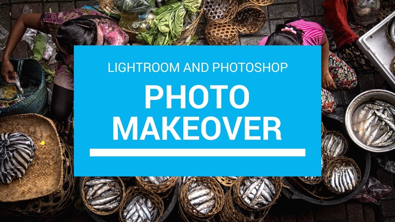
Every few months I’ll watch another working photographer edit in real time, not because I need the basics refreshed, but because the decisions are where the education lives. Anyone can list sliders. Watching someone decide which slider matters, and why, is a different thing entirely. That’s what pulled me into Matt Kloskowski’s new Photo Makeover series. Watch the full tutorial on YouTube and you’ll see what I mean within the first two minutes.
The format is simple: viewers submit photos, Matt edits them using whatever tools he’d reach for on his own work. No restrictions, no single-app constraints. Episode one covers three photos across different genres. I’m going to walk through his approach to the first one, a landscape overlook shot with good bones and a haze problem, because the decisions he makes there are transferable to almost anything you’ll shoot outdoors.
What I appreciate most is that Matt doesn’t perform editing. He thinks out loud, and when you’re trying to build your own instincts, that running commentary is worth more than any preset.
Step 1: Close the Histogram and Trust Your Eyes
 Lightroom interface with histogram panel closed
The first thing Matt does when he opens the photo in Lightroom is close the histogram panel. No fanfare, no explanation beyond the fact that he simply doesn’t use it. I’ve been editing long enough to know this is either going to scandalize someone or validate what they’ve been quietly doing for years.
Lightroom interface with histogram panel closed
The first thing Matt does when he opens the photo in Lightroom is close the histogram panel. No fanfare, no explanation beyond the fact that he simply doesn’t use it. I’ve been editing long enough to know this is either going to scandalize someone or validate what they’ve been quietly doing for years.
The point isn’t that histograms are useless. They’re a tool, and tools serve purposes. But when you’re doing creative editing rather than technical correction, staring at a graph can pull your eye away from the actual image. Matt looks at the photo first, identifies the problems visually (haze in the background, color that needs warming), and starts working from that read. Try it on your next edit. Cover the histogram for ten minutes and see if your decisions change.
Step 2: Warm the Image Before You Do Anything Else
 Temperature slider being pulled toward warm values
Before touching exposure or contrast, Matt reaches for the temperature slider and pulls it warm. Not a subtle nudge either. He describes it as “quite a bit,” which tells you something about how much warmth a hazy landscape can absorb before it starts looking cooked.
Temperature slider being pulled toward warm values
Before touching exposure or contrast, Matt reaches for the temperature slider and pulls it warm. Not a subtle nudge either. He describes it as “quite a bit,” which tells you something about how much warmth a hazy landscape can absorb before it starts looking cooked.
This is a sequencing choice worth internalizing. Warming an image changes how you perceive every other tonal adjustment you make afterward. If you wait until the end to add warmth, you’re often compensating for decisions you made on a cooler version of the photo. Starting warm means your shadows, highlights, and whites are all being evaluated in the light they’ll actually live in.
Step 3: Set Whites and Blacks with the Alt/Option Key Trick
 Whites slider being dragged with clipping preview visible
This is the technique I see overlooked most often in beginner edits, and Matt demonstrates it cleanly. Hold Alt on Windows or Option on Mac while dragging the Whites slider to the right. Lightroom switches to a clipping preview, showing you a black canvas that lights up wherever highlights are blowing out. You drag until you see just the first hint of color appearing, then back off slightly.
Whites slider being dragged with clipping preview visible
This is the technique I see overlooked most often in beginner edits, and Matt demonstrates it cleanly. Hold Alt on Windows or Option on Mac while dragging the Whites slider to the right. Lightroom switches to a clipping preview, showing you a black canvas that lights up wherever highlights are blowing out. You drag until you see just the first hint of color appearing, then back off slightly.
Do the same thing with the Blacks slider, pulling it left until you see the first shadows clip, then ease back. What you’ve done is stretch the tonal range of the image to its natural limits without destroying detail at either end. It takes about fifteen seconds and it’s more reliable than eyeballing it. After setting whites and blacks, Matt opens up the shadows slightly to recover some of the darker foreground areas, which is the right call on any backlit landscape where the ground is competing with a bright sky.
Step 4: Sharpen at 100% Zoom and Develop an Eye for Overcooked Edges
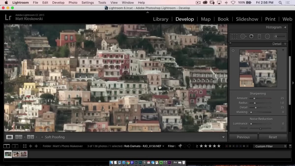 Image zoomed to 100% with sharpening Amount slider raised
Matt zooms to 100% before touching the sharpening controls, which is the only honest way to evaluate what sharpening is actually doing to your file. At thumbnail size, almost everything looks sharp. At pixel level, you see the truth.
Image zoomed to 100% with sharpening Amount slider raised
Matt zooms to 100% before touching the sharpening controls, which is the only honest way to evaluate what sharpening is actually doing to your file. At thumbnail size, almost everything looks sharp. At pixel level, you see the truth.
He raises the Amount slider until the image looks crisp and edges have definition, then stops. His philosophy here is refreshingly practical: if you’re posting to the web, don’t obsess over it. Viewers aren’t going to zoom into your JPEG on Instagram and pixel-peep your rocks. Get it looking sharp at 100%, move on. The nuance comes in when you’re printing, which leads directly to the next step.
Step 5: Sharpen Differently When You’re Printing
 Sharpening panel with Amount and Detail sliders pushed higher for print
For print, Matt deliberately goes a little further than feels comfortable on screen. He bumps the Amount slider higher, nudges the Detail slider up, and pushes the Radius to around 1.2 or 1.3. On screen it looks slightly over-sharpened. That’s intentional.
Sharpening panel with Amount and Detail sliders pushed higher for print
For print, Matt deliberately goes a little further than feels comfortable on screen. He bumps the Amount slider higher, nudges the Detail slider up, and pushes the Radius to around 1.2 or 1.3. On screen it looks slightly over-sharpened. That’s intentional.
Printing softens edges. Ink on paper, the physical surface texture, the viewing distance. All of it works against the crispness you see on a backlit monitor. If your print looks exactly as sharp as your screen preview, you probably under-sharpened. The goal is to push just past what looks right on screen, knowing the printing process will pull it back. There’s no universal formula for how far to push it, which is Matt’s honest admission and the right one. You print, you look, you adjust the next time. That feedback loop is how you actually learn sharpening, not by memorizing slider values.
What I’d Add From My Own Workflow
One thing Matt doesn’t cover in this first episode, probably because he’s keeping the pace moving, is masking your sharpening so it doesn’t affect smooth areas like sky or skin. In the Detail panel, holding Alt or Option while dragging the Masking slider shows you a black-and-white preview where white areas receive sharpening and black areas don’t. For landscapes, I usually push Masking to somewhere between 40 and 70, which keeps the sharpening on rocks, trees, and textured surfaces and off the gradients where it creates noise. It’s the difference between a photo that looks sharp and one that looks artificially crunchy.
My preset for this kind of landscape edit lives in my library under the name “Marquee Moon,” which should tell you everything you need to know about both my taste in music and how I spend my weekends. The point is that these decisions, warmth first, tonal range second, sharpening last, stack into a repeatable process you can codify and reuse.
The biggest thing this tutorial reminded me is that editing confidence comes from committing to a sequence. Matt doesn’t second-guess the order of operations. He knows what he’s fixing, he works through it methodically, and he doesn’t let perfect be the enemy of done. That’s the actual skill, and it’s harder to teach than any slider value.
Watch the full tutorial on YouTube to see Matt work through all three photos, including the genres he tackles after this landscape.
Comments
Leave a Comment