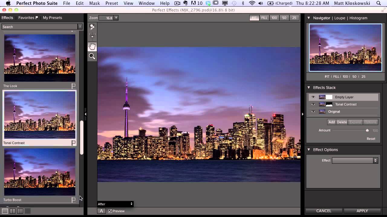
City skyline shots are the kind of image that look effortless on Instagram and quietly humiliating to edit on your own for the first time. The sky wants to blow out, the building lights want to clip, and the water always looks like you shot it in a parking garage. I’ve been there more times than I’d like to admit. So when I came across this KelbyOne tutorial by Matt Kloskowski, where he walks through the edit on a Toronto cityscape he captured the night before a Lightroom workshop, I paid close attention. The image is exactly the kind of technically tricky shot most of us delete before we even try. He didn’t.
Watch the full tutorial on YouTube
What makes this walkthrough worth your time isn’t just the settings. It’s the thinking behind the settings. Matt moves between Lightroom and Photoshop in a way that treats each tool as the right tool for specific problems, not just wherever you happened to open the file. The shot was taken at dusk with a 30-second exposure, a three-stop ND filter, and a Nikon D800 at f/8 on a 70-200mm lens. The long exposure blurs the water and clouds into something silky and intentional. The edit is where all of that becomes a finished image.
Step 1: Set the White Balance for the Mood, Not the Truth
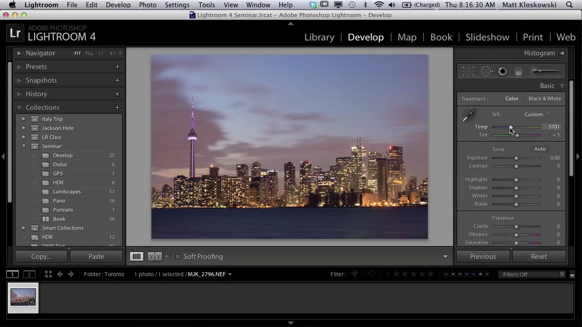 White balance sliders adjusted in the Basic panel
The first move Matt makes isn’t corrective, it’s creative. Rather than pulling the white balance back to neutral, he adds a touch more blue and a hint of purple to lean into the twilight feel. This is an important distinction. White balance in a cityscape at dusk isn’t about accuracy, it’s about atmosphere. If you shoot RAW, your camera’s auto white balance becomes basically a suggestion you’re free to ignore.
White balance sliders adjusted in the Basic panel
The first move Matt makes isn’t corrective, it’s creative. Rather than pulling the white balance back to neutral, he adds a touch more blue and a hint of purple to lean into the twilight feel. This is an important distinction. White balance in a cityscape at dusk isn’t about accuracy, it’s about atmosphere. If you shoot RAW, your camera’s auto white balance becomes basically a suggestion you’re free to ignore.
In the Basic panel, cool the Temperature slider slightly and nudge the Tint slider toward the magenta side. The exact values depend on your image, but you’re looking for that compressed, cinematic hour-after-sunset feeling. If it starts looking like a Instagram filter from 2014, you’ve gone too far. Subtle is the word.
Step 2: Work the Basic Panel Intentionally
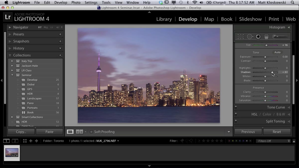 Shadows, Whites, and Blacks sliders being adjusted
Matt leaves the Exposure largely alone since the histogram is already sitting in a reasonable place. His focus here is on Shadows, Whites, and Blacks. He brings the Shadows up slightly to open the darker areas of the frame without flattening everything. Then he uses a technique worth burning into muscle memory: hold down Option (Mac) or Alt (PC) while dragging the Whites slider to the right. The screen goes black and shows you clipping highlights in white as they appear. Stop just before they blow out completely. Do the same thing moving the Blacks slider left, watching for true blacks to appear without crushing shadow detail you still want.
Shadows, Whites, and Blacks sliders being adjusted
Matt leaves the Exposure largely alone since the histogram is already sitting in a reasonable place. His focus here is on Shadows, Whites, and Blacks. He brings the Shadows up slightly to open the darker areas of the frame without flattening everything. Then he uses a technique worth burning into muscle memory: hold down Option (Mac) or Alt (PC) while dragging the Whites slider to the right. The screen goes black and shows you clipping highlights in white as they appear. Stop just before they blow out completely. Do the same thing moving the Blacks slider left, watching for true blacks to appear without crushing shadow detail you still want.
He skips Vibrance and Saturation entirely here. The colors in the shot are already doing what he wants. This is a restraint move, and it’s a good one. The instinct to boost saturation on a city shot is real, but often the raw twilight colors just need space to breathe rather than amplification.
Step 3: Clean Up Sensor Spots Before You Forget
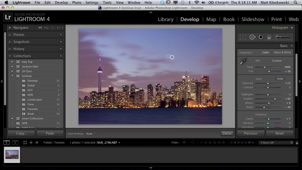 Spot removal tool active over the sky area
Long exposures at f/8 have a way of making every tiny piece of dust on your sensor look like a planet. Matt grabs the Spot Removal tool and works through the most obvious offenders in the sky. He’s not precious about getting every single one here because the image is heading into Photoshop shortly, and he knows the Healing Brush there will handle anything he misses with more precision.
Spot removal tool active over the sky area
Long exposures at f/8 have a way of making every tiny piece of dust on your sensor look like a planet. Matt grabs the Spot Removal tool and works through the most obvious offenders in the sky. He’s not precious about getting every single one here because the image is heading into Photoshop shortly, and he knows the Healing Brush there will handle anything he misses with more precision.
This is a workflow principle as much as an editing step. Don’t spend 20 minutes on a tool when a better tool for that job is one step away. Clean the obvious stuff, move forward.
Step 4: Fix the Horizon with a Horizontal Transform, Not a Rotation
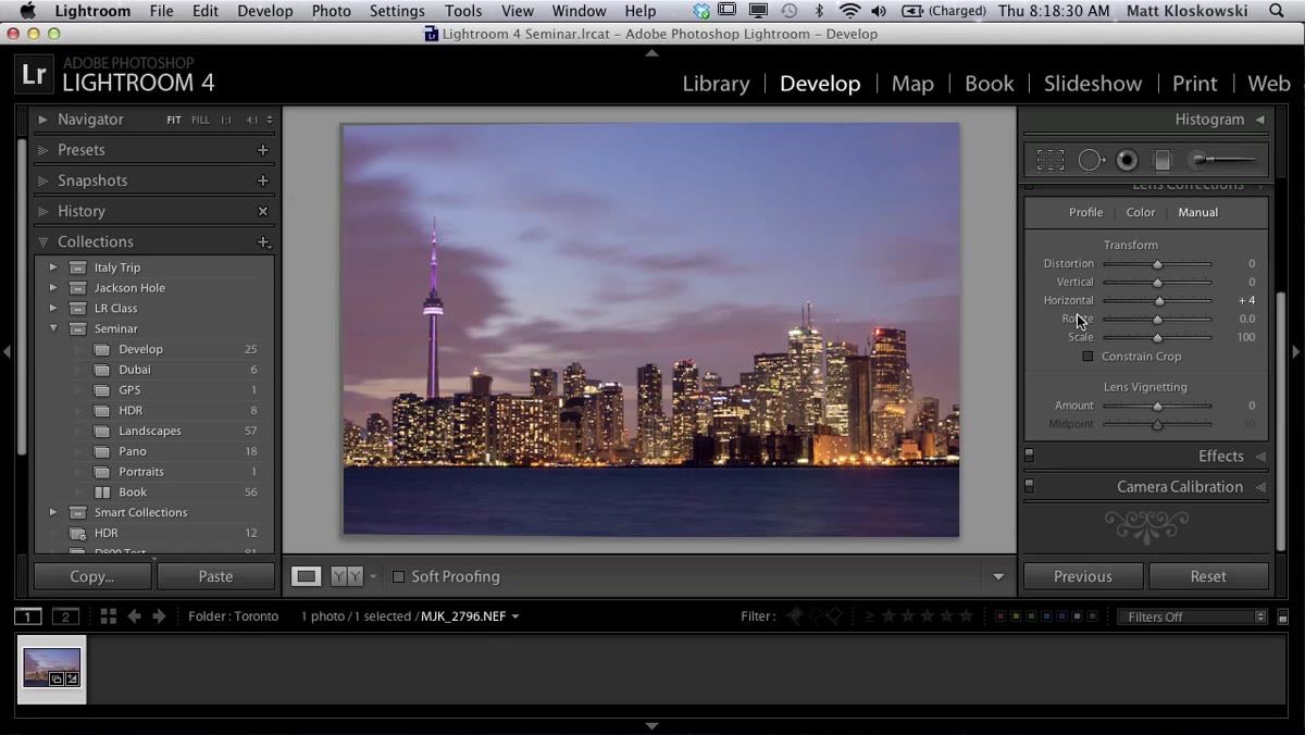 Transform panel with horizontal slider being adjusted
The horizon in this shot is slightly tilted, which is practically mandatory when you’re handholding a heavy tripod setup in the dark at the edge of a waterfront. The instinct is to rotate the image to fix it. Matt deliberately avoids that. Rotating an image tilts the vertical lines of buildings along with it, which makes skyscrapers look like they’re falling to one side. It’s a subtle wrongness, but your eye catches it.
Transform panel with horizontal slider being adjusted
The horizon in this shot is slightly tilted, which is practically mandatory when you’re handholding a heavy tripod setup in the dark at the edge of a waterfront. The instinct is to rotate the image to fix it. Matt deliberately avoids that. Rotating an image tilts the vertical lines of buildings along with it, which makes skyscrapers look like they’re falling to one side. It’s a subtle wrongness, but your eye catches it.
Instead, he uses the Horizontal Transform slider in the Transform panel. This corrects the horizon angle independently, keeping the buildings plumb. After applying it, he enables the Constrain Crop option and lets Lightroom trim the gray border edges automatically. No manual crop dragging required.
Step 5: Add Punch with a Targeted Tone Curve
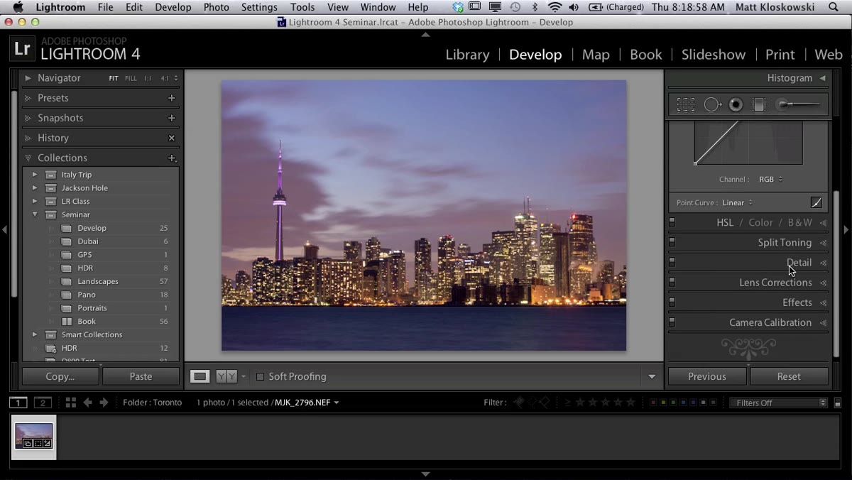 Tone curve panel with highlights lifted and midtones pulled down
Matt mentions he doesn’t use the Tone Curve often, which made me take note of exactly why he’s using it here. He lifts the top of the curve slightly to brighten the highlight range where the city lights and sky gradients live, then pulls the midtone section of the curve down to give the rest of the image a bit more depth. The result is a sky that glows rather than just being bright.
Tone curve panel with highlights lifted and midtones pulled down
Matt mentions he doesn’t use the Tone Curve often, which made me take note of exactly why he’s using it here. He lifts the top of the curve slightly to brighten the highlight range where the city lights and sky gradients live, then pulls the midtone section of the curve down to give the rest of the image a bit more depth. The result is a sky that glows rather than just being bright.
If you’re used to thinking of the Tone Curve as an advanced panel you’ll “get to eventually,” this is a good entry point. One small S-adjustment targeting just the upper range of the curve can do more for a cityscape than a lot of fiddling in the Basic panel.
Step 6: Darken the Sky with a Gradient Filter
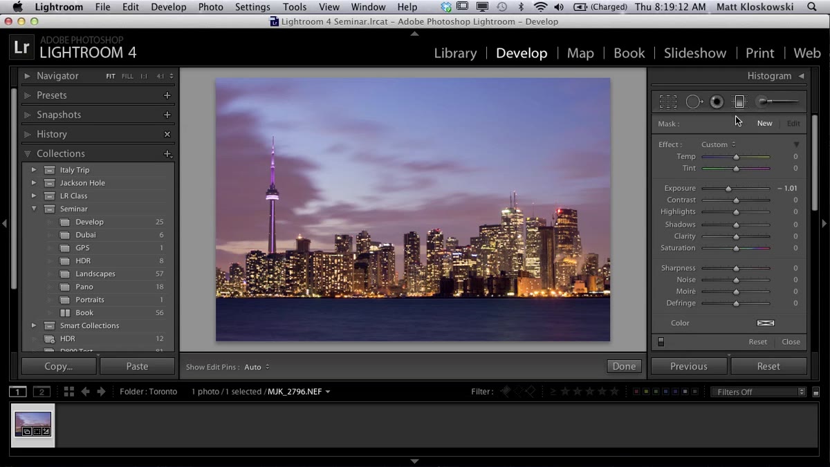 Gradient filter dragged down from the top of the frame
The final Lightroom move before heading to Photoshop is a gradient filter pulled from the top of the frame downward. Matt drops the exposure by roughly one stop within that gradient. The sky was already fairly balanced, but a gentle darkening draws the eye toward the lights and the horizon rather than leaving it wandering up into empty cloud space.
Gradient filter dragged down from the top of the frame
The final Lightroom move before heading to Photoshop is a gradient filter pulled from the top of the frame downward. Matt drops the exposure by roughly one stop within that gradient. The sky was already fairly balanced, but a gentle darkening draws the eye toward the lights and the horizon rather than leaving it wandering up into empty cloud space.
He notes that the CN Tower is the one thing interrupting a clean gradient pull, which is why a mask refinement or a Photoshop touch might be needed. But for the broad strokes, the gradient alone does most of the work.
What I’d Add from My Own Workflow
One thing Matt doesn’t go deep on here but that I find essential for city shots at this hour is a targeted Luminosity mask on the city lights themselves. The warm orange glow of office buildings and street lights can look muddy when you’ve cooled the overall white balance. A quick HSL adjustment targeting the orange channel, pulling the Luminosity down slightly and the Saturation up slightly, keeps those lights looking warm and alive against a cooler sky without making everything look like a fire.
If you’re working with multiple exposures of the same scene, this is also the point where I’ll usually blend in a brighter version of the foreground water using a luminosity mask in Photoshop. The long exposure blur is beautiful, but sometimes it loses mid-tone detail that a shorter exposure preserves.
The single biggest thing this tutorial reinforced for me is that mood is a technical decision. The choice to add blue to the white balance, to hold the shadows open, to use a horizontal transform instead of a rotation, to apply a gradient filter instead of global exposure correction - every one of those is a deliberate creative call that shapes how the image feels before a viewer even consciously looks at it. That’s the craft.
Watch the full tutorial on YouTube and follow along with your own city shot. The closer to dusk, the better.
Comments (2)
Solid advice. Especially the part about taking your time with it.
Finally someone explains this in a way that actually makes sense.
Leave a Comment