There’s a moment every Lightroom user hits where they crank up the Saturation slider and suddenly their subject looks like they’ve been standing next to a reactor. The colors pop, sure, but the reds are blown out, the skin tones look radioactive, and the detail in the image quietly disappears. For years I fixed this by just… not touching Saturation. I’d nudge it up two points and call it done. It worked, but it wasn’t understanding — it was avoidance.
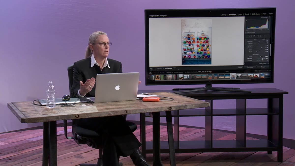
That changed when I sat down with Julieanne Kost’s tutorial for CreativeLive, where she breaks down exactly how Vibrance and Saturation behave differently at a mechanical level. Watch the full tutorial on YouTube — it’s one of those rare explainers that gives you a mental model you’ll actually use, not just a settings recipe you’ll forget.
Once I understood what Vibrance was actually protecting and what Saturation was actually doing, I stopped treating them like volume knobs and started using them as precision instruments. Here’s the full walkthrough.
Step 1: Start with a Colorful Image
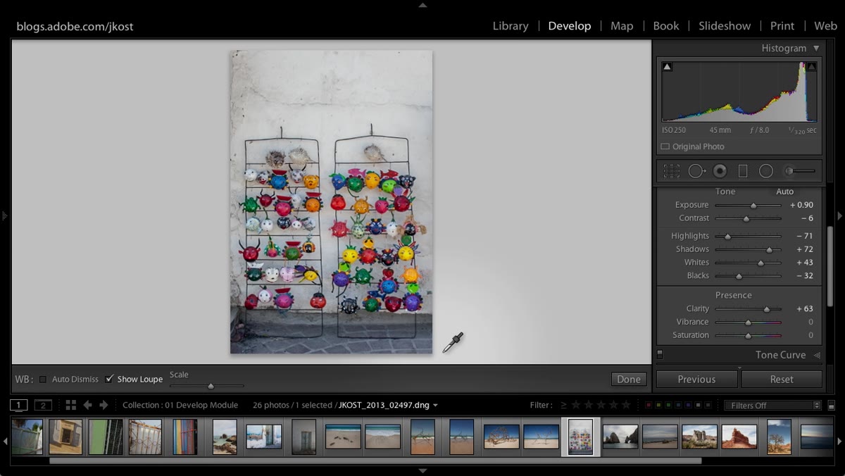 Colorful image loaded in Lightroom Develop module
Open an image with a decent range of colors — ideally something with reds, blues, and skin tones all present in the same frame. A portrait taken outdoors works perfectly for this exercise. The goal isn’t just to make the photo look good; it’s to see the sliders behave differently under pressure, and a color-rich image makes those differences obvious fast.
Colorful image loaded in Lightroom Develop module
Open an image with a decent range of colors — ideally something with reds, blues, and skin tones all present in the same frame. A portrait taken outdoors works perfectly for this exercise. The goal isn’t just to make the photo look good; it’s to see the sliders behave differently under pressure, and a color-rich image makes those differences obvious fast.
If you only have flat or muted images to work with, the comparison will be subtle and you’ll miss the point. You want color that’s already doing something.
Step 2: Pull Vibrance Down to Zero and Observe
 Vibrance slider dragged to negative 100
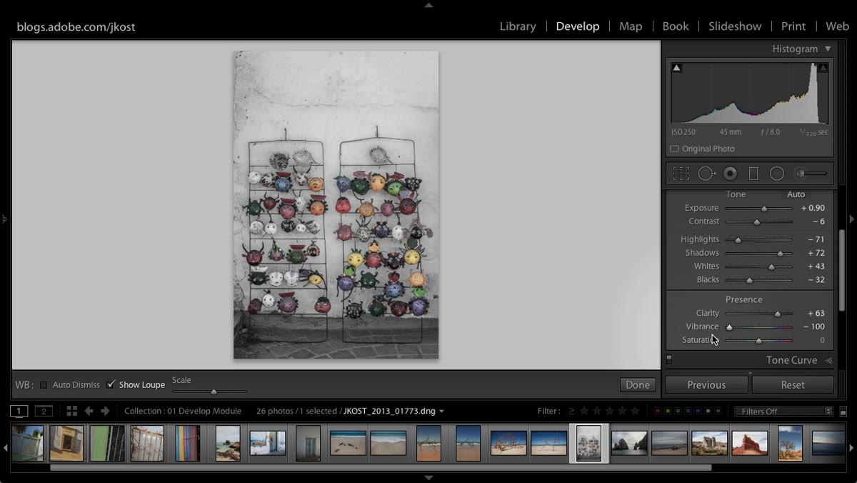
Drag the Vibrance slider all the way to the left, down to -100. Notice what happens: the image loses a lot of punch, but it does not go grayscale. Color is still present. This is the first clue that Vibrance isn’t a straight saturation control — it’s a biased one. It protects certain colors from being fully affected, even at its most extreme settings.
Vibrance slider dragged to negative 100
Drag the Vibrance slider all the way to the left, down to -100. Notice what happens: the image loses a lot of punch, but it does not go grayscale. Color is still present. This is the first clue that Vibrance isn’t a straight saturation control — it’s a biased one. It protects certain colors from being fully affected, even at its most extreme settings.
This matters because it tells you something about how the algorithm thinks. It’s not treating every pixel the same way. It’s making decisions based on what’s already in the frame.
Step 3: Push Vibrance to +100 and Watch the Reds
 Vibrance slider at positive 100 showing red detail retained
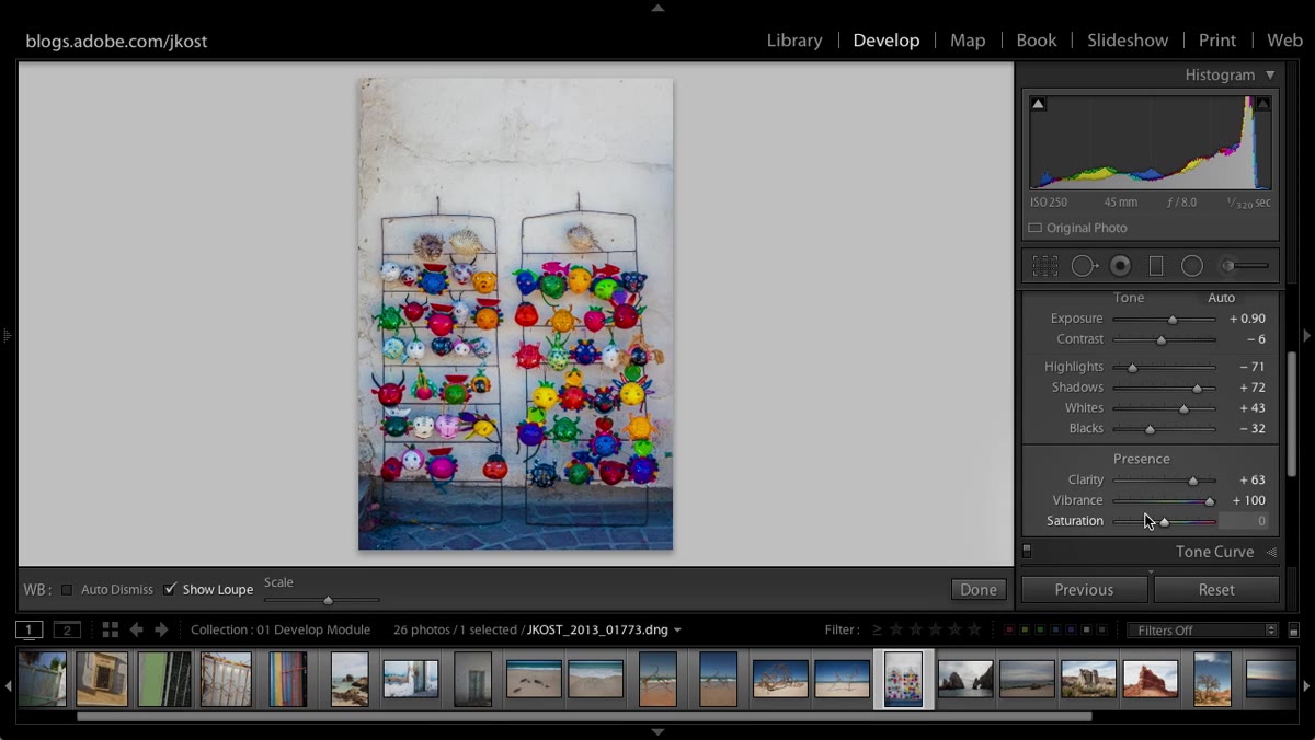
Now swing Vibrance all the way to the right. Look specifically at your reds — any flowers, clothing, or warm-toned elements in the frame. They’ll get more saturated, but they won’t clip into a flat wall of color. Vibrance applies a kind of proportional boost: colors that are already heavily saturated receive a smaller push than colors that are more muted. It essentially compresses the range rather than uniformly amplifying it.
Vibrance slider at positive 100 showing red detail retained
Now swing Vibrance all the way to the right. Look specifically at your reds — any flowers, clothing, or warm-toned elements in the frame. They’ll get more saturated, but they won’t clip into a flat wall of color. Vibrance applies a kind of proportional boost: colors that are already heavily saturated receive a smaller push than colors that are more muted. It essentially compresses the range rather than uniformly amplifying it.
The practical effect is that you can push Vibrance pretty hard and still retain tonal separation in your reds. That red jacket still reads as a jacket with folds and shadows, not a red blob. This is the feature that makes Vibrance useful rather than just decorative.
Step 4: Note the Skin Tone Protection
 Portrait detail showing skin tones unaffected by Vibrance boost
The second major bias built into Vibrance is its handling of skin tones. The slider is specifically calibrated to be less aggressive in the orange and yellow range, which is where human skin — across almost all complexions — lives on the color spectrum. Blues and greens get hit much harder than skin tones do.
Portrait detail showing skin tones unaffected by Vibrance boost
The second major bias built into Vibrance is its handling of skin tones. The slider is specifically calibrated to be less aggressive in the orange and yellow range, which is where human skin — across almost all complexions — lives on the color spectrum. Blues and greens get hit much harder than skin tones do.
This is why Vibrance is the go-to slider for outdoor portraits. You can make a grey sky more dramatic, bring green grass to life, and add depth to blue shadows without turning your subject into a sunburn patient. Saturation doesn’t make that distinction. It treats your subject’s face the same as it treats the sky behind them.
Step 5: Compare Saturation at +100
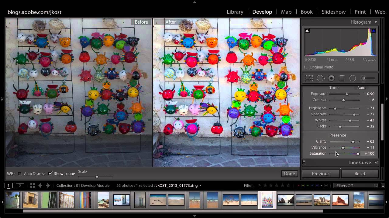
 Split screen showing Saturation 100 vs Vibrance 100 side by side
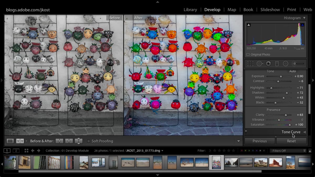
Set Saturation to +100 and look at the same image. The difference is immediately visible. Colors everywhere jump to maximum intensity at the same rate, regardless of where they started. That red with beautiful detail in Step 3 is now a flat, oversaturated block. The shadow variation in the fabric disappears. You’ve lost the three-dimensionality of the color.
Split screen showing Saturation 100 vs Vibrance 100 side by side
Set Saturation to +100 and look at the same image. The difference is immediately visible. Colors everywhere jump to maximum intensity at the same rate, regardless of where they started. That red with beautiful detail in Step 3 is now a flat, oversaturated block. The shadow variation in the fabric disappears. You’ve lost the three-dimensionality of the color.
Saturation treats every hue as equally deserving of the same boost, which is exactly the wrong approach when you have colors at different starting intensities. It’s like turning every instrument in a mix up to the same volume regardless of where they were — it creates loudness without clarity.
Step 6: Use the History Panel to Create a True Side-by-Side
 Lightroom History panel open with states being dragged to compare
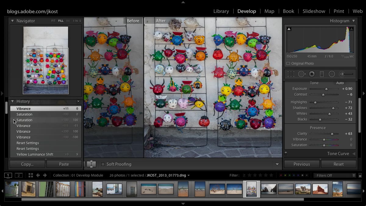
Lightroom’s built-in before/after toggle (the Y key) compares your current state to the very beginning of your edit history, which usually isn’t what you want. To compare two specific adjustment states — say, Vibrance at +100 versus Saturation at +100 — go to the History panel on the left side of Develop mode.
Lightroom History panel open with states being dragged to compare
Lightroom’s built-in before/after toggle (the Y key) compares your current state to the very beginning of your edit history, which usually isn’t what you want. To compare two specific adjustment states — say, Vibrance at +100 versus Saturation at +100 — go to the History panel on the left side of Develop mode.
Find the two history states you want to compare. Drag one of them into the before slot in the before/after view. Now you’re comparing the two edits directly, not your polished edit against a raw import. This is an underused feature that changes how you evaluate adjustments, especially when you’re deciding between two different approaches to the same problem.
Step 7: Split the Screen for Zoomed Comparisons
 Lightroom split-screen view zoomed in on image detail
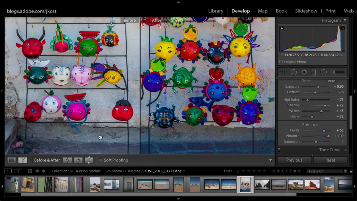
Once you’re in before/after mode, you can toggle from the full-screen overlay to a left-right split or a top-bottom split. The split view becomes especially useful when you zoom in — as you pan around the image, both sides of the split move together, letting you evaluate specific areas like skin, hair texture, or fabric detail at full resolution.
Lightroom split-screen view zoomed in on image detail
Once you’re in before/after mode, you can toggle from the full-screen overlay to a left-right split or a top-bottom split. The split view becomes especially useful when you zoom in — as you pan around the image, both sides of the split move together, letting you evaluate specific areas like skin, hair texture, or fabric detail at full resolution.
Tap Y to cycle through the comparison modes, and use this view to check your work on the areas where saturation clipping typically hides: deep reds, bright yellows, and saturated blues near the edge of the histogram.
What I Use This For in My Own Workflow
Honestly, I almost never move Saturation anymore. I reach for it only when I deliberately want to drain color out of an image for a stylized, faded look — usually combined with a film-style tone curve. For adding richness and pop to a photo, Vibrance does the job without the collateral damage.
Where I’ve found this most useful is in music photography. Shooting bands under stage lighting means you’re already dealing with heavily colored practical lights, and those reds clip fast. A Vibrance boost keeps the atmosphere without turning the guitar player’s face into a traffic light. If you shoot concerts, festivals, or anything with mixed practical lighting, this distinction will save you a lot of cleanup work.
The core takeaway here is simple but easy to misread: Saturation is a uniform boost, Vibrance is a smart one. Both have a place, but Vibrance earns its spot in almost every outdoor and portrait edit because it works with your image’s existing color relationships instead of overwriting them.
Watch the full tutorial on YouTube to see Julieanne Kost walk through the comparison live — seeing the before/after on a real image makes the difference between these two sliders click in a way that screenshots just can’t replicate.
Comments
Leave a Comment