Video Tutorials
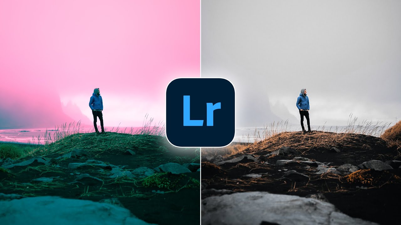
RGB Curves, HSL Masking, and the Lightroom Features You're Probably Sleeping On
Every few months I sit down with a tutorial from someone whose eye I trust, not to be told what I already know, but to get rattled a little. That’s what happened when I watched Watch the full tutorial on YouTube from Peter McKinnon, where he casually drops two Lightroom techniques that I either glossed over or genuinely never noticed hiding in the software I use every single day. The man is sipping a questionable espresso and somehow still teaching circles around most photography content out there.