There’s a particular kind of frustration that comes from knowing a tool has more to offer than you’re pulling out of it. I’ve been editing in Lightroom for years, and I still hit moments where I realize I’ve been doing something the slow way, or skipping a feature entirely because I didn’t quite understand what it was for. That’s what kept me watching this tutorial from start to finish. Watch the full tutorial on YouTube before or after you read this breakdown – either way, you’ll get more out of it with both.
In this Matt Kloskowski tutorial, he walks through five Lightroom Classic tips with a deliberate pace that I appreciate. He’s not just rattling off keyboard shortcuts. He gives you the why behind each one, which is the difference between a tip you use once and a tip that permanently rewires your workflow. The two techniques he covers early – custom color swatches in the Color Grading panel and spring-loaded auto masking with the brush – are the ones I want to dig into here, because they’re the most immediately applicable if you’re doing any kind of serious editing work.
I’ve started organizing my editing workflow the same way I organize my vinyl records: by feel and consistency. These tips fit right into that mindset. Here’s exactly how to implement them.
Step 1: Switch to One-Up View in the Color Grading Panel
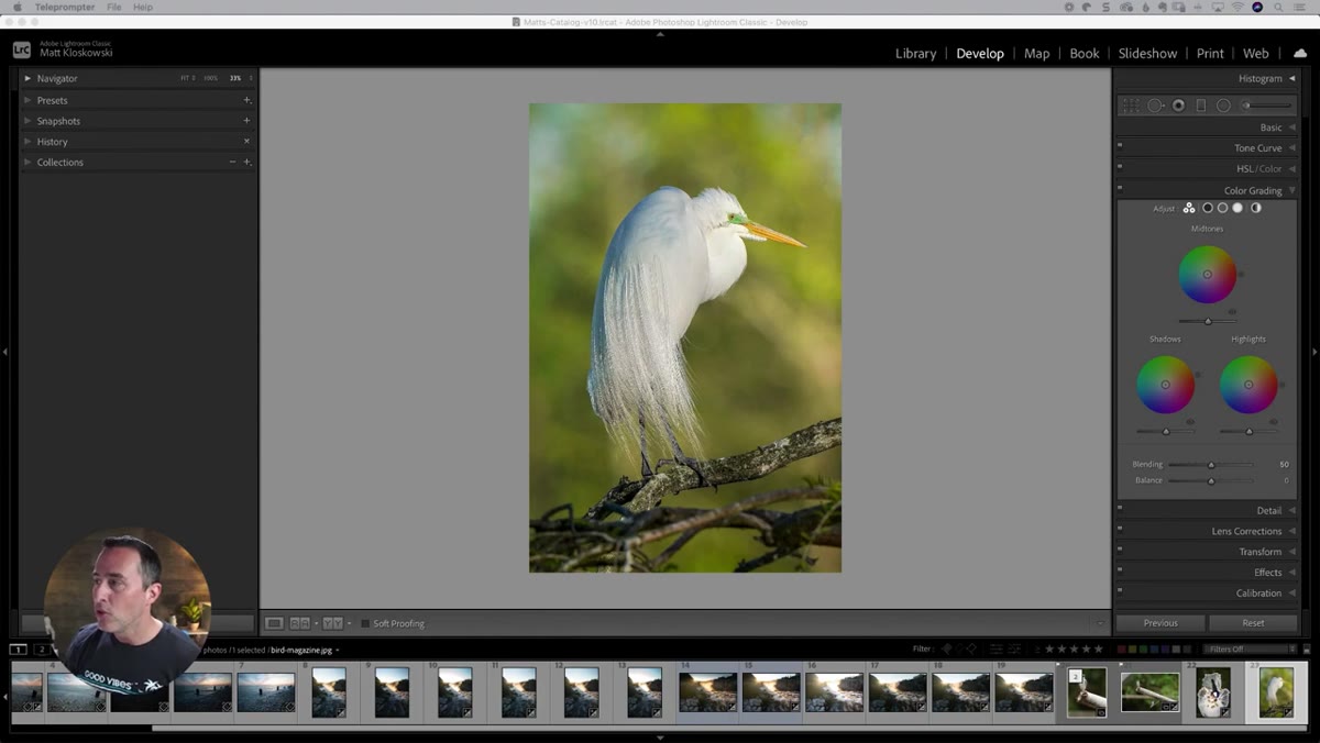 Color Grading panel open in Lightroom Classic Develop module
Most people who use Color Grading default to the three-wheel view where shadows, midtones, and highlights are all visible at once. Matt’s first suggestion is to switch to the single-wheel view instead, where you isolate one tonal range at a time. You do this by clicking the small dot icons at the top of the Color Grading panel. Click the left dot for shadows, the center for midtones, the right for highlights.
Color Grading panel open in Lightroom Classic Develop module
Most people who use Color Grading default to the three-wheel view where shadows, midtones, and highlights are all visible at once. Matt’s first suggestion is to switch to the single-wheel view instead, where you isolate one tonal range at a time. You do this by clicking the small dot icons at the top of the Color Grading panel. Click the left dot for shadows, the center for midtones, the right for highlights.
This isn’t a dramatic workflow change, but it matters. When all three wheels are small and stacked together, subtle hue shifts are hard to judge accurately. Viewing one wheel at full size gives you much better control over the exact color you’re dialing in.
Step 2: Apply a Custom Tint to Your Shadows (or Whichever Tone Range You’re Targeting)
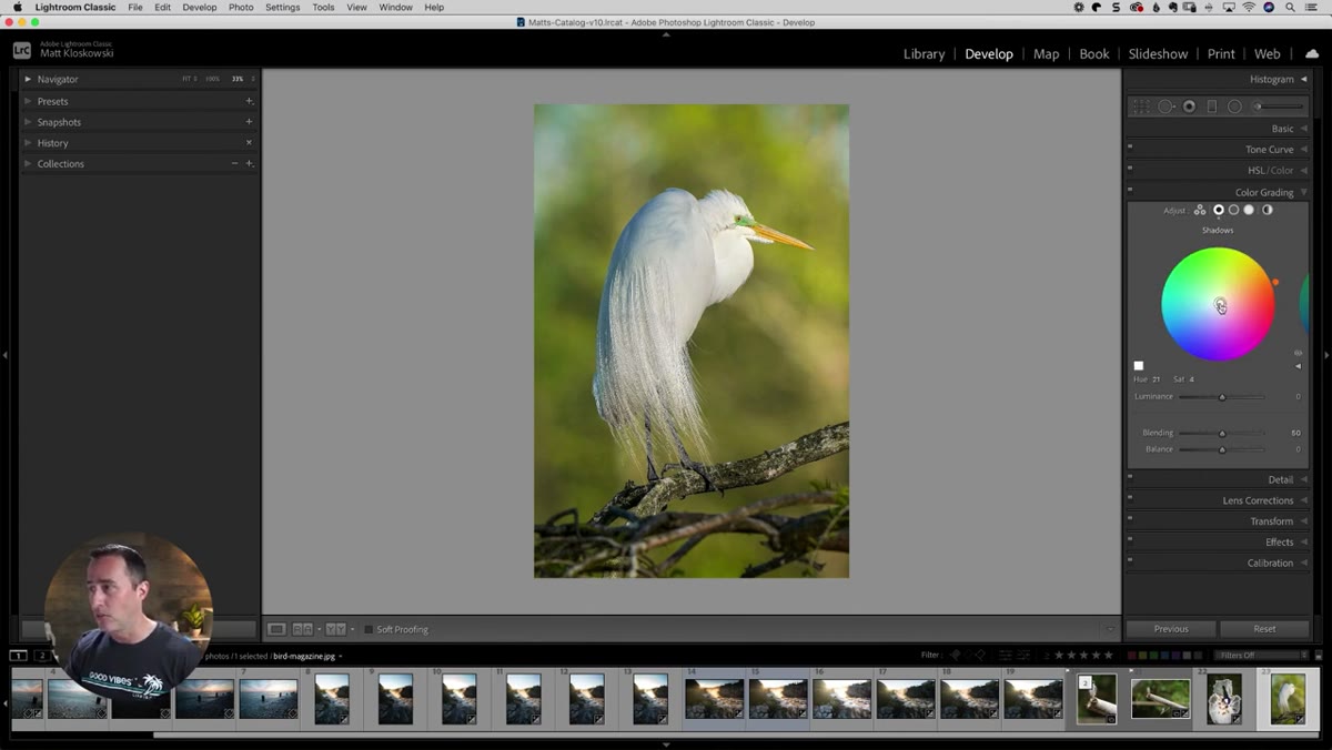 Shadow color wheel with warm orange tint applied
With the shadow wheel in single view, drag the center point toward whatever color direction you want to push the shadows. Matt tends toward warm yellows and oranges in the shadows, which is a look I’ve landed on myself for a lot of portrait and outdoor work. The specific value matters less than understanding the direction – warm shadows read as golden-hour nostalgia, cool shadows feel cinematic and detached.
Shadow color wheel with warm orange tint applied
With the shadow wheel in single view, drag the center point toward whatever color direction you want to push the shadows. Matt tends toward warm yellows and oranges in the shadows, which is a look I’ve landed on myself for a lot of portrait and outdoor work. The specific value matters less than understanding the direction – warm shadows read as golden-hour nostalgia, cool shadows feel cinematic and detached.
The point here isn’t to lock you into one color. It’s to set you up for the next step, which is where the real time savings come from.
Step 3: Save That Color as a Custom Swatch
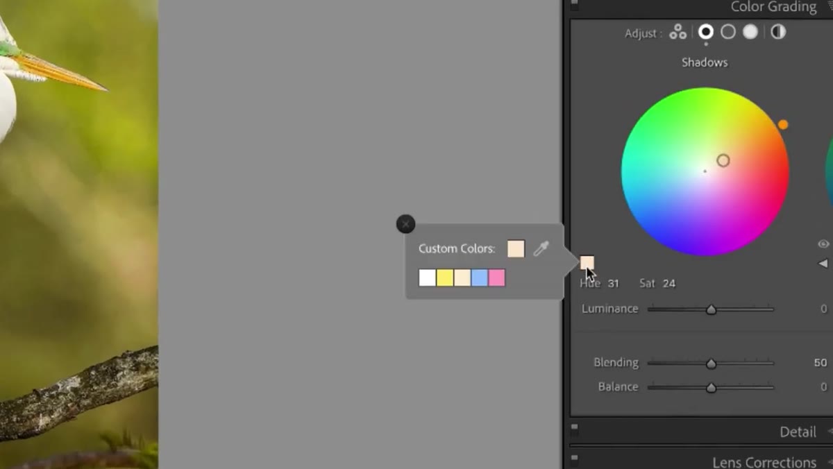 Right-click menu showing “Set this swatch to current color” option
Here’s the tip that genuinely surprised me. Once you have a color applied to your wheel, click the small color swatch icon in the corner of the Color Grading panel. A swatch picker opens, showing a row of color options you can choose from. If none of them match the color you’ve been working with, right-click on any swatch in that panel and you’ll see an option to set it to the current color.
Right-click menu showing “Set this swatch to current color” option
Here’s the tip that genuinely surprised me. Once you have a color applied to your wheel, click the small color swatch icon in the corner of the Color Grading panel. A swatch picker opens, showing a row of color options you can choose from. If none of them match the color you’ve been working with, right-click on any swatch in that panel and you’ll see an option to set it to the current color.
This turns that swatch into a one-click return to your preferred color – across any project, any session. For those of us who return to the same two or three color grades repeatedly, this is a real quality-of-life upgrade. I have a warm shadow tone I use on almost every outdoor portrait session. Having it as a saved swatch means I’m not eyeballing it from scratch every single time.
Step 4: Use the Adjustment Brush to Paint a Dark Background
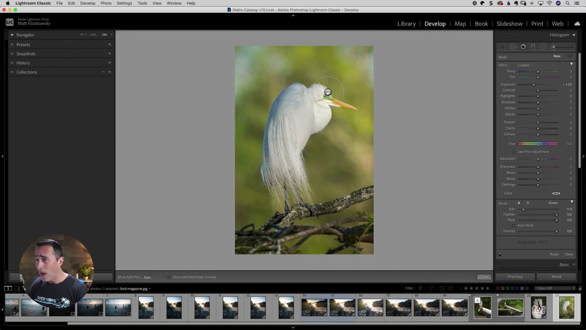 Adjustment brush selected with exposure pulled down in panel
The second technique Matt covers involves complex masking inside Lightroom – specifically, darkening a background that has a detailed subject in front of it (in his example, a bird with intricate feather detail against a lighter background). Select the Adjustment Brush from the toolbar in the Develop module, then pull the Exposure slider down to somewhere around -0.75 to -1.5 depending on how dramatic you want the result.
Adjustment brush selected with exposure pulled down in panel
The second technique Matt covers involves complex masking inside Lightroom – specifically, darkening a background that has a detailed subject in front of it (in his example, a bird with intricate feather detail against a lighter background). Select the Adjustment Brush from the toolbar in the Develop module, then pull the Exposure slider down to somewhere around -0.75 to -1.5 depending on how dramatic you want the result.
Start brushing the background in the areas that are clearly away from your subject. The easy parts first. You want to build up coverage before you get close to the edges.
Step 5: Hold Command (Mac) or Control (PC) to Spring-Load Auto Mask
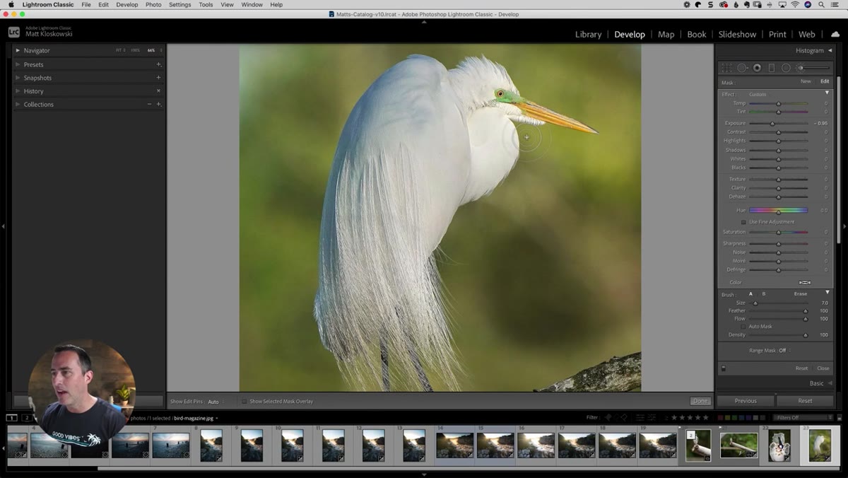 Brush edge following bird feathers with Auto Mask engaged
Here’s where it gets clever. As you approach the edge of your subject – the area where background meets feathers, hair, or any fine detail – hold down the Command key on Mac or Control on PC while you’re actively painting. This temporarily enables Auto Mask without you having to go click the checkbox in the panel. Let go of the key, and Auto Mask turns back off.
Brush edge following bird feathers with Auto Mask engaged
Here’s where it gets clever. As you approach the edge of your subject – the area where background meets feathers, hair, or any fine detail – hold down the Command key on Mac or Control on PC while you’re actively painting. This temporarily enables Auto Mask without you having to go click the checkbox in the panel. Let go of the key, and Auto Mask turns back off.
Matt describes this as a spring-loaded function, which is exactly the right way to think about it. Auto Mask does edge detection, which is great near subject boundaries but can create weird artifacts if you leave it on while brushing large open areas. Using it only where you need it – held on for edges, released for open background – gives you speed and precision together. It’s a much more natural way to work than toggling the checkbox on and off manually.
How I Use These Together in Real Sessions
Both of these tips are most useful when you treat them as a pair inside a single editing style. Here’s what I mean: the color swatch system is about establishing a consistent look across a body of work. The spring-loaded auto mask is about being able to apply localized adjustments quickly without sacrificing accuracy. When those two things are working together, you can build out a polished, cohesive edit in far less time than you’d expect.
One caveat from my own experience: the Auto Mask edge detection works best when there’s reasonable contrast between your subject and the background. On a gray bird against a gray sky, or any similarly low-contrast edge, it will struggle. In those cases, I’ll still use it for the broad strokes but finish with a small, slow brush at full manual control for the trickiest pixels. Lightroom’s masking has come a long way, but it isn’t magic – it’s a tool, and you still have to guide it.
The single biggest takeaway from this tutorial is that Lightroom Classic has features hiding in plain sight that most editors walk right past. The custom swatches in Color Grading and the spring-loaded Command key for Auto Mask are both the kind of things that, once you know them, you can’t believe you lived without. They don’t require plugins, presets, or subscription upgrades. They’re already in the software you’re using right now.
Watch the full tutorial on YouTube to see all five tips in action, including the additional techniques Matt covers that didn’t make it into this breakdown.
Comments (1)
Wow, I had no idea you could do this. Mind blown.
Leave a Comment