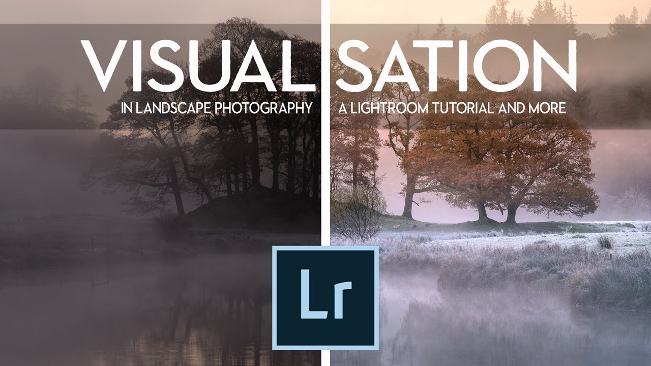
Most of my worst edits share the same root cause. I opened a raw file, started dragging sliders, and hoped something good would happen. The file looked flat, so I’d crank contrast. The sky looked pale, so I’d push blues. Thirty minutes later I had something technically processed and emotionally empty. It looked edited. It didn’t look felt.
That’s the exact problem that Nigel Danson addresses head-on in this landscape Lightroom tutorial. Watch the full tutorial on YouTube — and I’d recommend doing that alongside reading this, because his eye for light in the Lake District is genuinely worth studying. What he’s built here isn’t a recipe for punchy landscape presets. It’s a framework for understanding what you’re actually trying to say with an image before Lightroom ever opens.
I’ve been editing photos long enough to know that the people who consistently produce great work aren’t necessarily faster in Lightroom. They’re clearer about their intention before they sit down. Danson lays that out methodically, then backs it up with a concrete edit. Here’s how the whole thing breaks down.
Step 1: Define the Mood Before You Open Lightroom
 Danson speaking to camera about visualization before editing
The first thing Danson establishes is that Lightroom is a translation tool, not a creative engine. Your job in the field is to gather the raw material for a feeling. Lightroom’s job is to communicate that feeling accurately. If you skipped step one, no amount of HSL panel work will save you.
Danson speaking to camera about visualization before editing
The first thing Danson establishes is that Lightroom is a translation tool, not a creative engine. Your job in the field is to gather the raw material for a feeling. Lightroom’s job is to communicate that feeling accurately. If you skipped step one, no amount of HSL panel work will save you.
He’s specific about what this looks like in practice. Before pressing the shutter, ask yourself what the emotional temperature of the scene is. Cold and isolated? Moody and compressed? Warm and approachable? That answer becomes your north star during the edit. Every slider decision gets filtered through it. If you can’t answer that question about your file, it’s worth sitting with the image for a few minutes before touching anything.
Step 2: Understand That Location and Light Come Before Software
 Discussion of composition, subject, and timing as prerequisites
Danson makes a point that I think a lot of newer editors need to hear directly: Lightroom cannot manufacture a great image from a weak file. Good composition, a compelling subject, meaningful light, and precise timing are prerequisites. The software works on what you give it.
Discussion of composition, subject, and timing as prerequisites
Danson makes a point that I think a lot of newer editors need to hear directly: Lightroom cannot manufacture a great image from a weak file. Good composition, a compelling subject, meaningful light, and precise timing are prerequisites. The software works on what you give it.
He illustrates this with a day he describes as genuinely miserable weather, and explains how knowing the intended final result ahead of time changed how he approached the composition and what light he chose to wait for. That’s the practical value of visualization. It turns a vague hope into a set of creative decisions you can actually make in the field.
Step 3: Study How Different Photographers Process the Same Scene
 Comparing two different edits of the same Lake District morning
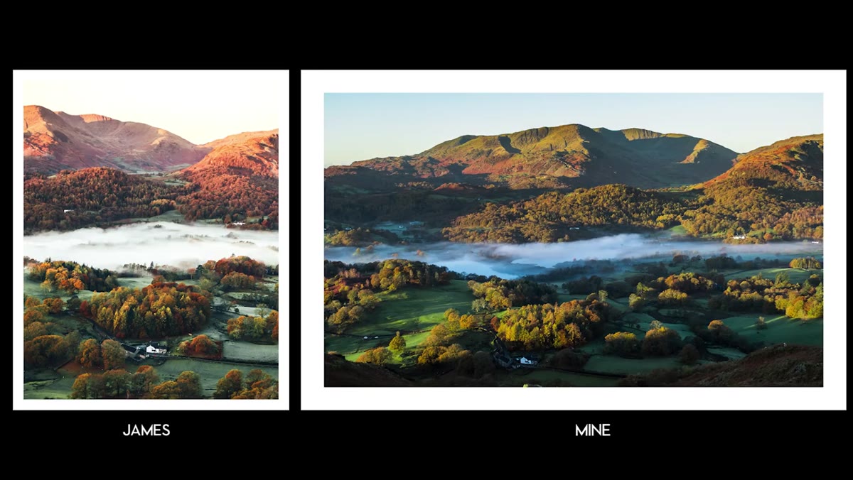
One of the most useful segments in the tutorial involves Danson comparing his edit of a Lake District morning to another photographer who was standing in nearly the same spot at the same time. Same light, same subject, same raw conditions. The two resulting images look like they were shot weeks apart.
Comparing two different edits of the same Lake District morning
One of the most useful segments in the tutorial involves Danson comparing his edit of a Lake District morning to another photographer who was standing in nearly the same spot at the same time. Same light, same subject, same raw conditions. The two resulting images look like they were shot weeks apart.
The takeaway isn’t that one approach is correct. It’s that your edit is a personal statement about how that scene felt to you, not an objective record. Danson’s version skews cooler and more austere. The other photographer’s version runs warmer and more inviting. Both are honest representations of two different people’s experiences of the same morning. When you understand this, you stop chasing presets from photographers whose vision doesn’t match yours, and you start building your own consistent language.
Step 4: Start the Edit With Tone, Not Color
 Opening the raw file and beginning with basic panel adjustments
When Danson finally moves into Lightroom, he starts with the tonal foundation rather than jumping to color. This means getting exposure, highlights, shadows, whites, and blacks into a range that actually represents the scene’s dynamic feel before any color work begins. It’s easy to skip this and go straight for the Hue/Saturation controls because color is more visually exciting to manipulate, but color grading on top of a poorly balanced tonal structure will always look slightly off.
Opening the raw file and beginning with basic panel adjustments
When Danson finally moves into Lightroom, he starts with the tonal foundation rather than jumping to color. This means getting exposure, highlights, shadows, whites, and blacks into a range that actually represents the scene’s dynamic feel before any color work begins. It’s easy to skip this and go straight for the Hue/Saturation controls because color is more visually exciting to manipulate, but color grading on top of a poorly balanced tonal structure will always look slightly off.
The goal at this stage is not a finished-looking image. It’s a stable platform. Think of it like stretching a canvas before painting. You’re not trying to make it look good yet, you’re trying to make it workable.
Step 5: Use Color Grading to Reinforce the Emotional Decision You Made in the Field
 Adjusting color temperature and applying targeted color grading
Once the tones are settled, color grading becomes about reinforcing the mood you identified in Step 1. For the cold, wintry Lake District image Danson is working on, that means leaning into cooler blues and desaturating anything that might accidentally read as warm. This isn’t about making the image look dramatic for drama’s sake. It’s about fidelity to the experience.
Adjusting color temperature and applying targeted color grading
Once the tones are settled, color grading becomes about reinforcing the mood you identified in Step 1. For the cold, wintry Lake District image Danson is working on, that means leaning into cooler blues and desaturating anything that might accidentally read as warm. This isn’t about making the image look dramatic for drama’s sake. It’s about fidelity to the experience.
A detail worth noting: he’s precise rather than aggressive. The color shifts are enough to steer the viewer’s emotional read of the image without tipping into obviously processed territory. If you find your edits always looking heavy-handed, try cutting your saturation and luminance adjustments by about a third and see if the image actually lands better.
Step 6: Let the Edit Serve the Story, Not the Other Way Around
 Reviewing the final edited image and discussing intent
The final stage of Danson’s process is a kind of editorial review. He steps back from the technical controls and asks whether the processed image matches the intended feeling. Does the tone feel right? Does the color temperature support the mood or fight against it? This is the step most people skip because it feels less like doing something.
Reviewing the final edited image and discussing intent
The final stage of Danson’s process is a kind of editorial review. He steps back from the technical controls and asks whether the processed image matches the intended feeling. Does the tone feel right? Does the color temperature support the mood or fight against it? This is the step most people skip because it feels less like doing something.
He’s straightforward about the fact that there’s no universal correct answer in Lightroom. Two skilled editors will make different choices from the same file, and both can be right. What matters is whether your choices are intentional and coherent. Randomness looks random, even when you can’t immediately identify why.
A Note From My Own Workflow
I started naming my Lightroom presets after songs a few years back, and it was a surprisingly useful discipline. A preset called “Harvest Moon” forces you to ask whether this image actually has that warmth and melancholy, or whether you’re just applying it by default. Danson’s visualization-first approach does something similar. It gives you a reference point outside the software that keeps your editing honest.
If you’re the kind of person who opens files and starts editing without a clear intention, try writing one sentence about the image before touching any sliders. One sentence about how it felt to be there. Keep it visible while you edit. It sounds almost too simple, but it changes what you reach for.
The single most important idea in this tutorial is that Lightroom is not where the creative decision gets made. The creative decision gets made in the field, and ideally before you even press the shutter. Lightroom is where you honor that decision and communicate it clearly. Everything else, the sliders, the panels, the masking tools, is just vocabulary.
Watch the full tutorial on YouTube to see Danson walk through the actual edit on screen. His pacing is calm and his reasoning is clear, which is rarer in tutorial content than it should be.
Comments (1)
Clear and practical. No fluff. Appreciate that.
Leave a Comment