Every wedding photographer I know has a folder somewhere called “book layouts - FINAL” that is neither final nor organized. You know the drill: you want something that looks editorial, something that tells the story of an entire wedding day on a single spread, but building it from scratch feels like assembling furniture without instructions. I’ve been there more times than I want to admit.
That’s why this tutorial from Scott Kelby over at KelbyOne stopped me mid-scroll. Watch the full tutorial on YouTube – Scott builds a magazine-quality, 11-photo wedding book page entirely inside Lightroom’s Print module, using nothing but the Custom Package layout tool. The design is inspired by a real spread from Perth Bride, an Australian wedding magazine, and the result looks like something a studio would charge extra for. Better yet, Scott offers the finished layout as a free downloadable preset, so you can skip the build and go straight to dropping in your own images.
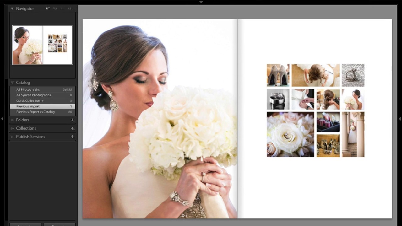
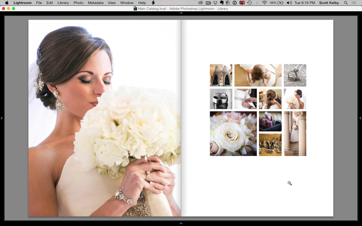
The left page of the spread is a simple full-bleed hero shot – nothing you need a tutorial for. The right page is where the craft lives: three rows of cells, mixing square crops with a wide panoramic cell and a tall vertical, all balanced in a way that actually feels designed rather than assembled. Here is exactly how to build it.
Step 1: Open the Print Module and Switch to Custom Package
 Print module open, Custom Package selected in layout style panel
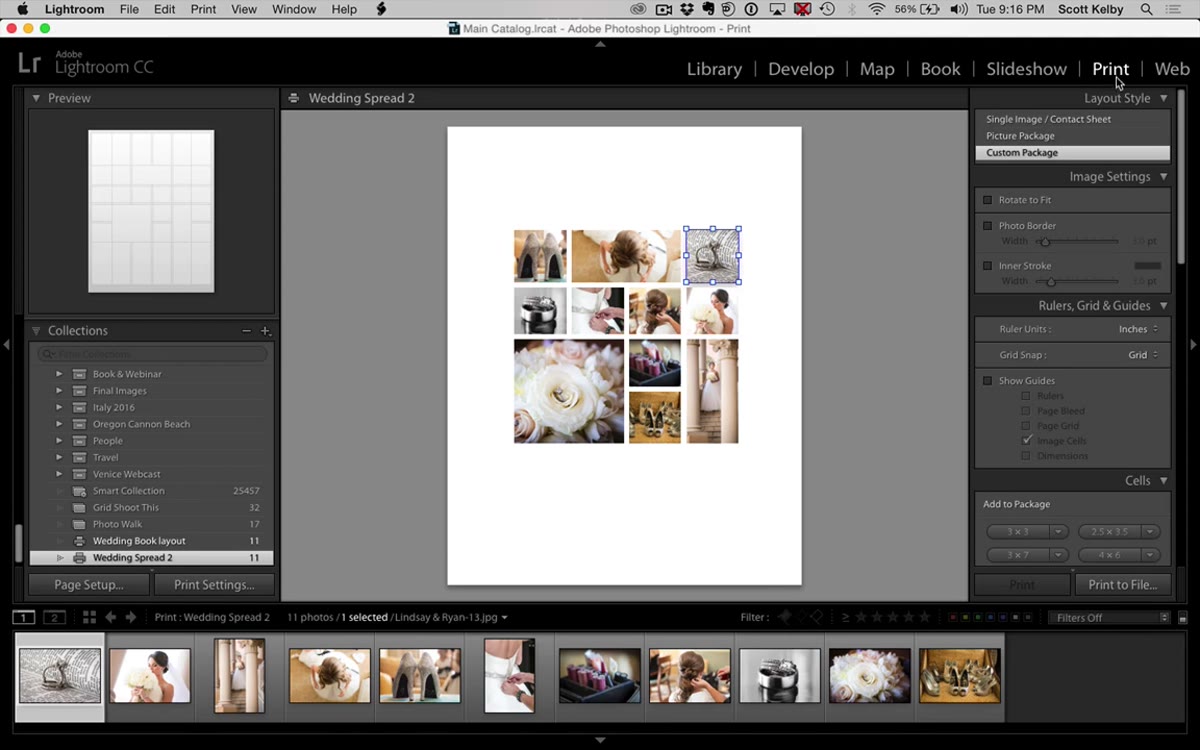
Head to the Print module in Lightroom – keyboard shortcut Ctrl+P on Windows or Cmd+P on Mac. In the layout style panel on the right, you will see three options: Single Image / Contact Sheet, Picture Package, and Custom Package. Select Custom Package. This is the mode that lets you place and size individual cells anywhere on the page, which is exactly what a multi-photo editorial layout requires. The canvas will appear blank, which is your starting point.
Print module open, Custom Package selected in layout style panel
Head to the Print module in Lightroom – keyboard shortcut Ctrl+P on Windows or Cmd+P on Mac. In the layout style panel on the right, you will see three options: Single Image / Contact Sheet, Picture Package, and Custom Package. Select Custom Package. This is the mode that lets you place and size individual cells anywhere on the page, which is exactly what a multi-photo editorial layout requires. The canvas will appear blank, which is your starting point.
Once you’re in Custom Package, scroll down to the Cells panel on the right side. You will see size presets for adding new cells. Before you place anything, go ahead and hit “Clear Layout” if there are any leftover cells from a previous session – it gives you a clean slate.
Step 2: Build the Top Row – Square, Wide Rectangle, Square
 First small square cell placed on the upper left of the canvas
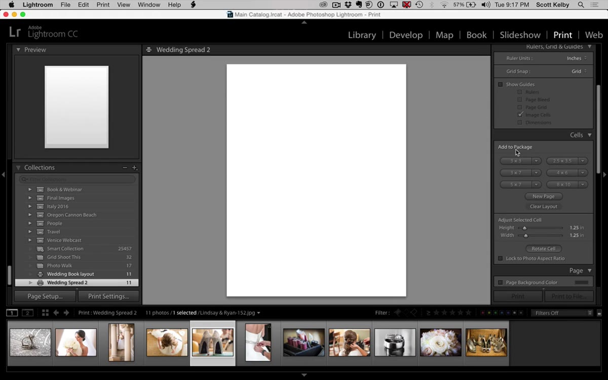
Click “Add to Package” with a small square selected to place your first cell on the canvas. Hold Shift while dragging a corner handle to resize it proportionally – aim for roughly a third of the page width. This is your first square.
First small square cell placed on the upper left of the canvas
Click “Add to Package” with a small square selected to place your first cell on the canvas. Hold Shift while dragging a corner handle to resize it proportionally – aim for roughly a third of the page width. This is your first square.
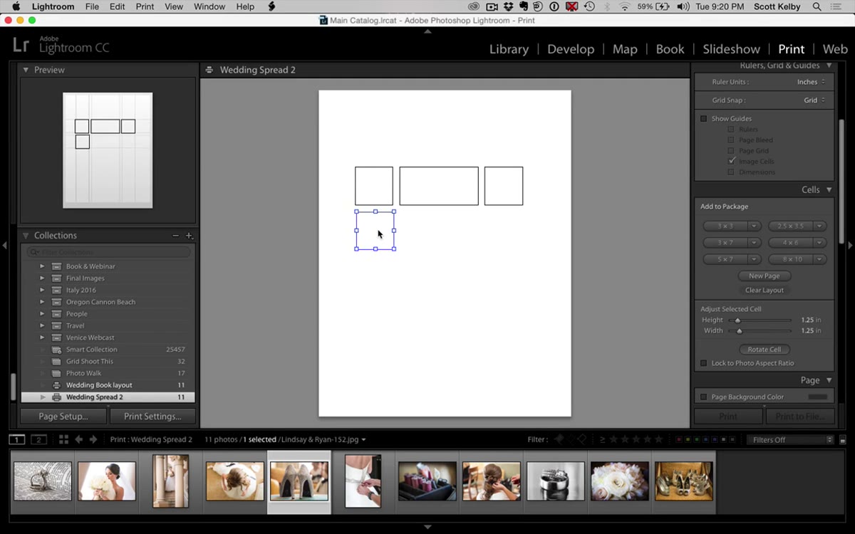
Now hold Option (Mac) or Alt (Windows) and drag the cell to duplicate it. Drag the copy toward the center of the row, then stretch it horizontally to roughly double the width of the first square – this becomes your wide panoramic cell. Duplicate the first square one more time for the right side of the row. The three cells should sit at the same vertical position with even gaps between them. Lightroom’s snap-to-grid behavior helps here: you will feel the cells click into alignment as you drag them close together.
Step 3: Build the Second Row – Four Equal Squares
 Four equal square cells snapped into alignment in the second row
Hold Option or Alt and drag a copy of one of your existing squares down below the top row to start row two. Then duplicate that cell three more times so you have four equal squares sitting side by side. The snap-to-grid feature is your friend again – drag each cell close to its neighbor and watch it lock into place. If the spacing between the middle two cells looks tighter than the outer gaps, nudge them apart manually using the arrow keys or by dragging carefully. Getting uniform gutters between all four cells is what makes this row look intentional rather than accidental.
Four equal square cells snapped into alignment in the second row
Hold Option or Alt and drag a copy of one of your existing squares down below the top row to start row two. Then duplicate that cell three more times so you have four equal squares sitting side by side. The snap-to-grid feature is your friend again – drag each cell close to its neighbor and watch it lock into place. If the spacing between the middle two cells looks tighter than the outer gaps, nudge them apart manually using the arrow keys or by dragging carefully. Getting uniform gutters between all four cells is what makes this row look intentional rather than accidental.
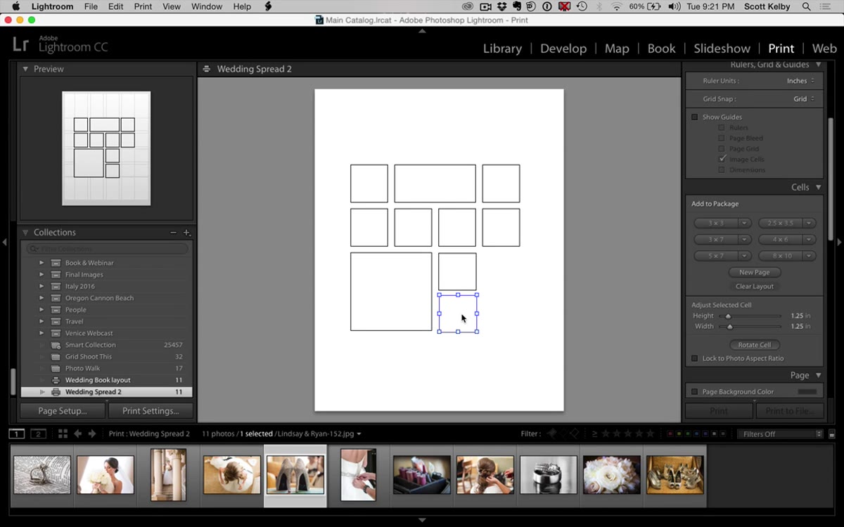
Step 4: Build the Bottom Row – Large Square, Two Tall Verticals
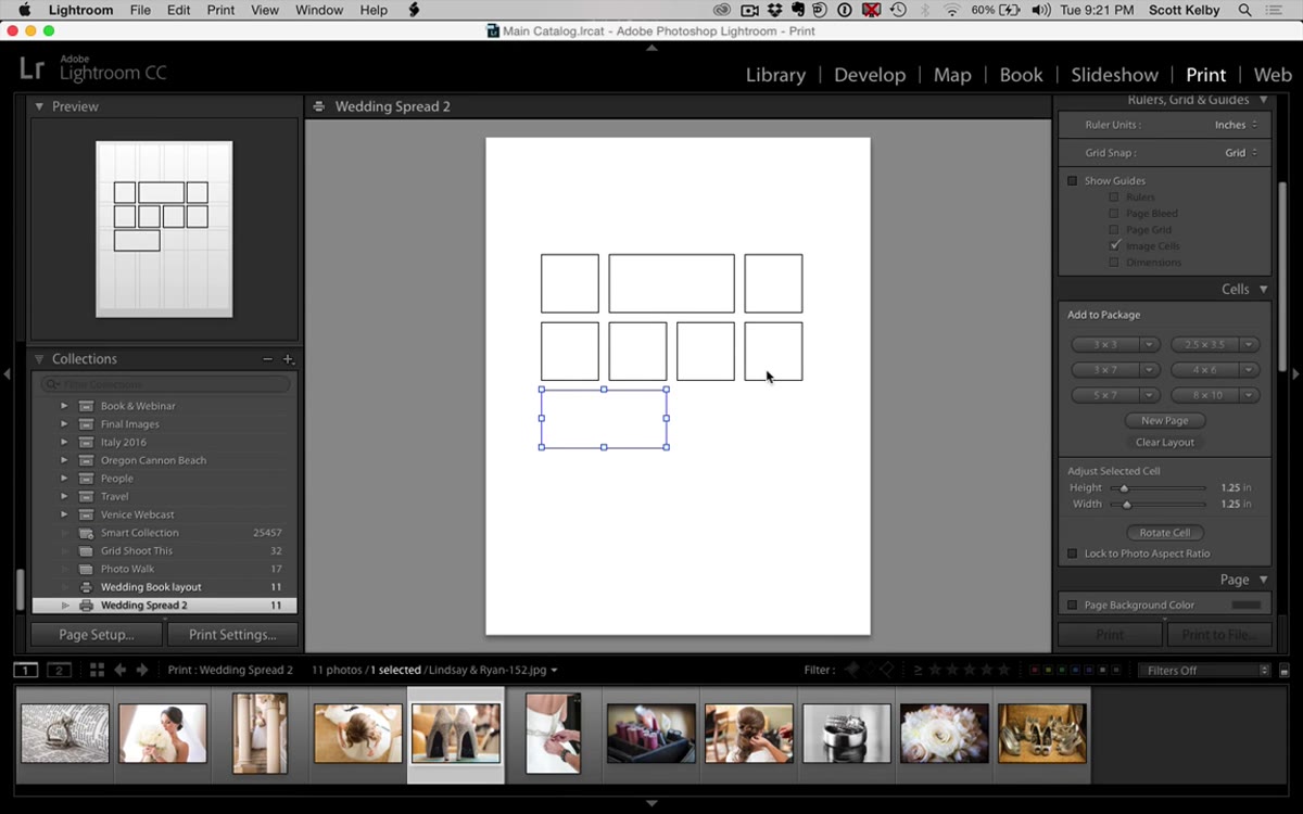 Larger square cell placed on the left of the third row
The third row has a different rhythm. Start by placing a new cell on the left side and sizing it so its width spans roughly two of the cells from row two, and its height matches about two rows deep. You are building a large square anchor for this row. Then duplicate it twice and place the copies to the right, making them narrower and taller – these become your vertical portrait cells. The goal is for the overall height of the bottom row to match the large square on the left, so take your time adjusting the vertical cells until they line up cleanly at the top and bottom.
Larger square cell placed on the left of the third row
The third row has a different rhythm. Start by placing a new cell on the left side and sizing it so its width spans roughly two of the cells from row two, and its height matches about two rows deep. You are building a large square anchor for this row. Then duplicate it twice and place the copies to the right, making them narrower and taller – these become your vertical portrait cells. The goal is for the overall height of the bottom row to match the large square on the left, so take your time adjusting the vertical cells until they line up cleanly at the top and bottom.
Step 5: Fine-Tune Alignment Across All Three Rows
 All cells visible, adjusting vertical alignment between rows
With all 11 cells placed, zoom out and look at the full layout with fresh eyes. Check that the left edge of column one lines up consistently across all three rows, that the gutters between cells are visually even, and that the overall layout sits centered on the page with appropriate margins. Small misalignments are easier to catch now than after you have populated the cells with images. Click each cell individually and use the size fields in the panel to type in precise dimensions if your eye is telling you something is slightly off – eyeballing only gets you so far.
All cells visible, adjusting vertical alignment between rows
With all 11 cells placed, zoom out and look at the full layout with fresh eyes. Check that the left edge of column one lines up consistently across all three rows, that the gutters between cells are visually even, and that the overall layout sits centered on the page with appropriate margins. Small misalignments are easier to catch now than after you have populated the cells with images. Click each cell individually and use the size fields in the panel to type in precise dimensions if your eye is telling you something is slightly off – eyeballing only gets you so far.
Step 6: Save the Layout as a Print Preset
 Finished 11-cell layout displayed before saving as preset
Once the layout looks right, save it as a preset so you never have to build it again. At the top of the right panel, click “Add” next to the Template Browser (or use the plus icon next to Print Templates). Give it a name you will actually recognize later – I name mine after songs, so something like “Springsteen Two-Page” would live in my preset list forever. Scott gives away his finished version as a free download if you want to start from that baseline instead of building by hand, which is a solid shortcut.
Finished 11-cell layout displayed before saving as preset
Once the layout looks right, save it as a preset so you never have to build it again. At the top of the right panel, click “Add” next to the Template Browser (or use the plus icon next to Print Templates). Give it a name you will actually recognize later – I name mine after songs, so something like “Springsteen Two-Page” would live in my preset list forever. Scott gives away his finished version as a free download if you want to start from that baseline instead of building by hand, which is a solid shortcut.
My Take: Use This for More Than Weddings
I started using a variation of this layout for portrait session galleries and event recap books, not just weddings. The three-row structure reads well any time you have a mix of landscape, square, and portrait images from a single shoot. The wide cell in row one is a natural fit for a venue or location establishing shot, and the verticals in the bottom row work beautifully for detail images – rings, flowers, table settings. The editorial feel it creates makes clients feel like they are looking at a magazine feature rather than a proof sheet.
One thing I would add to Scott’s workflow: after you populate the cells with images, switch your view to the two-page spread mode before sending anything to print or PDF. What looks balanced on a single-page preview can feel slightly off when you see it sitting next to a full-bleed image on the left. The visual weight of the layout page needs to hold its own against a strong hero photograph – bumping up the gutter margins slightly, by just a couple of millimeters, usually does the trick.
The single biggest thing this tutorial reinforced for me is that Lightroom’s Print module is genuinely underused. Most photographers treat it as the thing you click through to get a contact sheet. But Custom Package is a real layout tool, and layouts you save as presets become permanent parts of your workflow. Build it once, use it forever.
Watch the full tutorial on YouTube to see Scott walk through the build in real time and grab the free preset download from KelbyOne.
Comments
Leave a Comment