Every few months I get a message from someone asking how I put together those grid-style photo layouts — the kind you see on photographer portfolio pages, band promo sheets, or Instagram collages that actually look intentional. For the longest time I was doing it in Photoshop, dragging individual images onto a canvas and nudging them pixel by pixel. It worked, but it was the kind of workflow that makes you question your life choices around the third manual adjustment.
Then I watched Scott Kelby walk through the Print module approach in Lightroom Classic, and I felt that specific frustration of realizing a much better solution had been sitting in my software the whole time. Watch the full tutorial on YouTube — it runs about three minutes and Kelby keeps it tight. What follows is my expanded breakdown for anyone who wants to understand not just what to click, but why each step matters.
The method is built entirely inside Lightroom’s Print module using the contact sheet layout engine. No plugins, no Photoshop round-trips, no manually counting pixels. You set your rows, columns, and spacing, and the whole thing updates live while you drag sliders. It’s the kind of workflow that makes you want to actually use a feature instead of avoiding it.
Step 1: Gather Your Images Into a Collection
 Placing selected images into a Lightroom collection
Before you touch the Print module, do yourself a favor and drop all the images you want in the layout into a dedicated collection. This sounds like housekeeping, but it matters. The Print module works with whatever you have selected, and if your images are scattered across different folders, you’ll spend more time wrangling your selection than building your layout. Put them in one collection, then select everything with Command-A on Mac or Control-A on Windows. Clean selection, clean workflow.
Placing selected images into a Lightroom collection
Before you touch the Print module, do yourself a favor and drop all the images you want in the layout into a dedicated collection. This sounds like housekeeping, but it matters. The Print module works with whatever you have selected, and if your images are scattered across different folders, you’ll spend more time wrangling your selection than building your layout. Put them in one collection, then select everything with Command-A on Mac or Control-A on Windows. Clean selection, clean workflow.
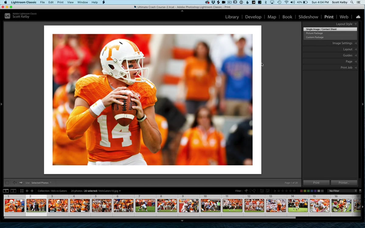
Step 2: Switch to the Print Module and Choose the Right Layout Style
 Clicking into the Print module with layout style panel visible
Head to the Print module using the module picker at the top of the screen. Once you’re there, look at the Layout Style panel on the right side. You’ll see a few options, and the one you want is “Single Image / Contact Sheet.” This is the layout engine that supports multiple photos in a grid. The other options serve different purposes, but for a multi-photo print layout, this is your starting point. Click it and you’re ready to build.
Clicking into the Print module with layout style panel visible
Head to the Print module using the module picker at the top of the screen. Once you’re there, look at the Layout Style panel on the right side. You’ll see a few options, and the one you want is “Single Image / Contact Sheet.” This is the layout engine that supports multiple photos in a grid. The other options serve different purposes, but for a multi-photo print layout, this is your starting point. Click it and you’re ready to build.
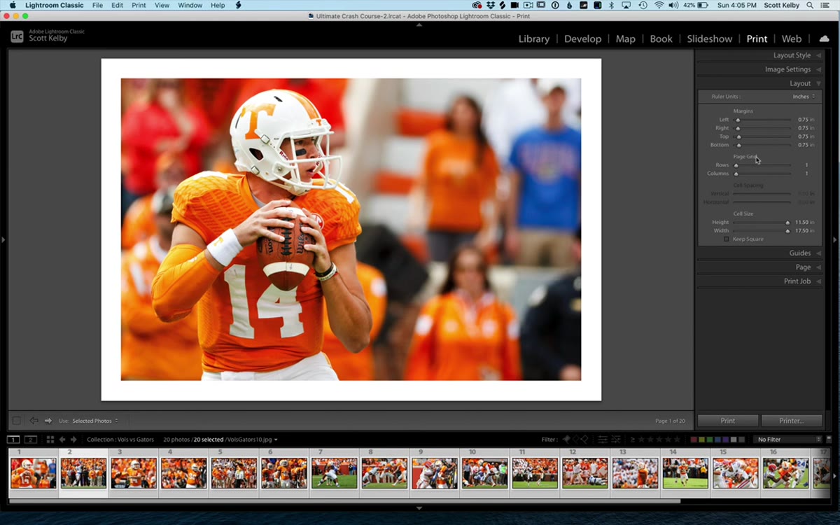
Step 3: Set Your Page Margins
 Layout panel open showing margin sliders set to three-quarter inch
Inside the Layout panel, the first set of controls you’ll see are the margin sliders: top, bottom, left, and right. Kelby runs his at three-quarters of an inch on all sides, which gives the finished layout a clean, professional border without eating too much of the page. You can match that, or dial it in to whatever fits your output. If you’re designing something meant to bleed close to the edge, pull those margins tighter. If it’s going into a portfolio with thick borders, give it more breathing room. Set this before you configure the grid, because margin changes will shift your image cells around.
Layout panel open showing margin sliders set to three-quarter inch
Inside the Layout panel, the first set of controls you’ll see are the margin sliders: top, bottom, left, and right. Kelby runs his at three-quarters of an inch on all sides, which gives the finished layout a clean, professional border without eating too much of the page. You can match that, or dial it in to whatever fits your output. If you’re designing something meant to bleed close to the edge, pull those margins tighter. If it’s going into a portfolio with thick borders, give it more breathing room. Set this before you configure the grid, because margin changes will shift your image cells around.
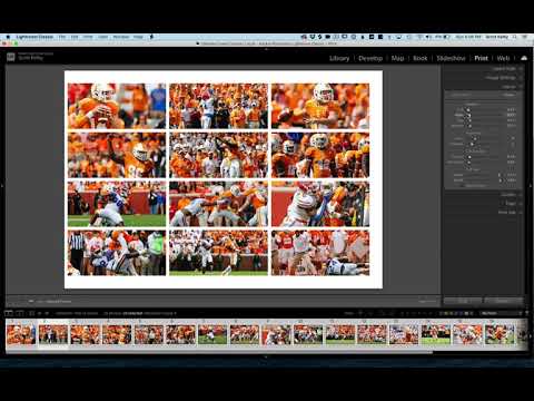
Step 4: Build Your Grid With the Page Grid Controls
 Page Grid sliders showing rows and columns being adjusted
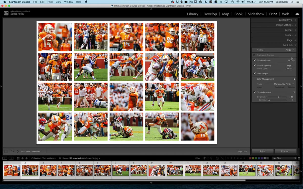
This is where the layout actually takes shape. Still inside the Layout panel, you’ll find the Page Grid section with two sliders: Rows and Columns. Start with Rows. Drag it up and watch your images multiply down the page in real time. Then add columns and watch the grid fill out horizontally. The live preview is genuinely useful here because you’re not committing to anything until it looks right. Kelby cycles through several combinations in the video, from a simple 4x1 strip to a denser 4x4 or 4x5 grid. There’s no single correct answer. For a band press sheet or a portfolio sampler, I tend to land around 3 rows by 3 columns. For a contact sheet where I’m reviewing a session, I’ll push it to 5 or 6 columns.
Page Grid sliders showing rows and columns being adjusted
This is where the layout actually takes shape. Still inside the Layout panel, you’ll find the Page Grid section with two sliders: Rows and Columns. Start with Rows. Drag it up and watch your images multiply down the page in real time. Then add columns and watch the grid fill out horizontally. The live preview is genuinely useful here because you’re not committing to anything until it looks right. Kelby cycles through several combinations in the video, from a simple 4x1 strip to a denser 4x4 or 4x5 grid. There’s no single correct answer. For a band press sheet or a portfolio sampler, I tend to land around 3 rows by 3 columns. For a contact sheet where I’m reviewing a session, I’ll push it to 5 or 6 columns.
Step 5: Add Spacing Between Your Images
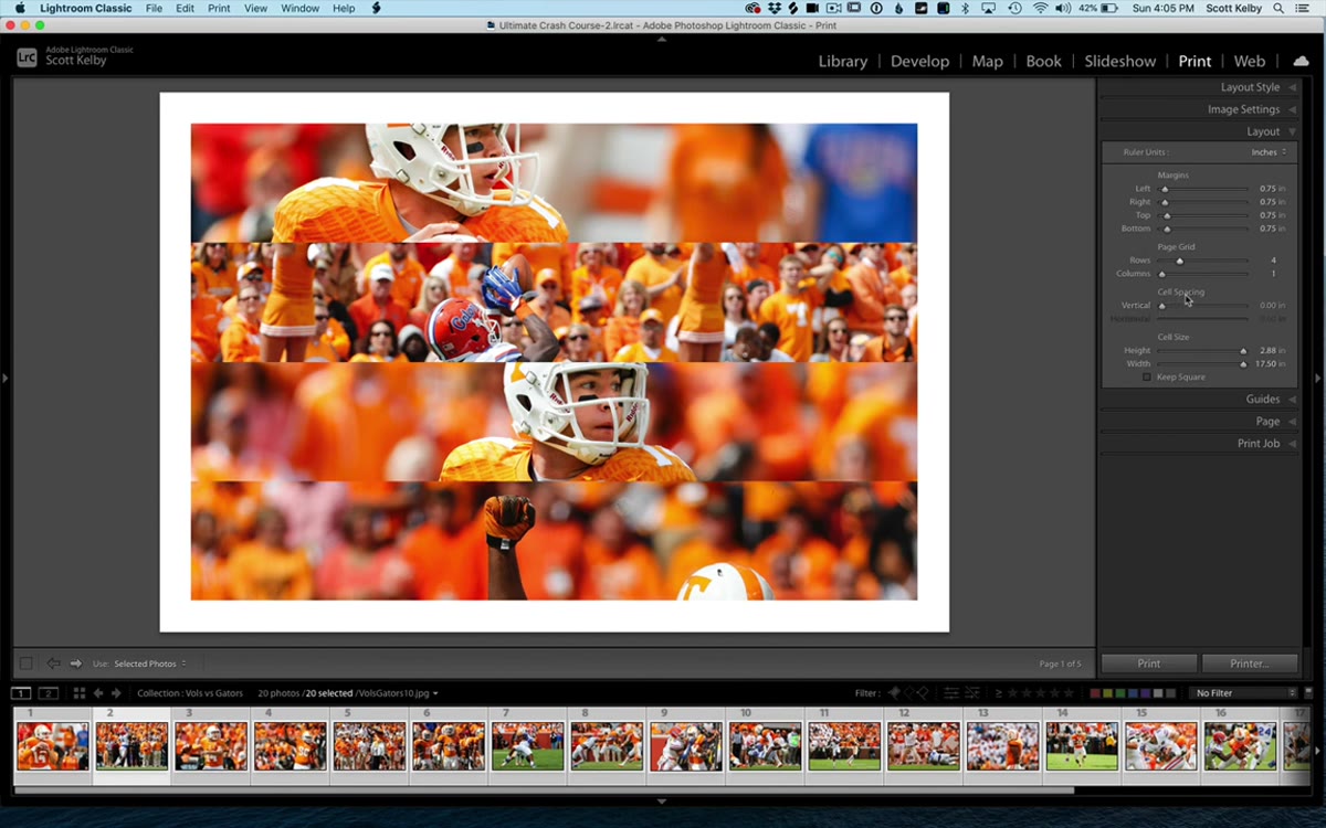 Cell Spacing sliders adjusting vertical and horizontal gaps
Once your grid dimensions feel right, the images will likely be sitting flush against each other with no breathing room. The Cell Spacing sliders fix that. You’ve got Vertical and Horizontal controls. Vertical spacing adds gaps between your rows. Horizontal spacing opens up space between your columns. Drag them up slowly, because a little goes a long way. Kelby keeps this intentionally visual rather than giving specific numbers, and I think that’s the right call. Your eye will tell you when the grid starts to feel balanced. Somewhere between 0.1 and 0.3 inches is usually the range where things look intentional rather than cramped or sparse.
Cell Spacing sliders adjusting vertical and horizontal gaps
Once your grid dimensions feel right, the images will likely be sitting flush against each other with no breathing room. The Cell Spacing sliders fix that. You’ve got Vertical and Horizontal controls. Vertical spacing adds gaps between your rows. Horizontal spacing opens up space between your columns. Drag them up slowly, because a little goes a long way. Kelby keeps this intentionally visual rather than giving specific numbers, and I think that’s the right call. Your eye will tell you when the grid starts to feel balanced. Somewhere between 0.1 and 0.3 inches is usually the range where things look intentional rather than cramped or sparse.
Step 6: Export as JPEG From the Print Job Panel
 Print Job panel showing Print to JPEG option selected
Here’s the step that a lot of people miss because they assume the Print module only outputs to a printer. Scroll down to the Print Job panel and look for the “Print To” dropdown. Switch it from “Printer” to “JPEG File.” This lets you save the entire grid layout as a single flat image file you can actually use everywhere: email, Instagram, Facebook, portfolio sites, client presentation PDFs. The output quality is solid, and since it’s just a JPEG, anyone can open it without knowing what Lightroom is. Click “Print to File,” name it, and you’re done.
Print Job panel showing Print to JPEG option selected
Here’s the step that a lot of people miss because they assume the Print module only outputs to a printer. Scroll down to the Print Job panel and look for the “Print To” dropdown. Switch it from “Printer” to “JPEG File.” This lets you save the entire grid layout as a single flat image file you can actually use everywhere: email, Instagram, Facebook, portfolio sites, client presentation PDFs. The output quality is solid, and since it’s just a JPEG, anyone can open it without knowing what Lightroom is. Click “Print to File,” name it, and you’re done.
What I’d Add From My Own Experience
The one thing Kelby doesn’t get into here, probably because the tutorial is intentionally brief, is photo order. Lightroom will populate your grid using whatever sequence your images appear in the collection. If you want a specific image in a specific cell, arrange your collection manually before you build the layout. Drag images in the filmstrip until your sequence tells the story you want, top-left to bottom-right. I learned this the hard way when I built a nice 3x3 grid for a show poster and realized the strongest image had ended up buried in the middle row instead of leading the top-left anchor position.
Also worth knowing: if you’ve got images with different aspect ratios, some cells may show white space or crop unexpectedly. Keep an eye on the “Zoom to Fill” checkbox in the Image Settings panel if you want everything to fill its cell uniformly. It will crop, so use it knowing that.
The biggest takeaway here is that Lightroom’s Print module is doing real layout work that most photographers outsource to Photoshop or a third-party app out of habit. For multi-photo grid layouts, this approach is faster, non-destructive, and lives entirely inside a tool you’re probably already in every day.
Watch the full tutorial on YouTube to see Scott Kelby run through the whole thing in real time. It’s three minutes and worth every second.
Comments
Leave a Comment