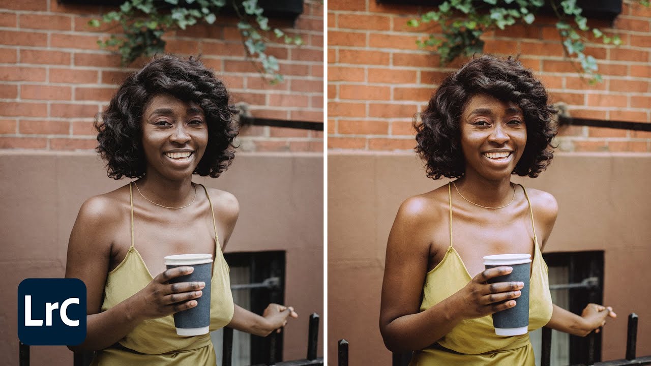
There’s a specific kind of frustration that comes from shooting a perfect burst of images and then realizing every single one looks slightly different in post. White balance drifts, shadows go cool, highlights go warm. You fix one frame and the rest still look off. I’ve been there more times than I want to admit, and for a long time my solution was to just manually drag sliders until something looked close enough. Not a great workflow.
The Color Grading panel in Lightroom Classic solves this in a way that feels almost unfair once you understand it. It gives you independent tonal control over shadows, midtones, and highlights, and because it lives in the Develop module like everything else, it syncs across a series of images cleanly. In this Aaron Nace (PHLEARN) tutorial, he walks through exactly how to use it, start to finish, with a batch of real photos. Watch the full tutorial on YouTube and follow along below with the breakdown.
What I like about Aaron’s approach is that he’s not just showing you where the sliders are. He’s showing you how to think about color correction as a layered decision rather than a single global adjustment. That framing alone is worth your time.
Step 1: Open Your Image in the Develop Module
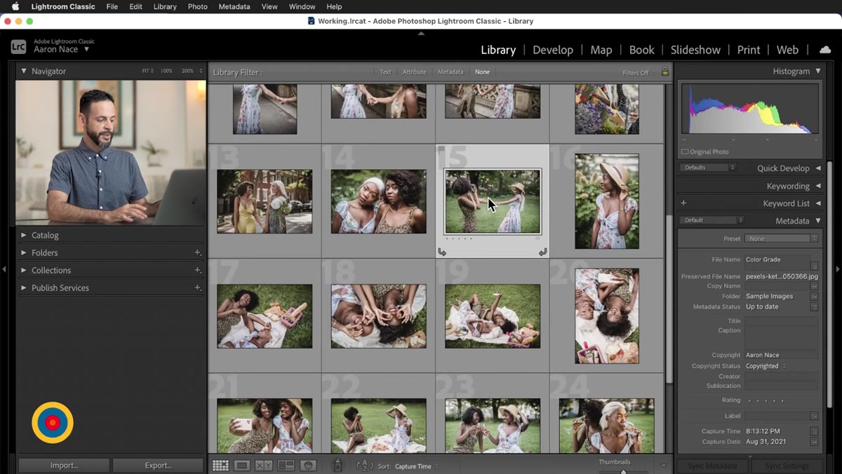 Selecting an image and pressing D to enter Develop module
Pick one image from your batch and press D to jump into the Develop module. Don’t start by tweaking exposure or white balance yet. You want to get to the Color Grading panel first, so you can see what you’re working with before introducing other variables.
If your panel list looks busy, collapse the sections you’re not using. Basic settings, tone curve, HSL – fold them up. You’re here for Color Grading specifically, and clearing the visual noise helps you stay focused.
Step 2: Get Familiar with the Three-Panel View
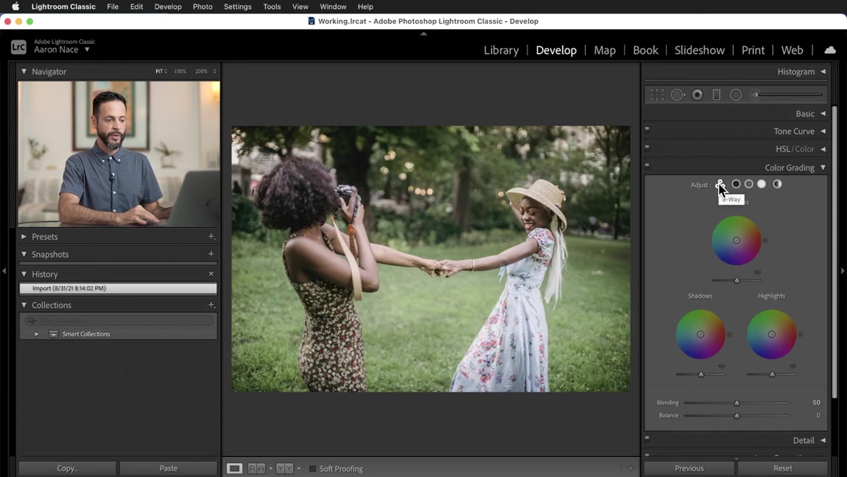 The Color Grading panel showing three wheels for shadows, midtones, highlights
The Color Grading panel opens in what Aaron calls the “three-window view” – a layout that shows you the shadows, midtones, and highlights color wheels simultaneously. This is the view you’ll want to work in most of the time, because seeing all three tonal ranges at once lets you make decisions about contrast and color relationship, not just individual adjustments.
You can also click the icons along the top of the panel to isolate a single wheel – just shadows, just midtones, or just highlights – if you need to focus. And there’s a global option that applies one color cast to the whole image at once. Aaron is honest about this one: it’s there, but it’s blunt. Less control means less finesse, and finesse is usually what separates a grade that looks intentional from one that looks filtered.
Step 3: Understand the Color Wheel Controls
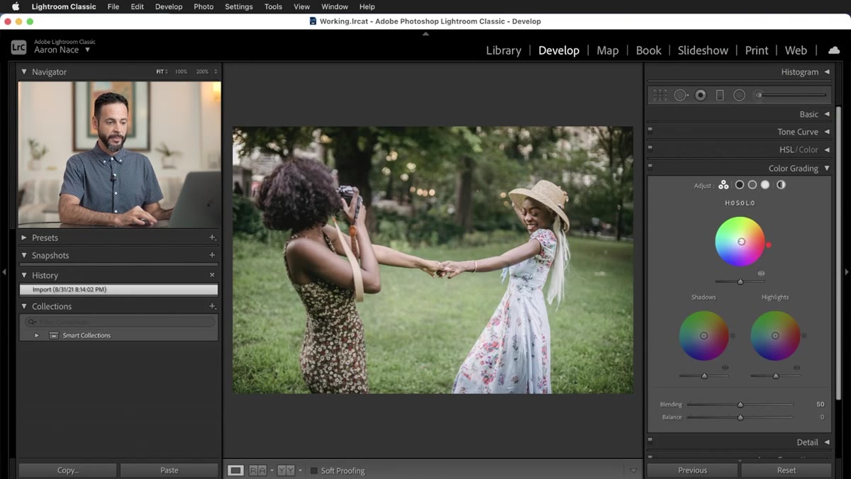 Close-up of the midtones color wheel with the center dot being dragged
Each wheel has a small dot in the center that you drag outward to introduce color and shift the hue by moving around the circle. The further from center, the more saturated the effect. There’s also a vertical luminance slider below each wheel that controls brightness independently of color – so you can push your midtones warmer without also blowing them out. Think of it as hue and saturation on the wheel, brightness on the bar.
The eye icon in the panel header toggles your before/after view so you can check your work without leaving the panel. Use it constantly. It’s easy to drift too far without noticing.
Step 4: Use the Keyboard Shortcuts for Precision
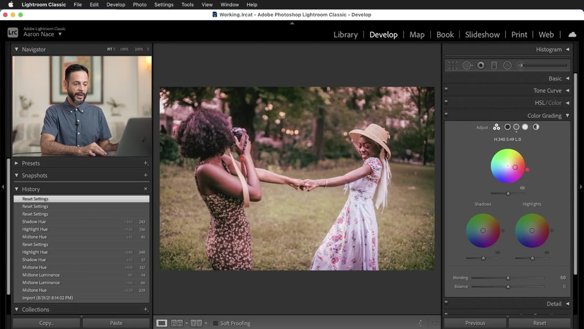 Demonstrating Alt/Option key held while dragging the color dot
This is the step most tutorials skip, and it’s the one that actually changed how I work. By default, dragging the color dot moves fast. That’s fine for big shifts, but color grading is usually about subtle pushes, not dramatic swings.
Hold Alt (Windows) or Option (Mac) while dragging and the movement slows down significantly. You get much finer control over where the hue lands. Hold Shift while dragging and only the saturation changes – the hue locks in place. That’s perfect when you’ve found a color you like but just want more or less of it. Hold Ctrl (Windows) or Command (Mac) and the opposite happens: only the hue rotates, while saturation stays fixed. These three modifiers basically give you three different tools in one dot.
Step 5: Reset Without Starting Over
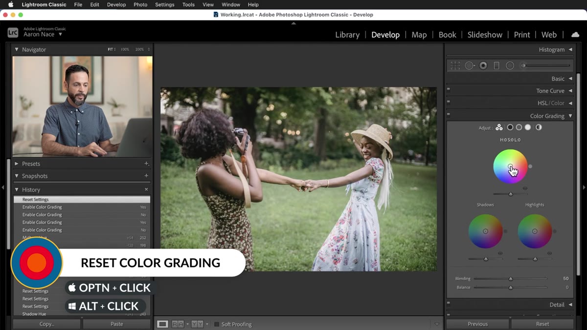
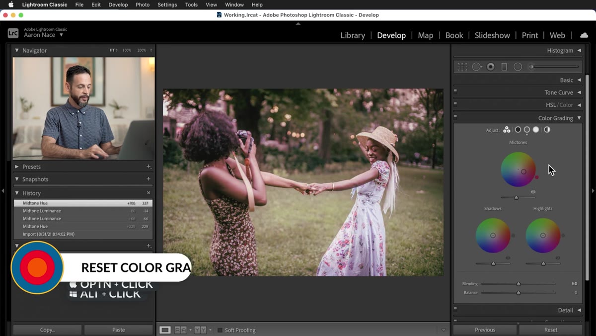 Holding Alt/Option to reveal reset options for individual tonal ranges
Before you go too deep into an edit, know your escape routes. Holding Alt/Option while looking at the panel reveals reset options for each individual tonal range, so you can wipe your midtone adjustments without touching shadows or highlights. If you want to clear everything at once, there’s a full reset available through the same modifier.
This matters because color grading is iterative. You’ll push something too far, realize it’s not working, and want to back up without undoing the whole session. The per-wheel reset makes that painless.
Step 6: Build a Grade Across All Three Tonal Ranges
 All three wheels adjusted, showing warmth in highlights and cool in shadows
Here’s where the actual creative work happens. Aaron’s approach in the tutorial is a classic warm/cool split: shift the highlights toward yellow/warm tones, leave the midtones relatively neutral, and push the shadows slightly cool. This creates a sense of depth and dimension that makes images feel more cinematic without looking processed.
Work with restraint. Aaron specifically says to keep adjustments relatively gentle and move things closer to center rather than out to the edges. A setting of 10-20 on saturation and a soft hue nudge will almost always read better than cranking the wheel to the extreme. The goal is for viewers to feel the grade, not identify it.
One Thing I’d Add: Apply to the Batch Last
After you dial in a grade on your hero image, resist the urge to sync it to the whole batch immediately. Shoot conditions change across a burst, especially outdoors. I’ll usually apply the grade, then do a quick visual scan of the synced images to catch any that need a small override. The Color Grading settings sync perfectly in Lightroom, but they’re not magic – if one frame is two stops darker, the same grade will read differently on it.
My personal habit is to name my working preset after whatever record I’m listening to while I edit. It sounds silly, but it means my preset library actually makes sense to me six months later. “Gold Rush” looks warmer than “Blue October,” and that’s immediately useful information.
The single most important takeaway here is that Color Grading in Lightroom is not an advanced feature reserved for heavy retouching work. It’s a practical, non-destructive way to give a consistent look to a series of images, and it’s precise enough to do real creative work once you know the keyboard shortcuts. The three-wheel view, the modifier keys, and the per-range resets are the whole toolkit.
Watch the full tutorial on YouTube to see Aaron demonstrate this in real time – the visual of watching the wheels move while the image shifts is worth more than any written description.
Comments (5)
Been doing this wrong for years apparently. Thanks for the wake-up call.
Printing this out and pinning it next to my monitor. That good.
Excellent tutorial. I'd add that from a compositing standpoint, this technique is incredibly versatile.
Never thought of approaching it this way. Really creative.
Solid advice. Especially the part about taking your time with it.
Leave a Comment