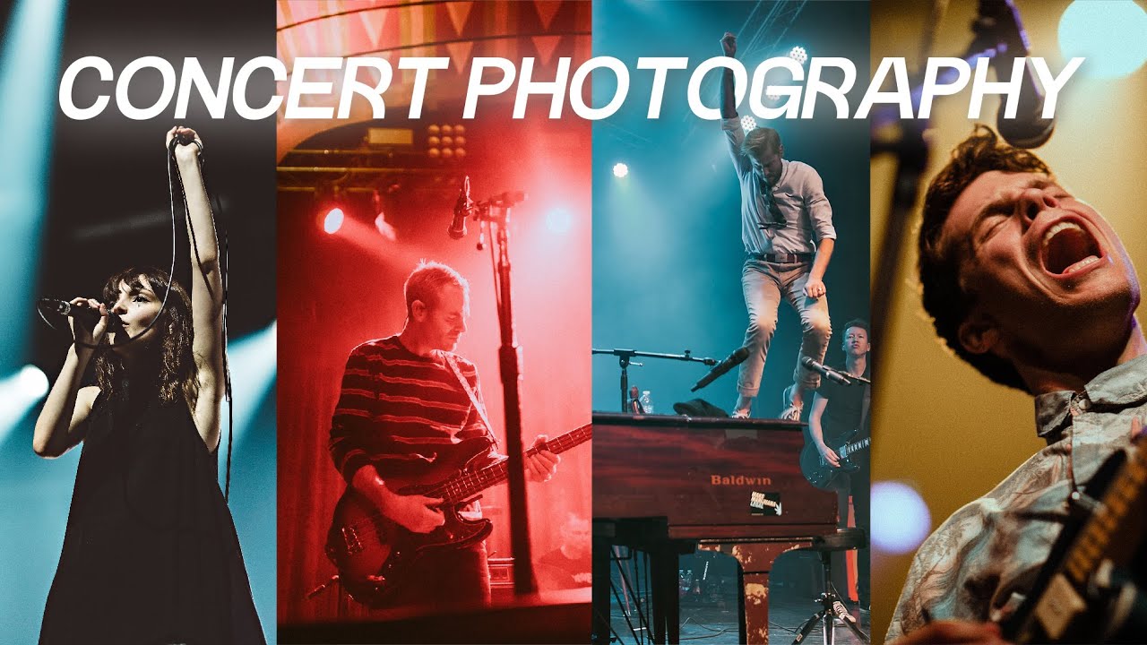
Concert photography is the editing equivalent of being handed a bag of mystery ingredients and told to make something edible. The lighting is dramatic, unpredictable, and almost aggressively wrong for skin tones. You’ll get magenta blasts, red face-melters, and blue washes that make your subject look like they’re performing from the bottom of the ocean. I’ve been there more times than I want to count, and finding a reliable editing framework for these shots is genuinely useful.
Watch the full tutorial on YouTube
In this Mango Street tutorial, the approach isn’t “fix everything to look natural.” It’s smarter than that. Sometimes you correct for skin tone. Sometimes the light is so wild that you lean into it and make it part of the image. Knowing which situation you’re in before you touch a slider is half the battle, and this tutorial lays out a clear decision tree for making that call.
Step 1: Apply a Base Preset First
 Applying a base preset to the raw concert image
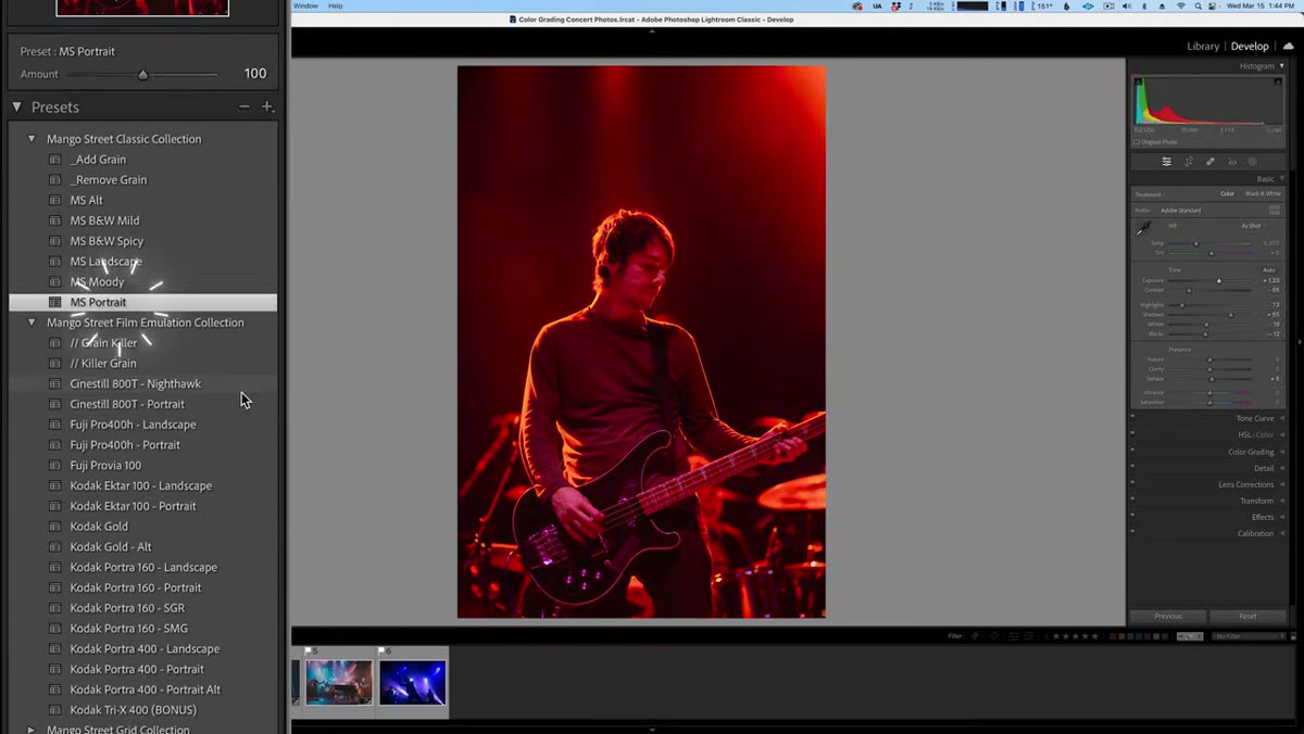
Before making any targeted adjustments, drop a base preset on the image to establish your exposure and tone foundation. This isn’t cheating. It’s giving yourself a workable starting point so you’re not building in the dark. The tutorial uses one of Mango Street’s own presets here, but any preset you trust for your general style will work. The key is that you want your exposure, contrast, and basic tone curve roughed in so that when you start making color-specific moves, you’re seeing them against something close to a final image rather than a flat raw file.
Applying a base preset to the raw concert image
Before making any targeted adjustments, drop a base preset on the image to establish your exposure and tone foundation. This isn’t cheating. It’s giving yourself a workable starting point so you’re not building in the dark. The tutorial uses one of Mango Street’s own presets here, but any preset you trust for your general style will work. The key is that you want your exposure, contrast, and basic tone curve roughed in so that when you start making color-specific moves, you’re seeing them against something close to a final image rather than a flat raw file.
Step 2: Correct White Balance and Use Calibration for Tough Color Casts
 White balance and calibration panel adjustments in Lightroom
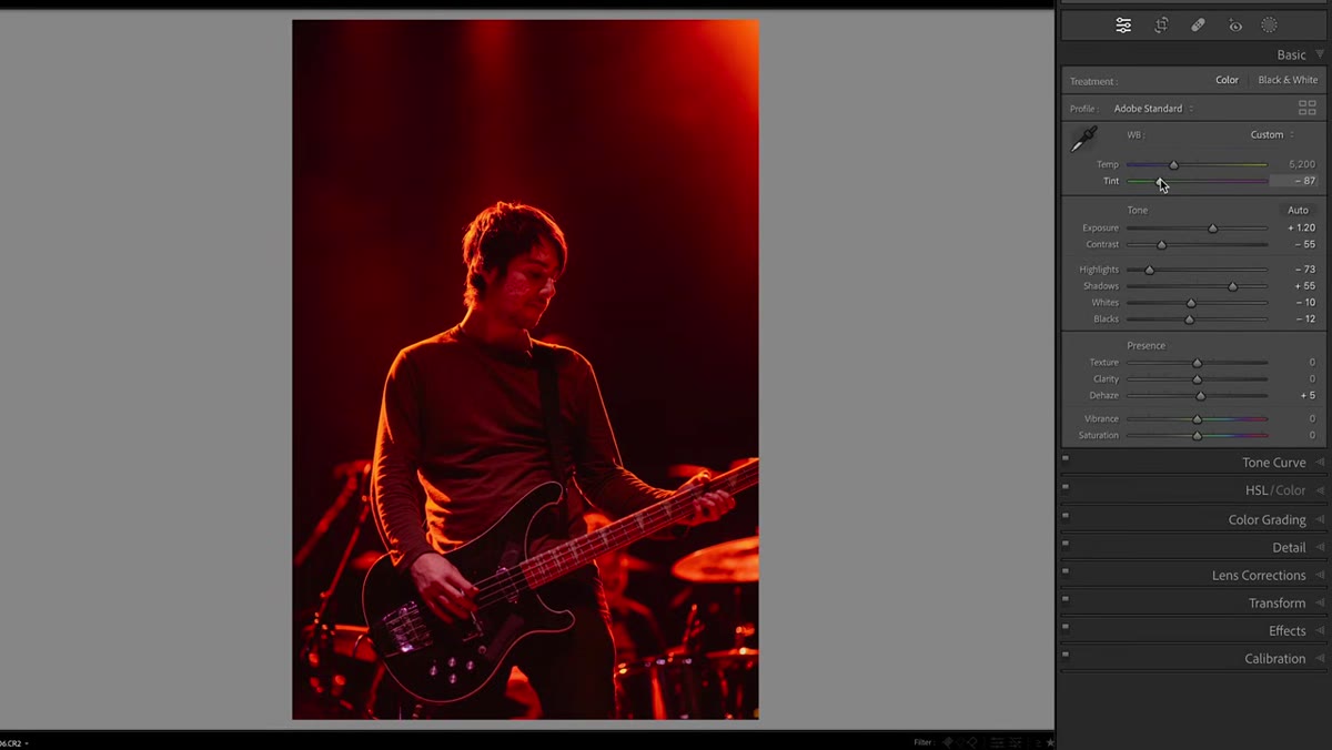
For photos with a yellow, blue, green, or magenta cast on your subject, start with a white balance correction. Push the Tint slider toward green to counteract magenta, or adjust Temperature to fight warm or cool casts. If the white balance sliders alone aren’t enough, head down to the Calibration panel. Bring the Red and Green Primary Hue sliders up toward 100, then pull back the saturation on each of those channels. For the Blue Primary, try dropping the Hue to around -10 and the Saturation to around -35. This combination gives you a broader, more flexible color correction than Temperature and Tint alone, especially when the problem isn’t one clean color cast but a combination of several fighting each other.
White balance and calibration panel adjustments in Lightroom
For photos with a yellow, blue, green, or magenta cast on your subject, start with a white balance correction. Push the Tint slider toward green to counteract magenta, or adjust Temperature to fight warm or cool casts. If the white balance sliders alone aren’t enough, head down to the Calibration panel. Bring the Red and Green Primary Hue sliders up toward 100, then pull back the saturation on each of those channels. For the Blue Primary, try dropping the Hue to around -10 and the Saturation to around -35. This combination gives you a broader, more flexible color correction than Temperature and Tint alone, especially when the problem isn’t one clean color cast but a combination of several fighting each other.
Step 3: Use Subject Masking to Refine Skin Tone Separately
 Creating a subject mask over the performer in Lightroom
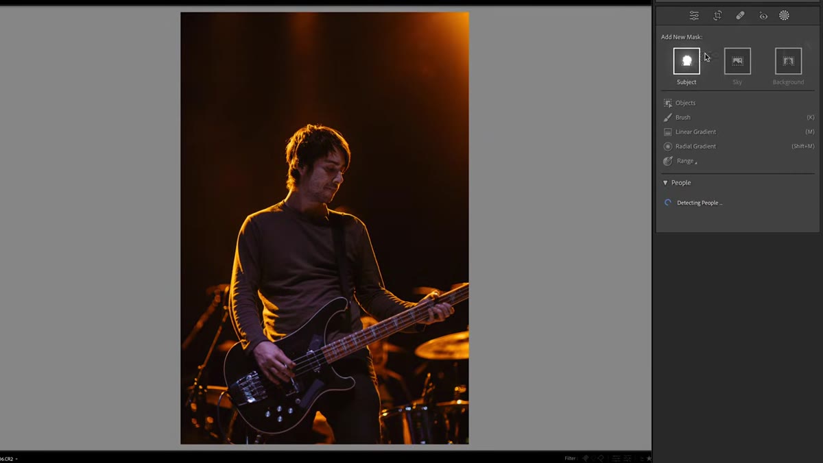
Once your global adjustments are in a reasonable place, create a mask using Lightroom’s person detection tool. This isolates your subject so you can fine-tune the exposure and white balance on their skin without affecting the rest of the frame. Bump the exposure up slightly on the mask to bring your subject forward visually, then make small white balance tweaks within the mask to pull the skin tone toward something human. The background can stay weird and dramatic. That’s often what makes the image interesting. Your subject’s face is the one thing that needs to read as real.
Creating a subject mask over the performer in Lightroom
Once your global adjustments are in a reasonable place, create a mask using Lightroom’s person detection tool. This isolates your subject so you can fine-tune the exposure and white balance on their skin without affecting the rest of the frame. Bump the exposure up slightly on the mask to bring your subject forward visually, then make small white balance tweaks within the mask to pull the skin tone toward something human. The background can stay weird and dramatic. That’s often what makes the image interesting. Your subject’s face is the one thing that needs to read as real.
Step 4: Deal with Stubborn Red or Magenta Light on Skin
 Adjusting hue and saturation with a face mask for red light
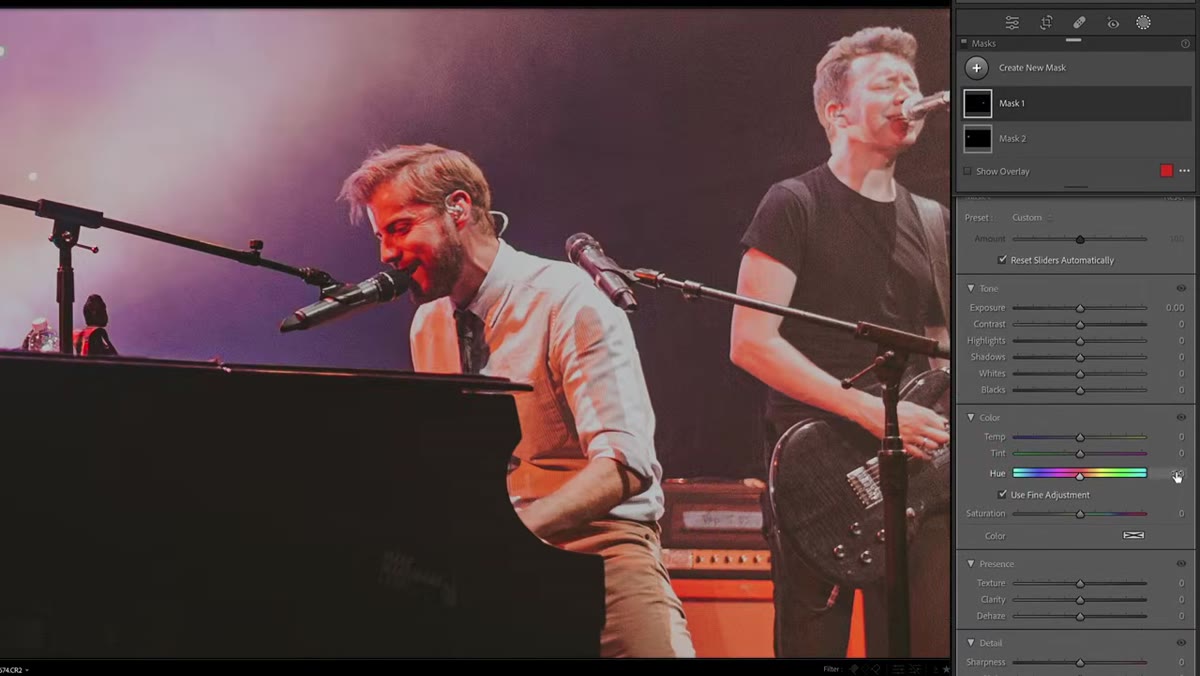
When the lighting is red and refuses to behave, the Hue slider within a subject mask becomes your best tool. Shift the Hue toward orange or yellow to pull red skin tones into warmer, more natural territory. Then carefully reduce the Saturation. The tricky part here is calibration. Pull it too far and your subject looks desaturated and flat. Leave it too high and they look like a tomato. The tutorial suggests a color overlay as an alternative: add a complementary color directly to the mask at low saturation. This can blend more naturally than saturation reduction alone. For the neck and areas outside your primary face mask, create a second mask and match the Hue adjustment there so everything blends consistently.
Adjusting hue and saturation with a face mask for red light
When the lighting is red and refuses to behave, the Hue slider within a subject mask becomes your best tool. Shift the Hue toward orange or yellow to pull red skin tones into warmer, more natural territory. Then carefully reduce the Saturation. The tricky part here is calibration. Pull it too far and your subject looks desaturated and flat. Leave it too high and they look like a tomato. The tutorial suggests a color overlay as an alternative: add a complementary color directly to the mask at low saturation. This can blend more naturally than saturation reduction alone. For the neck and areas outside your primary face mask, create a second mask and match the Hue adjustment there so everything blends consistently.
Step 5: Use Color Grading Midtones to Fight Extreme Casts
 Color grading panel open, midtones wheel being adjusted
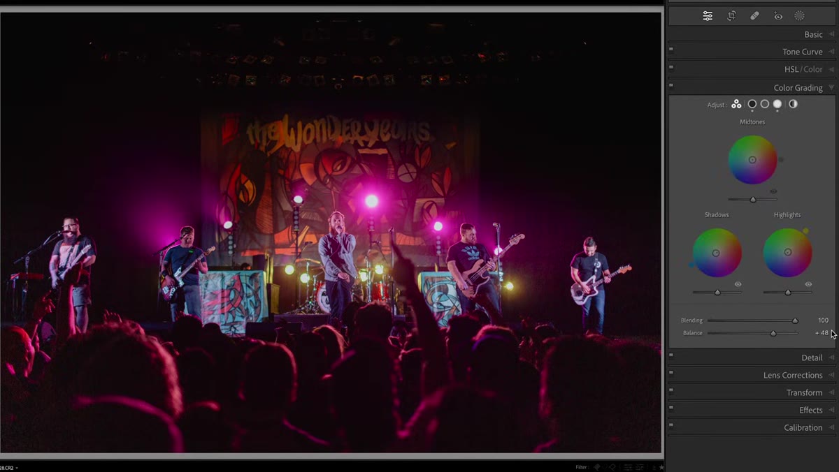
When a cast is so extreme that even maxing out the Tint slider doesn’t solve it, move into the Color Grading panel. Open the Midtones wheel and add color opposite the problem cast. Magenta on your subject? Add green in the midtones. The Luminance slider beneath the color wheel affects how bright or dark that midtone shift lands, so use it to keep the image from going muddy. You can also add slight warmth in the Global section of the Color Grading panel to unify the image and keep the correction from looking clinical.
Color grading panel open, midtones wheel being adjusted
When a cast is so extreme that even maxing out the Tint slider doesn’t solve it, move into the Color Grading panel. Open the Midtones wheel and add color opposite the problem cast. Magenta on your subject? Add green in the midtones. The Luminance slider beneath the color wheel affects how bright or dark that midtone shift lands, so use it to keep the image from going muddy. You can also add slight warmth in the Global section of the Color Grading panel to unify the image and keep the correction from looking clinical.
Step 6: Embrace the Color Cast and Lean Into Stylized Editing
 Bold stylized edit with blue and magenta color split in concert photo
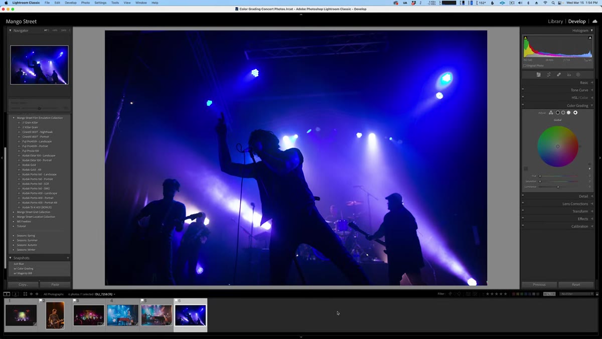
Some concert images are too far gone for skin tone correction, and honestly, that’s fine. If the lighting was genuinely that dramatic on the night, stripping out the color cast actually removes what made the photo interesting in the first place. Instead, apply a stylized preset (the tutorial uses a Kodak film emulation), warm the image to complement cool background lighting, and let the contrast between color temperatures create depth. For hot spots on colored lights within the frame, use an adjustment brush to paint over them, crank the exposure, and shift the Tint toward magenta. This converts distracting color blobs into blown-out light sources that read more naturally. From there, the Global color wheel in Color Grading lets you experiment with additional color pushes to find a look that feels intentional rather than accidental.
Bold stylized edit with blue and magenta color split in concert photo
Some concert images are too far gone for skin tone correction, and honestly, that’s fine. If the lighting was genuinely that dramatic on the night, stripping out the color cast actually removes what made the photo interesting in the first place. Instead, apply a stylized preset (the tutorial uses a Kodak film emulation), warm the image to complement cool background lighting, and let the contrast between color temperatures create depth. For hot spots on colored lights within the frame, use an adjustment brush to paint over them, crank the exposure, and shift the Tint toward magenta. This converts distracting color blobs into blown-out light sources that read more naturally. From there, the Global color wheel in Color Grading lets you experiment with additional color pushes to find a look that feels intentional rather than accidental.
What I’d Add from My Own Workflow
The tutorial keeps things in Lightroom for most of the corrections, which is exactly where I’d start too. One thing I’d emphasize is saving a snapshot before each major correction path you try. Concert images in particular can go several different directions during editing, and it is genuinely painful to get five minutes into a stylized edit and realize you preferred where it was at step two with no way back. Snapshots are free and they save your past decisions. I also tend to run a final check on the HSL panel after doing any color grading, specifically targeting orange and red ranges to make sure skin tones didn’t shift in a weird direction as a side effect of broader corrections. It takes thirty seconds and has saved a lot of portraits from looking subtly off in ways that are hard to name but easy to feel.
The single most important thing this tutorial gets right is framing concert photo editing as a decision rather than a formula. You look at the image, assess the light, and choose your path: correct toward realism, or commit to the color story the venue created. Neither approach is wrong. Executing either one with intention is what separates a finished edit from a rescued file.
Watch the full tutorial on YouTube and follow along with your own concert shots. Mango Street’s breakdown is worth pausing through at least once with Lightroom open beside it.
Comments (4)
Printing this out and pinning it next to my monitor. That good.
Tried this technique this morning. Game changer for real.
Wow, I had no idea you could do this. Mind blown.
Solid advice. Especially the part about taking your time with it.
Leave a Comment