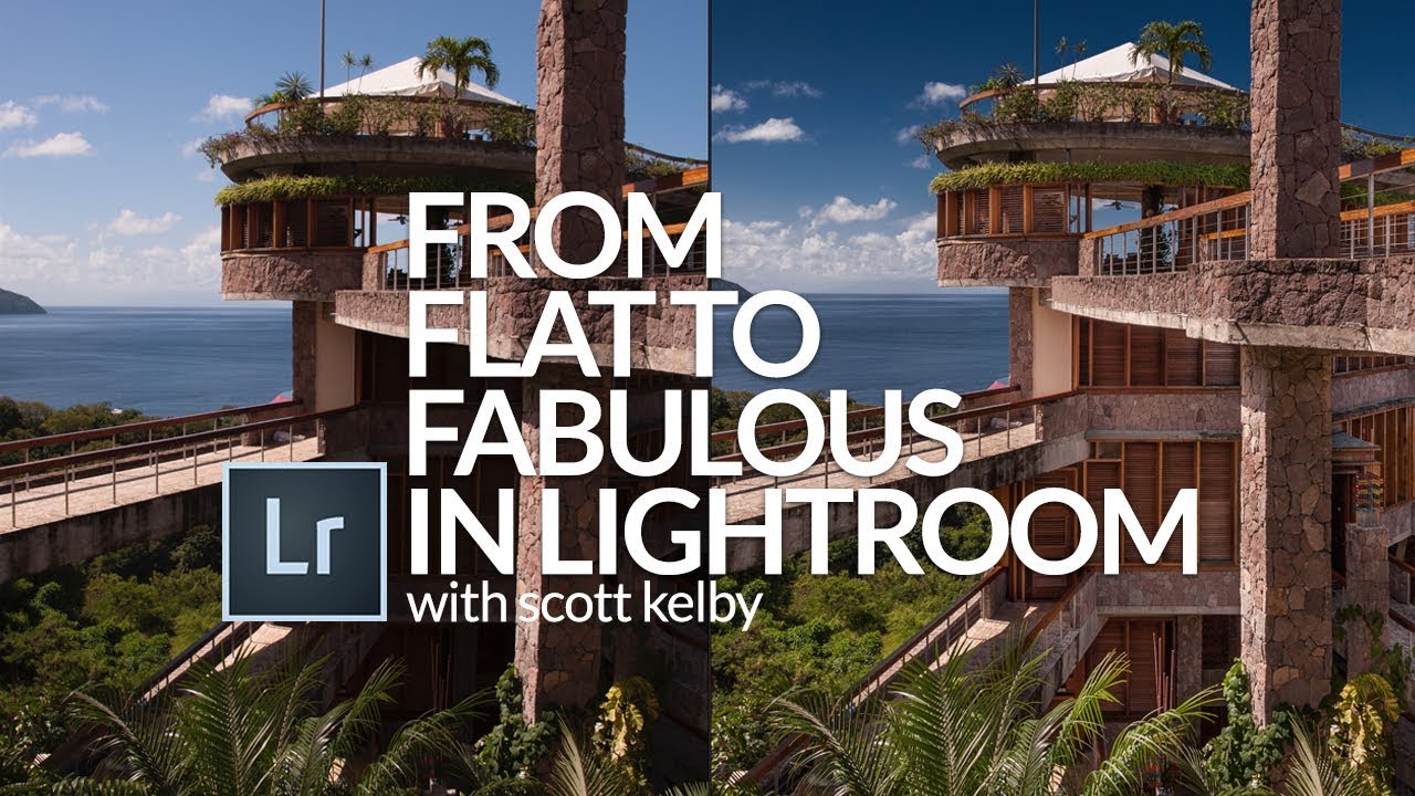
There’s a particular kind of dread that comes with opening a flat, straight-out-of-camera RAW file when you know a client is waiting. The histogram looks sad. The sky is blowing out. The columns are bowing like something shot through a fisheye. I’ve been there more times than I want to count, and the thing that pulled me out of that spiral early on was watching working photographers show their actual process, not just the before and after.
That’s exactly what Scott Kelby delivers in his “From Flat to Fabulous” tutorial. Watch the full tutorial on YouTube before or after reading this, either order works. The source image is a wide-angle interior shot from Jade Mountain resort in St. Lucia, the kind of image that has everything working against it: mixed light, architectural distortion, a blown sky, and flat shadows. It’s a perfect teaching photo precisely because it’s genuinely difficult.
What I want to do here is pull out the actual technique from each stage of Kelby’s edit and lay it out so you can follow along on your own images. This workflow is faster than it looks, and most of the moves transfer directly to any interior, landscape, or travel shot you’re working on.
Step 1: Start With Lens Correction
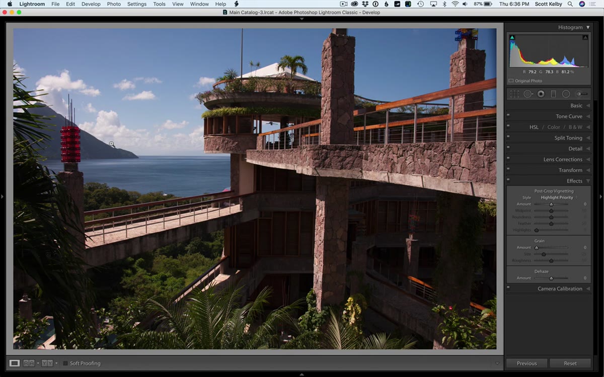 Lens Corrections panel with Enable Profile Correction toggled on
Before you touch a single tone slider, go to the Lens Corrections panel and turn on “Enable Profile Corrections.” Lightroom reads the EXIF metadata from your file and automatically matches the camera body and lens you used, then applies the manufacturer’s distortion and vignette correction profile. On a wide-angle shot, this single click visibly pulls the bowing out of vertical lines and straightens edges that were curving toward the frame corners. Toggle it on and off once so you can actually see the difference. It’s one of those moves that looks subtle in a screenshot but dramatic when you’re standing in front of a room full of architecture.
Lens Corrections panel with Enable Profile Correction toggled on
Before you touch a single tone slider, go to the Lens Corrections panel and turn on “Enable Profile Corrections.” Lightroom reads the EXIF metadata from your file and automatically matches the camera body and lens you used, then applies the manufacturer’s distortion and vignette correction profile. On a wide-angle shot, this single click visibly pulls the bowing out of vertical lines and straightens edges that were curving toward the frame corners. Toggle it on and off once so you can actually see the difference. It’s one of those moves that looks subtle in a screenshot but dramatic when you’re standing in front of a room full of architecture.
Step 2: Use the Transform Panel to Straighten the Frame
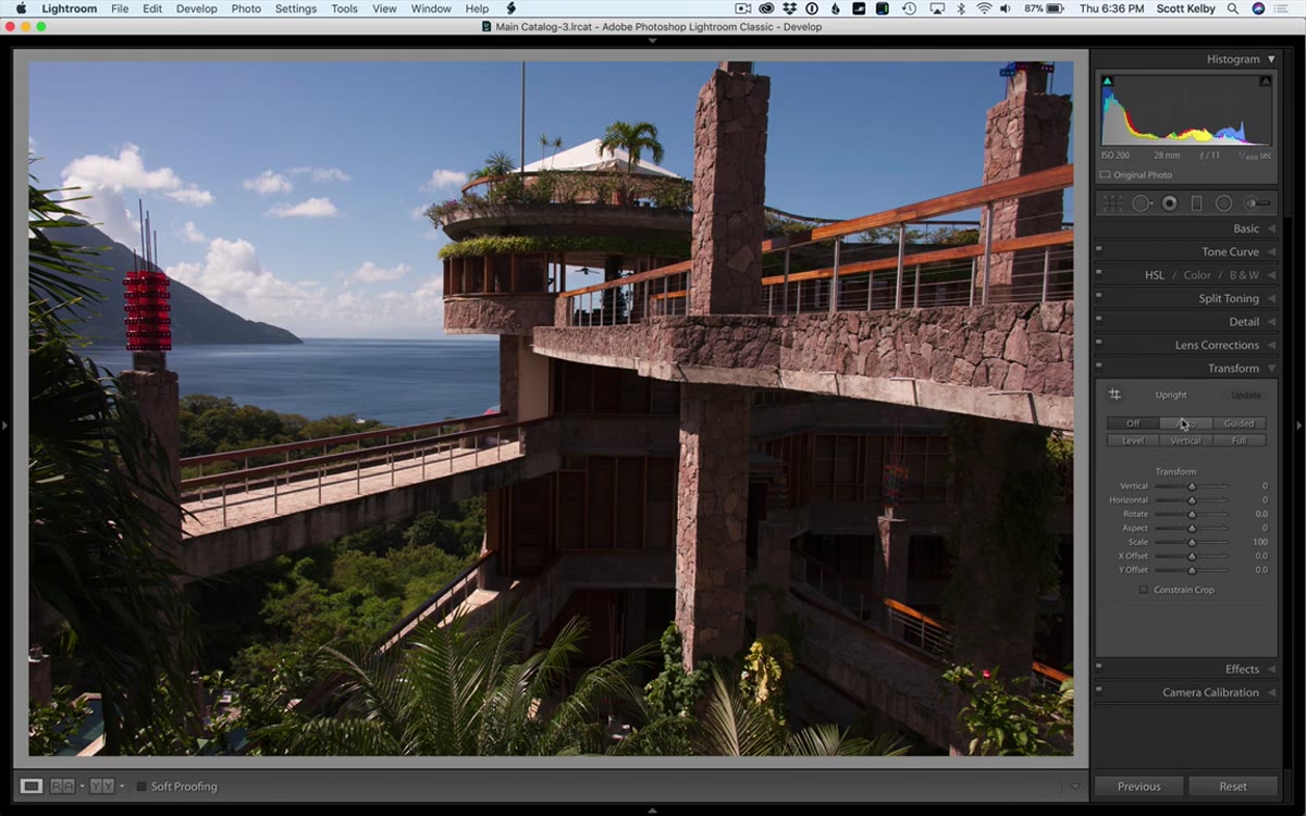 Transform panel with Auto selected under Upright feature
After lens correction handles optical distortion, the Transform panel handles perspective. Click “Auto” under the Upright section and Lightroom analyzes the geometry of the image, looking for lines that should be vertical or horizontal, and adjusts the perspective accordingly. It works best when your image has clear architectural reference points, and this resort interior gives it plenty to work with. After Lightroom does its job, Kelby makes one small manual rotation using the Rotate slider because the Auto result still felt slightly off to him. Trust your eye here. The Auto button gets you 90% of the way there; your judgment closes the gap.
Transform panel with Auto selected under Upright feature
After lens correction handles optical distortion, the Transform panel handles perspective. Click “Auto” under the Upright section and Lightroom analyzes the geometry of the image, looking for lines that should be vertical or horizontal, and adjusts the perspective accordingly. It works best when your image has clear architectural reference points, and this resort interior gives it plenty to work with. After Lightroom does its job, Kelby makes one small manual rotation using the Rotate slider because the Auto result still felt slightly off to him. Trust your eye here. The Auto button gets you 90% of the way there; your judgment closes the gap.
Step 3: Run Auto Tone as a Starting Point
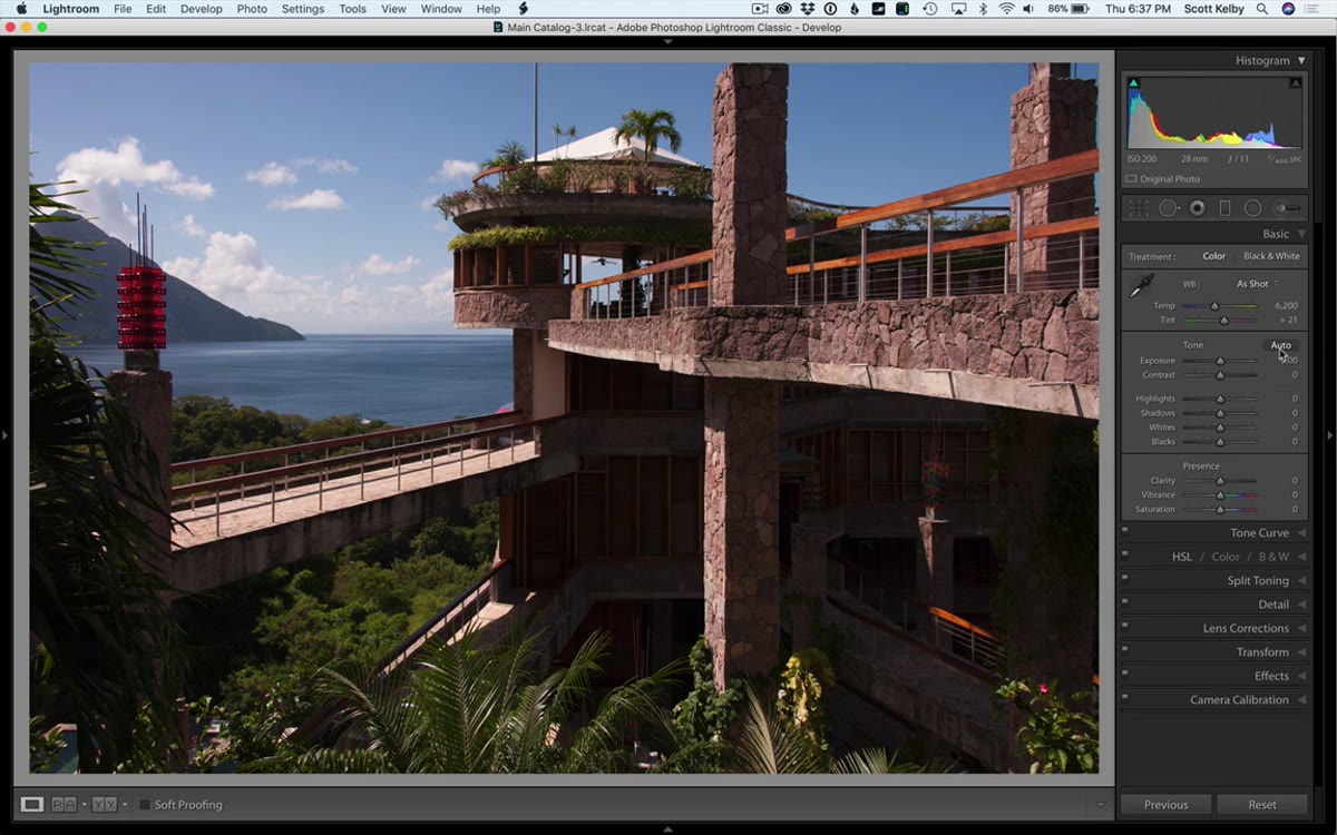 Basic panel after clicking Auto tone button
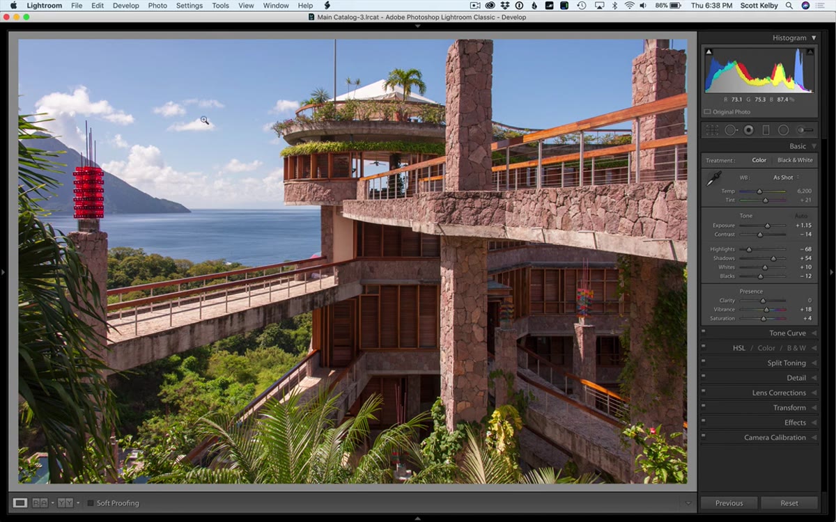
Here’s something that surprised me the first time I heard Kelby say it: the Auto button in the Basic panel is actually worth using now. Adobe retrained the underlying algorithm in recent versions of Lightroom CC, and it’s no longer the overexposure machine it used to be. Clicking it sets initial values for Exposure, Contrast, Highlights, Shadows, Whites, and Blacks all at once based on the AI analysis of your specific image. Think of it as a smart starting point, not a finished edit. Kelby uses it exactly that way, accepting most of what it gives him and then going back to correct the things it got wrong, mainly the sky.
Basic panel after clicking Auto tone button
Here’s something that surprised me the first time I heard Kelby say it: the Auto button in the Basic panel is actually worth using now. Adobe retrained the underlying algorithm in recent versions of Lightroom CC, and it’s no longer the overexposure machine it used to be. Clicking it sets initial values for Exposure, Contrast, Highlights, Shadows, Whites, and Blacks all at once based on the AI analysis of your specific image. Think of it as a smart starting point, not a finished edit. Kelby uses it exactly that way, accepting most of what it gives him and then going back to correct the things it got wrong, mainly the sky.
Step 4: Dial Back the Exposure and Recover the Sky
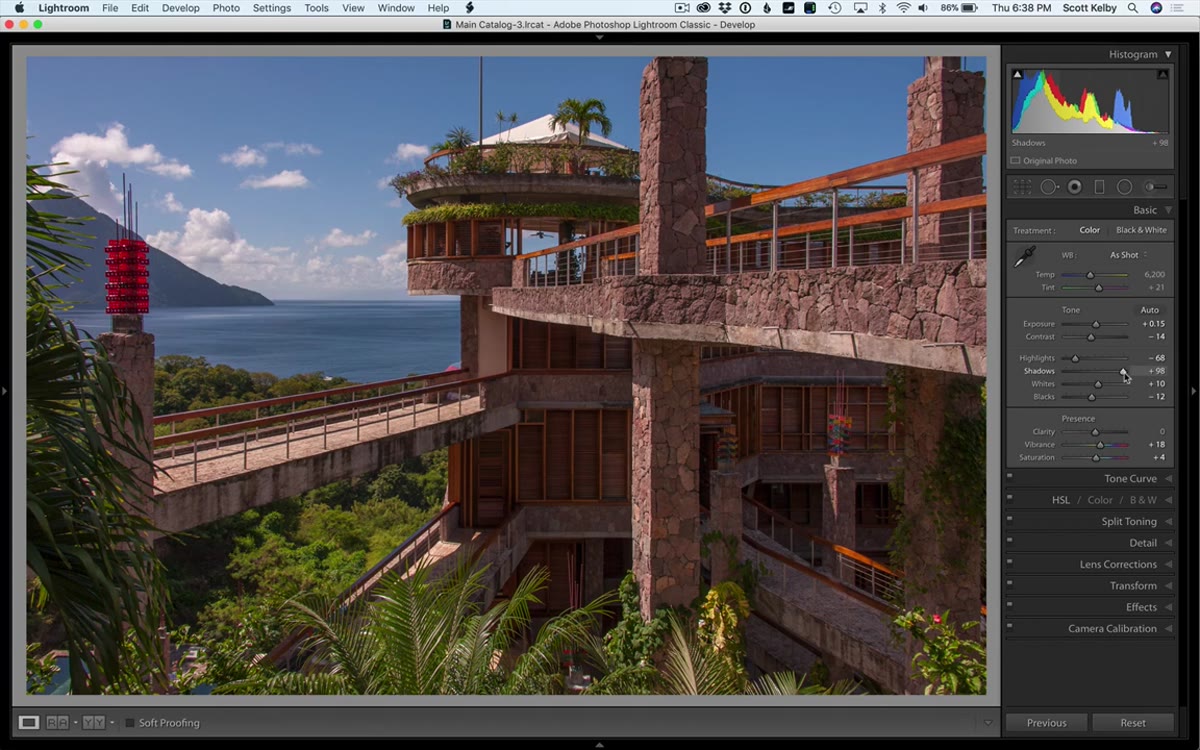
 Exposure slider being pulled back to protect highlight detail in sky
Auto tone tends to pull exposure up, which helps the shadows but can wreck the sky. After running Auto, bring the Exposure slider back down until you see cloud detail returning and the sky stops looking washed out. There’s no single magic number here because it depends on your original file, but the visual cue is simple: you want texture in the clouds and color in the blue areas. Once the sky is cooperating, push the Shadows slider up to compensate for the darker midtones and lower areas of the frame. You’re essentially using these two sliders to compress the dynamic range manually, darker highlights, brighter shadows, so the whole image sits in a more balanced range.
Exposure slider being pulled back to protect highlight detail in sky
Auto tone tends to pull exposure up, which helps the shadows but can wreck the sky. After running Auto, bring the Exposure slider back down until you see cloud detail returning and the sky stops looking washed out. There’s no single magic number here because it depends on your original file, but the visual cue is simple: you want texture in the clouds and color in the blue areas. Once the sky is cooperating, push the Shadows slider up to compensate for the darker midtones and lower areas of the frame. You’re essentially using these two sliders to compress the dynamic range manually, darker highlights, brighter shadows, so the whole image sits in a more balanced range.
Step 5: Address the Sky Separately With a Targeted Adjustment
 Graduated filter or HSL panel being applied to the sky area
A flat or overcast-looking sky is one of the most common problems in travel and landscape photography, and the Basic panel alone can’t fully solve it. Kelby moves to a targeted approach to give the sky its own treatment independent of the foreground. Whether you use a Graduated Filter dragged down from the top of the frame or the HSL panel to target the specific blue and aqua tones in the sky, the goal is the same: bring saturation and luminosity under control in the sky without touching the building, the furniture, or the skin tones below. The Luminance slider for Blues in the HSL panel is particularly powerful here. Drag it down and watch a pale, washed-out sky start to actually look like the Caribbean afternoon it was.
Graduated filter or HSL panel being applied to the sky area
A flat or overcast-looking sky is one of the most common problems in travel and landscape photography, and the Basic panel alone can’t fully solve it. Kelby moves to a targeted approach to give the sky its own treatment independent of the foreground. Whether you use a Graduated Filter dragged down from the top of the frame or the HSL panel to target the specific blue and aqua tones in the sky, the goal is the same: bring saturation and luminosity under control in the sky without touching the building, the furniture, or the skin tones below. The Luminance slider for Blues in the HSL panel is particularly powerful here. Drag it down and watch a pale, washed-out sky start to actually look like the Caribbean afternoon it was.
What I’d Do Differently on My Own Shots
Kelby’s workflow is tight and I follow a version of it on almost every travel image I edit. The one thing I’d add is an HSL pass before calling the edit done. After you’ve done all the tonal work, the colors often need individual attention. The oranges and reds in warm-light interiors can go muddy, and the aquas in tropical water shots frequently need their saturation pulled back slightly so they read as natural rather than over-processed.
I’d also strongly recommend naming any preset you build from this kind of workflow after whatever you’re listening to while you edit. Sounds ridiculous, I know. But “Slowdive - Alison” or “Joni Blue” are a lot easier to browse than “Warm Interior v3 final FINAL.” You’ll remember what it does and when you used it. Naming presets well is genuinely underrated.
Scott Kelby’s “flat to fabulous” approach proves that a great edit doesn’t require HDR stacking, heavy compositing, or sky replacement. The single most important thing this tutorial reinforced for me is that getting geometry right first, before you touch tone or color, changes everything. A correctly corrected frame makes every subsequent slider feel like it’s working with you instead of against you.
Watch the full tutorial on YouTube to see Kelby’s hands on the sliders and catch the visual details that timestamps alone can’t fully convey.
Comments
Leave a Comment