
There is a specific kind of frustration that hits when you spend an hour editing a photo, finally nail the look, and then export it only to watch it fall apart on screen or come back from the printer looking like a muddy mess. Color shifts, soft details, wrong dimensions. I have been there more times than I want to admit, and it took me a while to realize that exporting is not an afterthought. It is part of the edit. Get it wrong and none of the careful work before it matters.
That is why I kept coming back to this Day 27 tutorial from Aaron Nace over at PHLEARN. Watch the full tutorial on YouTube and you will see that Aaron treats the export dialogue with the same attention he gives to tone curves and masking. The tutorial uses a single raw photograph of two people on roller skates as the working file, walking through a full edit and then a complete export setup for both web and print. It is practical, fast, and exactly the kind of workflow walkthrough that sticks.
What I want to do here is break that process down step by step so you can follow along in Lightroom Classic without pausing and rewinding every 30 seconds.
Step 1: Start With an Auto Tone Baseline
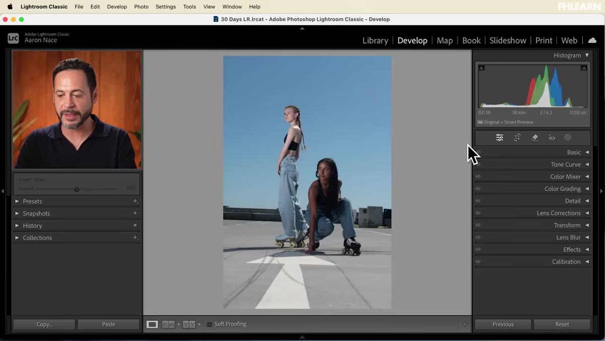 Auto settings applied in the Basic panel
The first move Aaron makes is applying Lightroom’s Auto setting inside the Basic panel. This is not laziness. It is a smart starting point that gives the histogram something reasonable to work from before you make intentional adjustments. Lightroom’s Auto algorithm has gotten genuinely good in recent versions, and for a well-exposed raw file it usually handles exposure, contrast, and white balance in a way that saves several minutes of manual sliding.
Auto settings applied in the Basic panel
The first move Aaron makes is applying Lightroom’s Auto setting inside the Basic panel. This is not laziness. It is a smart starting point that gives the histogram something reasonable to work from before you make intentional adjustments. Lightroom’s Auto algorithm has gotten genuinely good in recent versions, and for a well-exposed raw file it usually handles exposure, contrast, and white balance in a way that saves several minutes of manual sliding.
Think of Auto as zeroing out a mixing board to a usable gain structure before you start mixing. You are not done, but you are starting from somewhere sensible rather than from flat defaults.
Step 2: Build Subject Masks and Refine the People
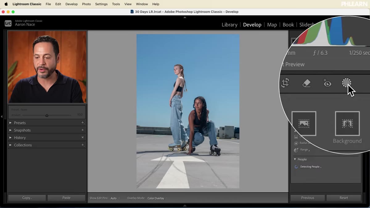 Masking panel open with person detection active
With the base tone set, Aaron heads straight into the Masking panel and uses Lightroom’s AI-powered people detection to isolate both subjects at once. The key move here is selecting the option that detects the entire person rather than just the face or skin, then confirming both subjects before creating the mask. Lightroom processes this quickly and produces a remarkably clean selection even around edges where hair meets sky.
Masking panel open with person detection active
With the base tone set, Aaron heads straight into the Masking panel and uses Lightroom’s AI-powered people detection to isolate both subjects at once. The key move here is selecting the option that detects the entire person rather than just the face or skin, then confirming both subjects before creating the mask. Lightroom processes this quickly and produces a remarkably clean selection even around edges where hair meets sky.
Once the mask is active, Aaron bumps contrast slightly, lifts the shadows to open up detail in the darker parts of the clothing, raises exposure just a touch, and pulls the highlights back down. The goal is separation. The subjects should feel like they exist in the frame, not like they are floating on top of it. Small moves here, done selectively, make a bigger visual difference than global adjustments ever could.
Step 3: Push the Sky With a Targeted Color Shift
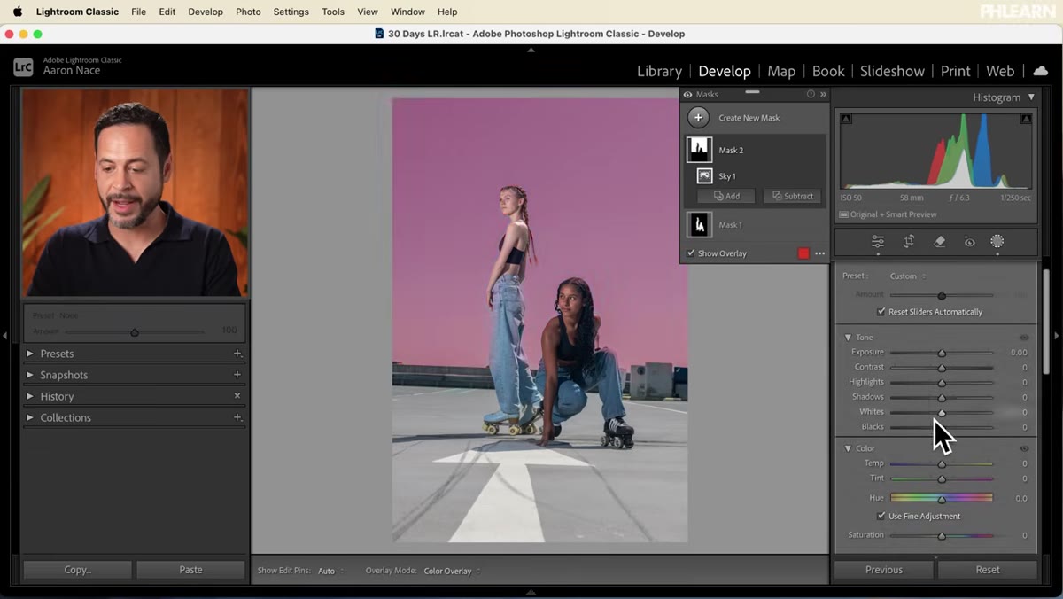 Sky mask selected with color temperature shifted blue
A second mask targets the sky using Lightroom’s Select Sky feature. What Aaron does next is the kind of decision that separates a technically correct edit from an interesting one. He pulls the color temperature dramatically toward blue, giving the sky a hyper-saturated, almost cinematic quality that reads as intentional rather than accidental.
Sky mask selected with color temperature shifted blue
A second mask targets the sky using Lightroom’s Select Sky feature. What Aaron does next is the kind of decision that separates a technically correct edit from an interesting one. He pulls the color temperature dramatically toward blue, giving the sky a hyper-saturated, almost cinematic quality that reads as intentional rather than accidental.
This is a stylistic choice, not a rule. But the lesson underneath it is important: once you have a clean mask, you can make aggressive moves that would look broken on the whole image. The sky can go very blue precisely because the subjects are protected on a separate mask. Masking is what gives you permission to be bold.
Step 4: Add Depth With a Radial Gradient
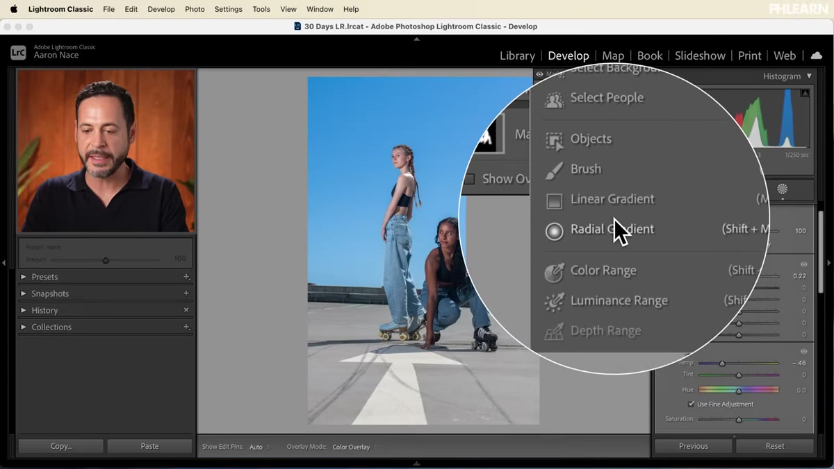 Radial gradient centered on subjects with feathering at 100
To give the image a sense of light falling on the subjects from the center of the frame, Aaron draws a large radial gradient from the middle outward and lifts the exposure slightly inside it. The critical setting here is Feathering set all the way to 100. Without full feathering, a radial gradient leaves a visible edge that looks like a vignette applied with a cookie cutter. At 100, the transition is so gradual that you feel the light before you consciously notice the mask.
Radial gradient centered on subjects with feathering at 100
To give the image a sense of light falling on the subjects from the center of the frame, Aaron draws a large radial gradient from the middle outward and lifts the exposure slightly inside it. The critical setting here is Feathering set all the way to 100. Without full feathering, a radial gradient leaves a visible edge that looks like a vignette applied with a cookie cutter. At 100, the transition is so gradual that you feel the light before you consciously notice the mask.
This is a technique I use constantly. A centered radial gradient with high feathering is one of the fastest ways to make a subject feel like they are lit rather than just photographed.
Step 5: Level and Crop the Horizon
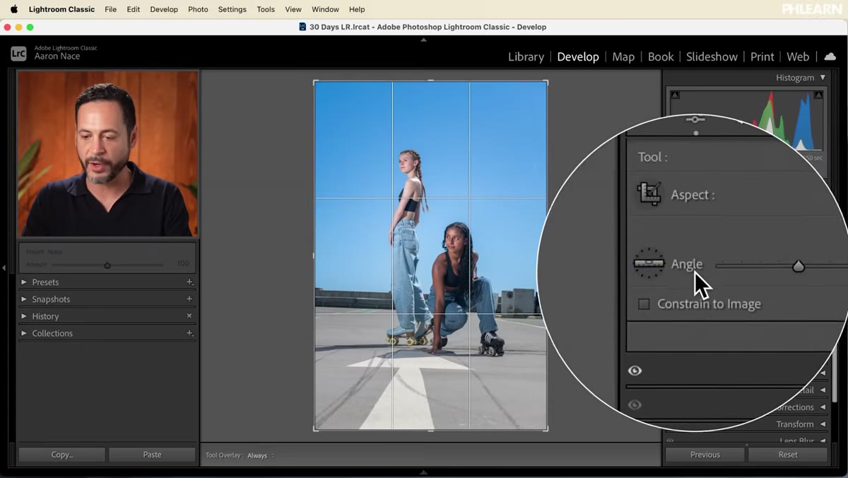 Angle correction tool tracing the horizon line
A crooked horizon is one of those things that viewers notice without knowing they noticed it. Something just feels slightly wrong. Aaron uses Lightroom’s angle correction tool inside the crop panel, clicking and dragging directly along the horizon line to let Lightroom calculate the rotation automatically. After that correction, he also crops in slightly to tighten the composition.
Angle correction tool tracing the horizon line
A crooked horizon is one of those things that viewers notice without knowing they noticed it. Something just feels slightly wrong. Aaron uses Lightroom’s angle correction tool inside the crop panel, clicking and dragging directly along the horizon line to let Lightroom calculate the rotation automatically. After that correction, he also crops in slightly to tighten the composition.
The two-pass approach matters: first correct the level, then refine the crop. Trying to do both at once by eye usually means you end up neither level nor well-composed.
Step 6: Clean the Ground With Generative AI Remove
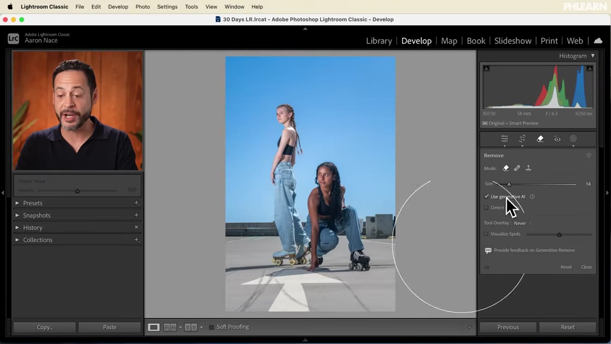 Remove tool painting over skate marks on the pavement
The final retouching step removes scuff marks left on the pavement from the roller skates. Aaron uses the Remove tool with Generative AI enabled, painting over the marks in a few strokes. He zooms in using the spacebar-click shortcut, adjusts brush size with the bracket keys, and works across the ground methodically.
Remove tool painting over skate marks on the pavement
The final retouching step removes scuff marks left on the pavement from the roller skates. Aaron uses the Remove tool with Generative AI enabled, painting over the marks in a few strokes. He zooms in using the spacebar-click shortcut, adjusts brush size with the bracket keys, and works across the ground methodically.
Generative AI removal in Lightroom Classic is genuinely impressive on textured surfaces like pavement. It reads the surrounding pattern and fills in convincingly. The workflow shortcut worth memorizing here is spacebar plus click to pan around a zoomed view without exiting the tool you are working in.
My Take: Export Settings Are Where Most People Leave Money on the Table
I have reviewed a lot of export workflows and the single most common mistake I see is people exporting everything at the same settings regardless of destination. One preset for everything feels efficient until a client prints a 16x20 and it looks soft, or you upload to a portfolio site and the colors look faded because the file was exported in the wrong color space.
For web, I export sRGB at 72 to 96 PPI, quality around 80 in JPEG, with sharpening set to Screen. For print, I switch to Adobe RGB at the resolution my print lab specifies, usually 300 PPI, with output sharpening set to Matte or Glossy depending on the paper. Keeping named export presets for each destination is one of the best habits you can build in Lightroom. It takes five minutes to set up and saves you from a painful conversation with a client about reprints.
The single most transferable idea from this tutorial is that a finished edit is not finished until the export settings match the destination. All the masking and color work in the world gets undermined by the wrong file format or color profile.
Watch the full tutorial on YouTube to see Aaron walk through the complete export dialogue with his own commentary. Day 27 of 30 days of Lightroom is worth your time.
Comments (3)
Clear and practical. No fluff. Appreciate that.
Shared this with my photography group. Everyone loved it.
Couldn't agree more. I've seen this make a huge difference in retouching work specifically.
Leave a Comment