How to Edit Photos Like a Professional: Lightroom Mastery in 2024
I’ve been editing photos for over a decade, and I can tell you with absolute certainty: the difference between amateur and professional editing isn’t about expensive gear or secret filters. It’s about understanding fundamental principles and applying them with intention. If you want to know how to edit photos like a professional, you’re in the right place.
Think of professional editing like the difference between a home-cooked meal and a Michelin-star restaurant dish. The ingredients might be the same, but the technique, precision, and understanding of flavor profiles separate the two. Your photos deserve that same level of care.
Understanding the Foundation: Exposure and Tone First
When I approach any image, I start with the fundamentals. This is what separates professionals from people who jump straight to the “cool” filters.
Step 1: Set Your Whites and Blacks
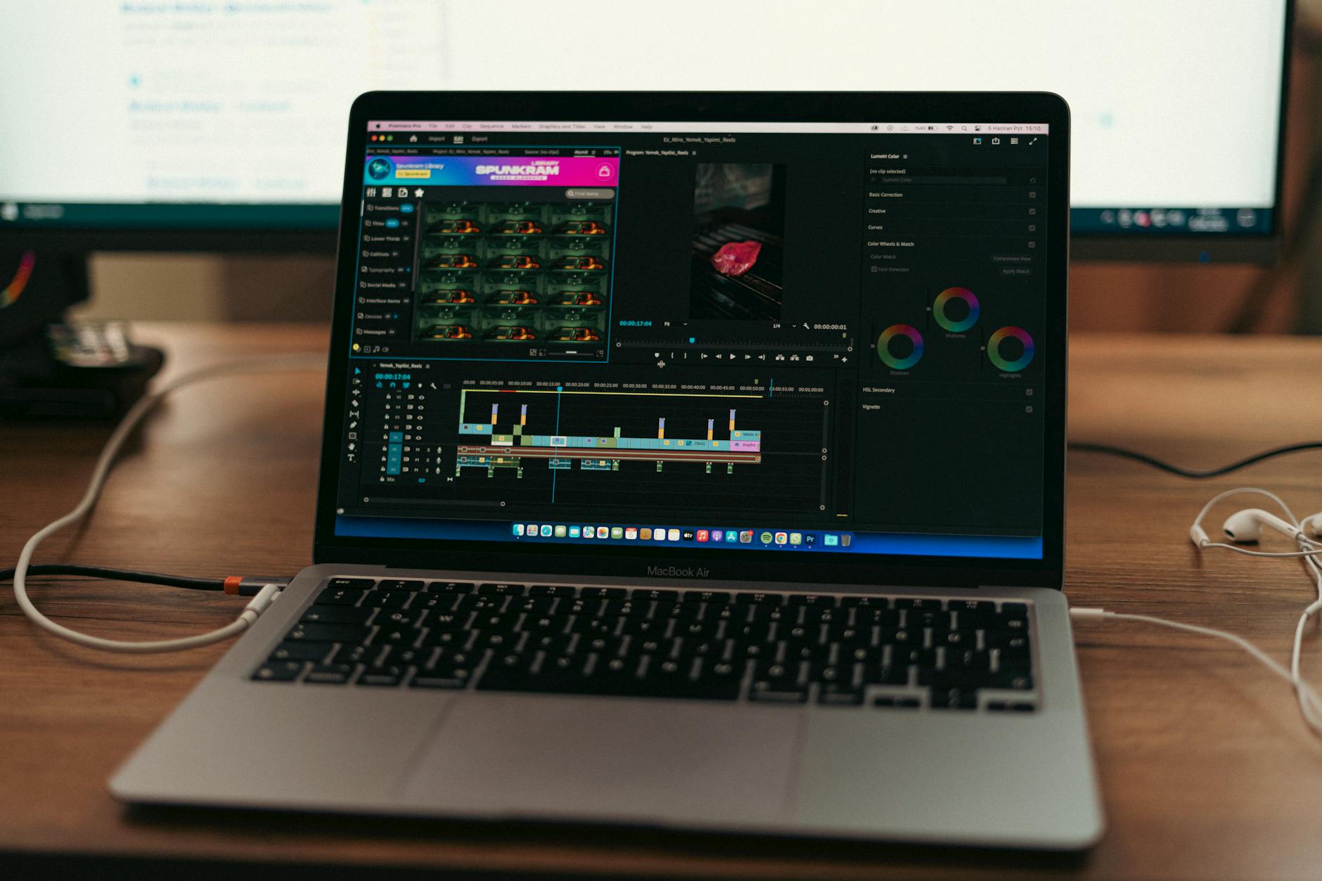
Open your image in Lightroom’s Develop module. Before touching saturation or clarity, I use the tone curve to establish proper exposure. In the Tone Curve panel, I identify my brightest whites and darkest blacks using the shadow/highlight clipping indicators (press J). This gives your image a proper foundation—like tuning an instrument before recording.
Step 2: Work with the Histogram
The histogram is your truth-teller. I aim for a histogram that spans from left to right without clipping (unless intentional). Professionals don’t edit by feel alone; we edit by data. It’s the difference between guessing the temperature and using an actual thermometer.
Master Color Grading Like You Mean It
This is where editing transcends from technical to artistic. Color grading is what transforms a decent photo into something that stops the scroll.
Start with White Balance
Before any creative color grading, get white balance right. I’ll use the eyedropper tool to click on a neutral gray in the image, then fine-tune from there. A cool-toned wedding photo reads as depressing; a warm-toned one feels intimate. Intent matters.
The Split Toning Secret
Here’s what professionals know: split toning separates your work from Instagram-filter crowd. In the Split Toning panel, I add complementary colors to shadows and highlights. For example:
- Shadows: Cool (blue/cyan) tones for depth
- Highlights: Warm (orange/yellow) tones for dimension
This creates visual richness that flat, single-color grades can’t achieve. Think of it like cinematography—the Kodachrome aesthetic uses warm-cool separation beautifully.
Selective Editing and Masking
The magic of professional editing happens here. Lightroom’s masking tools (introduced in 2022) are genuinely transformative. I use them constantly.
Use Range Masking
Instead of editing your entire image uniformly, use Range Masks to target specific tonal ranges or colors. Want to enhance only the blue sky without touching the foreground? Mask by color. Want to brighten shadows without blowing out highlights? Mask by luminance range. This level of control is what professionals leverage.
Local Adjustments with Brushes
I frequently use the Adjustment Brush to dodge and burn (lighten and darken specific areas). This mimics what film photographers did in the darkroom. A subtle dodge on a subject’s eyes makes them pop. A slight burn around edges creates dimensional framing.
Invest in Your Environment (The Monitor Question)
Here’s something rarely discussed: your monitor determines whether your edits translate to the real world. I spent years editing on a mediocre display, wondering why my images looked different on other screens.
The BenQ SW270C 27" Photo Editing Monitor changed my workflow completely. Its 99% Adobe RGB coverage and factory calibration mean I’m seeing color accurately. No more “why does this look weird on my phone?” moments.
To truly dial this in, I use the Calibrite ColorChecker Display Colorimeter to calibrate my monitor seasonally. This sounds obsessive until you realize professionals aren’t guessing—they’re measuring. Your edits are only as good as the screen you’re viewing them on.
Texture and Clarity: The Subtle Touch
Amateur editors crank Clarity to +50. Professionals understand subtlety.
I typically use:
- Clarity: +5 to +15 (adds midtone pop without looking processed)
- Texture: +5 to +10 (enhances fine detail without harshness)
- Vibrance: +10 to +20 (saturates muted colors while protecting skin tones)
Less is more. If you’re noticing the edit, you’ve gone too far.
The Before/After Reality Check
Before saving, I toggle between Before and After (press \ in Develop mode). Does the edit enhance the image’s story, or does it look like a filter? Does it match your intended aesthetic? I’ve scrapped countless edits that looked cool but didn’t feel right.
Final Professional Habits
Create Presets (But Don’t Rely on Them)
I use presets as starting points, never as endings. Every image is different. A preset for golden hour might need adjustments for overcast conditions. Professionals customize; amateurs apply and submit.
Edit in Proper Lighting
I edit in a dimly lit room with neutral gray walls. This prevents ambient light from tricking my eyes. Sound extreme? Professional color graders work in exactly these conditions.
Take Breaks
Staring at an image for hours causes editing blindness. I step away, look at other images, return with fresh eyes. The edits I make in that second pass are always stronger.
The Real Secret
If I’m being honest, the secret to editing photos like a professional is simple: understand that editing is problem-solving, not decoration. Every adjustment should answer a question: Does this improve clarity? Does this enhance mood? Does this guide the viewer’s eye?
Your software doesn’t matter. Your monitor does. Your understanding of color, tone, and light matters infinitely more than trending presets.
Start with fundamentals, master your tools, invest in proper equipment, and approach each image with intention. That’s how professionals do it.
Now go edit something beautiful.
Comments
Leave a Comment