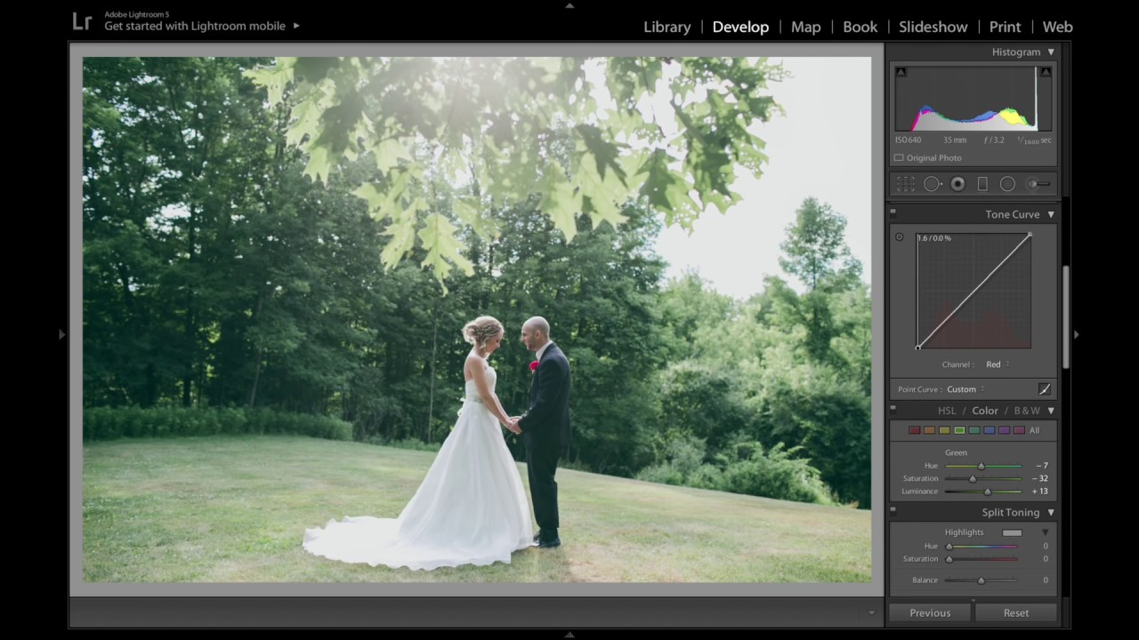
Wedding photography editing has a tax that portrait or street work doesn’t. You are not just making a photo look good. You are making a photo look good for two people who will print it, frame it, and stare at it for the next forty years. That’s a different kind of pressure, and it demands a workflow built around restraint as much as creativity.
I’ve been in that situation enough times to have strong opinions about it. And when I came across this Jessica Kobeissi tutorial on editing raw wedding photography in Lightroom, I found myself nodding along more than I expected. Jessica shoots professionally and leans on Photoshop for most of her work, but she switches to Lightroom for weddings because of one practical reality: batch processing 200-plus images in Photoshop is a slow way to ruin your weekend. Her approach here is clean, deliberate, and smart about where the guardrails need to be. Here’s the full walkthrough.
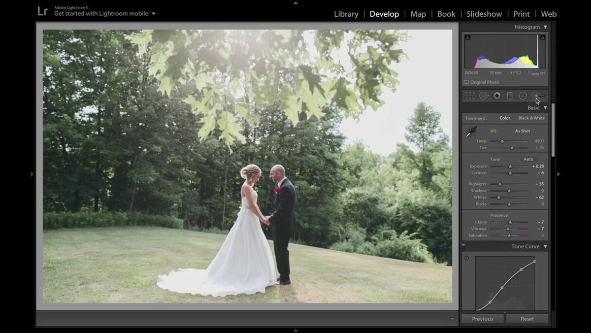
Step 1: Set Exposure and Contrast Without Blowing the Dress
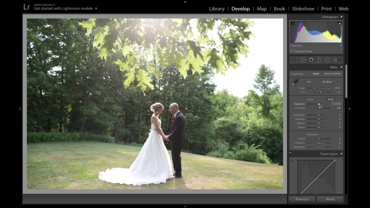 Contrast and exposure sliders being adjusted in the Basic panel
The first move is a gentle lift on exposure and a nudge of contrast, but Jessica flags something that trips up a lot of editors new to wedding work: white fabric is unforgiving. Push exposure too far on a bride in a white gown and you lose all the texture in the dress, the lace, the stitching, everything that makes it photograph well. The image goes flat and bright in the worst possible way.
Her fix is to add whatever exposure you need, then immediately pull the Highlights and Whites sliders down to compensate. You are essentially borrowing brightness from the dress detail to serve the overall exposure of the frame. It’s a balancing act, not a single-slider solution. If the dress is clipping in your histogram, you have gone too far.
Step 2: Add Clarity and Pull Back Vibrance
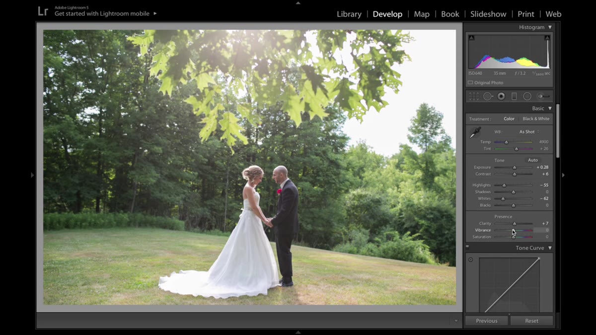 Clarity and Vibrance sliders adjusted in the Presence section
A small amount of Clarity adds midtone contrast and gives the image a little more structural definition without pushing into the crunchy, over-sharpened territory that looks fine on Instagram and rough in print. Jessica keeps this subtle, and that’s the right call for a style that leans natural.
The Vibrance adjustment is where she makes an interesting editorial choice. The background foliage in this image is reading too saturated, pulling the eye away from the subject. Rather than try to fix the greens with a targeted tool immediately, she drops the global Vibrance first to knock the whole image back toward neutral. It’s a smart first pass that gives you a cleaner starting point before you go in for more precise corrections.
Step 3: Dial In the Greens and Yellows with HSL
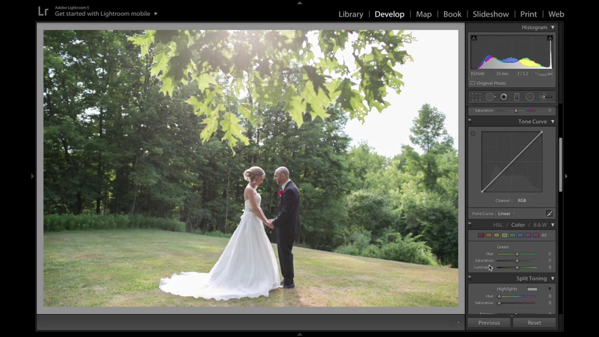 HSL panel open with Green Saturation slider being moved
This is where the edit starts feeling intentional. Inside the HSL panel, Jessica works through both the Green and Yellow tabs, using the Hue and Saturation sliders to soften the foliage. The goal isn’t to make the leaves look fake or muted. It’s to reduce their visual competition so the bride stays the focal point.
Hue adjustments here let you shift the green away from the neon, overly saturated range that cameras tend to produce in daylight. Saturation brings down the intensity. You’re not coloring the leaves a different color. You’re just asking them to be quieter. Work slowly in this panel because small moves read dramatically on foliage.
Step 4: Lift the Blacks in the Tone Curve
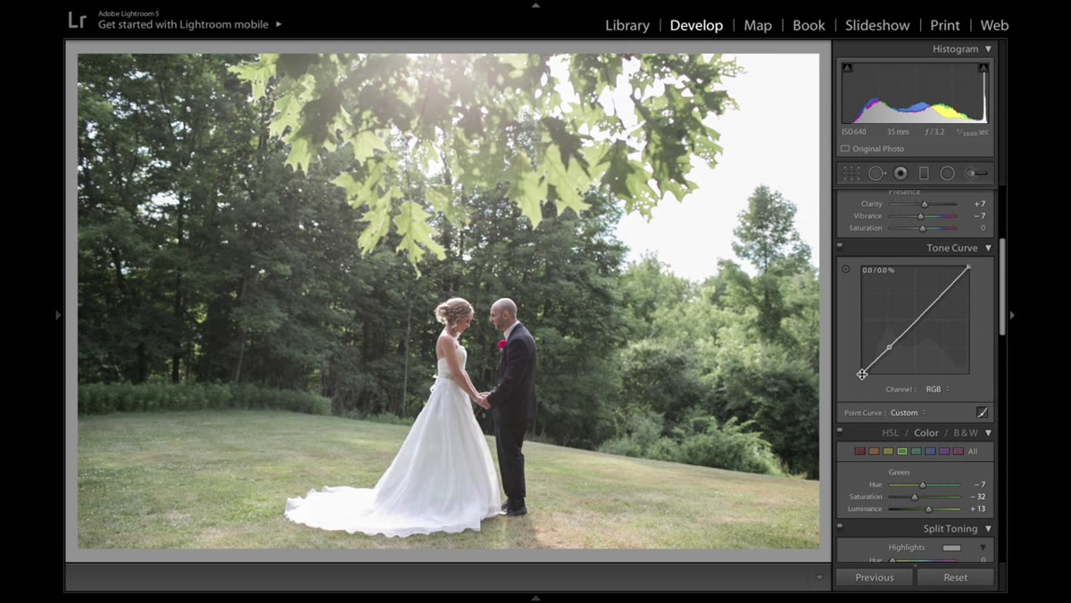 Tone Curve panel with the bottom-left point being lifted
Jessica opens the Tone Curve and pulls the bottom-left anchor point upward, which lifts the darkest shadows and prevents the blacks from going fully crushing. This is a classic technique for creating a slightly faded, vintage-adjacent look without committing to a heavy preset. It gives shadow areas some air.
The key detail here is that she doesn’t go further into the individual RGB channel curves. For wedding clients, she keeps the tone curve in composite mode and avoids color channel manipulation that might introduce a color cast. Most clients want natural skin tones and accurate whites, and messing with the red, green, or blue channels individually is easy to overdo. She describes it as walking on thin ice, and that’s accurate.
Step 5: Add a Subtle Color Cast to the Shadows
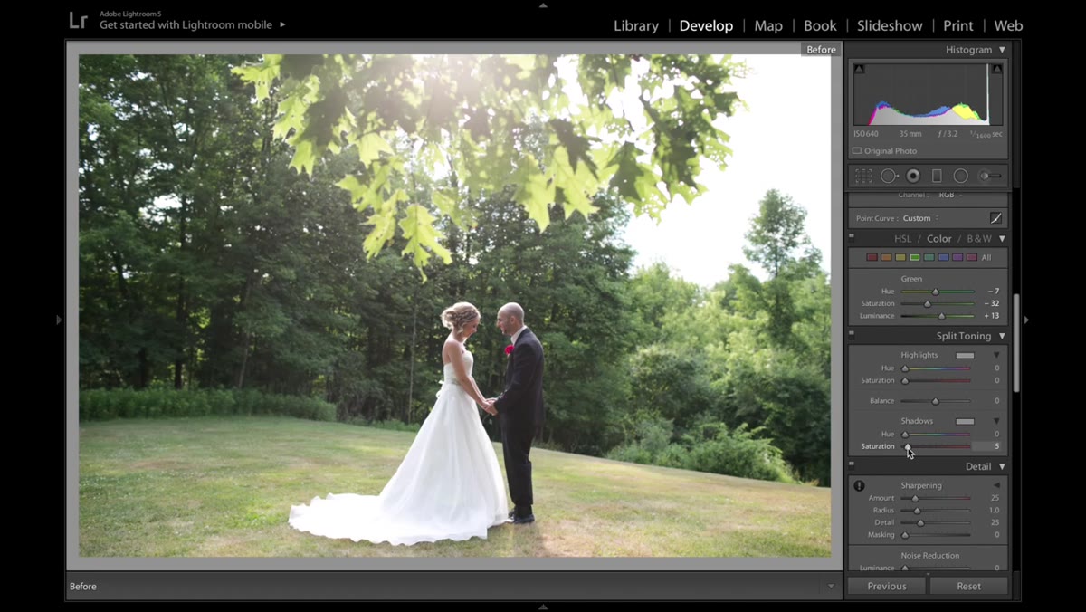 Color Grading or Split Toning with a warm shadow hue added
With the hue locked at zero, Jessica adds a small amount of saturation to the shadows, around 5 percent, pushing just a touch of warmth into the darker areas of the image. This creates depth without obviously tinting the photo. The effect is barely perceptible on its own but contributes to the overall feeling of the final image in a way that viewers register without being able to name.
This is one of those adjustments that sounds too subtle to bother with until you toggle it off and on and realize what it was doing.
Step 6: Enable Lens Profile Corrections
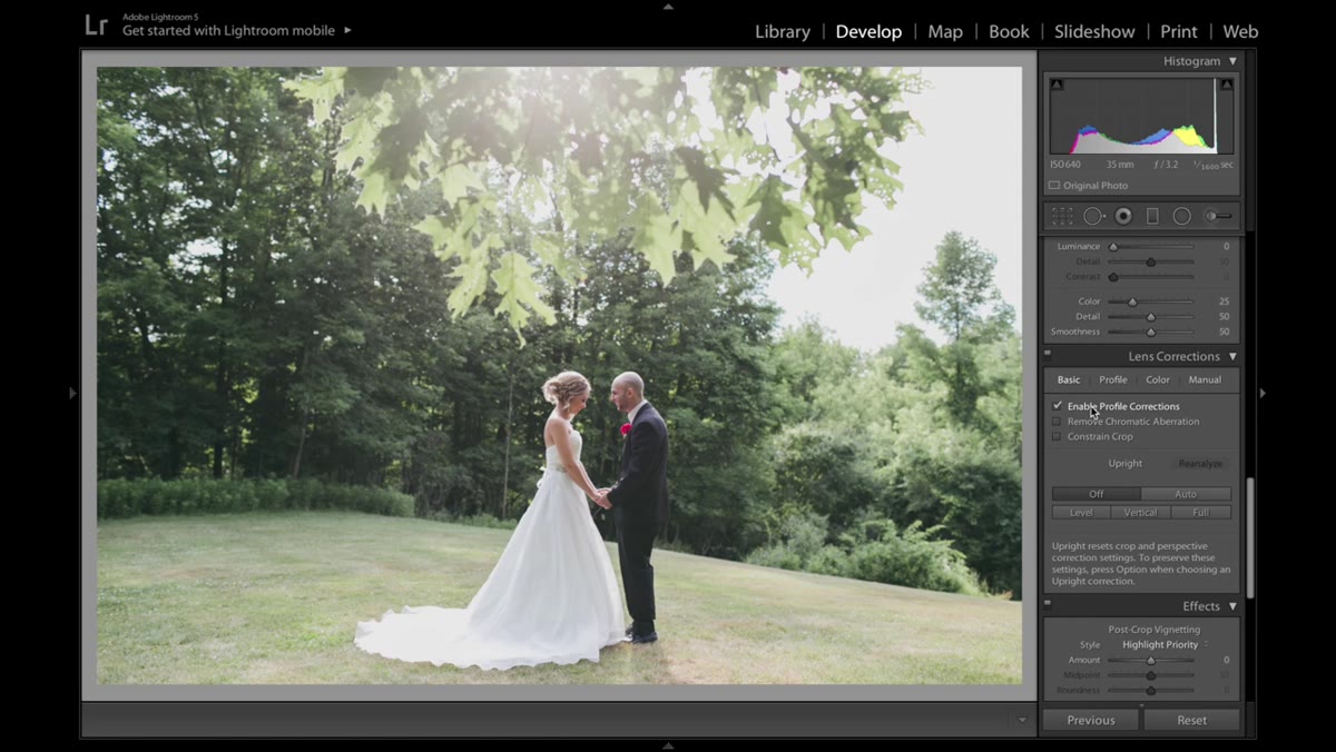 Lens Corrections panel with Profile Corrections checkbox enabled
One click, one checkbox. Enabling Lens Profile Corrections removes the barrel distortion and corner vignetting that most lenses introduce, especially zooms used at the wide end. For portrait and wedding work where you want clean, undistorted edges on the frame, this is a step you should never skip. Lightroom pulls the correction data from the lens EXIF metadata and applies it automatically.
Step 7: Use the Adjustment Brush to Paint In Warm Light
 Adjustment Brush tool active with warm color overlay being painted
This is the most creative step in the edit and the one that takes the image from “processed” to “felt.” Jessica selects the Adjustment Brush, assigns it a warm yellowish color, and sets the Exposure and Contrast high while keeping everything else at zero. Then she paints through areas of the frame where sunlight might have landed, simulating the warmth of natural golden-hour light.
The technique works because it mimics something real. Warm directional light is what photographers are chasing on wedding days, and when the cloud cover or the venue doesn’t cooperate, this brush can recover some of that feeling. The trick is restraint. Too much and the image looks like a yellow filter was dropped on it. Just enough and it looks like the sun was doing its job.
A Note on Camera Calibration as a Color Tool
Jessica briefly mentions the Camera Calibration panel as an alternative way to shift leaf and foliage colors, and it’s a tool I find underused by people who come to Lightroom from Photoshop. The Primary sliders in that panel affect how Lightroom interprets the raw data at the foundation level, before any other adjustments apply. Shifting the Green Primary Hue slider can move foliage in directions that the HSL panel alone can’t quite reach. I’d treat it as a secondary option rather than a first stop, but if your greens are stubbornly wrong after HSL adjustments, Camera Calibration is worth a few minutes.
The biggest lesson I take from Jessica’s approach isn’t any single slider setting. It’s the philosophy underneath the whole edit: wedding photos have clients who want to feel something, not be impressed by a color grade. Everything she does in this workflow is in service of that. The adjustments that could go further, don’t. The colors that could be more stylized, aren’t. That restraint is a skill, not a limitation.
Watch the full tutorial on YouTube to see the before and after and follow along with the actual image.
Comments (4)
Love how you break down complex stuff into manageable steps.
My workflow just got 10x faster. Not even kidding.
Excellent tutorial. I'd add that from a photoshop standpoint, this technique is incredibly versatile.
Love how you break down complex stuff into manageable steps.
Leave a Comment