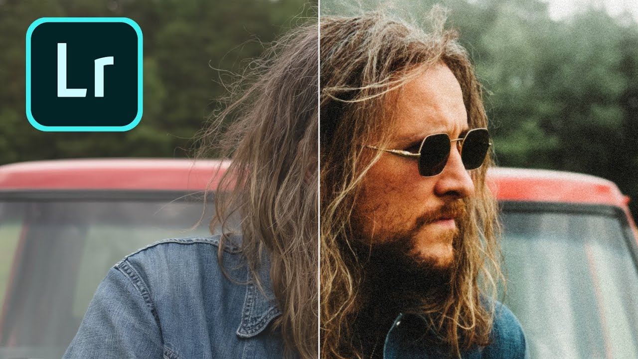
There’s a specific problem I kept running into with digital photos that were supposed to feel vintage. I’d pile on the grain, drop the contrast, pull back the clarity, and the result still looked like a digital photo wearing a Halloween costume. Something was off. The scene felt sharp in a way that film never is, too evenly exposed, too present. It took me longer than I’d like to admit to figure out what was missing, and honestly, the answer was sitting in a Lightroom panel I was already using for other things.
Watch the full tutorial on YouTube
In this Peter McKinnon tutorial, he walks through exactly how he creates that washed-out, light-kissed quality that 35mm film has almost by accident. The technique centers on a linear gradient mask with subject subtraction, and once you see it, you’ll wonder why it wasn’t the first thing you tried. This is not a “add a preset and call it a day” approach. It’s a repeatable, adjustable method that works on almost any outdoor shot with a subject in frame.
Step 1: Build Your Foundation With Grain
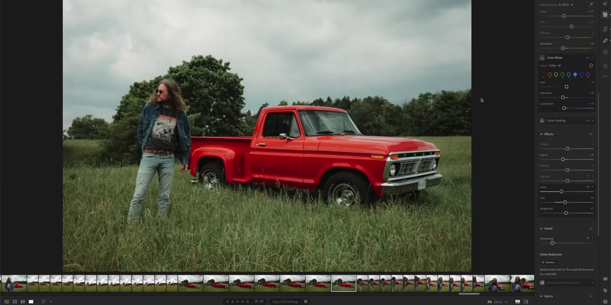 Grain panel open with Amount, Size, and Roughness sliders raised
Before touching masks or gradients, get your grain settings right. In the Detail panel, push all three grain sliders, Amount, Size, and Roughness, up to around 50. This is the part most people rush past. They add Amount and stop there, which gives you a texture that reads more like digital noise than film grain. The Size slider makes the grain particles larger and more organic. Roughness makes the edges of those particles irregular rather than smooth. Together, they create the kind of grain that actually looks like it came from a roll of Kodak.
Grain panel open with Amount, Size, and Roughness sliders raised
Before touching masks or gradients, get your grain settings right. In the Detail panel, push all three grain sliders, Amount, Size, and Roughness, up to around 50. This is the part most people rush past. They add Amount and stop there, which gives you a texture that reads more like digital noise than film grain. The Size slider makes the grain particles larger and more organic. Roughness makes the edges of those particles irregular rather than smooth. Together, they create the kind of grain that actually looks like it came from a roll of Kodak.
Step 2: Pull Back Contrast and Clarity
 Basic panel showing reduced Contrast and Clarity sliders
Film doesn’t bite. That’s the simplest way I can describe it. Digital images tend to have a crispness, an assertiveness in the midtones that film just doesn’t have. To counter that, bring your Contrast down significantly in the Basic panel. Then drop Clarity into negative territory. Negative Clarity softens the local contrast in midtones, which blurs the boundary between the sharp and soft parts of an image in a way that feels less processed than reducing global sharpness. This is a combination that I use in almost every film-inspired edit I build.
Basic panel showing reduced Contrast and Clarity sliders
Film doesn’t bite. That’s the simplest way I can describe it. Digital images tend to have a crispness, an assertiveness in the midtones that film just doesn’t have. To counter that, bring your Contrast down significantly in the Basic panel. Then drop Clarity into negative territory. Negative Clarity softens the local contrast in midtones, which blurs the boundary between the sharp and soft parts of an image in a way that feels less processed than reducing global sharpness. This is a combination that I use in almost every film-inspired edit I build.
Step 3: Open the Masking Panel and Add a Linear Gradient
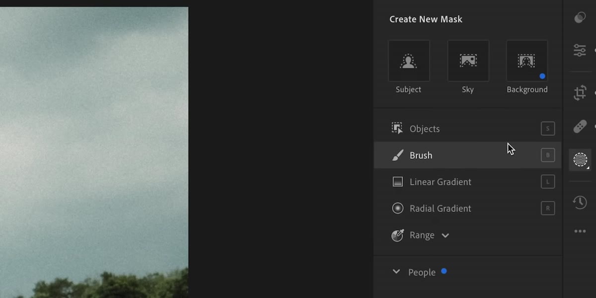 Masking panel open with Linear Gradient selected and drawn across the frame
This is where the technique gets interesting. Open the Masking panel (the circle icon in the toolbar, or Shift+W), click “Linear Gradient,” and draw it from the top of the frame down across the image. By default, this creates a gradient mask that covers the entire area you drag across. Any adjustments you make now will affect everything in that masked zone, including your subject. That’s not what you want yet, so don’t touch the sliders. The gradient is just the starting point.
Masking panel open with Linear Gradient selected and drawn across the frame
This is where the technique gets interesting. Open the Masking panel (the circle icon in the toolbar, or Shift+W), click “Linear Gradient,” and draw it from the top of the frame down across the image. By default, this creates a gradient mask that covers the entire area you drag across. Any adjustments you make now will affect everything in that masked zone, including your subject. That’s not what you want yet, so don’t touch the sliders. The gradient is just the starting point.
Step 4: Subtract Your Subject From the Mask
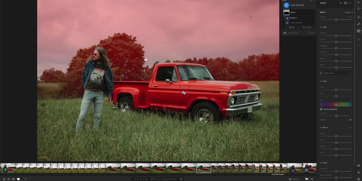 Mask panel showing Subtract option with Subject selected, subject removed from gradient
With your gradient mask selected, click “Subtract” in the Masking panel, then choose “Select Subject.” Lightroom’s AI will analyze the image and remove the subject from the gradient’s coverage area. What you’ve built now is a gradient that falls across the background and environment without touching the person or main subject in the frame. McKinnon points out that this isn’t limited to people. You can go back to the same mask, hit Subtract again, and choose “Objects” to cut out additional elements like vehicles or structures. The mask gets smarter with each subtraction.
Mask panel showing Subtract option with Subject selected, subject removed from gradient
With your gradient mask selected, click “Subtract” in the Masking panel, then choose “Select Subject.” Lightroom’s AI will analyze the image and remove the subject from the gradient’s coverage area. What you’ve built now is a gradient that falls across the background and environment without touching the person or main subject in the frame. McKinnon points out that this isn’t limited to people. You can go back to the same mask, hit Subtract again, and choose “Objects” to cut out additional elements like vehicles or structures. The mask gets smarter with each subtraction.
Step 5: Use the Gradient to Add the Washed-Out Sky
 Exposure and tone sliders being adjusted within the masked gradient area
Now that the gradient is protecting your subject, use it to introduce that washed-out overexposed feel that’s characteristic of film shot near bright light. Bring up the Exposure within the mask, and optionally reduce contrast even further inside that masked region. The effect is subtle but transformative: the sky and background take on that bleached, slightly blown-out quality while your subject stays properly exposed. This is the thing that was missing from every film-style edit I did before learning this. The subject stays grounded while the world around them feels like it’s being swallowed by light.
Exposure and tone sliders being adjusted within the masked gradient area
Now that the gradient is protecting your subject, use it to introduce that washed-out overexposed feel that’s characteristic of film shot near bright light. Bring up the Exposure within the mask, and optionally reduce contrast even further inside that masked region. The effect is subtle but transformative: the sky and background take on that bleached, slightly blown-out quality while your subject stays properly exposed. This is the thing that was missing from every film-style edit I did before learning this. The subject stays grounded while the world around them feels like it’s being swallowed by light.
Step 6: Adjust Colors to Complement the Look
 HSL or color mixer panel open, saturation being pulled back on selected hues
Film stock has preferences. It renders certain colors with more warmth, it lets others go slightly muted. In the HSL panel, consider pulling back saturation on blues and greens while leaving oranges and yellows relatively intact. This creates a color palette that leans warm without going full golden-hour. You don’t need everything to match a specific stock, but you do want the colors to feel like they’ve aged slightly. Think faded photograph found in a shoebox, not Instagram filter. The gradient mask you built in the previous steps will let the sky colors shift more noticeably than the subject, which adds to the depth of the overall edit.
HSL or color mixer panel open, saturation being pulled back on selected hues
Film stock has preferences. It renders certain colors with more warmth, it lets others go slightly muted. In the HSL panel, consider pulling back saturation on blues and greens while leaving oranges and yellows relatively intact. This creates a color palette that leans warm without going full golden-hour. You don’t need everything to match a specific stock, but you do want the colors to feel like they’ve aged slightly. Think faded photograph found in a shoebox, not Instagram filter. The gradient mask you built in the previous steps will let the sky colors shift more noticeably than the subject, which adds to the depth of the overall edit.
One Way I’ve Extended This in My Own Work
The subtract-from-mask workflow that McKinnon demonstrates is something I’ve started using in a completely different context: window light edits. When I’m working on an interior shot with a bright window in the background, I’ll draw a linear gradient across the window area and subtract the subject standing in front of it. Then I use the masked gradient to bring down the highlight intensity of the window without darkening the subject at all. It solves the same fundamental problem from the other direction, keeping the subject properly exposed while controlling a dominant light source in the background.
I’ve also found that combining this technique with a slight warm shift in the masked gradient (push the Temp slider toward yellow inside the mask) makes outdoor shots feel like they were taken during magic hour even when they weren’t. The washed background goes warm and the subject pops forward in a way that feels natural rather than composited. It’s become part of a standard outdoor edit flow for me, sitting right next to my grain settings and the clarity pullback.
The single most useful thing this technique gave me is the ability to separate subject from environment in tonal terms without making any actual selection in Photoshop or using a brush. Lightroom’s AI subject detection is good enough now that this whole workflow takes under two minutes once you’ve done it a few times, and the result is a photo that reads as film even before you add a preset.
Watch the full tutorial on YouTube and pay close attention to how McKinnon handles the mask subtractions in sequence. That part goes fast, and it’s the step that makes everything else work.
Comments (5)
Simple but effective. Sometimes that's all you need.
Simple but effective. Sometimes that's all you need.
This is fantastic. I've been recommending this approach to my readers too.
Just used this on a wedding shoot edit. Client was thrilled.
Bookmarked. Coming back to this one for sure.
Leave a Comment