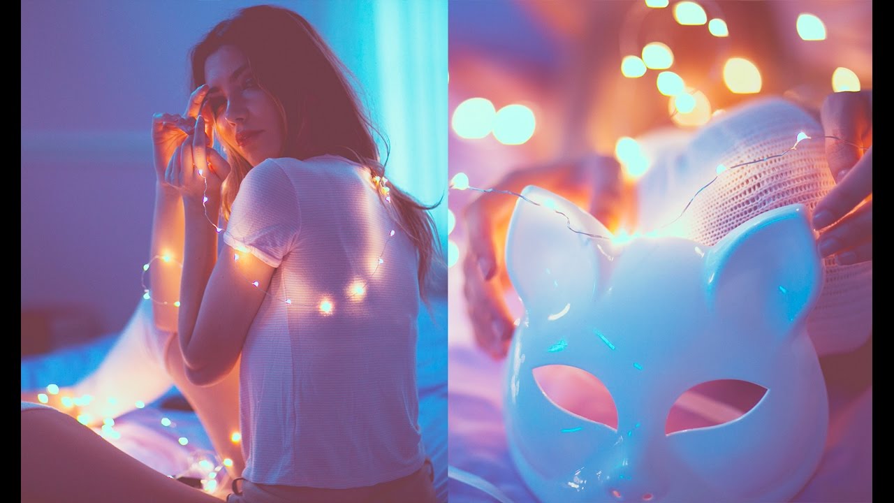
There’s a specific kind of photo that stopped me mid-scroll for years before I understood how it was made. Dusty highlights, a faint blue-pink cast, colors that feel like they were recovered from a roll of film left in someone’s glove compartment. It’s the aesthetic that defined a certain era of Tumblr photography, and Brandon Woelfel made it his signature. The problem was I could see it, but I couldn’t reverse-engineer it on my own. Tone curves are one of those tools that look simple until you’re actually trying to use them to chase a specific feeling.
That’s where this Jessica Kobeissi tutorial came in. Watch the full tutorial on YouTube - Kobeissi walks through her own interpretation of the Woelfel style, and what makes it worth your time is that she doesn’t just hand you a preset and walk away. She shows the thinking behind each decision, including some dead ends she hit along the way. I’ve broken her process down into a step-by-step walkthrough below so you can follow along in Lightroom without having to pause and rewind every 20 seconds.
The edit touches nearly every major panel in Lightroom, which sounds intimidating. But each adjustment has a clear purpose, and once you understand why each slider is moving in a particular direction, you can adapt this look to almost any image.
Step 1: Cool Down the Temperature and Add a Pink Tint
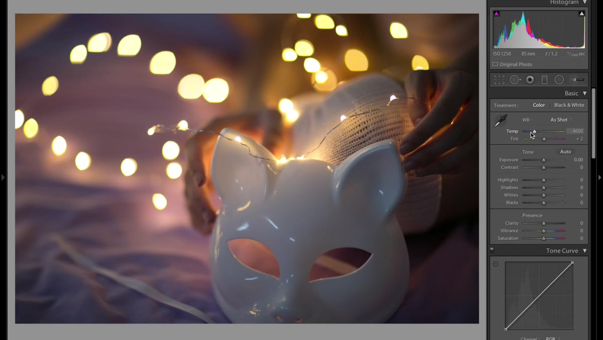 White balance sliders being adjusted cooler with pink tint added
Start in the Basic panel by pulling the Temperature slider to the left, into cooler territory. You want the image to feel a little underlit, slightly crisp, the kind of light you’d get from an overcast afternoon rather than golden hour. Don’t go so far that skin tones look sick. From there, nudge the Tint slider toward the pink/magenta side. This isn’t arbitrary. The pink counteracts some of the green shift that can creep in when you cool a photo down, and it also contributes to that warm-meets-cold tension that makes these edits feel layered rather than flat.
White balance sliders being adjusted cooler with pink tint added
Start in the Basic panel by pulling the Temperature slider to the left, into cooler territory. You want the image to feel a little underlit, slightly crisp, the kind of light you’d get from an overcast afternoon rather than golden hour. Don’t go so far that skin tones look sick. From there, nudge the Tint slider toward the pink/magenta side. This isn’t arbitrary. The pink counteracts some of the green shift that can creep in when you cool a photo down, and it also contributes to that warm-meets-cold tension that makes these edits feel layered rather than flat.
Step 2: Lift Exposure and Bring in a Touch of Contrast
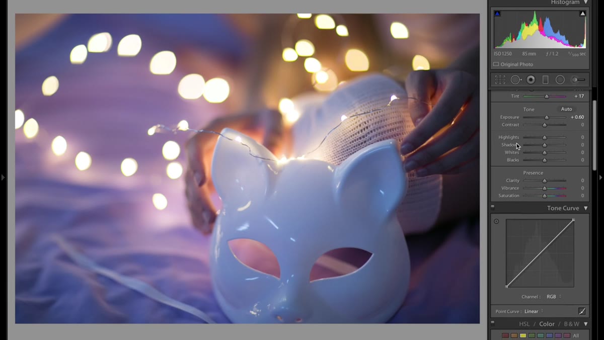 Exposure and contrast sliders being adjusted in Basic panel
Bump your Exposure up slightly. Woelfel’s images tend to read as bright without being blown out, so think in terms of opening up the midtones rather than torching the highlights. Add a modest amount of Contrast. You’re not going for a punchy, contrasty look here, just enough to keep the image from going soft and lifeless. Then push Vibrance up a small amount. Saturation can be too blunt for this style, pulling every color equally, whereas Vibrance is more selective and tends to protect skin tones while still making the overall image feel alive.
Exposure and contrast sliders being adjusted in Basic panel
Bump your Exposure up slightly. Woelfel’s images tend to read as bright without being blown out, so think in terms of opening up the midtones rather than torching the highlights. Add a modest amount of Contrast. You’re not going for a punchy, contrasty look here, just enough to keep the image from going soft and lifeless. Then push Vibrance up a small amount. Saturation can be too blunt for this style, pulling every color equally, whereas Vibrance is more selective and tends to protect skin tones while still making the overall image feel alive.
Step 3: Shape the RGB Tone Curve for a Faded, Dusty Base
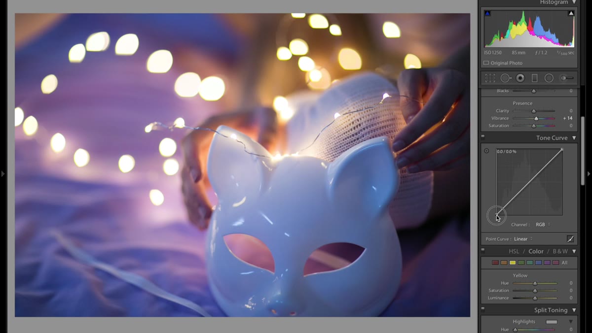 Tone curve panel open with RGB channel being adjusted
This is the most consequential step in the whole edit. Open the Tone Curve panel and work in the RGB channel first. Kobeissi describes this as a step you could honestly spend hours on, and that’s not an exaggeration. The goal is to create a faded, matte quality in the image. The key move is dragging the top-right anchor point (the highlights end of the curve) downward. This pulls your whites into a gray zone, which is exactly what gives the photo that dusty, aged quality. How far you pull it depends on your image, but when the whites stop looking white and start looking like old paper, you’re in the right range.
Tone curve panel open with RGB channel being adjusted
This is the most consequential step in the whole edit. Open the Tone Curve panel and work in the RGB channel first. Kobeissi describes this as a step you could honestly spend hours on, and that’s not an exaggeration. The goal is to create a faded, matte quality in the image. The key move is dragging the top-right anchor point (the highlights end of the curve) downward. This pulls your whites into a gray zone, which is exactly what gives the photo that dusty, aged quality. How far you pull it depends on your image, but when the whites stop looking white and start looking like old paper, you’re in the right range.
Step 4: Adjust the Red and Blue Channels Separately
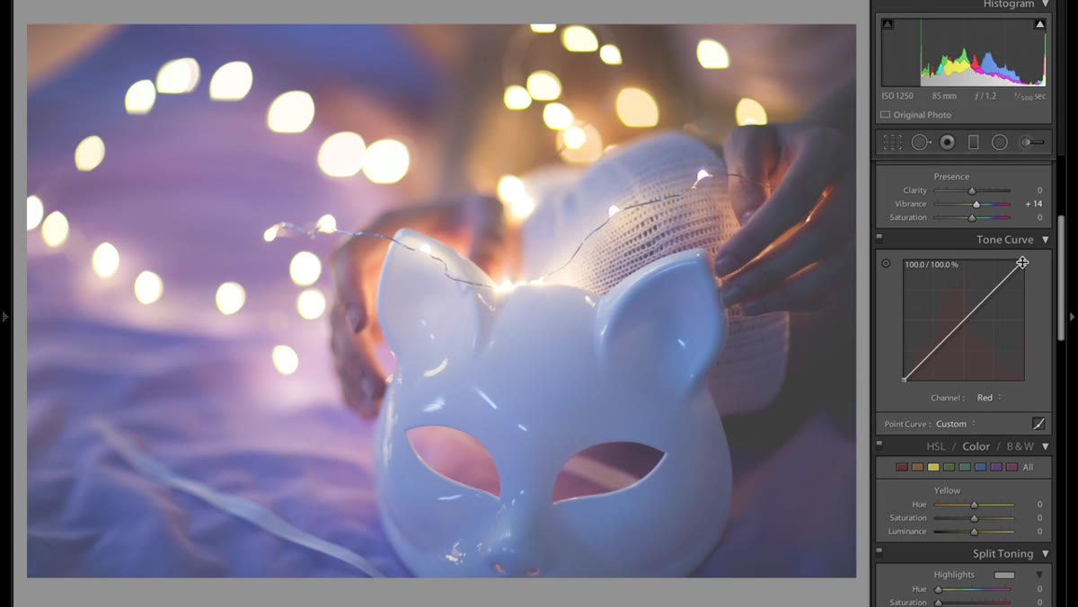 Red channel selected in tone curve with shadow point being lowered
Switch from RGB to the Red channel. Pull the shadow region of the curve down. This introduces a cyan-green cast into the darker areas of the photo, which is a counterintuitive move but creates that split-toned, vintage film quality where shadows lean one direction and highlights lean another. Skip the Green channel for now. Pushing green too aggressively tends to make images look unnatural in ways that are hard to pull back from.
Red channel selected in tone curve with shadow point being lowered
Switch from RGB to the Red channel. Pull the shadow region of the curve down. This introduces a cyan-green cast into the darker areas of the photo, which is a counterintuitive move but creates that split-toned, vintage film quality where shadows lean one direction and highlights lean another. Skip the Green channel for now. Pushing green too aggressively tends to make images look unnatural in ways that are hard to pull back from.
Move to the Blue channel and push the curve slightly above the center line, particularly in the midtone to highlight region. Adding blue to the brighter areas of the image is a core move in this style. It’s what gives the highlights that cool, slightly ethereal quality. The before-and-after difference just from the tone curve work alone is significant. You should already be seeing a photo that looks like it belongs in a 2013 photo blog.
Step 5: Use Split Toning to Lock in the Color Cast
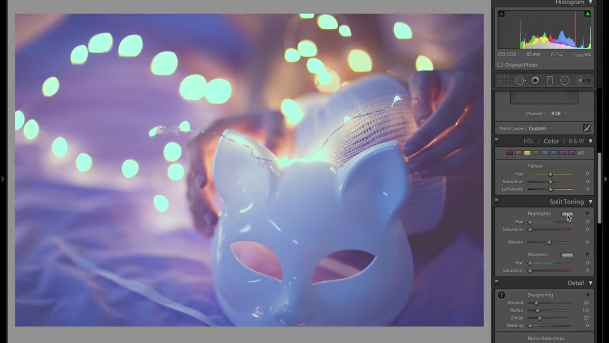 Split toning panel open with hue and saturation values being entered
Open the Split Toning panel. For Highlights, set the Hue to 22 and Saturation to 11. For Shadows, set the Hue to 33 with a Saturation of 35. These values push a warm amber quality into the highlights and a slightly different warm tone into the shadows. Sliding the Highlights hue bar while watching your image in real time is a useful way to understand what’s happening. Try dragging it all the way around the color wheel and you’ll see how dramatically a single hue choice can shift the entire mood of a photo. The saturation values Kobeissi uses are intentionally restrained. Higher saturation here can quickly make the image look tinted rather than graded.
Split toning panel open with hue and saturation values being entered
Open the Split Toning panel. For Highlights, set the Hue to 22 and Saturation to 11. For Shadows, set the Hue to 33 with a Saturation of 35. These values push a warm amber quality into the highlights and a slightly different warm tone into the shadows. Sliding the Highlights hue bar while watching your image in real time is a useful way to understand what’s happening. Try dragging it all the way around the color wheel and you’ll see how dramatically a single hue choice can shift the entire mood of a photo. The saturation values Kobeissi uses are intentionally restrained. Higher saturation here can quickly make the image look tinted rather than graded.
Step 6: Refine with Camera Calibration
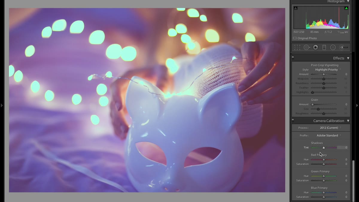 Camera calibration panel open with sliders being adjusted
The Camera Calibration panel sits at the bottom of the Develop module and tends to get ignored, which is a shame because it operates differently from the HSL panel. The sliders here affect the raw color data at a more fundamental level, which means small adjustments can produce shifts that feel more organic. Kobeissi treats this panel as a finishing pass, using it to push the image’s overall color profile into alignment with everything the tone curve and split toning already established. Experiment with the Red, Green, and Blue Primary sliders individually. Small moves here. You’re tuning, not repainting.
Camera calibration panel open with sliders being adjusted
The Camera Calibration panel sits at the bottom of the Develop module and tends to get ignored, which is a shame because it operates differently from the HSL panel. The sliders here affect the raw color data at a more fundamental level, which means small adjustments can produce shifts that feel more organic. Kobeissi treats this panel as a finishing pass, using it to push the image’s overall color profile into alignment with everything the tone curve and split toning already established. Experiment with the Red, Green, and Blue Primary sliders individually. Small moves here. You’re tuning, not repainting.
What I Do Differently: Save Your Curve Variations as Named Presets
The tone curve step is where most people get stuck, and then frustrated, and then just stop using it. My solution is to create named snapshots every time I land on a curve that works. In Lightroom, you can save the tone curve as part of a preset and apply only that portion to future images. I’ve got a growing library of curve presets named after songs (my current favorite is called “Fade Into You,” which should tell you exactly what it looks like), and having them ready to test against an image cuts the experimentation time down dramatically.
One other thing worth noting: this editing style works best on photos that were shot with intention. If your source image is flat, underexposed in the wrong way, or shot under harsh midday sun, the vintage treatment can feel forced. Kobeissi’s first video in her series covers how she shoots to set up this kind of edit, and it’s worth watching alongside this one.
The single most important thing to take away from this tutorial is that the tone curve is doing the heavy lifting. Every other adjustment is supporting it. Learn to read and manipulate that curve with confidence, and this entire aesthetic becomes something you can dial in rather than stumble into.
Watch the full tutorial on YouTube to see Kobeissi’s real-time adjustments and hear her reasoning as she works through the edit.
Comments (2)
Printing this out and pinning it next to my monitor. That good.
Great breakdown. The step-by-step approach really helps.
Leave a Comment