Every few months I find myself doing a version of the same ritual: a Lightroom update drops, I install it, and then I spend twenty minutes clicking around the Develop module trying to figure out what changed. Adobe is not exactly famous for dramatic release notes. The December 2018 update to Lightroom Classic CC - version 8.1 - was one of those quiet ones that turned out to matter more than the changelog suggested.
In this Matt Kloskowski tutorial, he runs through the highlights in a tight, no-fluff video that gets right to the features worth knowing about. Watch the full tutorial on YouTube if you want the visual alongside this breakdown. For those of you who want to dig in and apply each piece as you go, here’s the full walkthrough.
The two changes that matter most are panel customization in the Develop module and a new visual warning system for presets that don’t fully apply to certain file types. Neither is flashy. Both will genuinely save you time if you know how to use them.
Step 1: Right-Click in the Develop Panel to Access Customization
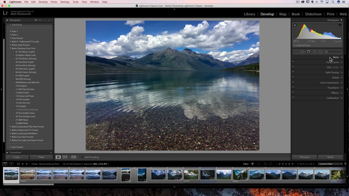 Right-click menu open in the Develop module panel
Open the Develop module and right-click anywhere on the name of one of your panels - or right next to it. You’ll see a new option in the context menu called “Customize Develop Panel.” This didn’t exist before 8.1, so if you’ve been clicking around there and never noticed it, that’s why.
Right-click menu open in the Develop module panel
Open the Develop module and right-click anywhere on the name of one of your panels - or right next to it. You’ll see a new option in the context menu called “Customize Develop Panel.” This didn’t exist before 8.1, so if you’ve been clicking around there and never noticed it, that’s why.
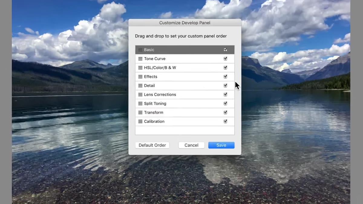
Once you click it, a dialog opens that shows all your panels listed out and available to reorder.
Step 2: Drag Your Panels Into an Order That Matches How You Actually Work
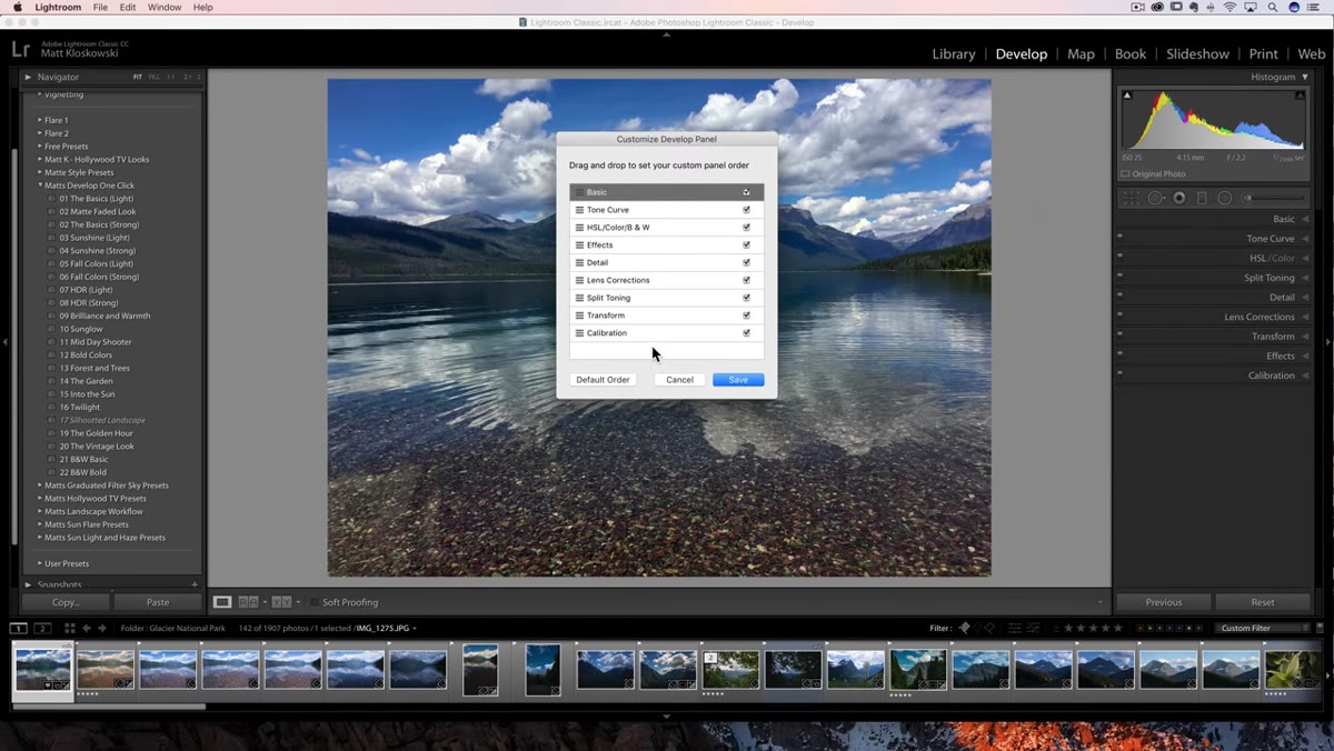 Drag-and-drop panel order in the Customize Develop Panel dialog
Inside the Customize Develop Panel dialog, you can drag any panel up or down to reorder it. This is the part that sounds small but compounds over time. Think about how often you scroll past three panels you never use to get to the one you want. That friction adds up across hundreds of editing sessions.
Drag-and-drop panel order in the Customize Develop Panel dialog
Inside the Customize Develop Panel dialog, you can drag any panel up or down to reorder it. This is the part that sounds small but compounds over time. Think about how often you scroll past three panels you never use to get to the one you want. That friction adds up across hundreds of editing sessions.
Matt’s example is a good one: he moves the Effects panel toward the top because that’s where his vignette controls live, and he uses those constantly. Panels like Transform or Lens Corrections might sit lower if they’re not part of your regular first pass. The goal is to front-load the panels you reach for most, so your eye travels less and your hands stay in flow. Personally, I’d put HSL toward the top because color grading is where I spend most of my time. Your priorities will be different, and now you can actually reflect them in the layout.
Step 3: Save and Relaunch Lightroom to Apply the New Order
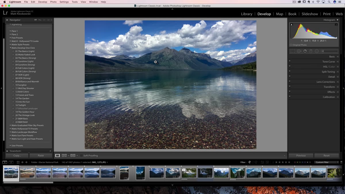 Save button in the Customize Develop Panel dialog
After you’ve arranged everything, hit Save. Lightroom will prompt you to relaunch the application before the changes take effect. This is normal - it’s not a bug or a sign something went wrong. Just restart, and when you come back your panels will be in the new order.
Save button in the Customize Develop Panel dialog
After you’ve arranged everything, hit Save. Lightroom will prompt you to relaunch the application before the changes take effect. This is normal - it’s not a bug or a sign something went wrong. Just restart, and when you come back your panels will be in the new order.
One honest note from Matt that I appreciated: he admits that after years of muscle memory, reordering panels can actually feel disorienting at first. When you’ve been reaching for a specific panel in a specific place for years, your hand knows where to go before your brain does. Give yourself a few sessions to adjust before you decide it isn’t working.
Step 4: Hide Panels You Never Use With the Checkbox Toggle
 Turning off a panel checkbox to hide it from the Develop module
This one isn’t new to 8.1, but Matt flags it as a companion feature worth knowing: you can turn off individual panels entirely using the checkboxes in that same right-click menu. Unchecking Split Toning, for example, removes it from your panel list completely.
Turning off a panel checkbox to hide it from the Develop module
This one isn’t new to 8.1, but Matt flags it as a companion feature worth knowing: you can turn off individual panels entirely using the checkboxes in that same right-click menu. Unchecking Split Toning, for example, removes it from your panel list completely.
Matt keeps his panels visible because he makes training videos and it looks strange when panels disappear for viewers. That’s a reasonable exception. For personal working copies of Lightroom, hiding the panels you genuinely never use is a clean way to reduce visual clutter without losing the features - they’re still there, just not taking up space.
Step 5: Understand the New Italicized Preset Warning
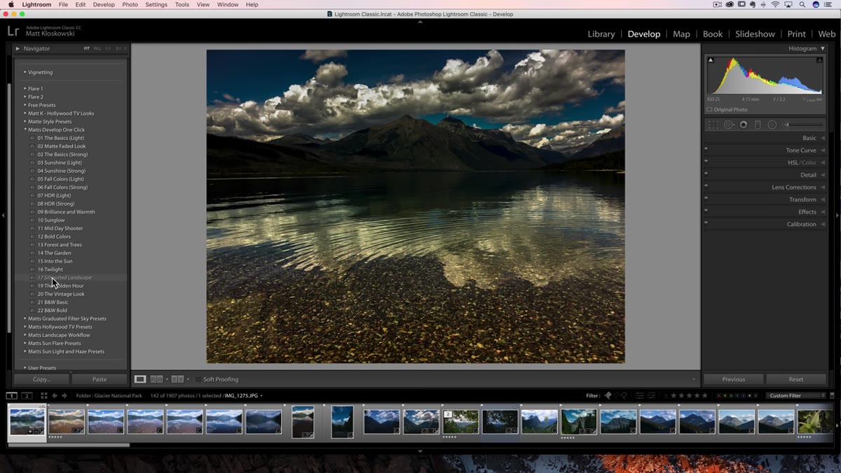 Italicized preset name visible in the Presets panel with a JPEG selected
Here’s the second meaningful change in this update. Open the Presets panel in the Develop module and look at the preset names while a JPEG file is selected. If a preset name appears italicized, it means that preset contains at least one setting that won’t work correctly on a JPEG - typically because it references a camera profile or a feature that only applies to RAW files.
Italicized preset name visible in the Presets panel with a JPEG selected
Here’s the second meaningful change in this update. Open the Presets panel in the Develop module and look at the preset names while a JPEG file is selected. If a preset name appears italicized, it means that preset contains at least one setting that won’t work correctly on a JPEG - typically because it references a camera profile or a feature that only applies to RAW files.
Before 8.1, that preset would apply silently and you’d get a result that looked wrong with no explanation. Now the italics give you a visual heads-up before you even click. It’s a small change that eliminates a specific kind of confusion that used to require you to troubleshoot after the fact.
Step 6: Control Partial Preset Visibility in Preferences
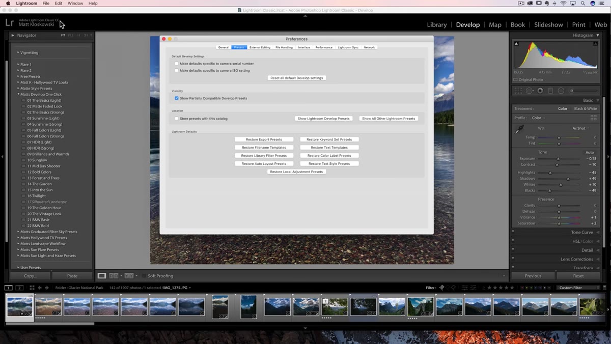 Lightroom Preferences with the partial preset compatibility checkbox visible
You can control whether italicized presets show up at all. Go to Edit (PC) or Lightroom (Mac) in the top menu, then choose Preferences, then navigate to the Presets tab. There’s a checkbox labeled “Show partially compatible presets.” When it’s checked, the italicized presets appear with the warning. When it’s unchecked, those presets are hidden from the panel entirely when they won’t apply correctly.
Lightroom Preferences with the partial preset compatibility checkbox visible
You can control whether italicized presets show up at all. Go to Edit (PC) or Lightroom (Mac) in the top menu, then choose Preferences, then navigate to the Presets tab. There’s a checkbox labeled “Show partially compatible presets.” When it’s checked, the italicized presets appear with the warning. When it’s unchecked, those presets are hidden from the panel entirely when they won’t apply correctly.
Matt’s recommendation is to leave it checked, and I agree. Hiding presets that exist in your library creates a different kind of confusion - you know you built a preset, you go looking for it, and it’s just gone. Seeing it italicized is more informative than having it vanish.
One Thing I’d Add: Build a Test Image Into Your Workflow
If you’re building presets that you plan to use across both RAW and JPEG files - which comes up more than you’d think if you shoot events or receive mixed deliverables from clients - it’s worth keeping a reference JPEG open in a second window while you design your presets. You’ll immediately see which presets go italic when you switch to it, and you can decide whether to build a companion version without the RAW-specific settings.
I name my presets after songs, which means my preset pack is essentially a playlist. Knowing which ones are “JPEG-compatible” has become a real workflow consideration, and this update made it much easier to track at a glance rather than relying on notes I’d inevitably lose.
The single most useful thing in this update is panel reordering - it’s the kind of customization that should have existed years ago, and now that it does there’s no reason not to spend ten minutes setting up a layout that actually reflects how you work. The preset compatibility warning is quieter but just as practical once you understand what it’s telling you.
Watch the full tutorial on YouTube to see Matt walk through both features in real time with live examples.
Comments
Leave a Comment