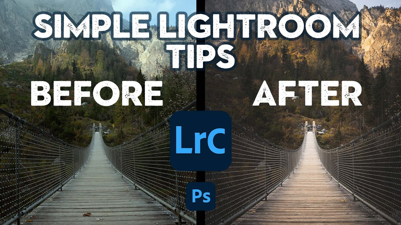
There’s a specific frustration I run into with wide-angle landscape shots that I’ve never totally shaken. The sky grabs all the attention, the foreground goes flat, and the image loses the sense of depth that made you stop and take the photo in the first place. You can push the sliders around for an hour and still end up with something that feels technically correct but emotionally empty. What I keep coming back to is that the problem isn’t exposure, it’s visual weight. The different parts of a photo need to feel balanced in a way that pulls your eye through the frame, not just up and out of it.
In this Nigel Danson tutorial, Watch the full tutorial on YouTube, Nigel works through a community RAW challenge, editing subscriber-submitted landscape photos live. The first image - a stunning New Zealand wide-angle shot from a Z6 at 40mm - becomes a masterclass in layered local adjustments. He’s not doing anything exotic. He’s stacking simple tools in a smart order, and the result is a photo that feels alive. I took notes, tried the workflow myself, and want to break it down step by step for you.
What makes this session worth studying isn’t just the before-and-after. It’s how Nigel diagnoses a photo before he touches a slider. He identifies the visual problem first, then reaches for the tool. That’s the habit that separates editors who get consistent results from editors who just spin wheels hoping something clicks.
Step 1: Apply a Base Preset to Anchor the Edit
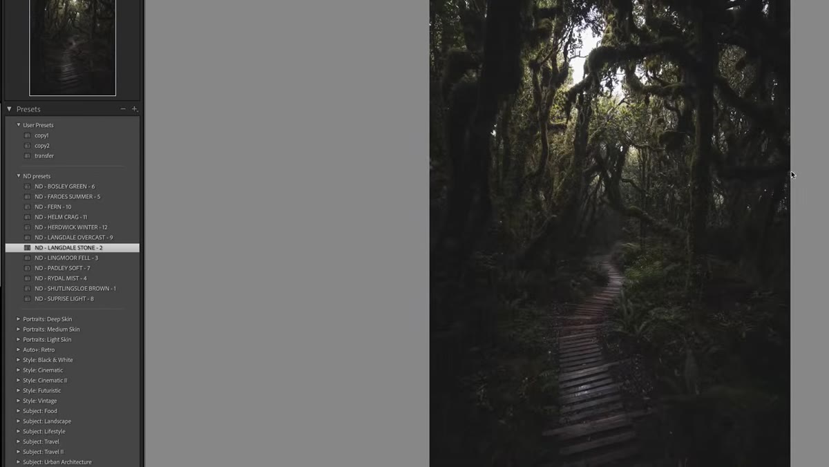 Applying the Langdale Stone preset in Lightroom
Before touching individual sliders, Nigel drops a preset on the image to establish a starting tone curve. In his case it’s his own Langdale preset, but the principle applies to any starting preset you trust: it sets a gentle S-curve, lifts the blacks slightly, and nudges the colors in the direction of the final mood. Think of it as tuning your instrument before you play - you’re not performing yet, you’re just getting into the right key.
If you don’t have a preset you love, build a simple one: raise blacks by around +20, create a mild S-curve in Tone Curve, and warm the temperature by 200-300K. Save it and use it as your starting point. The goal isn’t a finished edit, it’s a foundation that already leans the right direction so your local adjustments don’t have to fight against a flat base.
Step 2: Tweak the Hue of Problem Colors Before Going Further
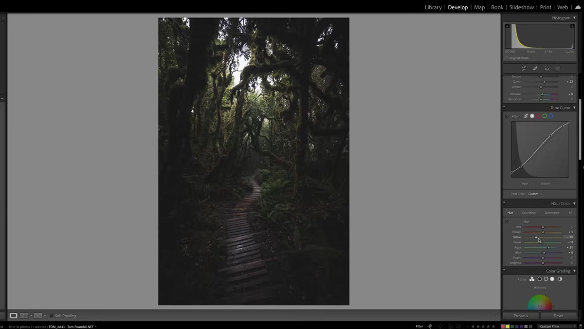 Adjusting green hue in the HSL panel
After the preset lands, Nigel immediately checks the greens. In wide-angle landscape work, foliage can go yellow-green or murky depending on the light, and fixing the hue early prevents you from chasing it later when you’re buried in masks. He nudges the green hue slightly in the HSL panel - just enough to keep it natural without making the grass look artificially saturated.
In practice, open HSL, click the targeted adjustment tool (the little circle icon), hover over the green area of your image, and drag down slightly. You’ll usually find the green hue sits somewhere between the yellow and aqua sliders. Move it toward aqua by 5-15 points if the greens look sickly, toward yellow if they look too cool. Don’t overdo it - you’re correcting, not painting.
Step 3: Use a Radial Gradient Intersected with a Luminosity Range to Create a Glow Effect
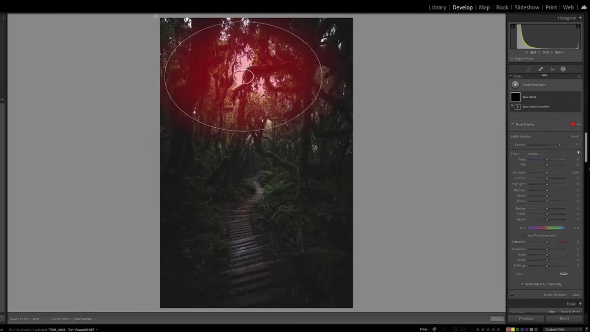 Radial gradient with luminosity mask intersection in Lightroom
This is the technique I came back to rewatch twice. Nigel draws a radial gradient over the bright area of the frame - the sky and upper light source - but then intersects it with a luminosity range mask so it only affects the highlights, not the shadows underneath. This is what stops a glow effect from muddying the darks and making everything look foggy.
In Lightroom, after drawing your radial gradient, click “Intersect Mask With” and choose Luminance Range. Set the lower bound to around 60-70 (pulling it away from the blacks) and keep the upper end at 100. Feather the transition. Then apply negative Dehaze - somewhere around -20 to -30 - to create that soft, diffused glow in the bright tones. Add a touch of warmth (Temperature slider, +10 to +15). You get the look of golden-hour light pooling in the sky without blowing out or contaminating the midtones.
Step 4: Brighten the Foreground Path with a Targeted Brush
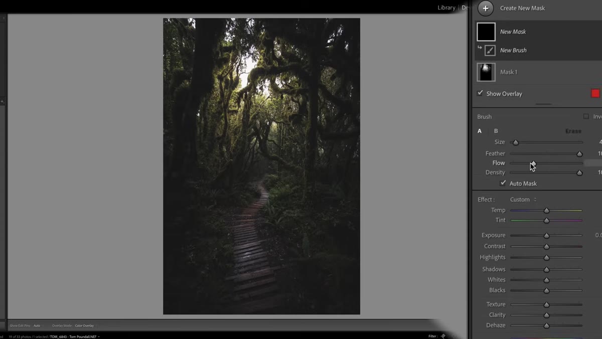 Brush tool brightening the foreground path
Nigel’s diagnosis here is sharp: the path in the foreground is too dark relative to the sky, and that imbalance means your eye never travels into the frame. It shoots straight up and leaves. The fix is a brush adjustment targeting just the path, raising Exposure and Whites, adding a little Clarity, and warming the tone so it reads as earthy and inviting.
Set your brush Flow to around 30-40% so you can build the effect gradually by painting over the same area multiple times. Raise Exposure by +0.5 to +0.8 and Whites by +20. Then shift Temperature warmer by +15 or so to give the path that dusty, sun-baked look. Paint along the path in two or three passes. The cumulative buildup of a low-flow brush is much more controllable than slamming a high-exposure brush across the image once.
Step 5: Create a Color Range Mask to Boost Just the Greens
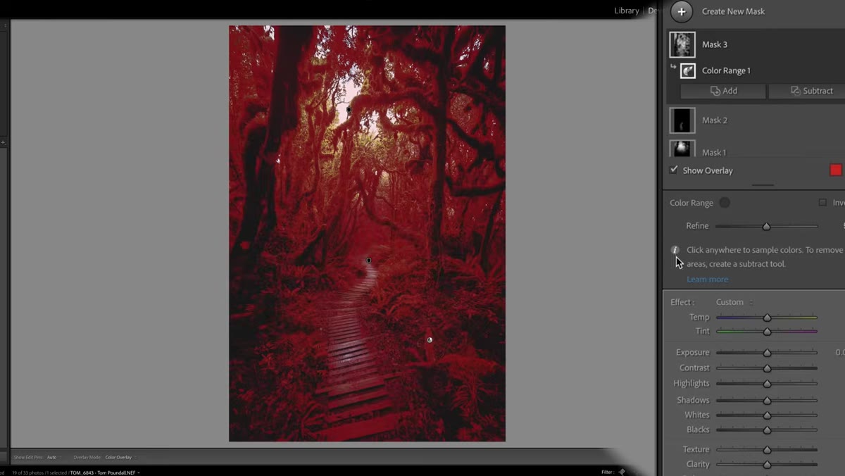 Color range mask selecting greens in the scene
Rather than pushing green saturation globally - which tends to make everything look unnatural - Nigel isolates the greens with a mask and boosts only those selected tones. In Lightroom’s masking panel, choose “Select Color Range,” then click directly on the green areas of the image. Adjust the refinement slider to tighten or loosen the selection, then raise Saturation by 10-20 points inside that mask.
The result is richer grass and foliage without any color bleed into skin tones, rocks, or sky. It’s surgical in a way that global HSL adjustments simply can’t replicate.
Step 6: Add a Second Radial Gradient for Atmospheric Depth
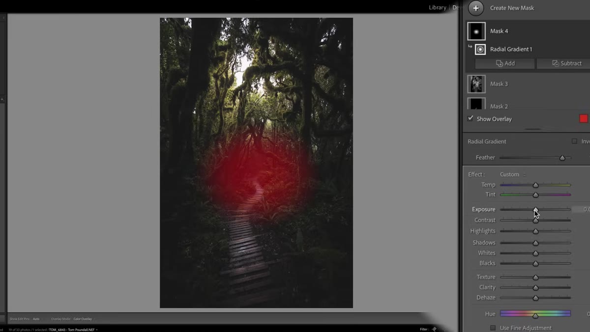 Second radial gradient adding haze to the path end
The final move is subtle but effective. Nigel drops a second radial gradient at the far end of the foreground path - the point where it disappears into the scene - and uses negative Dehaze again to introduce a soft atmospheric haze. There was no actual mist in the original shot, but adding just a suggestion of it creates a sense of mystery and makes the image feel deeper.
Keep this adjustment gentle: Dehaze around -15 to -25 max. Add a touch of warmth and raise Exposure slightly so it reads as light, not just fog. The goal is to imply distance, not fake weather.
One Thing I’d Add: Lock in Visual Weight with a Linear Gradient Before Any of This
I always add a step zero that Nigel skips because he’s working fast - a simple linear gradient pulling down the top third of the frame by around -0.3 Exposure before applying any presets. Wide-angle skies are almost always brighter than the camera’s meter wants to admit, and taming that first means every subsequent adjustment works with a more balanced base. It’s the kind of thing that took me an embarrassing number of ruined edits to figure out, and I wish someone had just told me.
The single most important idea in this whole workflow is that visual weight has to be managed deliberately. Light in the sky and light in the foreground need to be in conversation with each other, and Lightroom’s masking tools - especially luminosity range intersections - are how you have that conversation precisely. Stop editing globally and start editing selectively, and the mood you’ve been chasing will start showing up consistently.
Watch the full tutorial on YouTube to see Nigel work through multiple community photos - the pacing of a live edit is something you really do have to watch to internalize.
Comments
Leave a Comment