When Hype Overshadows Craft: What AI's Growing Pains Teach Us About Creative Work

When Hype Overshadows Craft: What AI's Growing Pains Teach Us About Creative Work

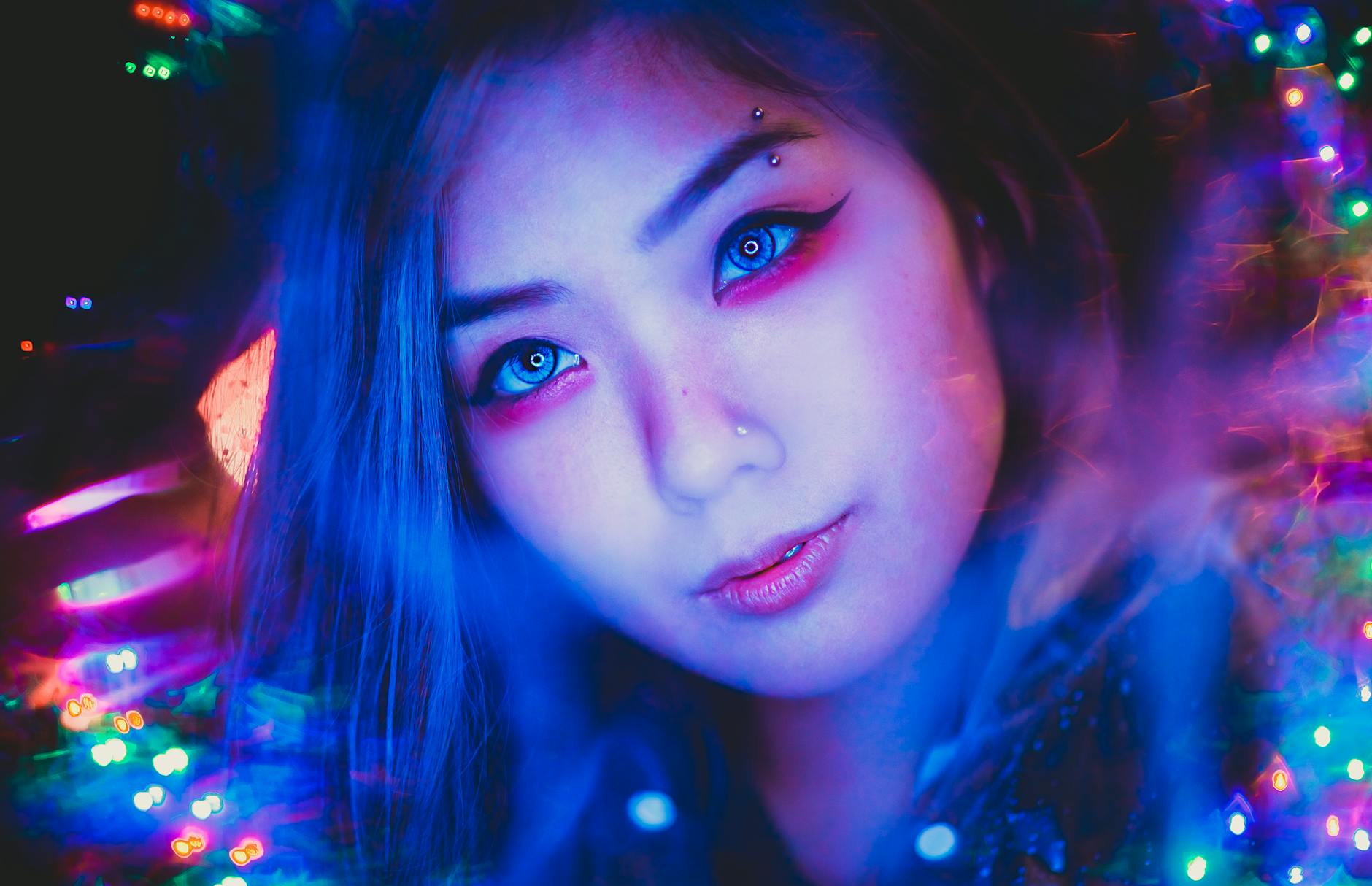
The Problem With Performing Innovation I’ve been thinking a lot lately about the difference between creating something meaningful and simply creating something that gets attention. It’s a distinction that matters deeply in photography and color grading, where the craftsmanship behind an image is what separates memorable work from forgettable content. Recently, I watched a major AI company stumble spectacularly while unveiling a new creative tool. The moment felt less like genuine innovation and more like a teenager trying to impress classmates with something they didn’t fully understand themselves.

Why Night Lights Photography is the Ultimate Lightroom Color Grading Challenge

Why Night Lights Photography is the Ultimate Lightroom Color Grading Challenge

When Artificial Light Becomes Your Canvas I’ve been watching the photography community light up—pun absolutely intended—over night lights photography, and I’m here to tell you why this genre is basically a masterclass in Lightroom color grading. There’s something magical about artificial light sources that forces you to abandon your typical editing playbook and get creative. Unlike natural light photography, where you’re working with predictable color temperatures and falloff, night lights throw you into the deep end.

Mastering the Tone Curve in Lightroom: The Secret Weapon of Professional Editors

Mastering the Tone Curve in Lightroom: The Secret Weapon of Professional Editors

Mastering the Tone Curve in Lightroom: The Secret Weapon of Professional Editors I used to think the Tone Curve was for advanced editors only—you know, the kind of people who use words like “luminosity” casually at dinner parties. But after years of editing thousands of photos, I’ve realized it’s actually the most forgiving, most powerful tool in Lightroom’s arsenal. And honestly? It’s easier to master than you’d think. The tone curve changed everything for me.

The Lightroom Panic Attack: Why Your Photos Aren't Really Gone (And How to Find Them)

The Lightroom Panic Attack: Why Your Photos Aren't Really Gone (And How to Find Them)

The Lightroom Panic Attack: Why Your Photos Aren’t Really Gone (And How to Find Them) We’ve all been there. You open Lightroom on a Monday morning, coffee in hand, ready to dive into color grading that weekend shoot. But instead of your carefully organized grid of thumbnails, you’re staring at an empty library. Your stomach drops. Where did everything go? Before you start imagining your entire photo collection evaporating into the digital void—take a breath.

Breathing New Life Into Your Camera Roll: How Modern Upscaling Transforms Low-Resolution Photos

Breathing New Life Into Your Camera Roll: How Modern Upscaling Transforms Low-Resolution Photos

Breathing New Life Into Your Camera Roll: How Modern Upscaling Transforms Low-Resolution Photos We’ve all been there. You’re scrolling through your photo library and stumble upon images from your old point-and-shoot or that ancient smartphone camera—crisp memories stuck at 8 megapixels, now feeling impossibly small on modern displays. Your instinct? Delete them. But before you hit that trash button, I’ve discovered something that completely changed how I view my digital archive.

Mastering HSL in Lightroom: The Secret Weapon for Selective Color Grading

Mastering HSL in Lightroom: The Secret Weapon for Selective Color Grading

Mastering HSL in Lightroom: The Secret Weapon for Selective Color Grading I used to think that getting the perfect color grade meant either nailing it in-camera or spending hours with masks and brushes. Then I discovered the HSL panel in Lightroom, and it completely changed my workflow. If you’re not using it yet, you’re leaving serious creative potential on the table. HSL stands for Hue, Saturation, and Luminance—three separate controls that let you adjust specific color ranges independently.

Lightroom Presets: The Shortcut to Consistent, Professional Color Grading

Lightroom Presets: The Shortcut to Consistent, Professional Color Grading

Lightroom Presets: The Shortcut to Consistent, Professional Color Grading I used to spend 20 minutes editing each photo. Twenty minutes! Adjusting whites, shadows, vibrance, HSL sliders—the whole tedious dance. Then I discovered the real power of Lightroom presets, and my entire workflow changed. I’m not talking about one-click Instagram filters that make your photos look flat and over-processed. I’m talking about smart, customizable starting points that cut my editing time in half while actually improving consistency across my library.

What a Modern Zelda Remake Means for Video Game Color Grading

What a Modern Zelda Remake Means for Video Game Color Grading

The Remake We’ve Been Waiting For I’ve been scrolling through gaming forums lately, and the buzz around a potential Ocarina of Time remake has reached fever pitch. Industry insiders are suggesting we might finally see Nintendo tackle a ground-up reimagining of their seminal N64 masterpiece for the Switch 2, potentially arriving in late 2026. What strikes me isn’t just the nostalgia factor—it’s the visual storytelling opportunity this presents. Why This Matters Beyond Gaming Here’s what keeps me thinking about this as a color grading enthusiast: Ocarina of Time defined how an entire generation experienced 3D game environments.

Why Microsoft's Return to Basics Matters for Creative Professionals

Why Microsoft's Return to Basics Matters for Creative Professionals

The Great Software Reset We Didn’t Know We Needed I’ve been thinking a lot lately about bloat. Not the kind in your Lightroom catalog (though that’s real too), but the kind that creeps into software when companies lose sight of what made their products great in the first place. Microsoft’s recent pivot away from shoving AI into every corner of Windows 11 feels like a creative exhale—and honestly, it’s got me reflecting on what this means for us as visual creators.

Split Toning in Lightroom: The Secret Weapon for Cinematic Color

Split Toning in Lightroom: The Secret Weapon for Cinematic Color

Split Toning in Lightroom: The Secret Weapon for Cinematic Color I remember the first time I really understood split toning. I was editing a sunset portrait that felt flat despite nailing the exposure, and I thought: “This needs something.” I opened the Split Toning panel in Lightroom, threw a cool blue into the shadows while keeping the highlights warm, and suddenly the image had dimension. It looked like a film still instead of a snapshot.

When Tech Leaders Lose Focus: What the AI Video Moment Teaches Content Creators

When Tech Leaders Lose Focus: What the AI Video Moment Teaches Content Creators

The Hype Machine vs. Creative Responsibility There’s something telling about watching major technology figures stumble publicly. Recently, OpenAI’s leadership made headlines with what can only be described as a tone-deaf moment—announcing AI video generation capabilities with all the maturity of someone discovering Photoshop filters for the first time. As someone who spends my days thinking about visual storytelling, editing workflows, and color grading philosophy, I found myself reflecting on what this says about the culture driving innovation in creative tools.

Masking Tools in Lightroom: The Secret Weapon for Selective Editing

Masking Tools in Lightroom: The Secret Weapon for Selective Editing

Masking Tools in Lightroom: The Secret Weapon for Selective Editing I used to think global adjustments were enough. Brighten the whole image, boost saturation everywhere, call it a day. Then I discovered Lightroom’s masking tools, and I realized I’d been editing with one hand tied behind my back. Masking lets you apply adjustments to specific parts of your image instead of the entire photo. It’s the difference between giving everyone in a room the same haircut versus letting each person walk out looking their best.