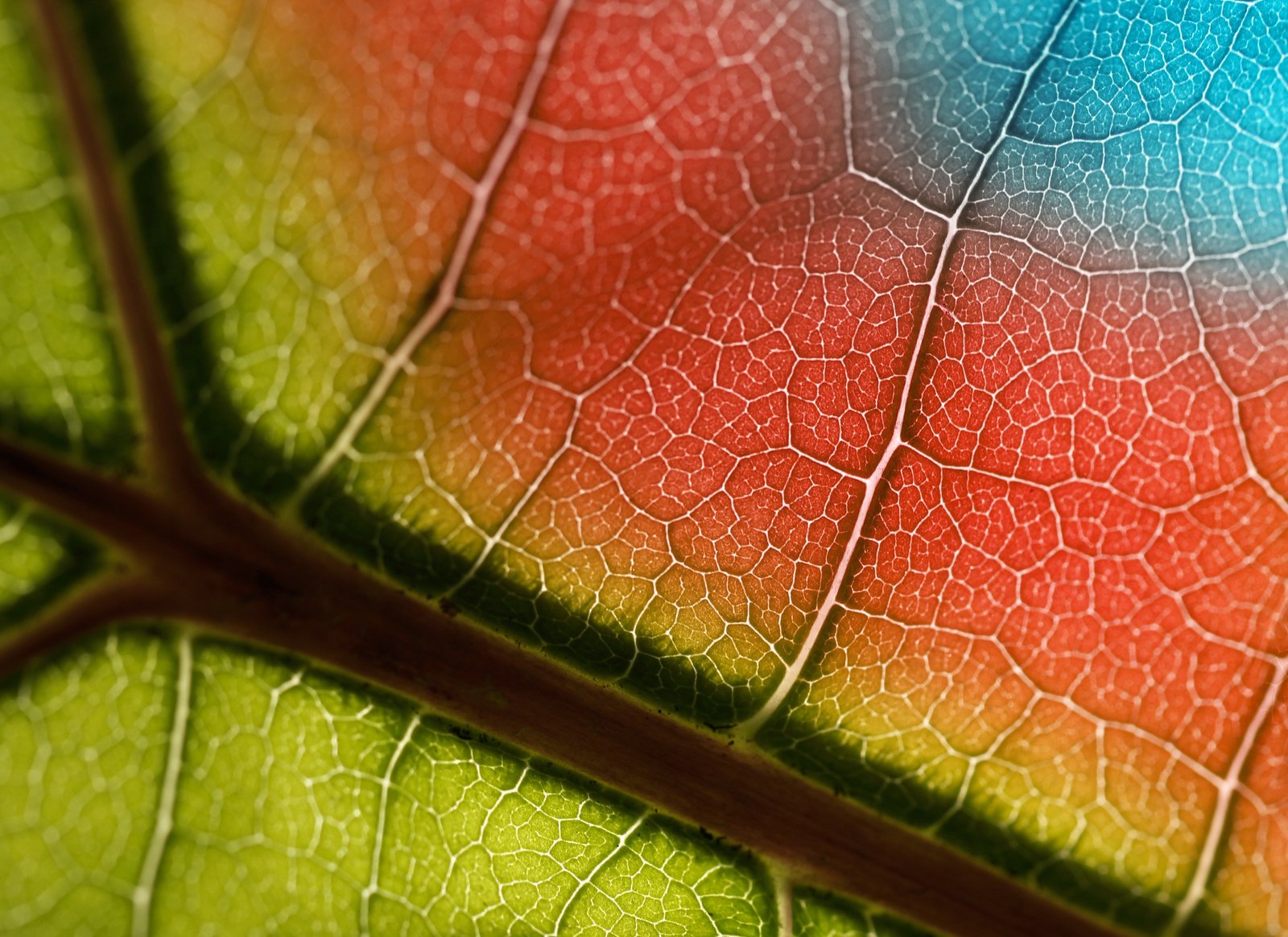
I was editing a client’s golden hour shoot last spring, Rumours by Fleetwood Mac on the turntable, and I kept nudging the overall white balance warmer trying to get that rich, filmic feel. Warmer. A little warmer. Now it looked like the couple got married inside a tandoor oven. The problem wasn’t the temperature slider. The problem was I was treating the whole image as one tonal unit when it isn’t. Shadows and highlights respond to color completely differently, and until you start working with them separately, your edits will keep fighting you.
That’s what split toning solves.
What Split Toning Actually Does to Your Image
Split toning lets you push different hues into the shadow regions and highlight regions of a photo independently. You’re not changing exposure or saturation globally. You’re tinting specific luminance ranges with color, which is how a lot of the film stocks we’re all trying to emulate actually behaved. Kodak Portra 400, for example, has famously warm highlights and slightly cooler, more muted shadows. That contrast between tonal regions is a huge part of why it reads as “cinematic” rather than just “orange.”
In Lightroom Classic, this lives in the Color Grading panel, which replaced the older Split Toning panel back in Lightroom 10. The newer interface gives you three color wheels: Highlights, Midtones, and Shadows. Each wheel has a Hue and Saturation value, plus a Luminance slider underneath. You can work the wheels visually by dragging the center dot, or type values directly into the fields. I almost always type values first to get in the ballpark, then fine-tune with the wheel.
The Settings That Actually Work (With Numbers)
Here’s a starting framework I use on outdoor portraits. It’s not a universal fix, but it gives you a reference point that isn’t just vibes.
For warm, filmic outdoor portraits:
- Highlights: Hue 40-50 (a golden amber), Saturation 10-18
- Midtones: Hue 35-45, Saturation 5-8 (much lighter touch here)
- Shadows: Hue 215-230 (a cool blue-teal), Saturation 12-20
That orange-to-teal push in opposite directions is the foundation of what people call the “Hollywood blockbuster” grade. You’ve seen it in every action movie trailer from 2010 to 2016 and about half the Lightroom preset packs sold on Etsy. The reason it works is complementary contrast: warm skin tones in the highlights pop harder when the shadows are pulling in the opposite direction on the color wheel.
The Blending slider (0-100) controls how much the three regions overlap. Lower values mean harder, more distinct separation. Higher values blend them together more gradually. I usually sit around 50 for portraits and 35-40 when I want a more stylized, aggressive grade. The Balance slider shifts the boundary between shadows and highlights. Push it negative to protect more of your image in the shadow treatment. Push positive to let the highlight toning dominate.
Why Saturation Values Below 20 Are Usually Enough
This is where most people go wrong. They crank saturation to 40 or 50, post the photo, and wonder why it looks like a Instagram filter from 2012. Split toning works best when it’s something the viewer feels rather than identifies. Keep your Highlights saturation under 20 and your Shadows saturation under 25 in most cases. If you can immediately name the color in the shadows just by looking at the image, it’s probably too strong.
A quick test I use: export the file, look at it in your phone’s photo app with the screen at full brightness, and wait ten seconds. If the color grading is the first thing you notice rather than the subject, pull back the saturation by 30 percent and re-evaluate.
The Preset That Taught Me to Stop Guessing
A few years ago I built a preset pack over one long weekend, lost sleep over color wheel angles, named every preset after a Wilco or Big Star song, and eventually just gave the whole thing away. It got downloaded 50,000 times, which was equal parts gratifying and mildly humiliating because the most popular preset in the pack was one I almost cut. It was called “September Gurls” (yes, after the Big Star song), and it used an unusually high shadow saturation of 28 on a hue of 240, basically a violet-blue, paired with Highlights at hue 48 and saturation 14.
On skin, it looked strange. On architecture and moody street shots, it was stunning. The lesson I took from watching people use that preset in the wild was that split toning recipes don’t belong to subject categories. They belong to light conditions. That preset worked because of how it handled the specific quality of late-afternoon shade. Subject didn’t matter. Light quality did.
Now when I build a grade, I ask: what kind of light is in this photo, and what would a complementary color do to the shadows that are already there? That question does more than any formula.
Matching Your Grade to the Existing Light
Before you touch the Color Grading panel, look at the raw light in your frame. Indoor tungsten lighting already has orange in the highlights. Pushing more amber into those highlights is redundant and will blow past that 20-saturation ceiling fast. Instead, try a light cyan in the highlights (hue 185-195, saturation 8-12) to balance the warmth, and let the shadows go slightly warm (hue 30-40, saturation 10-15). You’re not fighting the light. You’re finishing the conversation it already started.
Overcast outdoor light is neutral and flat, which means you have the most creative freedom and also the highest risk of over-grading. Go gentle. Flat light doesn’t anchor a heavy grade the way golden hour does. A subtle Midtone push is often more effective than strong shadow and highlight tones in these conditions.
The single most important thing about split toning isn’t the numbers. It’s learning to see the light that’s already in your image and treating your color grade as something that extends that light rather than replaces it.
Comments (1)
Love how you break down complex stuff into manageable steps.
Leave a Comment