
Every photographer I know has spent too much time dragging the Contrast slider back and forth trying to resurrect a flat, muddy RAW file. I did it for years. Back when I was editing press shots for my band on a borrowed laptop, I thought contrast was something you added manually, like salt to a recipe. Turns out I was starting from the wrong ingredient entirely.
That’s the core lesson in this CreativeLive tutorial on color management policies in Lightroom. Watch the full tutorial on YouTube - it’s worth your time even if you think you already know white balance. The instructor walks through a real color-calibration workflow using a physical color checker target, then shows how choosing the right camera profile inside Lightroom’s Develop module changes the starting point of your entire edit. Not the end result. The starting point.
That distinction matters more than most tutorials acknowledge. When your foundation is right, you stop compensating and start actually editing. Here’s how the workflow breaks down.
Step 1: Shoot Your Color Checker Target with the Subject in Frame
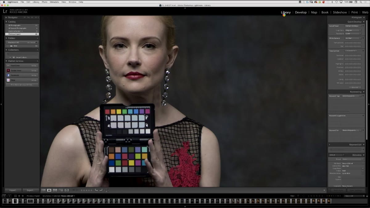 Color checker target shown alongside a portrait subject
When you photograph a color checker target on set, include part of the subject’s face in the same frame. This sounds obvious, but it’s easy to just photograph the card by itself and call it done. The problem is that a target in isolation tells you very little once you start making tonal adjustments. Skin tones are your real reference point. Seeing the face alongside the card lets you judge whether your white balance correction is actually flattering, or just technically accurate.
Color checker target shown alongside a portrait subject
When you photograph a color checker target on set, include part of the subject’s face in the same frame. This sounds obvious, but it’s easy to just photograph the card by itself and call it done. The problem is that a target in isolation tells you very little once you start making tonal adjustments. Skin tones are your real reference point. Seeing the face alongside the card lets you judge whether your white balance correction is actually flattering, or just technically accurate.
This is especially important in mixed lighting situations where “correct” and “good-looking” aren’t always the same thing.
Step 2: Use the Color Checker Midpoint to Set Your White Balance
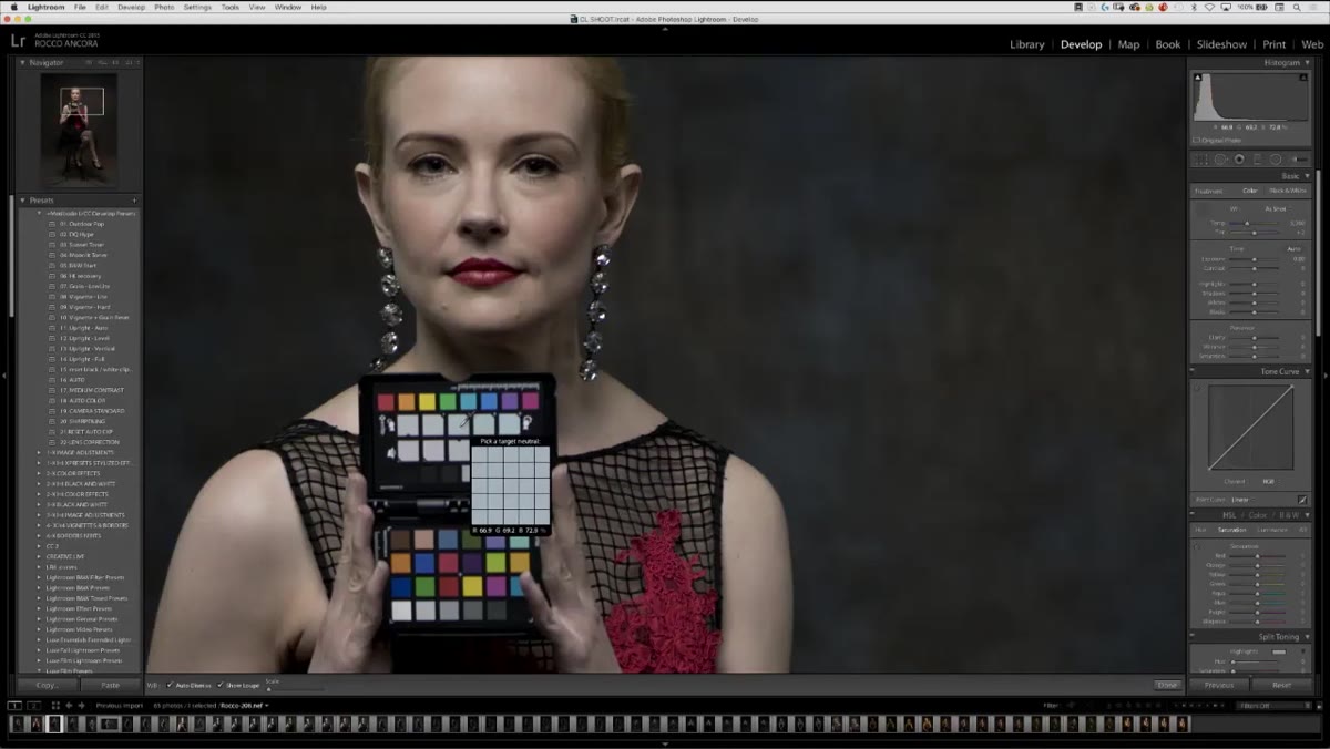 Clicking the midpoint on the color checker card in Develop module
Inside the Develop module, use the white balance selector tool and click on the midpoint of your color checker card. What you’ll notice immediately is that the result isn’t locked to one option. Clicking on slightly cooler patches on the card will warm up the skin tones in the photo, and clicking on warmer patches will cool the skin down. This is counterintuitive the first time you see it, but it makes sense once you understand that you’re telling Lightroom what neutral looks like - and adjusting that reference shifts everything else in the opposite direction.
Clicking the midpoint on the color checker card in Develop module
Inside the Develop module, use the white balance selector tool and click on the midpoint of your color checker card. What you’ll notice immediately is that the result isn’t locked to one option. Clicking on slightly cooler patches on the card will warm up the skin tones in the photo, and clicking on warmer patches will cool the skin down. This is counterintuitive the first time you see it, but it makes sense once you understand that you’re telling Lightroom what neutral looks like - and adjusting that reference shifts everything else in the opposite direction.
This gives you creative control baked directly into the calibration step. You’re not stuck with a clinical, mathematically neutral result. You can dial in a slightly warmer or cooler starting point based on the mood of the shoot.
Step 3: Apply the White Balance to the Rest of the Shoot Using Previous
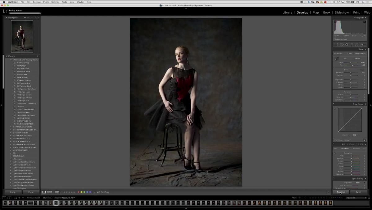 Clicking the Previous button to sync settings to the next image
Once you’ve corrected your reference frame, move to the next image in the sequence and click the “Previous” button at the bottom of the Develop module. This copies the color corrections you just made directly onto the new image without you having to re-enter a single value. Work through the set this way - correct, previous, correct if needed, previous - and you can batch-process an entire session in a fraction of the time it takes to manually match images by eye.
Clicking the Previous button to sync settings to the next image
Once you’ve corrected your reference frame, move to the next image in the sequence and click the “Previous” button at the bottom of the Develop module. This copies the color corrections you just made directly onto the new image without you having to re-enter a single value. Work through the set this way - correct, previous, correct if needed, previous - and you can batch-process an entire session in a fraction of the time it takes to manually match images by eye.
The key here is consistency at the shooting stage. If your camera settings stay constant across the session, the “Previous” sync will hold up. If your lighting changed between shots, you’ll need to re-correct from a new reference frame.
Step 4: Switch from Adobe Standard to Camera Standard in the Camera Calibration Panel
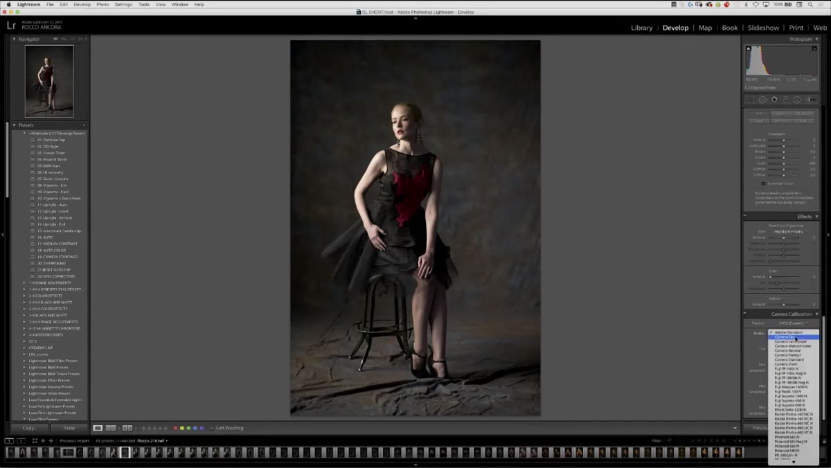 Profile dropdown changing from Adobe Standard to Camera Standard
This is the step most people skip, and it’s the one that makes the biggest difference. Scroll to the bottom of the Develop module panels and open Camera Calibration. By default, Lightroom renders your RAW files using Adobe Standard, which is a generalist profile designed to work acceptably across many camera brands. It prioritizes flexibility over accuracy, and the tradeoff is a noticeably flat image with muted contrast.
Profile dropdown changing from Adobe Standard to Camera Standard
This is the step most people skip, and it’s the one that makes the biggest difference. Scroll to the bottom of the Develop module panels and open Camera Calibration. By default, Lightroom renders your RAW files using Adobe Standard, which is a generalist profile designed to work acceptably across many camera brands. It prioritizes flexibility over accuracy, and the tradeoff is a noticeably flat image with muted contrast.
Switch that dropdown to Camera Standard, and watch what happens to the image. The contrast snaps in. Colors become more saturated and differentiated. The photo starts to look like what you saw on your camera’s LCD. This is because Camera Standard pulls from your camera manufacturer’s actual color science rather than Adobe’s interpretation of it. If you’ve been shooting on a Canon or Nikon and wondering why your RAWs never look as punchy as your JPEGs, this is the reason.
Step 5: Recover Dynamic Range After Applying the Profile
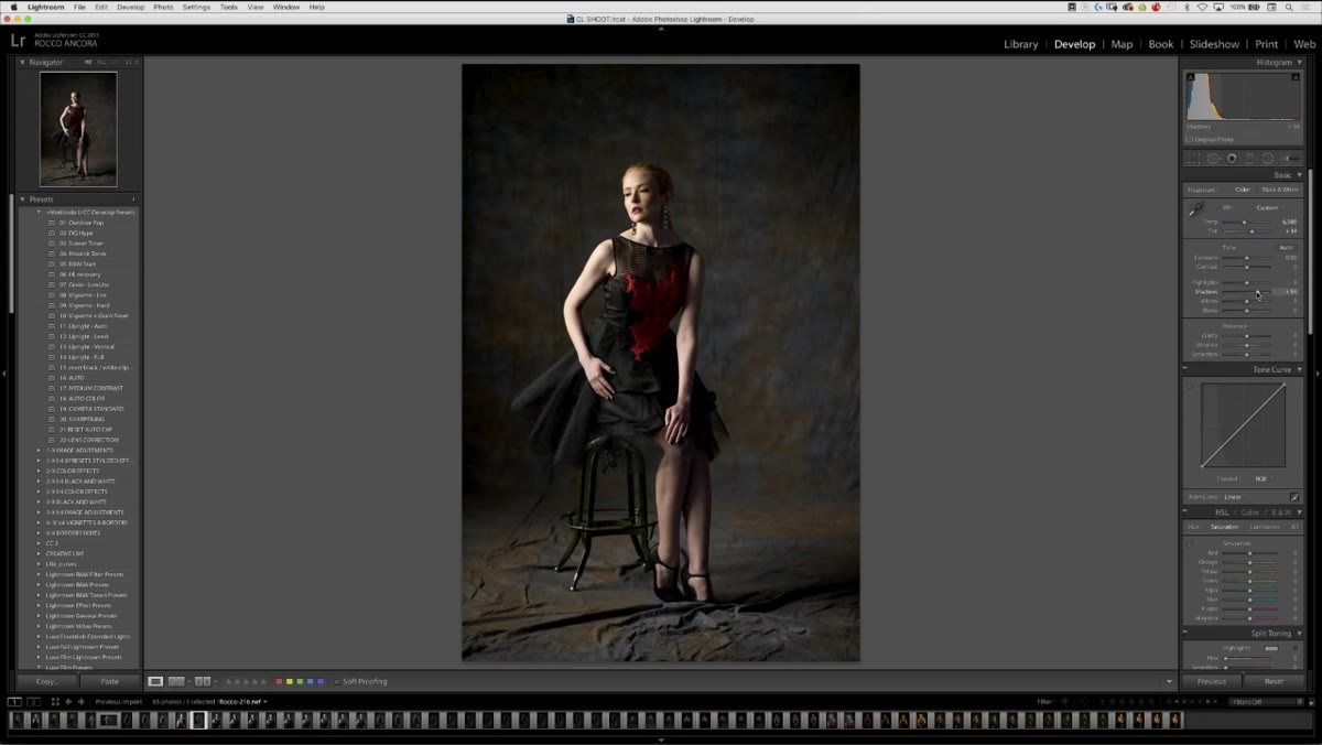 Shadows slider being lifted and Highlights slider being pulled down
After switching to Camera Standard, the image has more contrast baked in, which is great, but it means your shadows may get a little darker and your highlights a little hotter. The fix is simple: open up the Shadows slider and bring down the Highlights. You’re not fighting the profile, you’re complementing it. The extra contrast gives you texture and depth; the shadow recovery gives you detail in the darker areas of the frame without making the image look artificially lifted.
Shadows slider being lifted and Highlights slider being pulled down
After switching to Camera Standard, the image has more contrast baked in, which is great, but it means your shadows may get a little darker and your highlights a little hotter. The fix is simple: open up the Shadows slider and bring down the Highlights. You’re not fighting the profile, you’re complementing it. The extra contrast gives you texture and depth; the shadow recovery gives you detail in the darker areas of the frame without making the image look artificially lifted.
The goal here is tonal range, not a specific look. Think of this stage as expanding the amount of information you have to work with before any creative grading happens. The instructor’s framing stuck with me: Lightroom gets you to good color and a full tonal range, and Photoshop is where you take it somewhere interesting.
One Thing I’d Add from My Own Workflow
The Camera Standard profile is a great starting point, but if you’re shooting with a mirrorless camera and your manufacturer offers a dedicated camera profile for a specific picture style - say, Portrait or Landscape - those are worth testing too. I’ve found that for skin-heavy work, the Portrait profile on certain Sony bodies actually renders more accurate skintones than Camera Standard out of the box. The principle is the same: you’re leveraging the camera manufacturer’s color science instead of reinventing it with sliders.
The other thing worth noting is that this entire calibration workflow is far more powerful if you shoot in a consistent picture style with all in-camera sharpening, saturation boosts, and noise reduction turned off. The cleaner the camera’s output, the more accurately the profile maps to it. That’s not a limitation - it’s the whole point.
The single most important takeaway from this tutorial is one that sounds almost too simple: your starting profile shapes everything. Switching from Adobe Standard to Camera Standard isn’t a stylistic choice, it’s a technical correction that puts your edit on solid ground before a single creative decision is made. Every slider you touch after that is additive rather than corrective.
If you’ve been compensating for flat RAWs with heavy contrast adjustments, start here instead. Watch the full tutorial on YouTube and pay close attention to the before-and-after moment when the profile switches. That moment is the whole lesson.
Comments
Leave a Comment