
There’s a specific kind of frustration that comes from nailing a wildlife shot, getting the exposure right, holding your breath long enough for the bird to turn its head just so, and then zooming in at your desk to find the background looks like a bowl of colored gravel. I’ve been there more times than I’d like to admit. Noisy backgrounds don’t just look bad on their own. They actively pull the viewer’s eye away from your subject, which is the one thing you actually cared about when you pressed the shutter.
The fix isn’t as complicated as most people assume, and it doesn’t mean applying blanket noise reduction across the whole image and watching your subject turn to soap. In this Tony & Chelsea Northrup tutorial, Chelsea walks through a targeted approach that uses Lightroom’s adjustment brush and Auto Mask to reduce noise in the background only, leaving the subject’s texture and detail completely intact. Watch the full tutorial on YouTube if you want to follow along with her seagull example. Otherwise, here’s the full breakdown.
Step 1: Open the Develop Panel and Select the Adjustment Brush
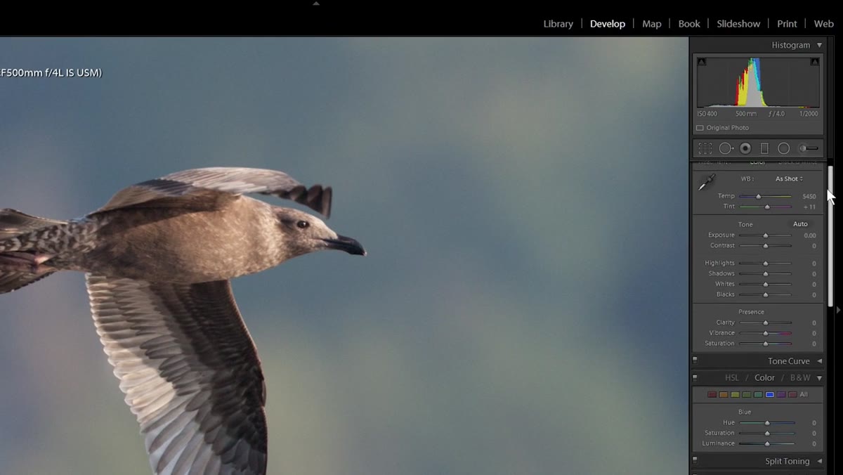 Develop panel open with adjustment brush selected
Start in the Develop module. From the toolbar just above the basic sliders, select the Adjustment Brush (keyboard shortcut: K). This is a local adjustment tool, meaning every change you make with it only affects the areas you paint over. That’s the whole point here. You’re not touching the global noise settings yet.
Develop panel open with adjustment brush selected
Start in the Develop module. From the toolbar just above the basic sliders, select the Adjustment Brush (keyboard shortcut: K). This is a local adjustment tool, meaning every change you make with it only affects the areas you paint over. That’s the whole point here. You’re not touching the global noise settings yet.
Once the brush is active, you’ll see a panel with various effect sliders. Scroll through the Effect dropdown and set it to Noise. This primes the brush so that wherever you paint, Lightroom applies noise reduction to that area specifically.
Step 2: Turn On Auto Mask and Adjust Your Brush Settings
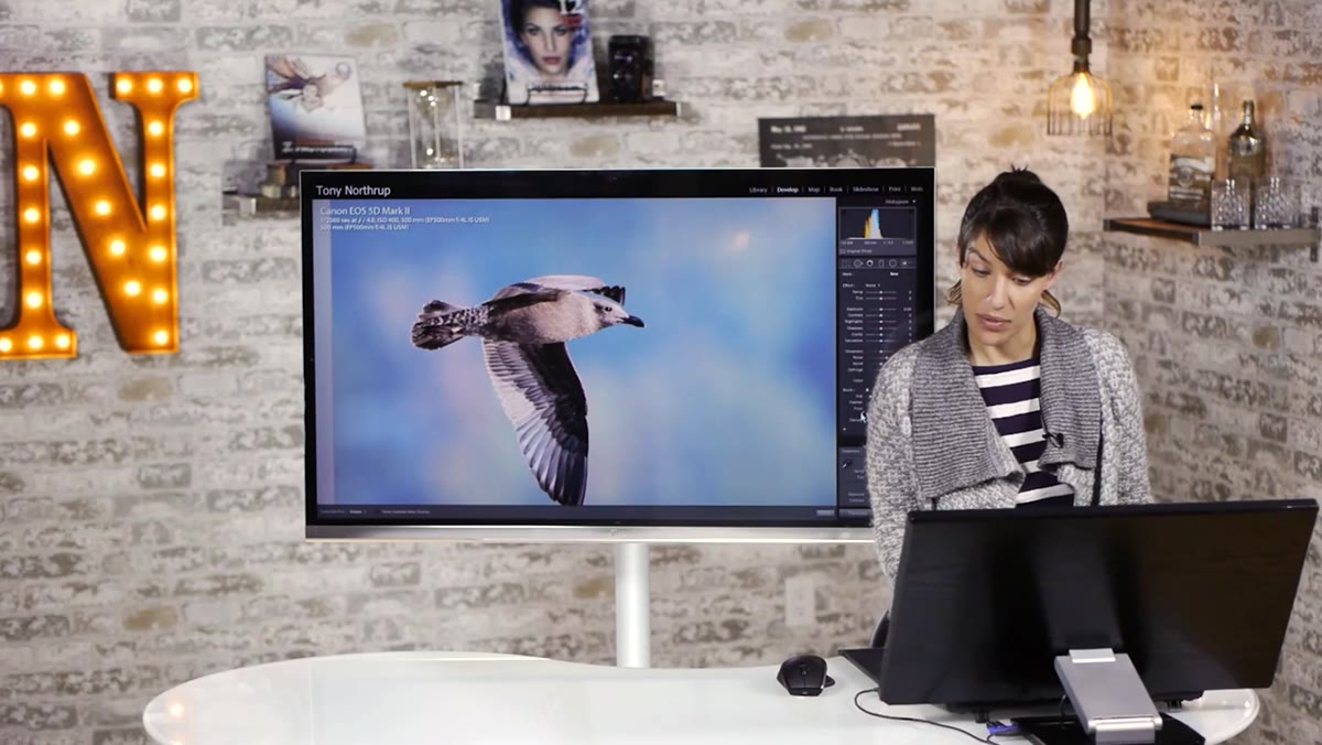 Auto Mask checkbox enabled in brush options panel
Before you start painting, check the Auto Mask box in the brush options at the bottom of the panel. Auto Mask tells Lightroom to detect edges based on color and tone as you paint, so it tries to stay within the region that matches where your brush starts. It’s not magic, and Chelsea is upfront that it’s “hit or miss.” But for images with a clearly defined background color that contrasts reasonably well with your subject, it does a solid job.
Auto Mask checkbox enabled in brush options panel
Before you start painting, check the Auto Mask box in the brush options at the bottom of the panel. Auto Mask tells Lightroom to detect edges based on color and tone as you paint, so it tries to stay within the region that matches where your brush starts. It’s not magic, and Chelsea is upfront that it’s “hit or miss.” But for images with a clearly defined background color that contrasts reasonably well with your subject, it does a solid job.
Also bring your Feathering down toward zero and make the brush harder. A soft brush edge is great for blending exposure adjustments, but for noise reduction on a background, a harder edge gives you more control right up to your subject’s outline. Keep the brush at a workable size for your screen.
Step 3: Enable the Mask Overlay So You Can See What You’re Selecting
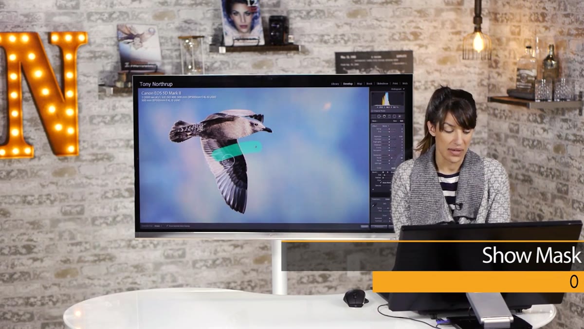 Red mask overlay visible on background using Shift+O toggle
Press O to toggle the mask overlay on. By default it shows as a red or green tint over the areas you’ve painted. If the color blends in with your image and makes it hard to read, press Shift+O to cycle through the available overlay colors until you land on something that stands out. Red tends to work well against blue or green backgrounds, which is exactly what you’d have with a sky or water behind a subject.
Red mask overlay visible on background using Shift+O toggle
Press O to toggle the mask overlay on. By default it shows as a red or green tint over the areas you’ve painted. If the color blends in with your image and makes it hard to read, press Shift+O to cycle through the available overlay colors until you land on something that stands out. Red tends to work well against blue or green backgrounds, which is exactly what you’d have with a sky or water behind a subject.
Now you can actually see your selection building as you paint. This is the step most people skip, and it’s the reason their selections end up sloppy. Paint slowly along the edges of your subject, letting Auto Mask do its thing. You’ll see it cling to the background color and avoid crossing onto the subject in most places.
Step 4: Fill In the Background and Clean Up With the Erase Brush
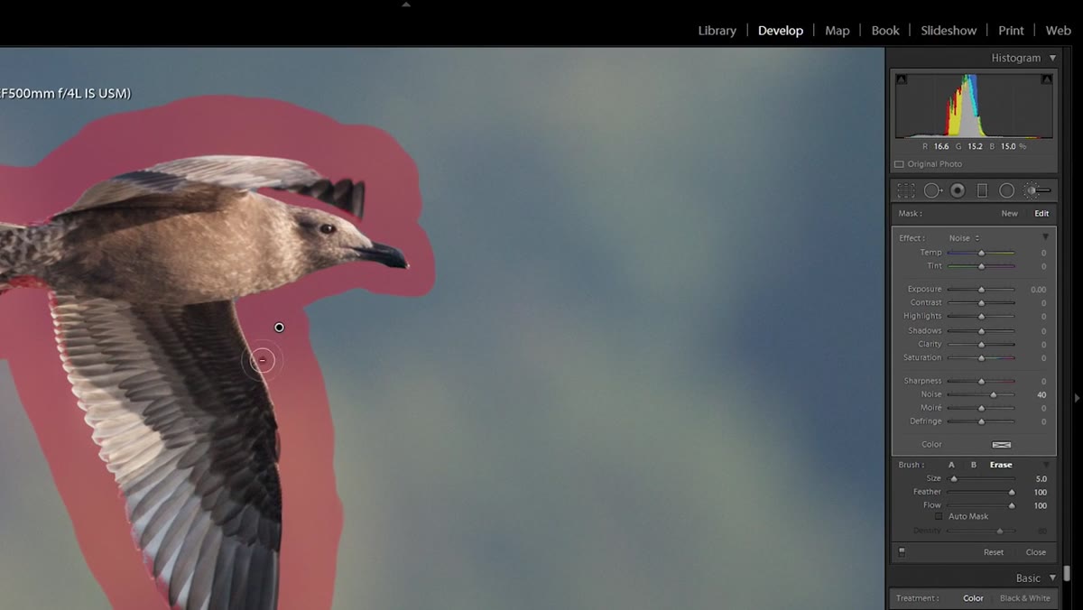 Erase brush cleaning up selection edges near subject
Once you’ve traced the edges, turn Auto Mask off before filling in the larger open areas of the background. This is important. Auto Mask slows things down and can produce strange artifacts when you’re painting quickly over areas that don’t have any tricky edges. Switch to a bigger brush size, make a few broad strokes to fill the rest of the background, then turn the Erase brush on to clean up any spots where you accidentally painted over your subject.
Erase brush cleaning up selection edges near subject
Once you’ve traced the edges, turn Auto Mask off before filling in the larger open areas of the background. This is important. Auto Mask slows things down and can produce strange artifacts when you’re painting quickly over areas that don’t have any tricky edges. Switch to a bigger brush size, make a few broad strokes to fill the rest of the background, then turn the Erase brush on to clean up any spots where you accidentally painted over your subject.
For noise reduction, you don’t need a surgically perfect selection. A few pixels of overlap on the subject won’t be visible the way they would if you were making an exposure adjustment. Get it reasonably clean and move on.
Step 5: Dial In the Noise Reduction Amount
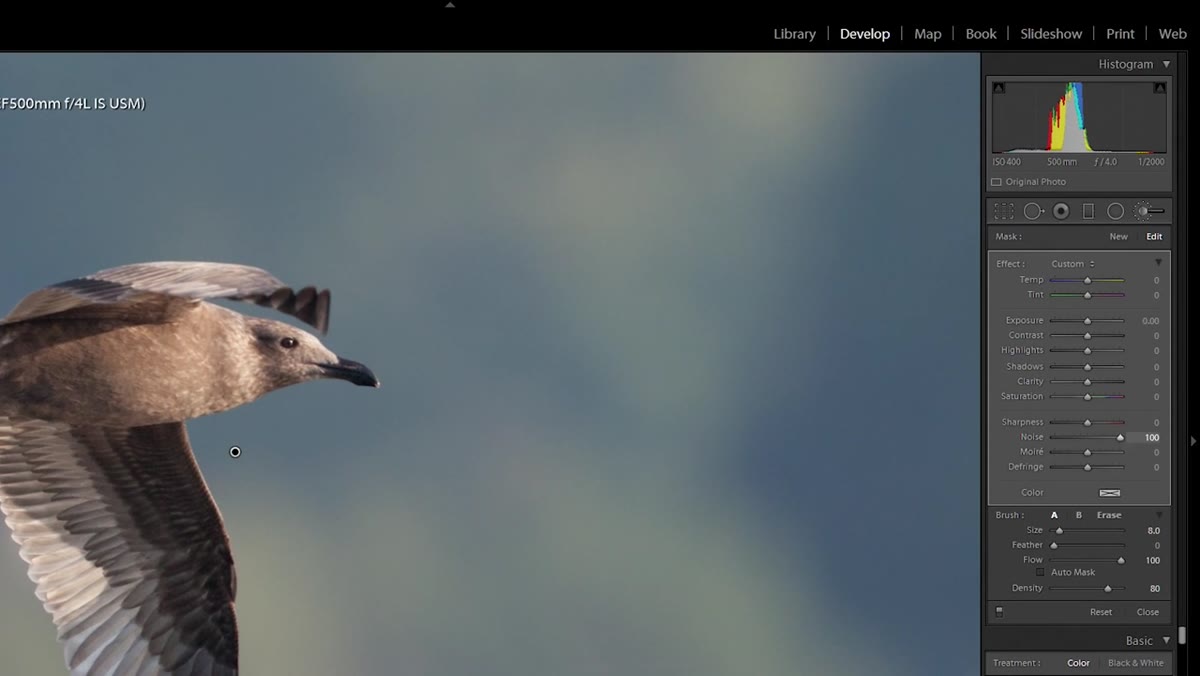 Noise slider pulled up showing before and after background smoothness
Press O again to turn the overlay off so you can evaluate the actual effect. Drag the Noise slider up and watch the background. You’ll see the grain and chroma noise start to smooth out. Chelsea also suggests pulling the Sharpness slider down slightly alongside the noise reduction. This might sound counterintuitive, but sharpness in a noisy background actually makes the noise more visible rather than the detail more defined. Reducing it a touch gives you a cleaner, calmer background without looking fake.
Noise slider pulled up showing before and after background smoothness
Press O again to turn the overlay off so you can evaluate the actual effect. Drag the Noise slider up and watch the background. You’ll see the grain and chroma noise start to smooth out. Chelsea also suggests pulling the Sharpness slider down slightly alongside the noise reduction. This might sound counterintuitive, but sharpness in a noisy background actually makes the noise more visible rather than the detail more defined. Reducing it a touch gives you a cleaner, calmer background without looking fake.
Compare before and after using the backslash key () to toggle the adjustment on and off. The difference is most obvious when you’re at 1:1 zoom, though it’s visible even at standard view.
Step 6: Leave the Subject Alone On Purpose
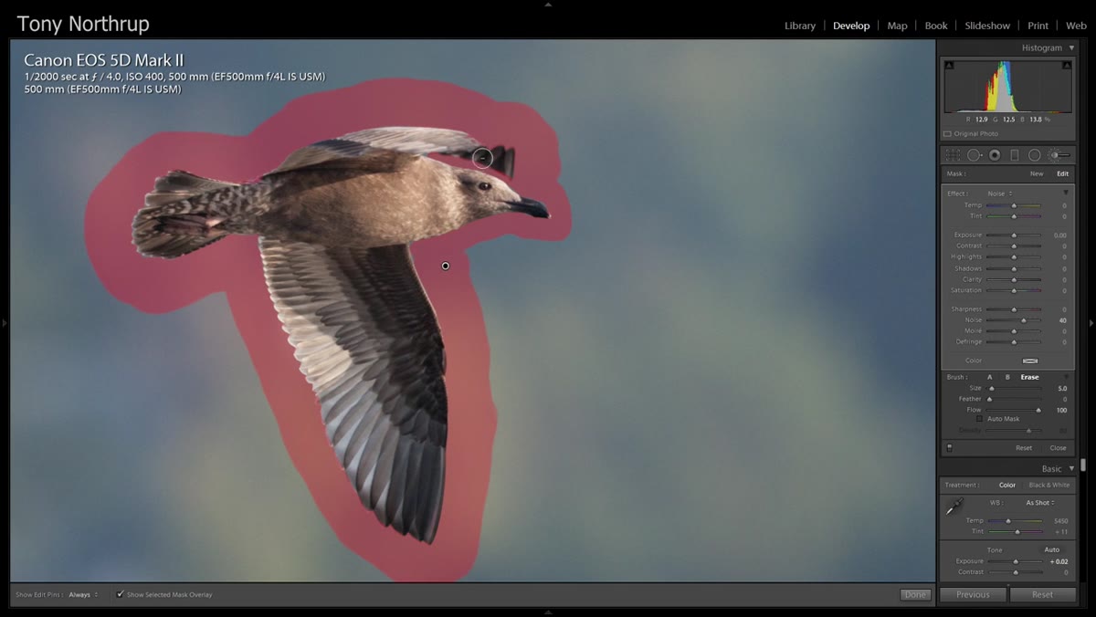 Bird subject unmasked, background red overlay showing selection boundary
This step is a decision, not a slider. The reason Chelsea limits noise reduction to the background is that applying it to a textured subject like a bird actually makes it look worse, not better. Noise reduction works by averaging pixel data to smooth out variation, and that same process softens fine detail like feathers, fur, or fabric. The noise in a textured subject tends to hide inside that texture anyway. The background has no texture to hide behind, which is exactly why it looks so obviously grainy in the first place.
Bird subject unmasked, background red overlay showing selection boundary
This step is a decision, not a slider. The reason Chelsea limits noise reduction to the background is that applying it to a textured subject like a bird actually makes it look worse, not better. Noise reduction works by averaging pixel data to smooth out variation, and that same process softens fine detail like feathers, fur, or fabric. The noise in a textured subject tends to hide inside that texture anyway. The background has no texture to hide behind, which is exactly why it looks so obviously grainy in the first place.
Resist the temptation to run noise reduction globally just because it’s faster. Protect your subject’s detail by keeping the brush off it entirely.
One Thing I’d Add From My Own Work
Chelsea briefly mentions Clarity and warns against over-applying it globally, which is correct. I’d push that further. If you want to add crispness to your subject after smoothing the background, use a second adjustment brush set to a small positive Clarity value and paint only on the subject. This creates a natural sharpness contrast between the smooth background and the detailed subject, which is part of what makes studio and wildlife photography look so polished. It mimics the depth-of-field separation that a fast prime gives you optically, and it works on shots that were taken with slower glass.
Just keep the Clarity value modest. Somewhere between 10 and 25 is usually enough. Past that, you’re into gritty HDR territory, and nobody’s presets should go there.
The single most useful idea from this tutorial is the combination of local adjustment and intentional restraint: reduce noise where it hurts the image, and leave alone what doesn’t need fixing. That mindset applies well beyond noise reduction. Most over-edited photos got that way because someone applied a global change when a local one would have done less damage.
Watch the full tutorial on YouTube to see Chelsea’s actual brush strokes and the real-time before and after on the seagull image. It’s worth seeing in motion even if you’ve already read through this.
Comments
Leave a Comment